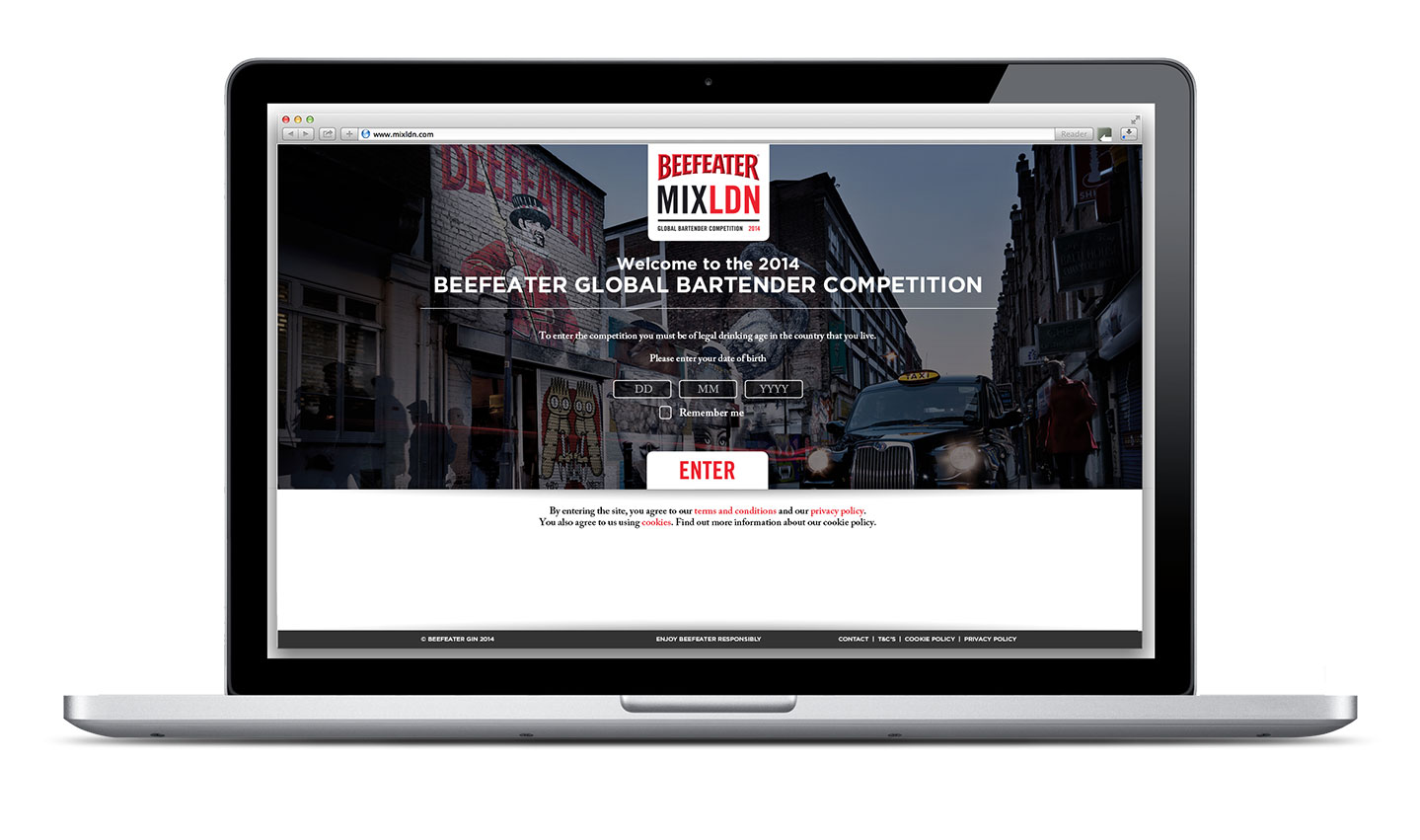
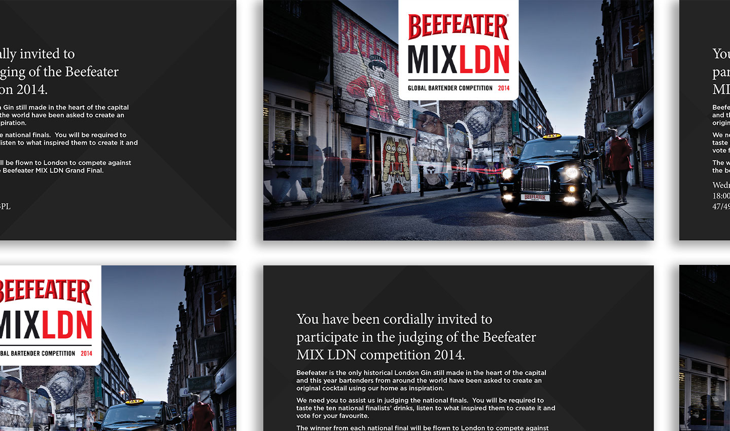
We worked with agency Amplify to deliver the branding and event collateral for Beefeater’s global bartender competition. Beefeater MIXLDN is an inspiring and engaging competition that mixes the best of contemporary London with the heritage of Beefeater gin and is designed to challenge the most talented bartenders from around the globe.
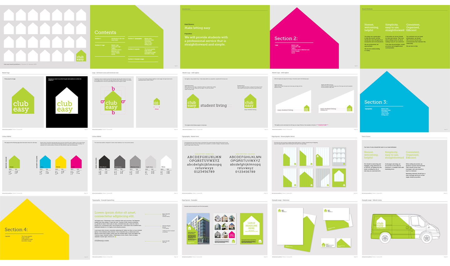
We spent the early part of the year re-branding the student letting company ClubEasy. Our re-branding was part of some extensive research that had given us a revised strategy and clear plan for the future. It was an interesting and challenging job, and unfortunately it wont see the light of day as the company went into administration before we could implement the revised strategic approach.
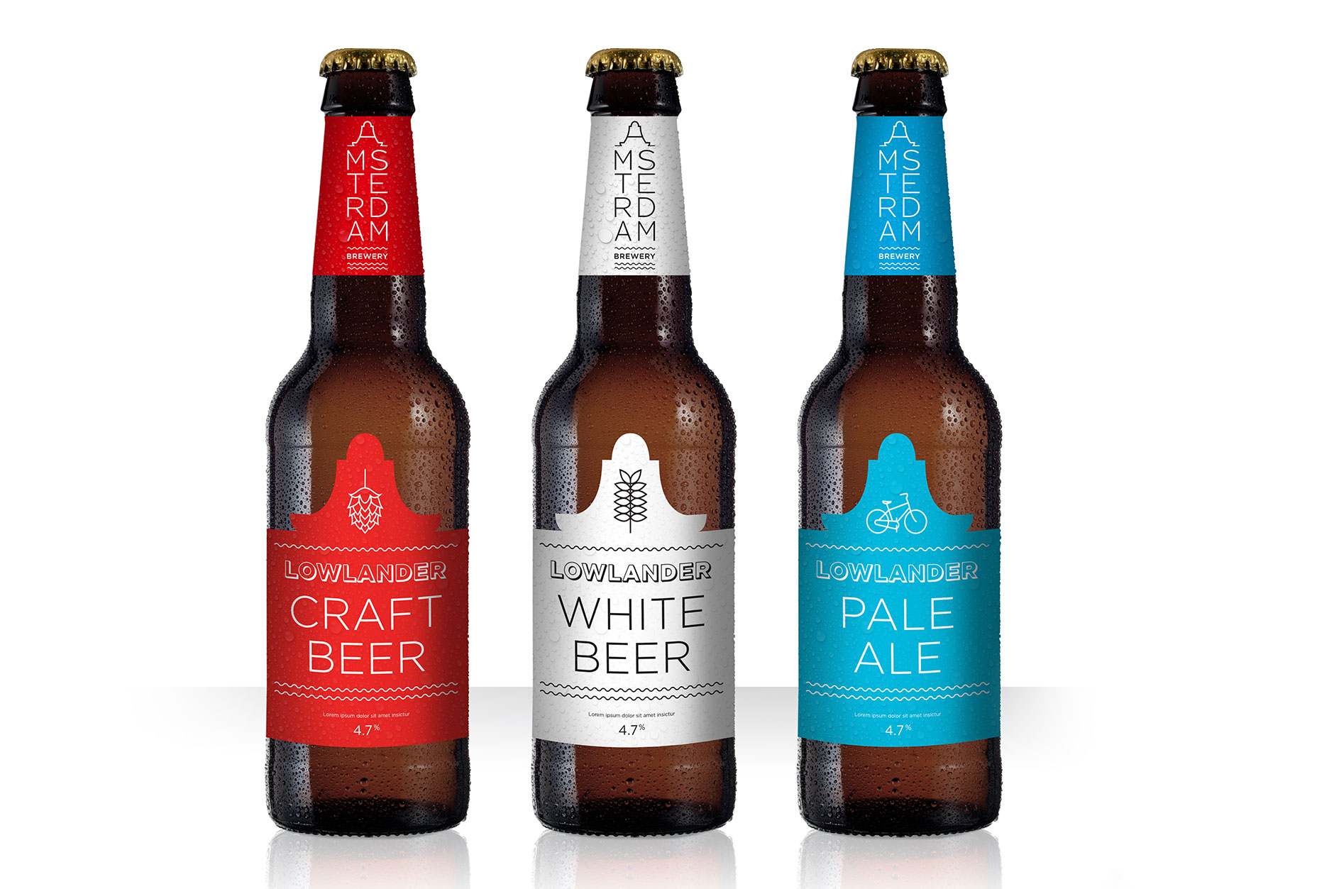
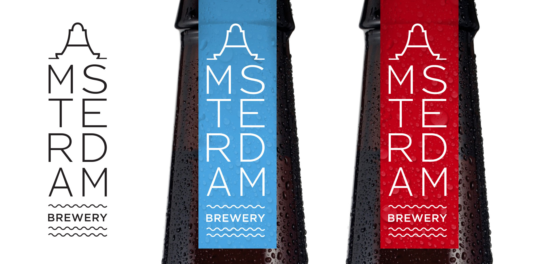
We worked on the concept designs for a new craft beer company – Amsterdam Brewery. Initial branding ideas and packaging concepts were created to bring to life, and gain investment, for a startup in beer innovation. The concept for the brewery logo focussed on the iconic canal houses and warehouses creating a typographic mark that tapered down from the gabled A.
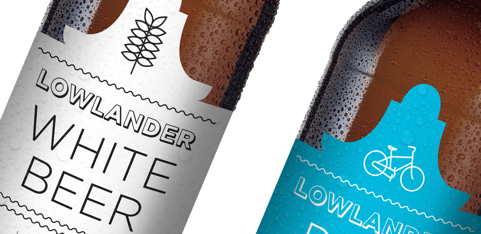
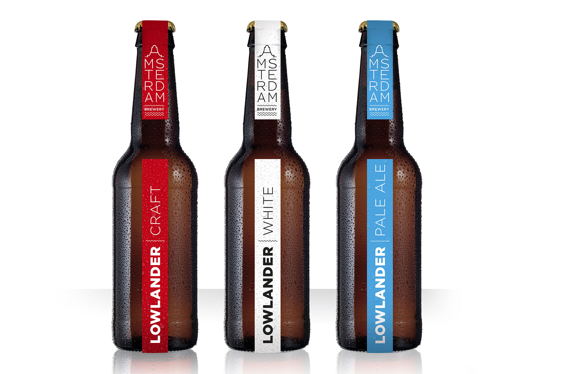
Label variation using simple illustrated icons to create a clean and contemporary looking beer, moving away from some of the cliches of craft beer to create stand out at bar:
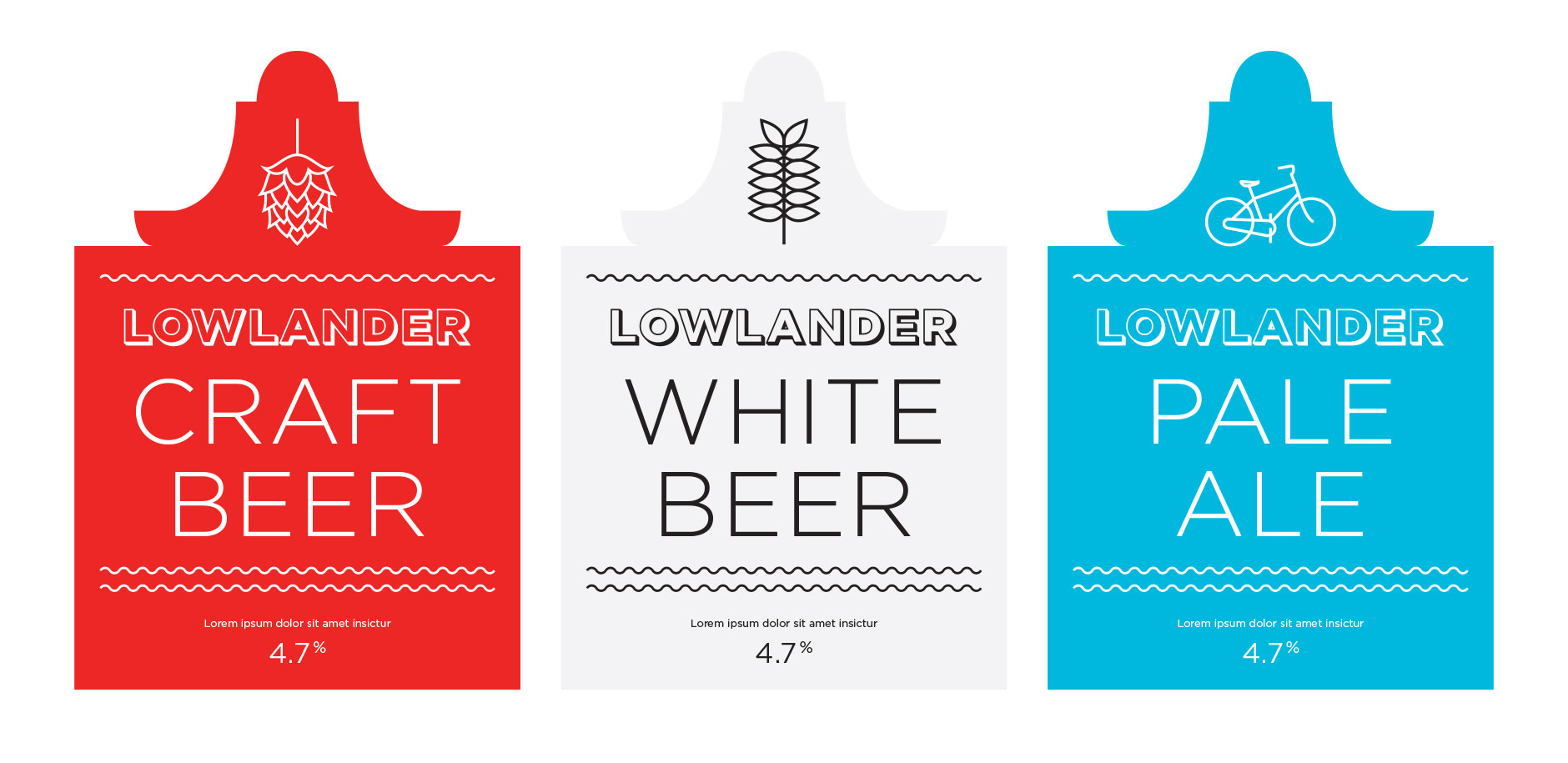
Packaging concept one:
The brewery logo influenced by Amsterdam’s iconic architecture:
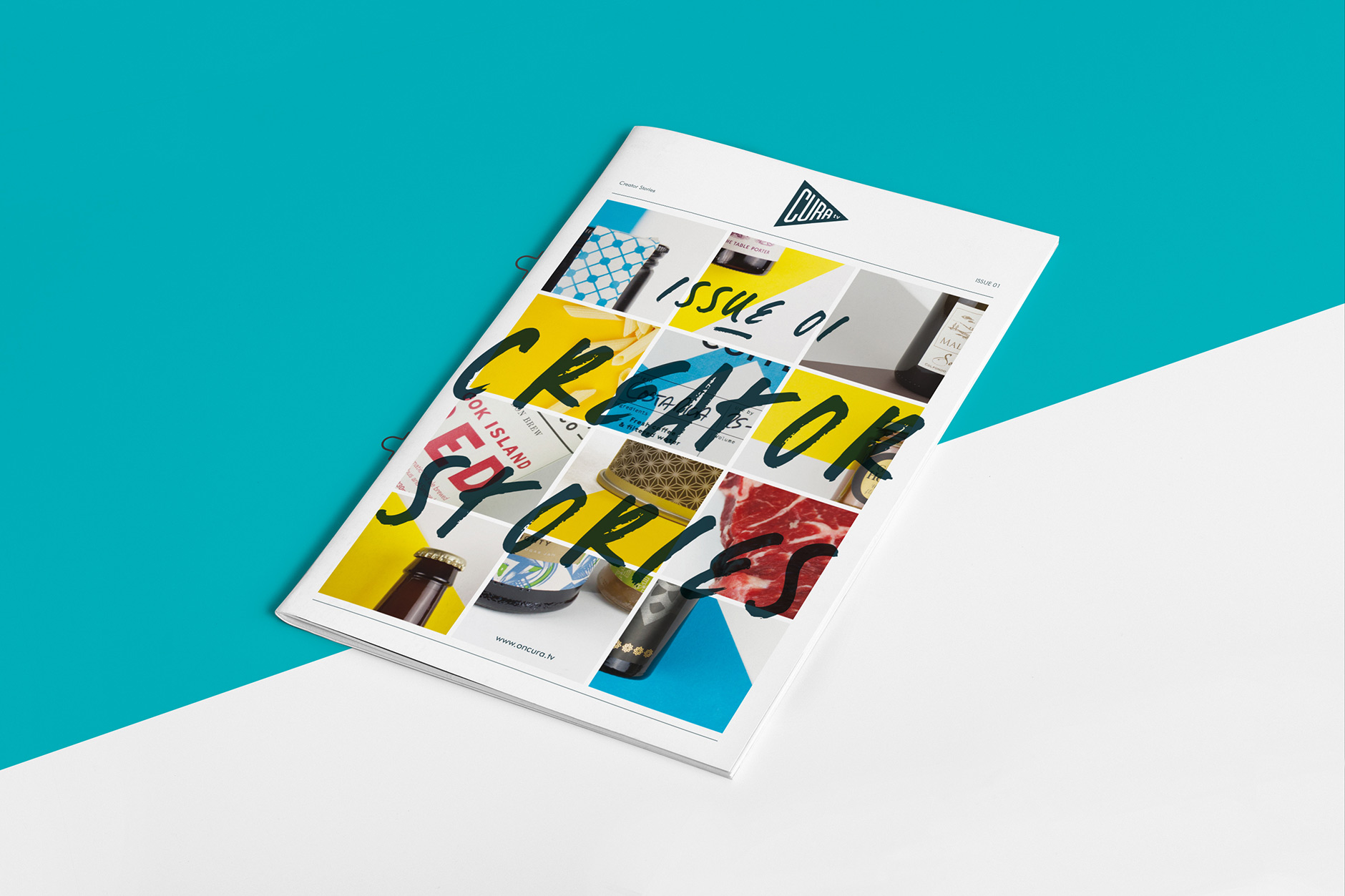
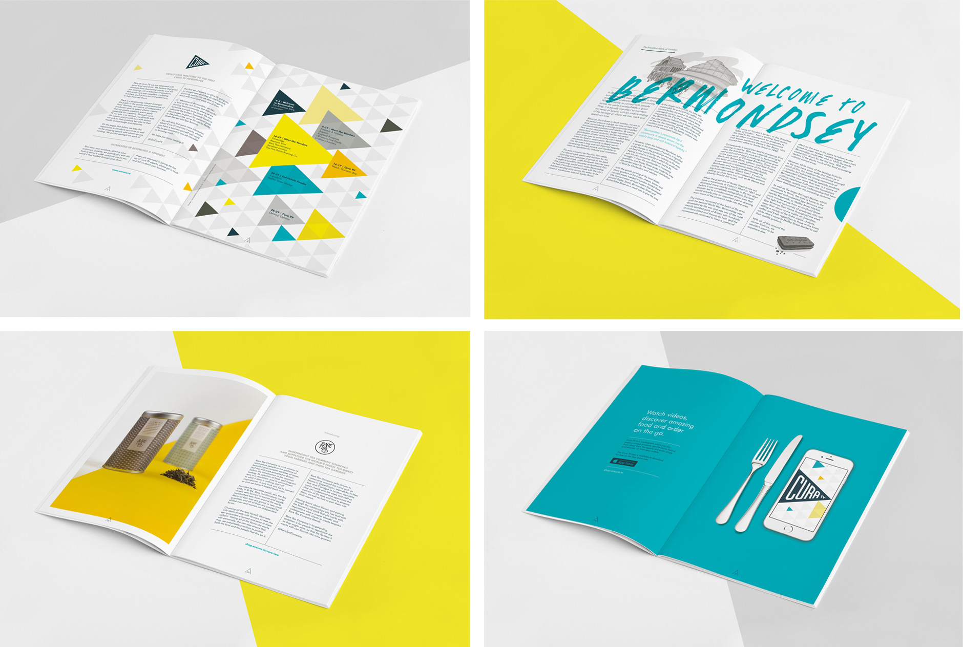
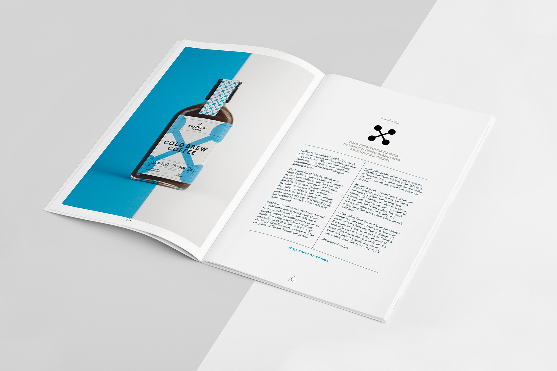
We’ve recently created this mini newspaper for Cura TV. Issue 1 focusses on the vendors whose products we shot and retouched in-house. The photography style follows on from our development of the brand, bold colours and a sharp grid. This coupled with simple clean typography lets the products stay as the focal point and link back to the strategy behind Cura.
The final Cura newspaper is between A5 and A4, printed on a light uncoated paper with loop stitching to hold it together. Copies will start popping up in London coffee shops in the coming weeks.
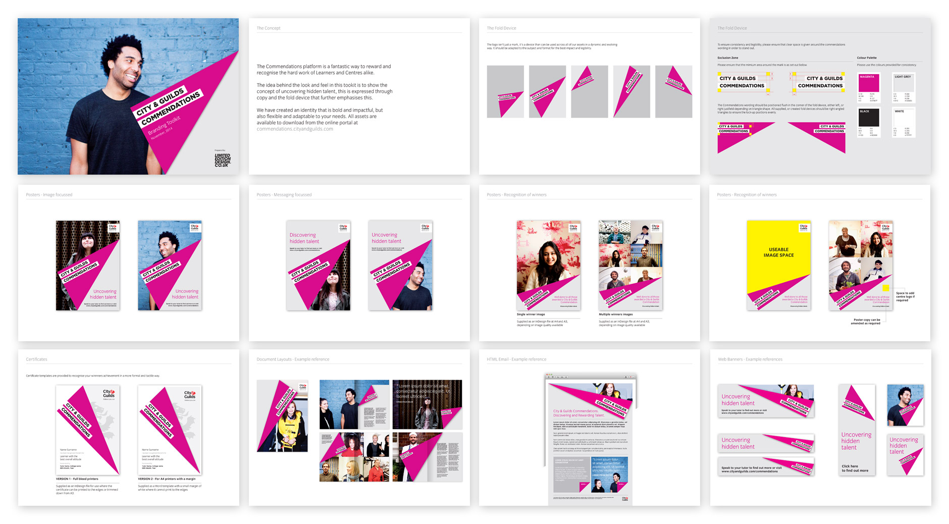
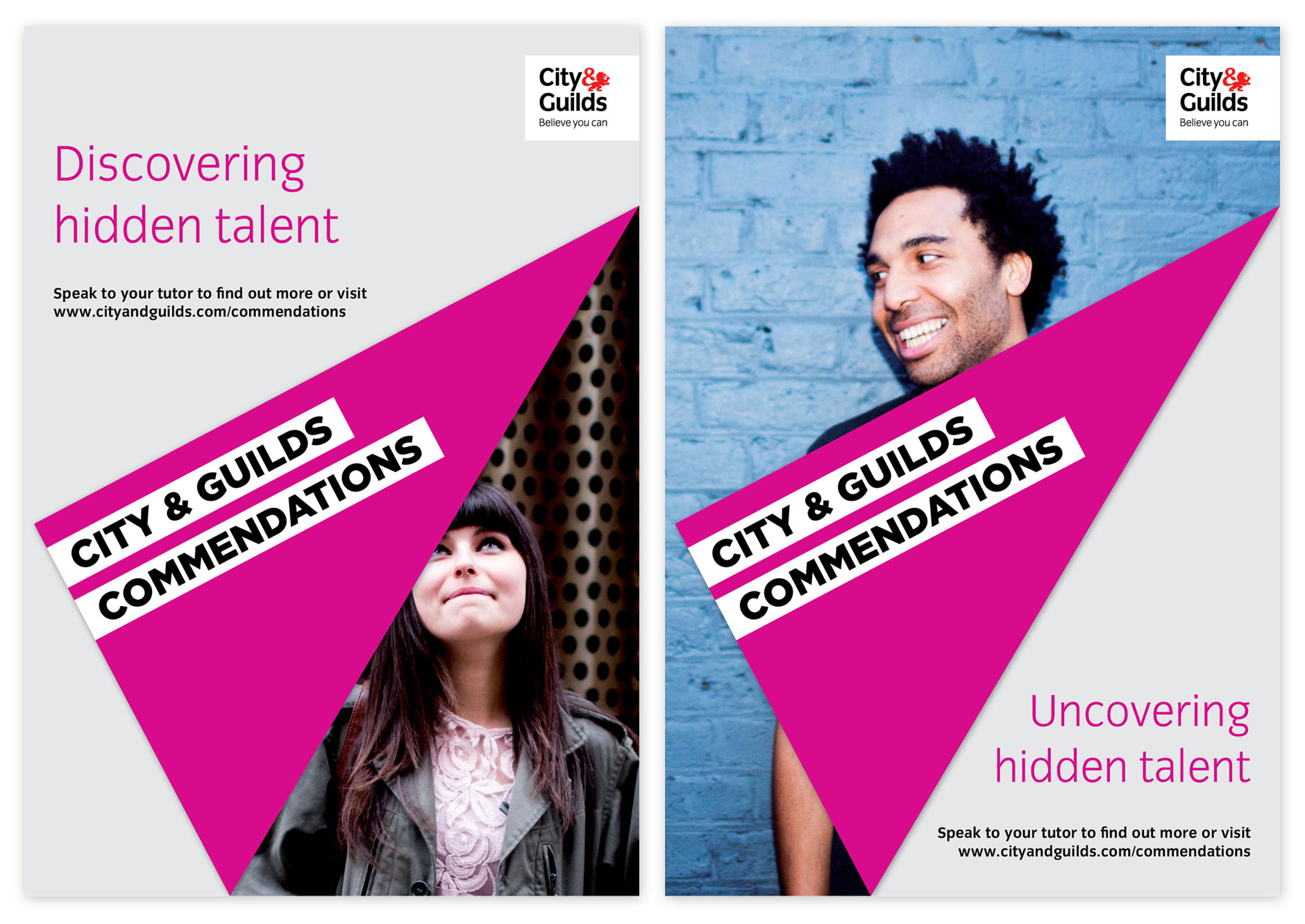
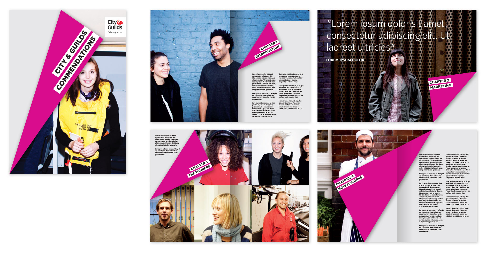
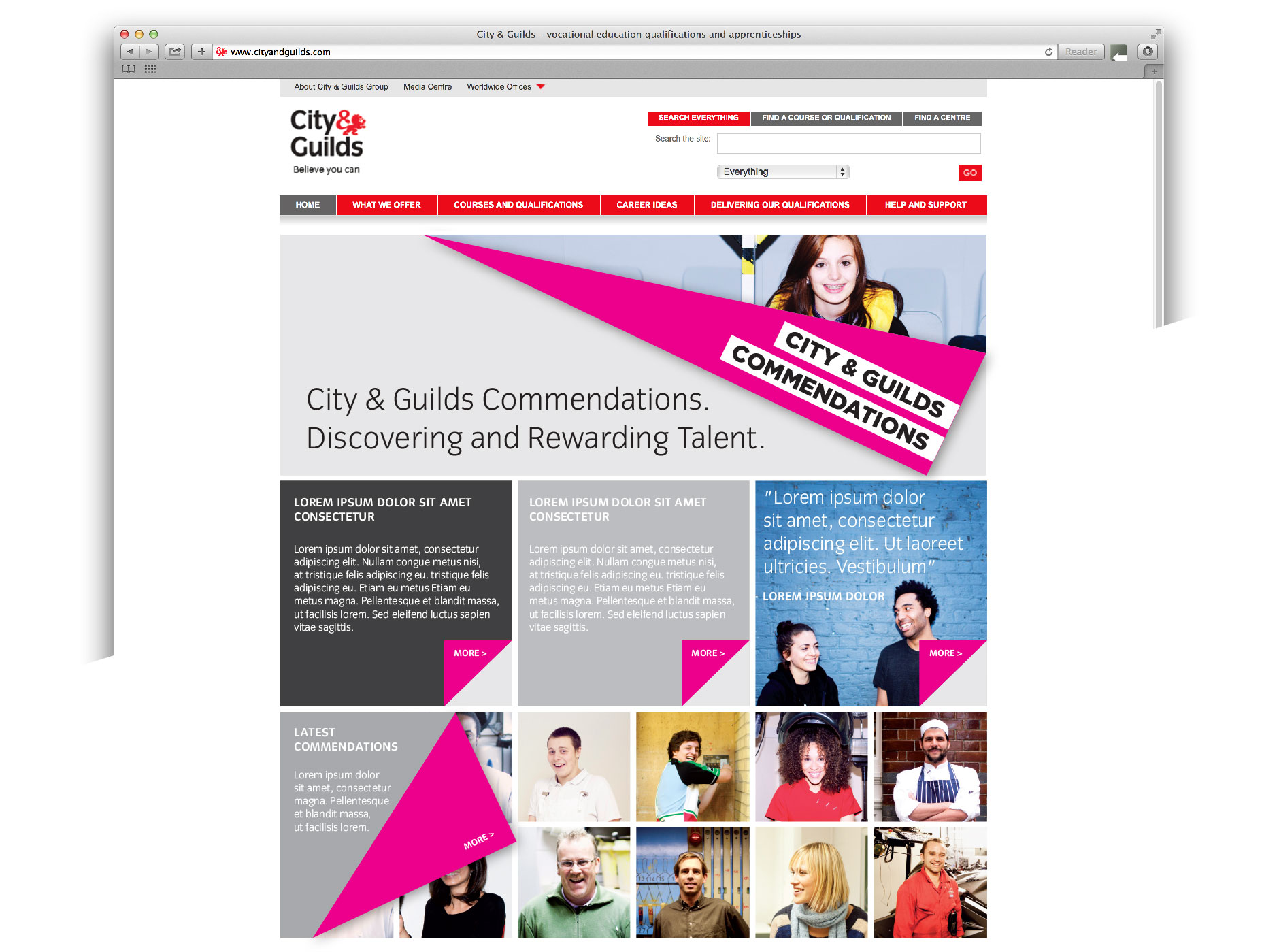
The City & Guilds Commendations platform has been created to reward and recognise the hard work of Learners and Centres alike. Commendations is designed to bridge the gap between Medals of Excellence and The Lion Awards, both of which we have also worked on and developed identities for.
Our idea behind the look and feel is to show the concept of uncovering hidden talent, this is expressed through copy and the fold device that further emphasises this. We have created an identity that is bold and impactful, but also flexible and adaptable to allow colleges and centres to incorporate it into their own guidelines.
Posters:
Toolkit examples showing how the identity can be used in print design: