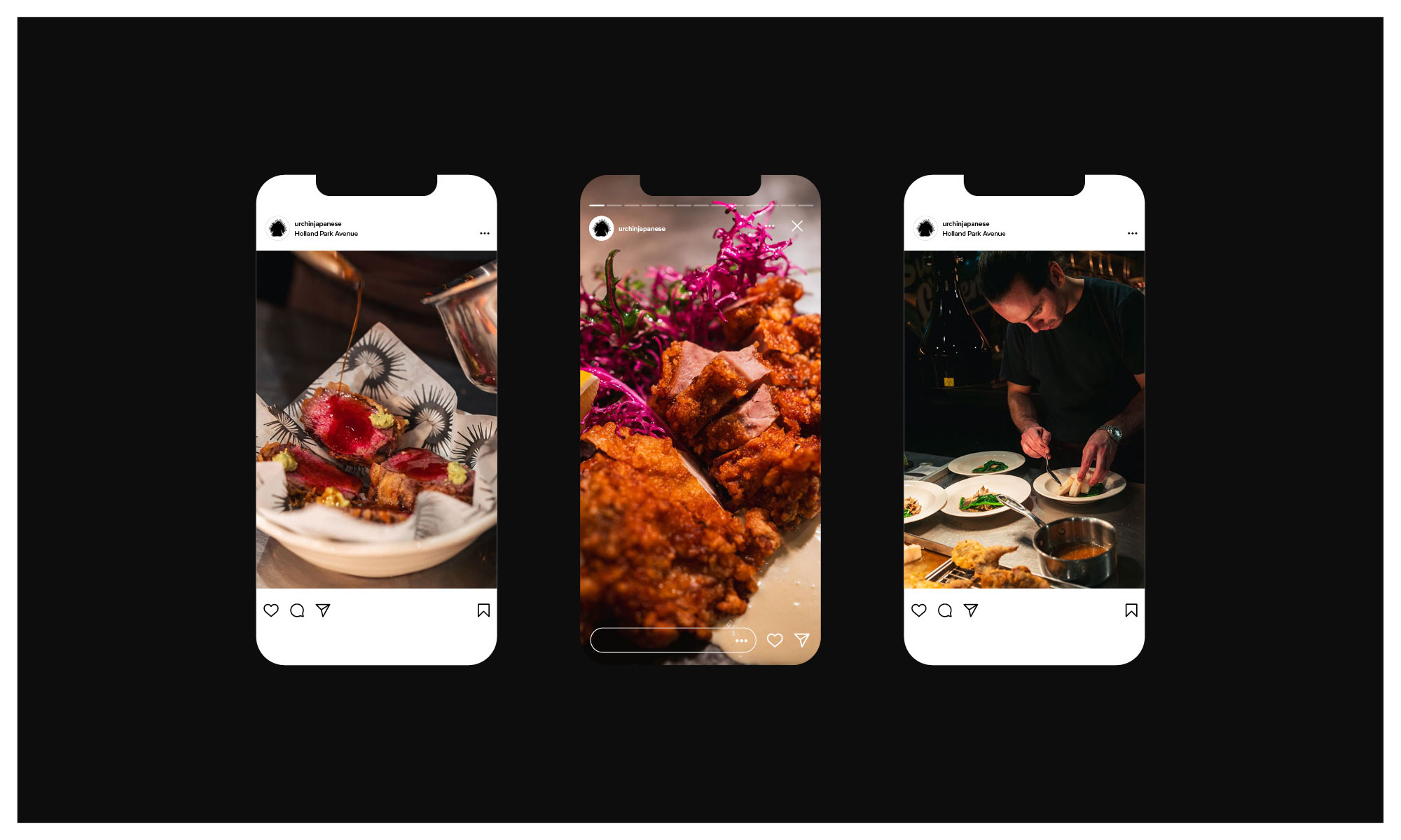
Urchin Japanese is the latest culinary hotspot from the team behind Dorian, Notting Hill Fish Shop, Tuna Fight Club and debuts in their Supermarket of Dreams location in Holland Park. With an upgraded open restaurant kitchen, multi-level wood grill and rotisserie, the killer team have hit the ground running.
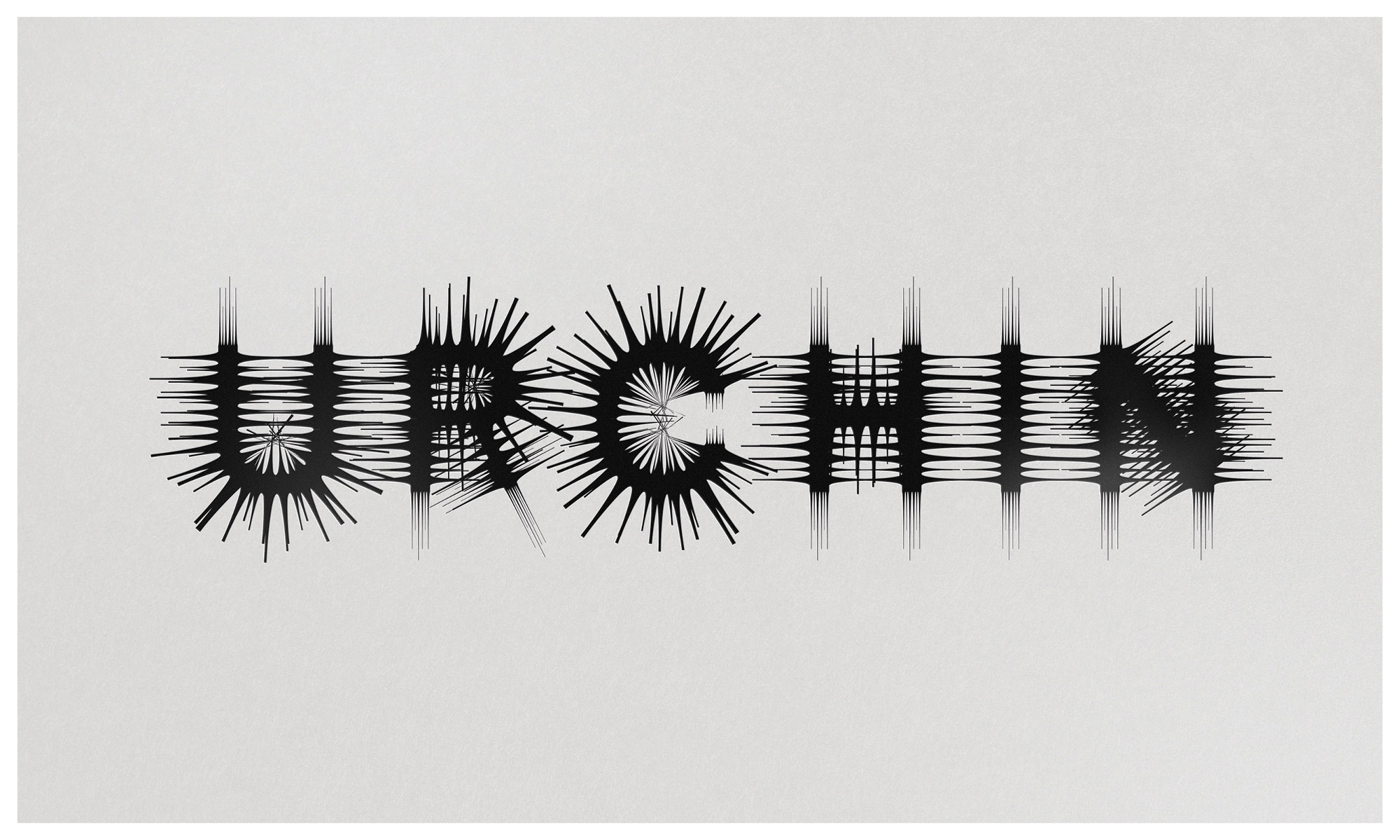
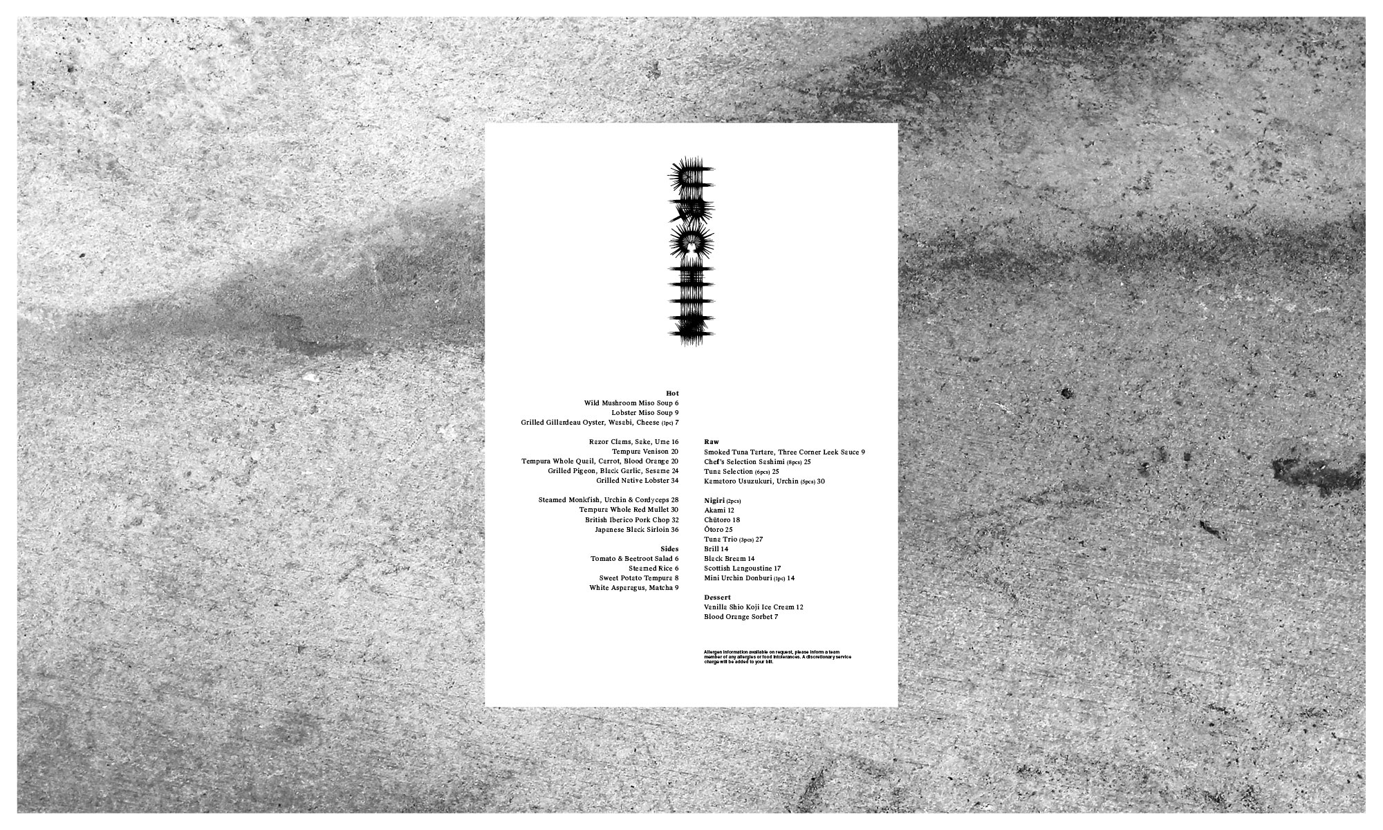
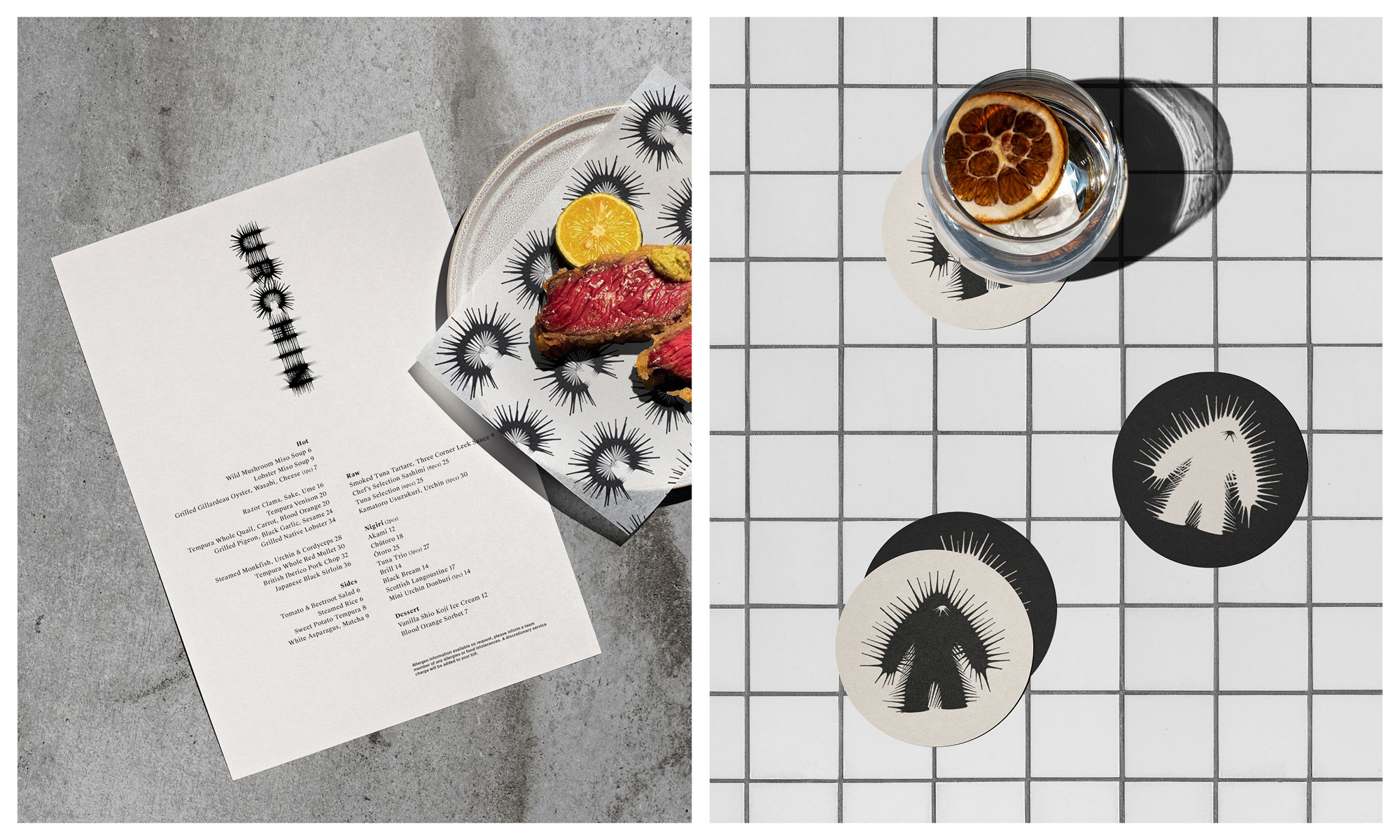
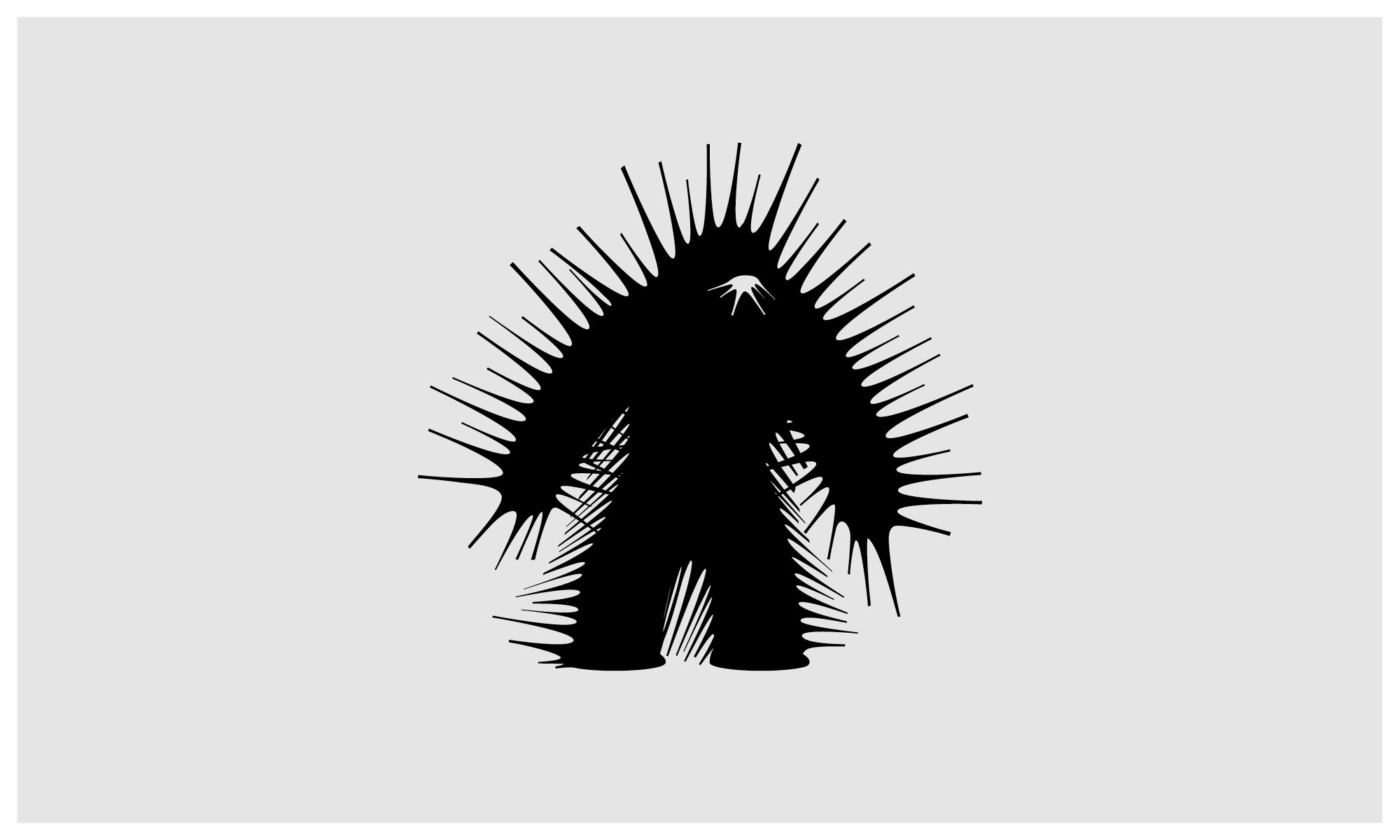
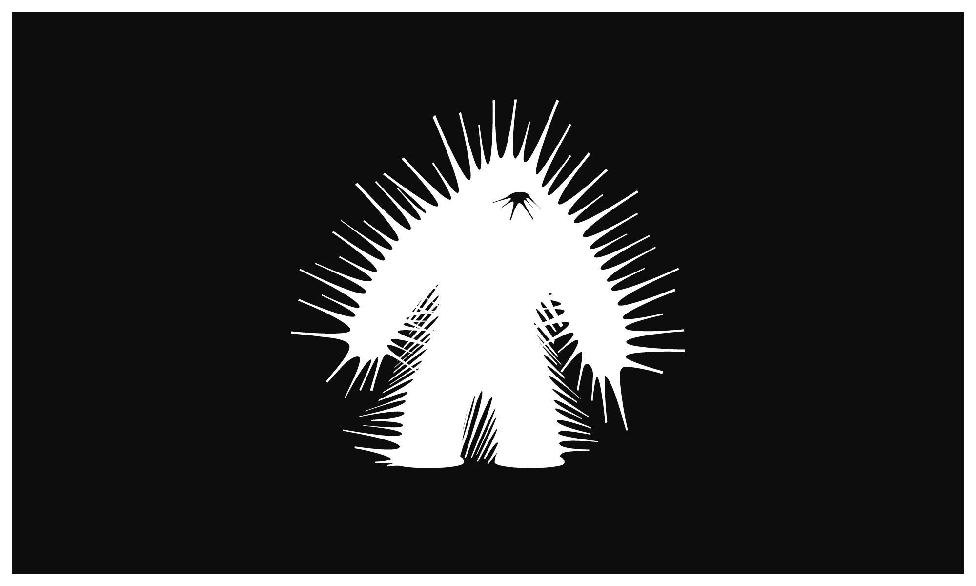
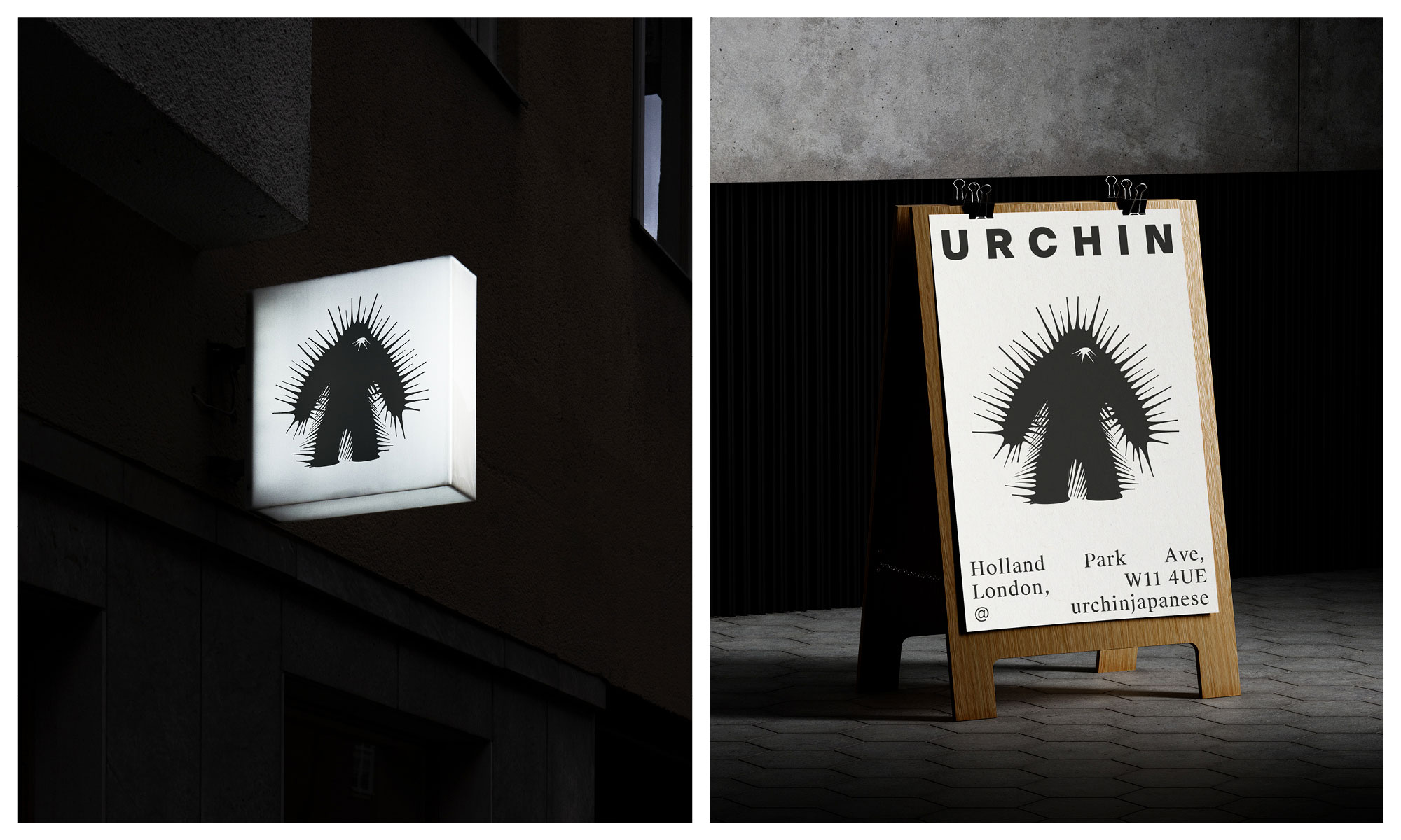
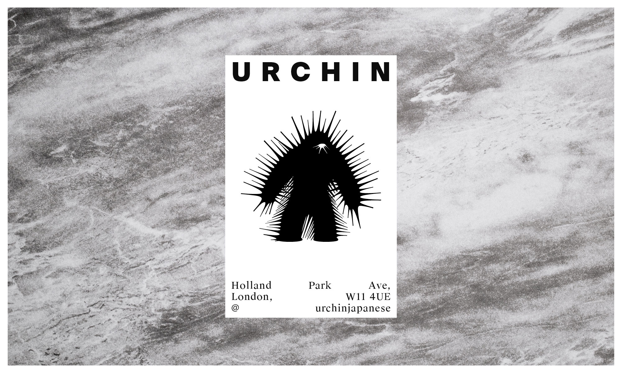
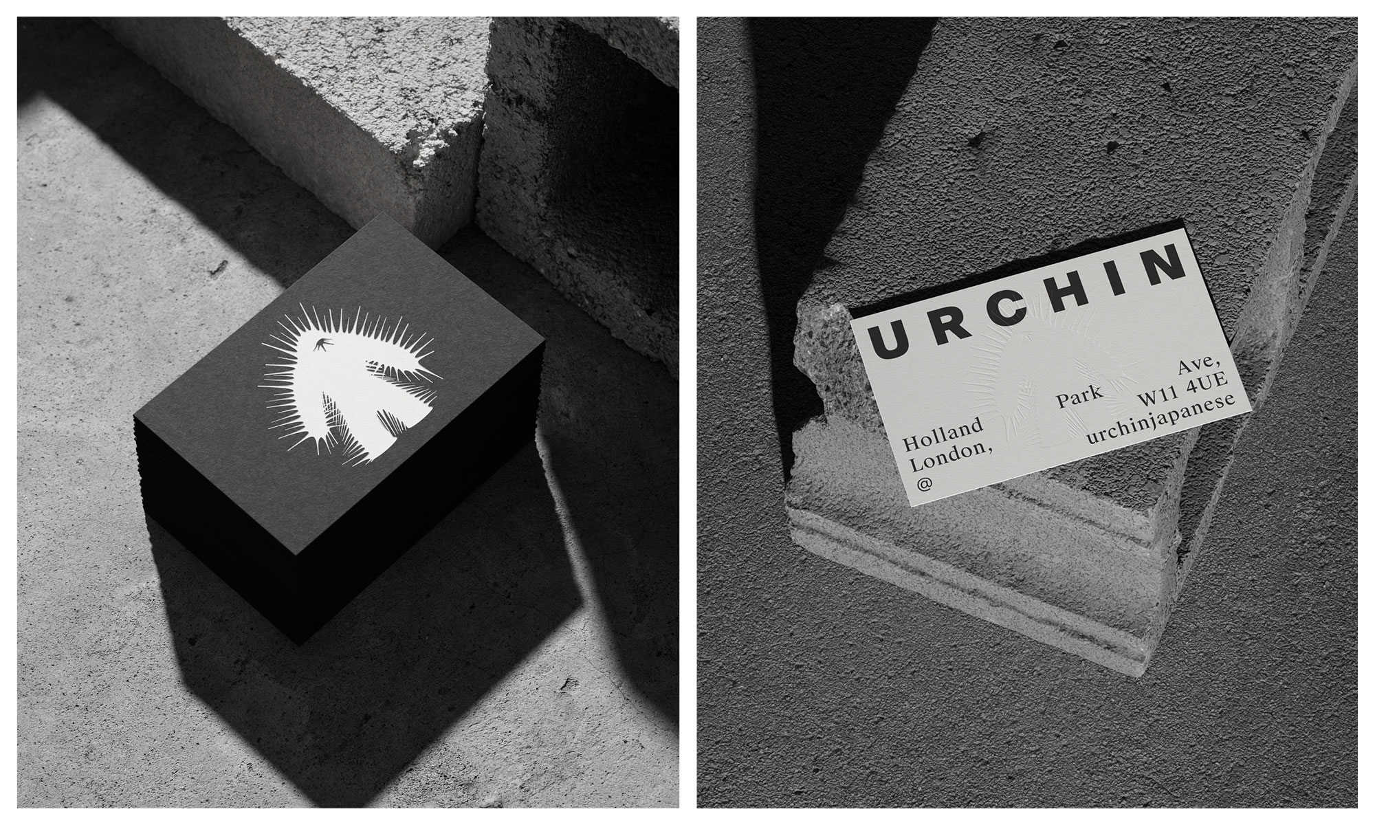
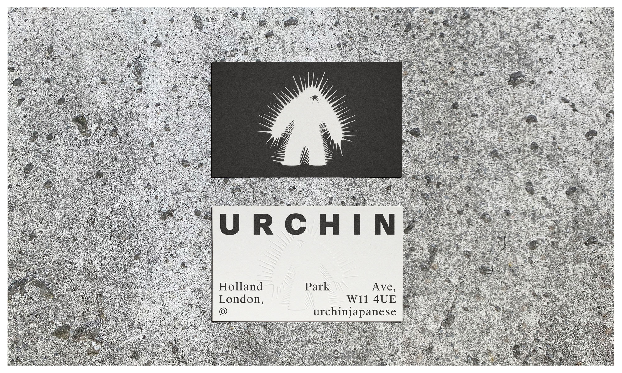
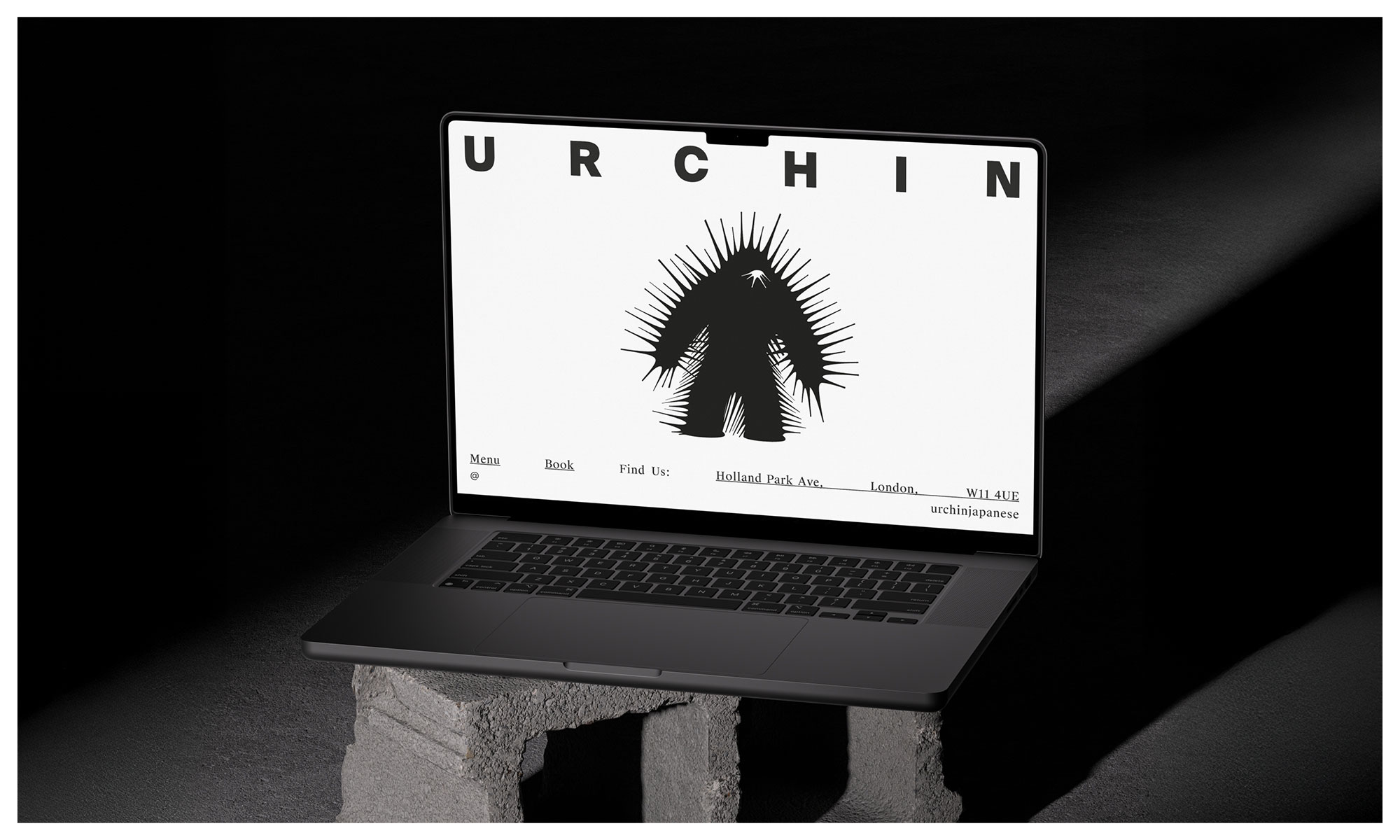
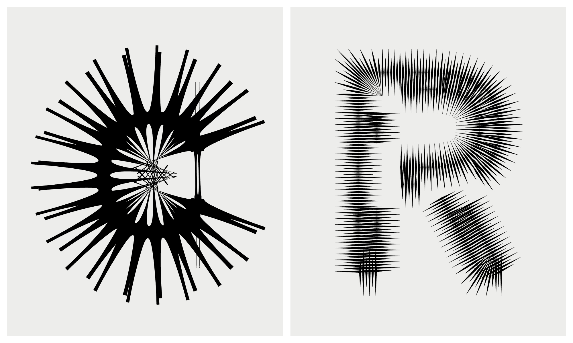
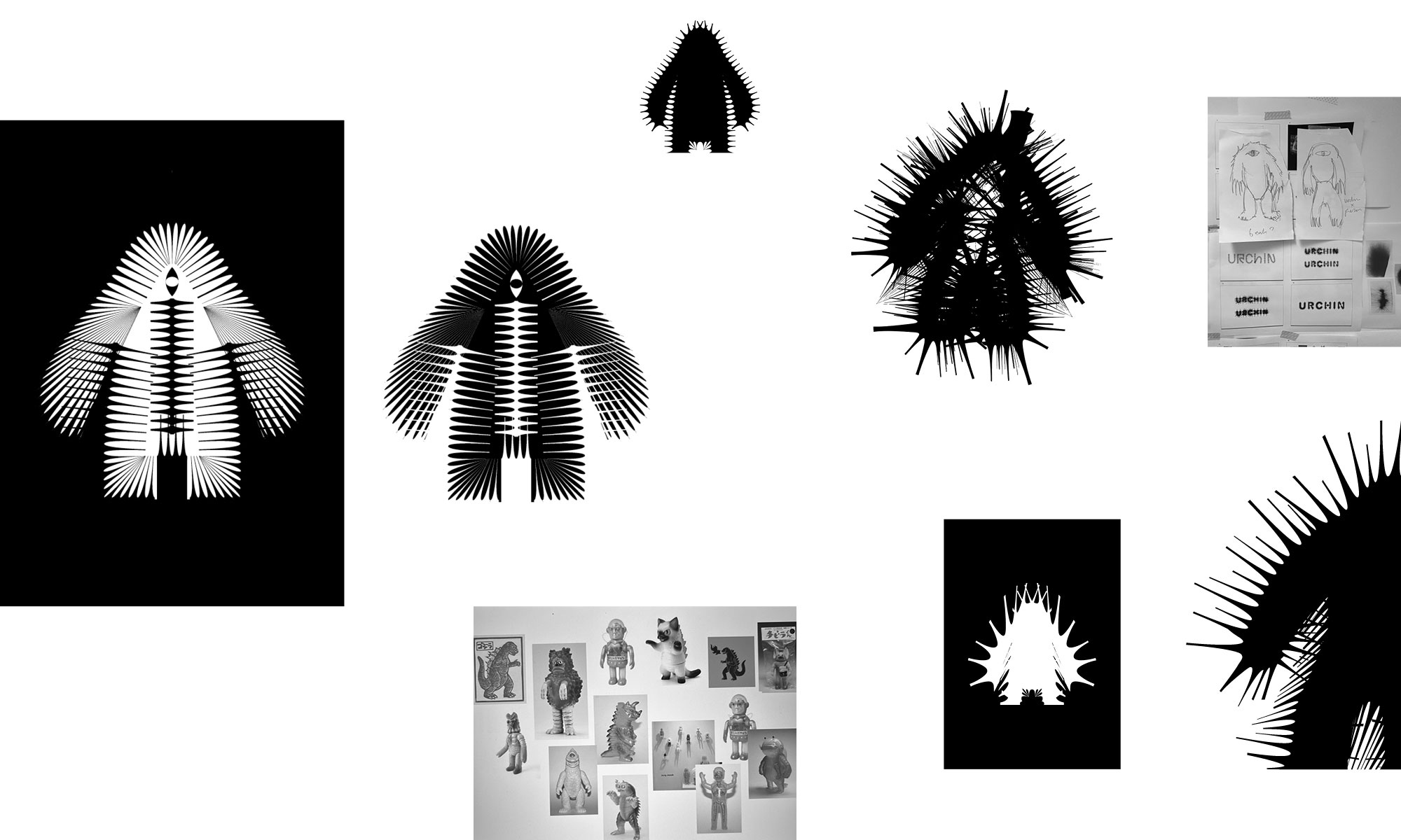
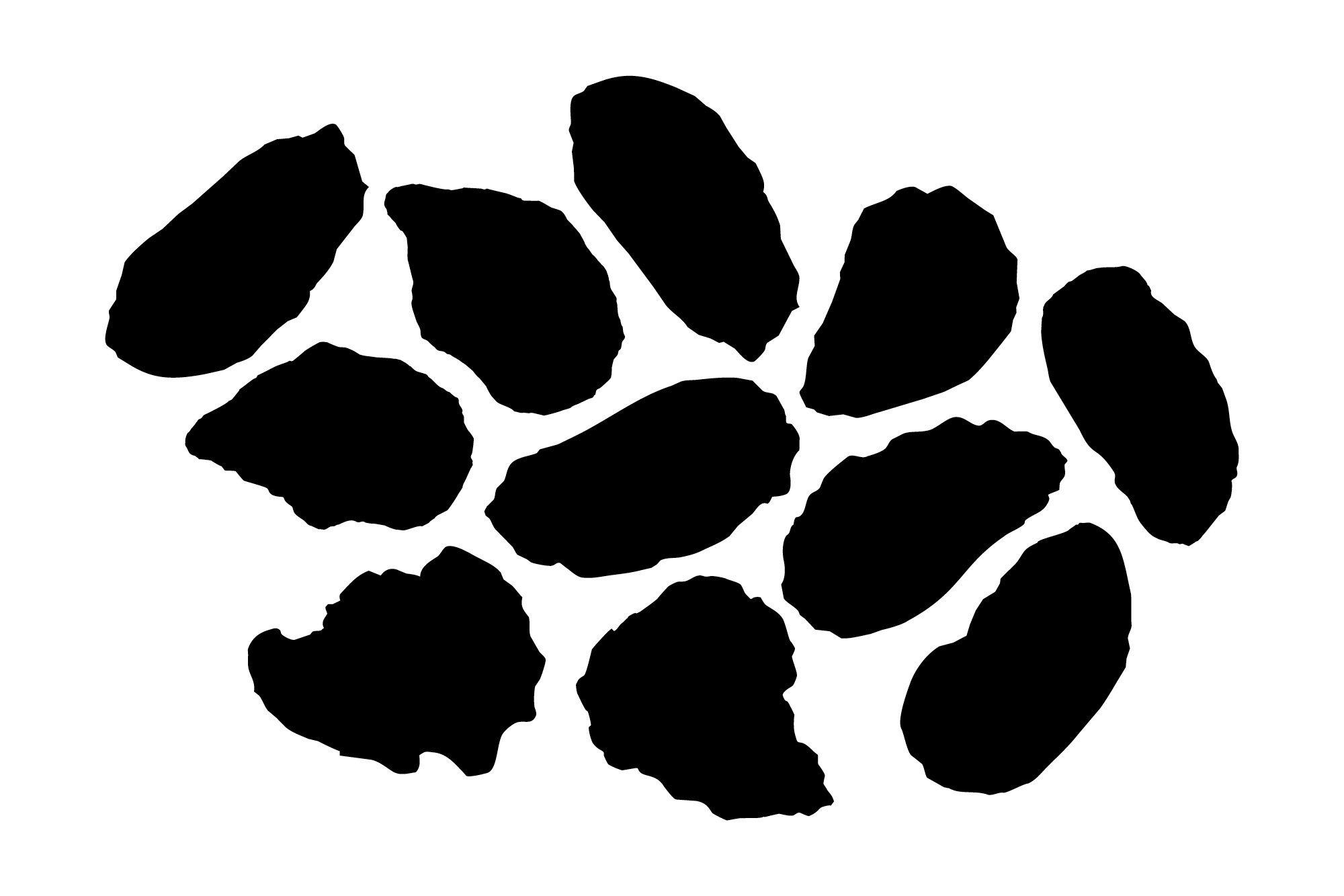
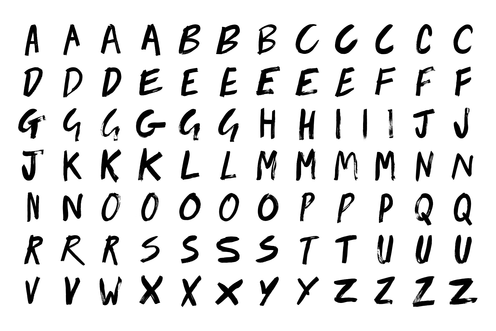
The identity pairs a unique Kaiju-inspired character with experimental typography for the wordmark that echoes the spiky nature of urchins. The monster is a quiet nod to the slang term, embracing a Mischievous and dark persona, a foreboding creature emphasised with the barbed and schizophrenic exterior.
It’s a deliberate shift from the sterile and conservative cues that underly the category. There is still a sense of elegance and sophistication, but with such a dynamic and passionate team, this was never about fitting in.
Head chef Yuji Shimokawa has quickly made this new venture a runaway hit, alongside the infamous Tuna Fight Club shenanigans. Authentic cooked Japanese produced with superior produce, meet Hot Japanese.
Expect classic dishes alongside the likes of; Orkney Scallop tempura layered with black truffle dusted with maituke powder garnished with tempura flakes, shaved ceps, ginger sauce and house Dirty Tendashi. Fresh Sea Urchin Donburi with fresh wasabi and Minina leaf.
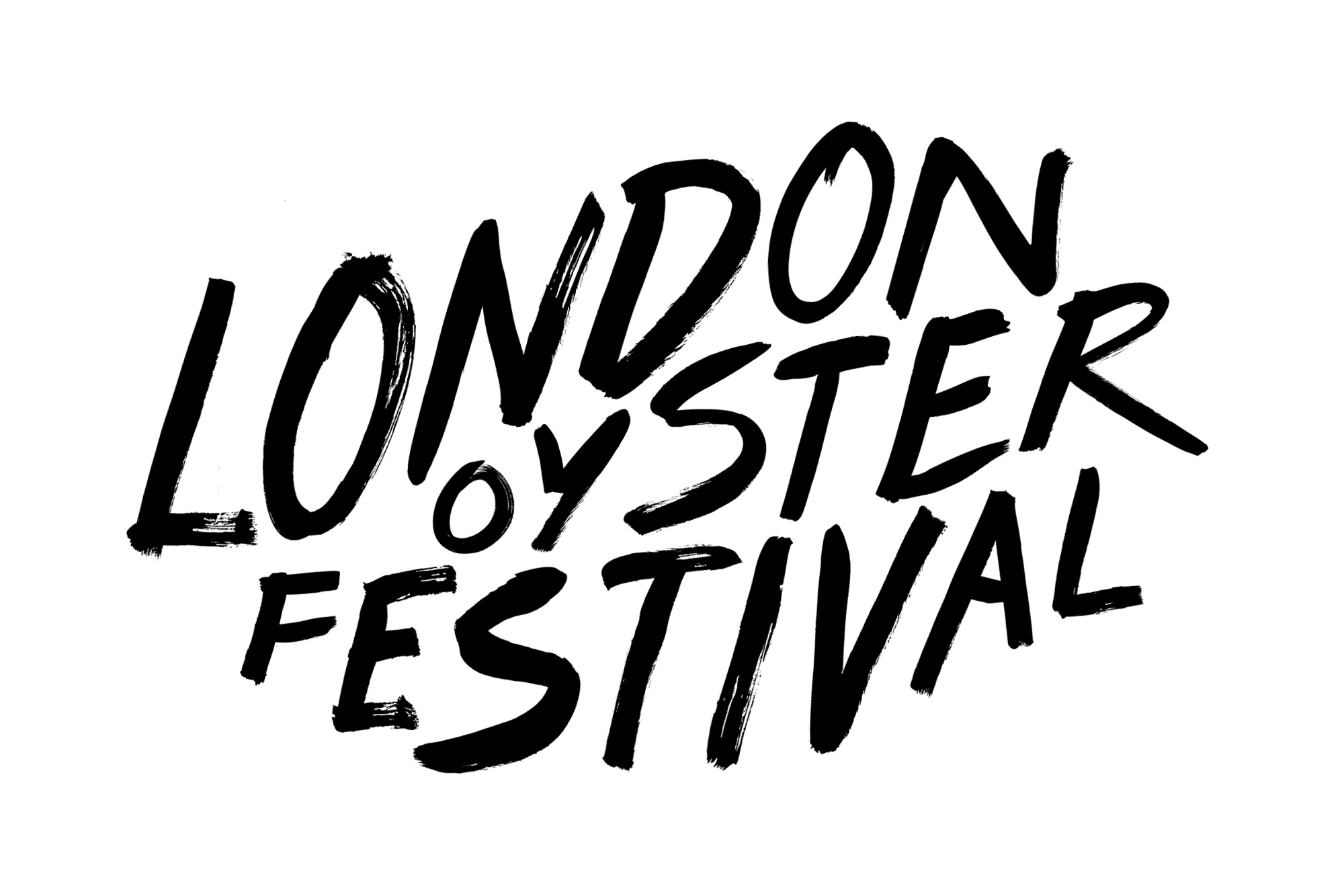
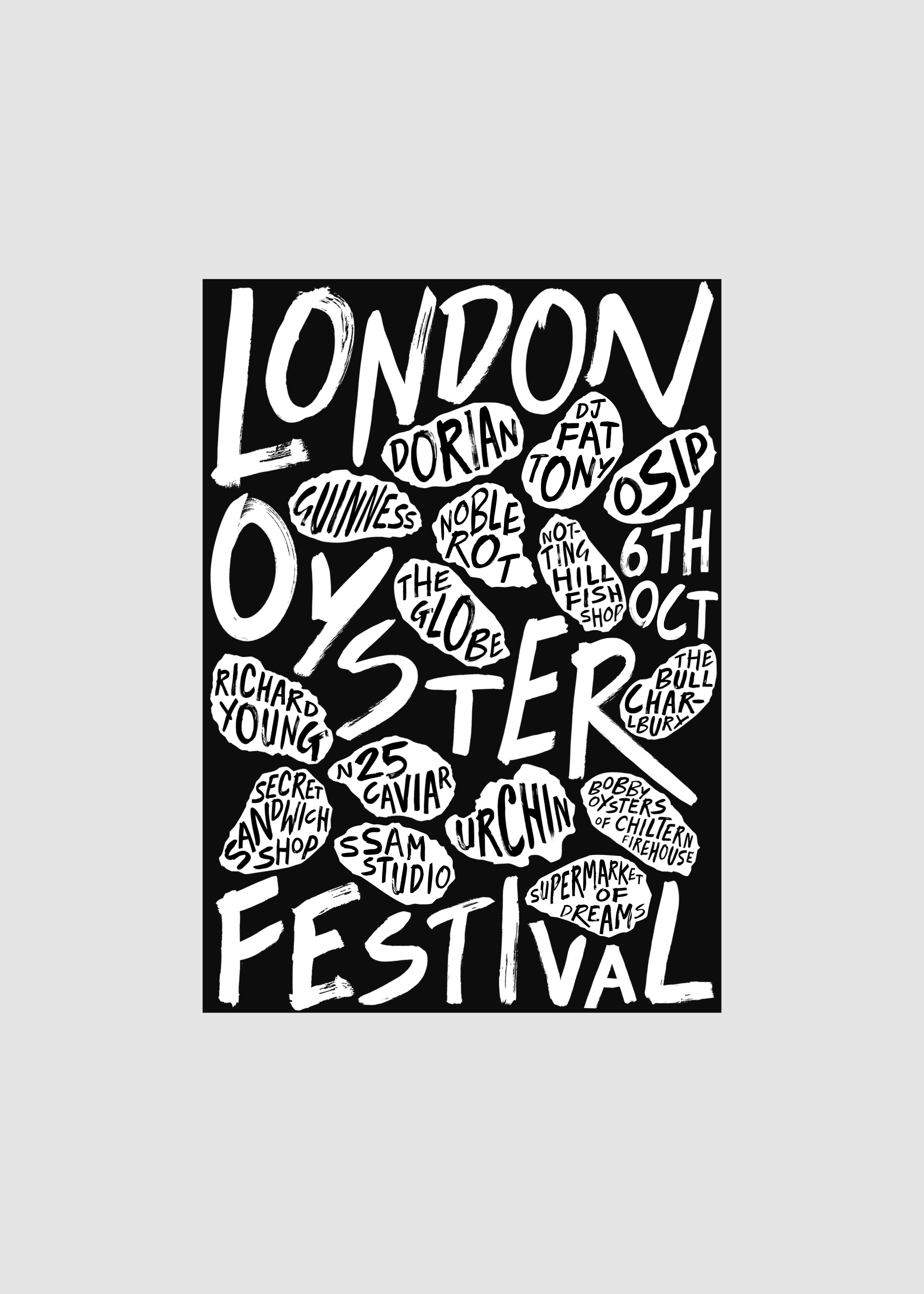
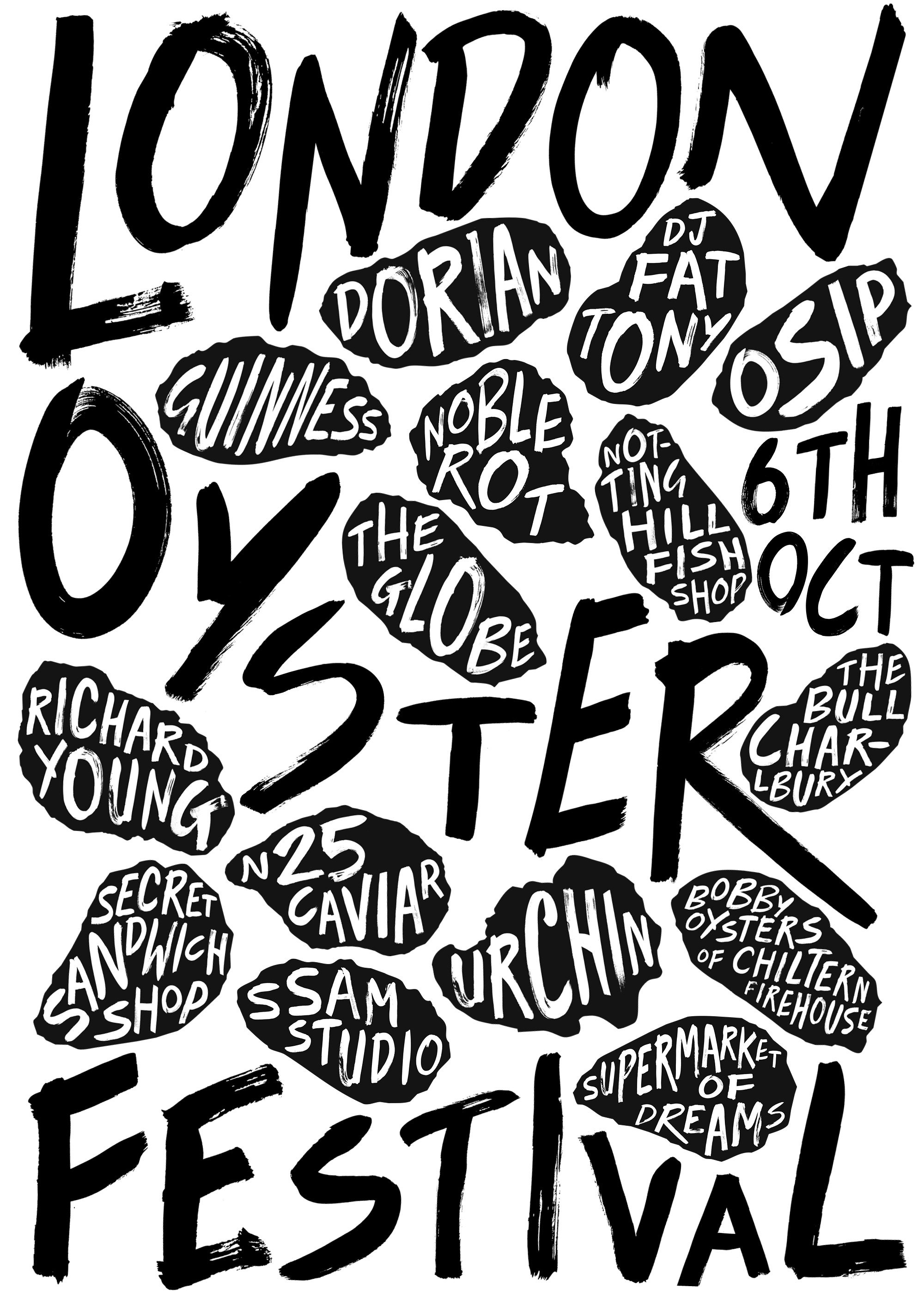
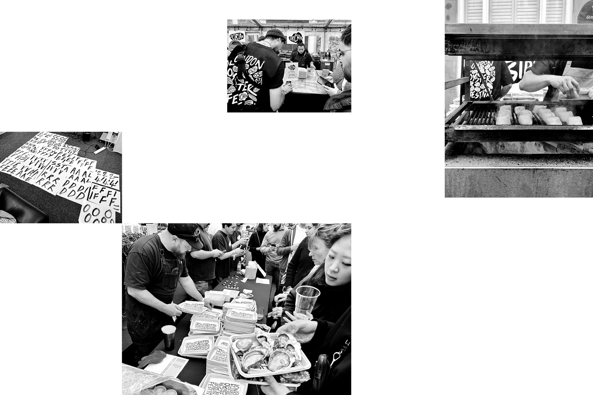
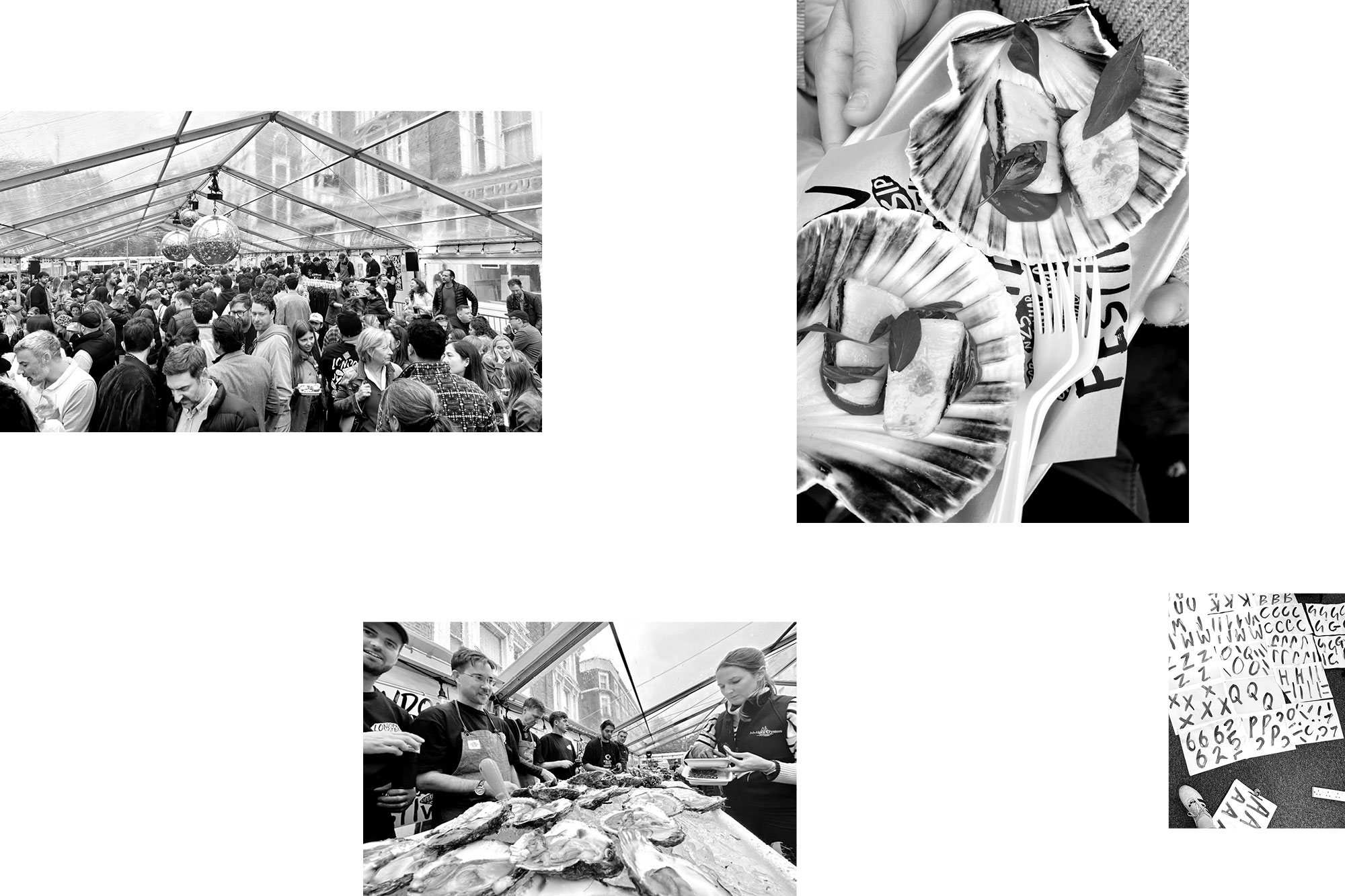
Notting Hill, closed roads, DJs, a giant mirror ball, arguable some of London and the UK’s best chefs, Guinness, fine wines, and a shed load of oysters. The London Oyster Festival is back, from the infamous team at Notting Hill Fish & Meat.
We crafted a bold brand identity with hand-painted typography that let the line-up sell itself. A strong black and white palette, and simple paper cutouts for contrast.
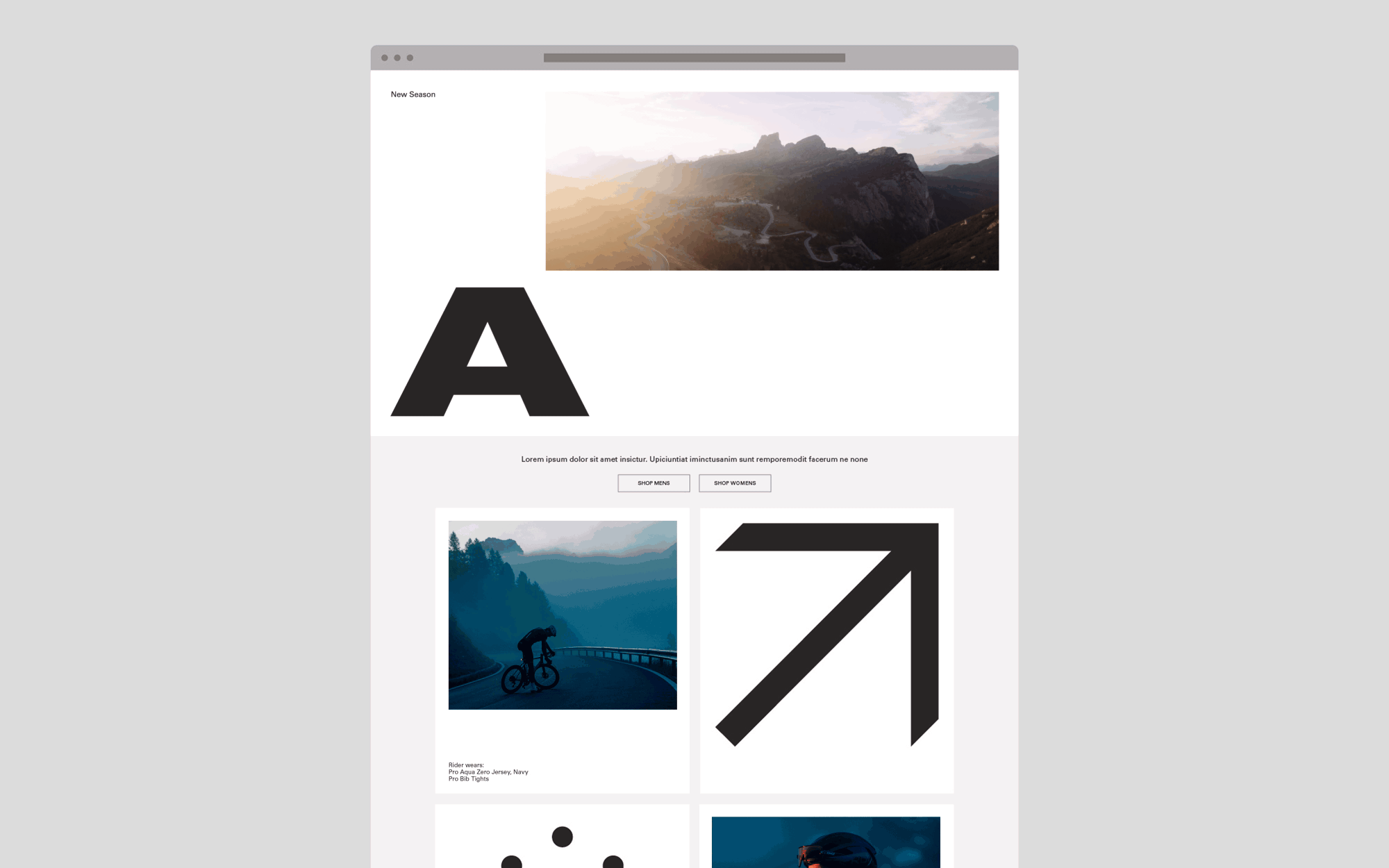
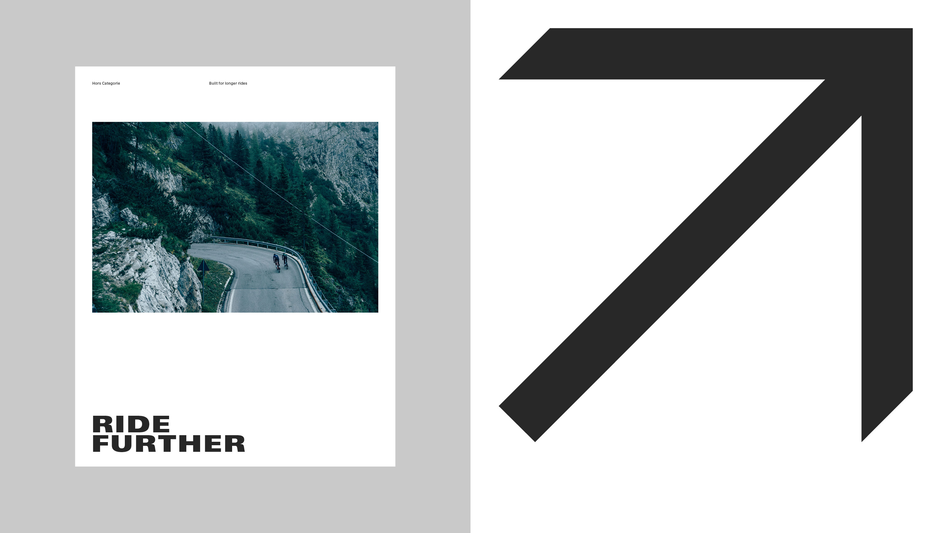
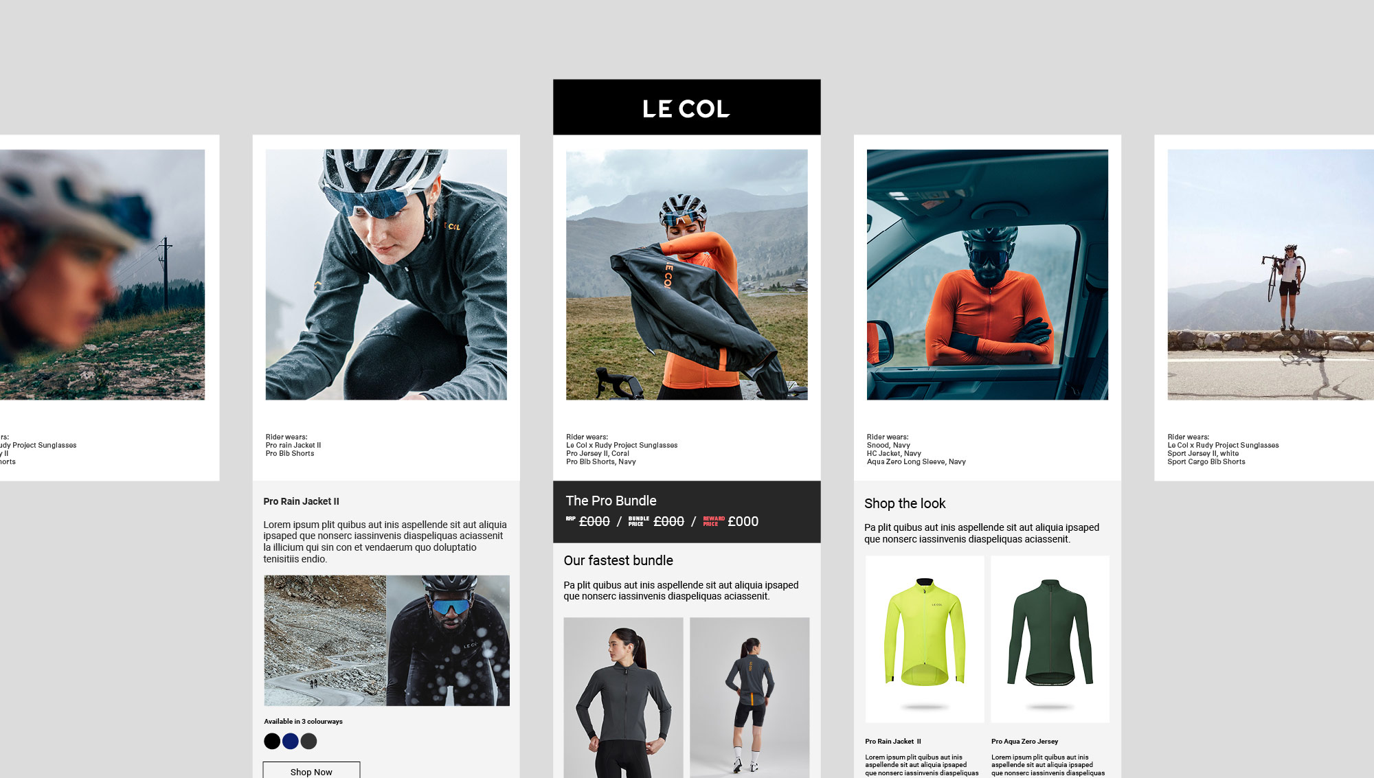
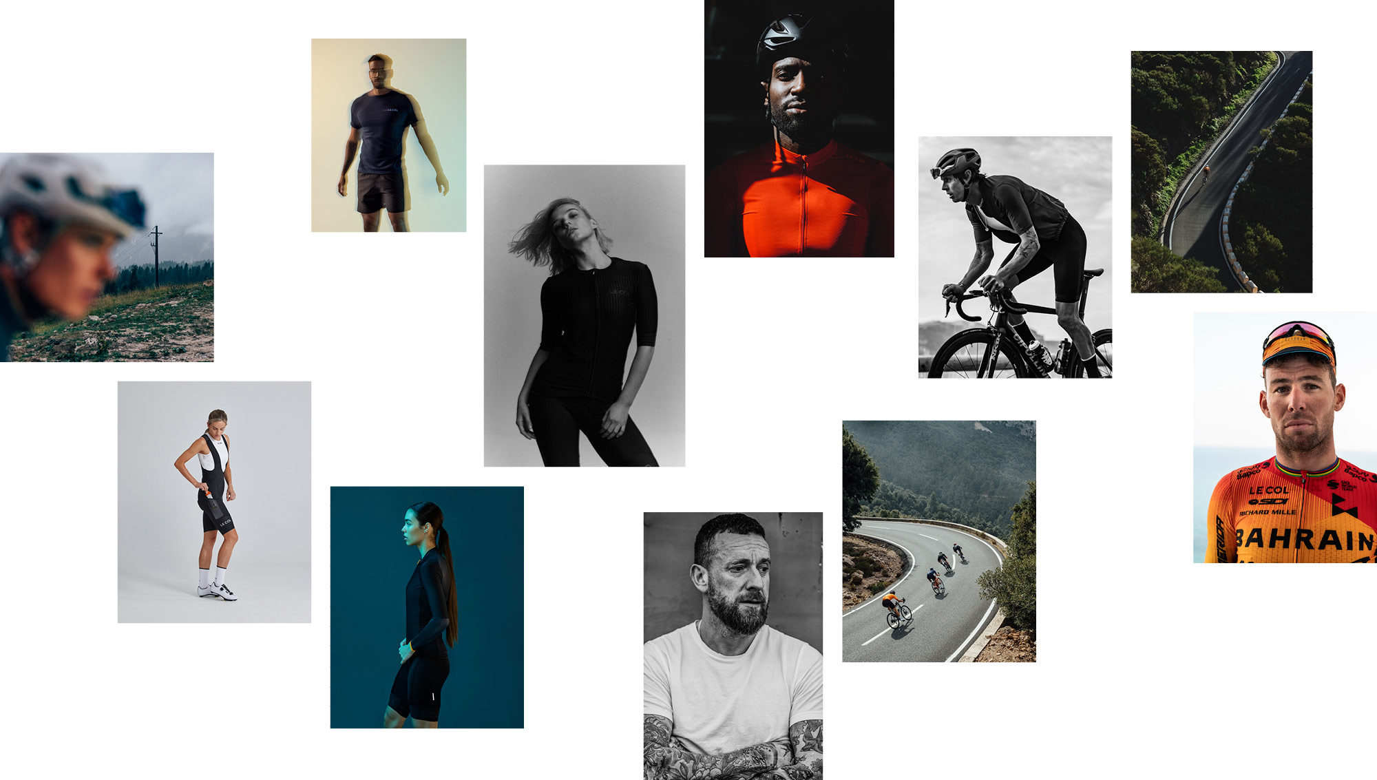
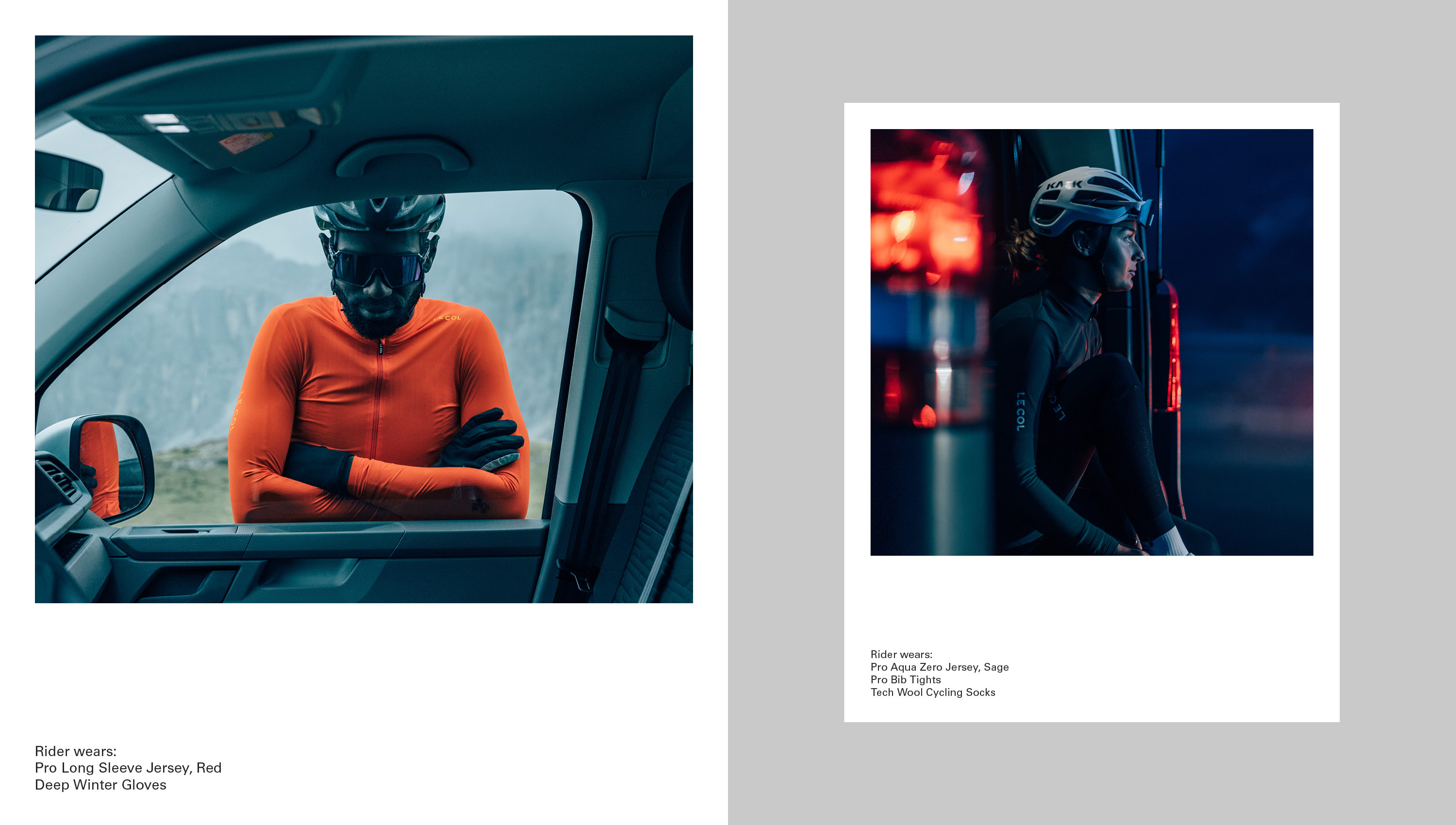
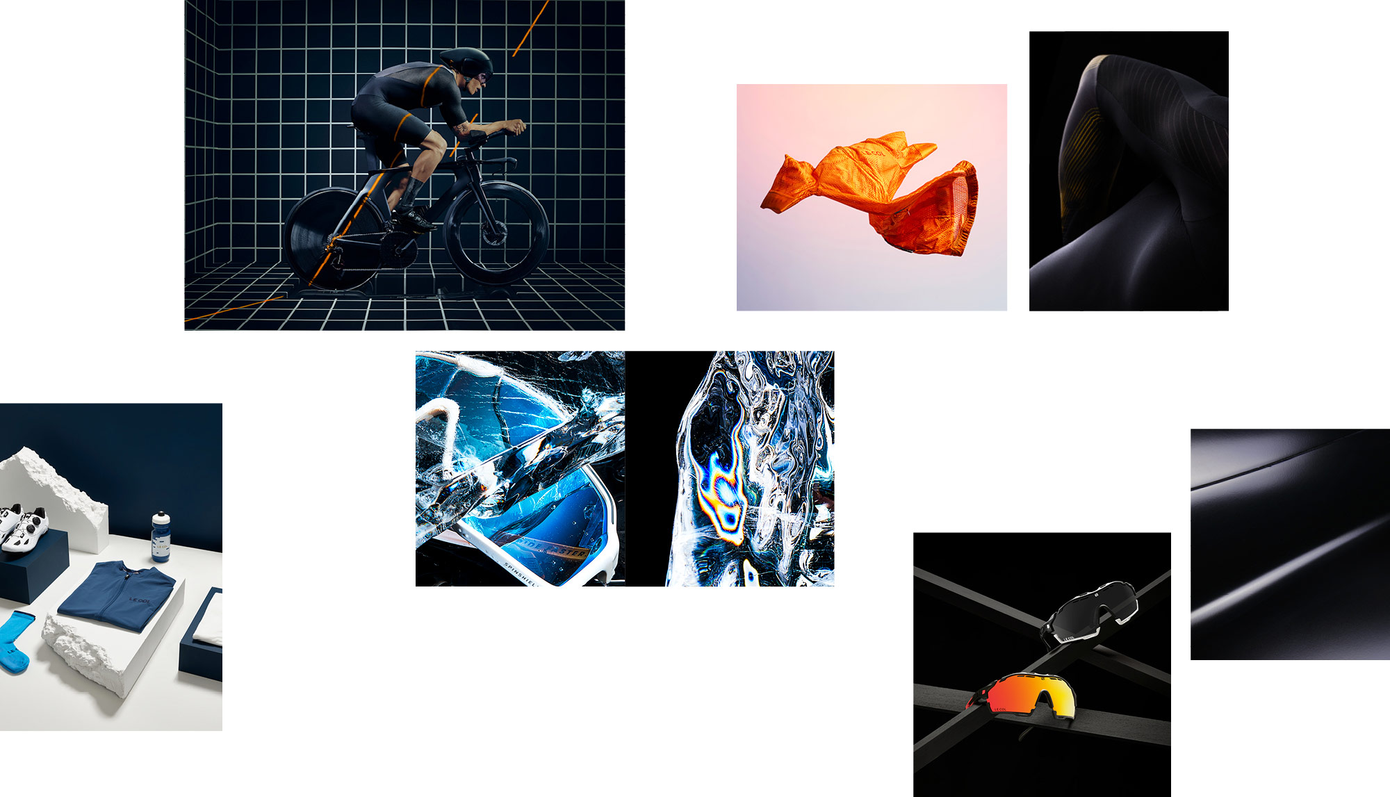
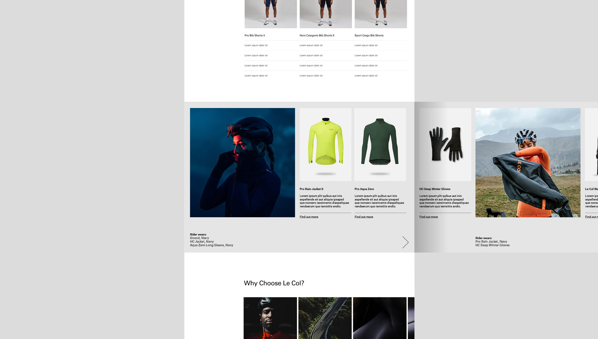
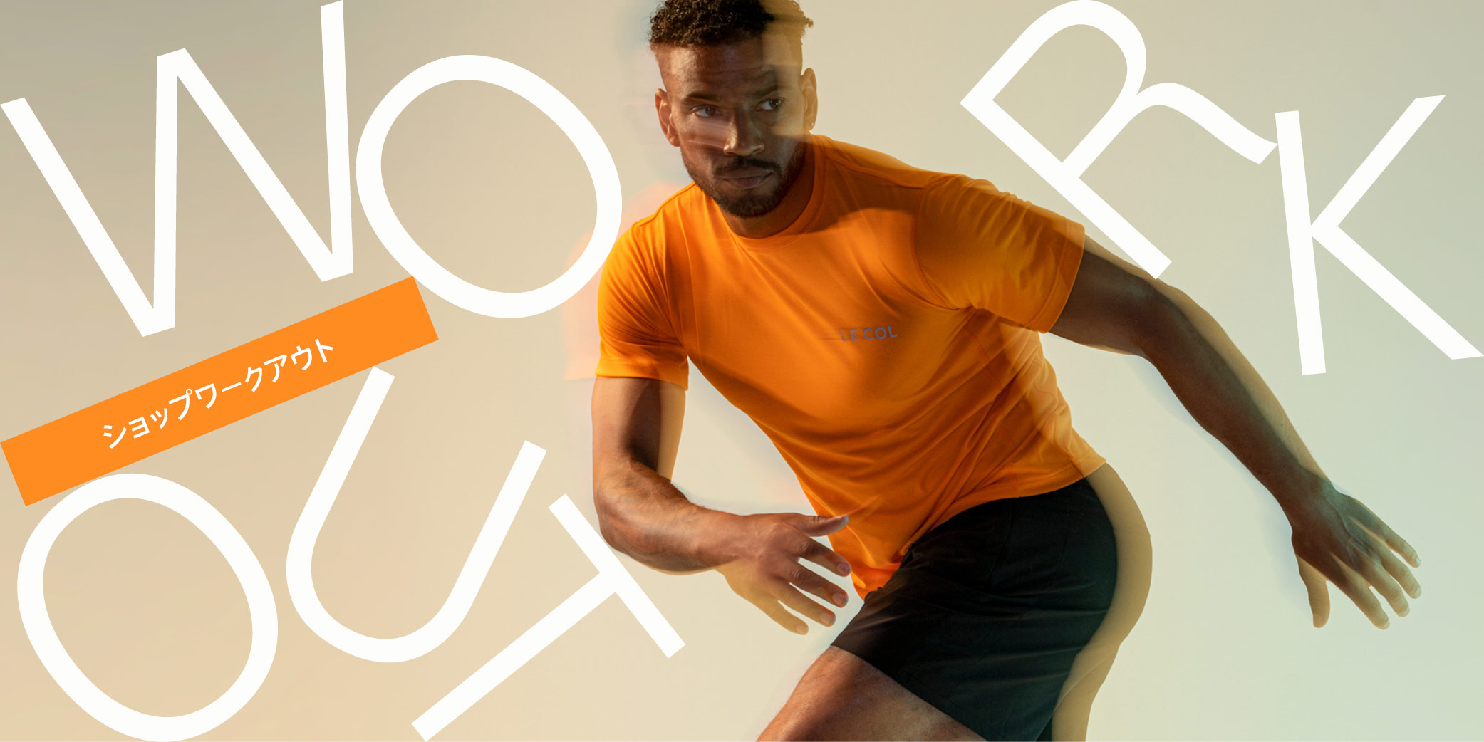
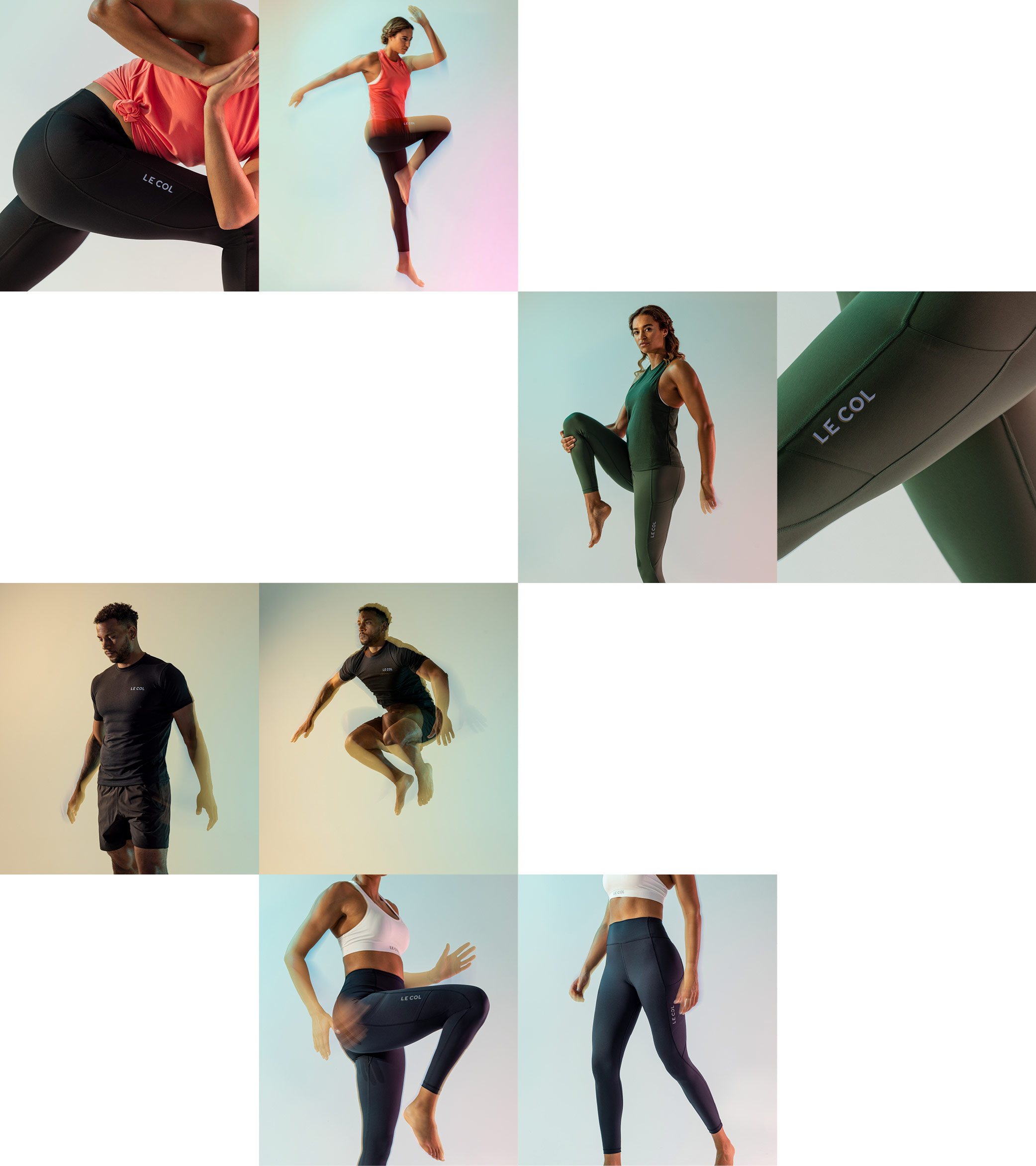
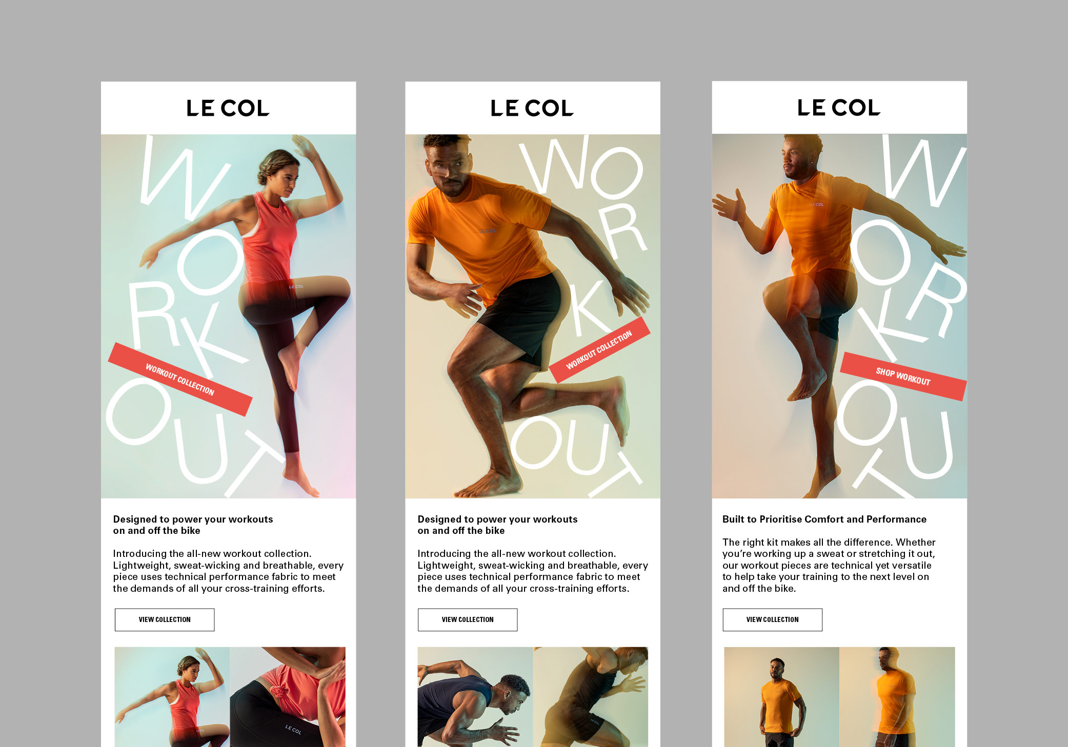
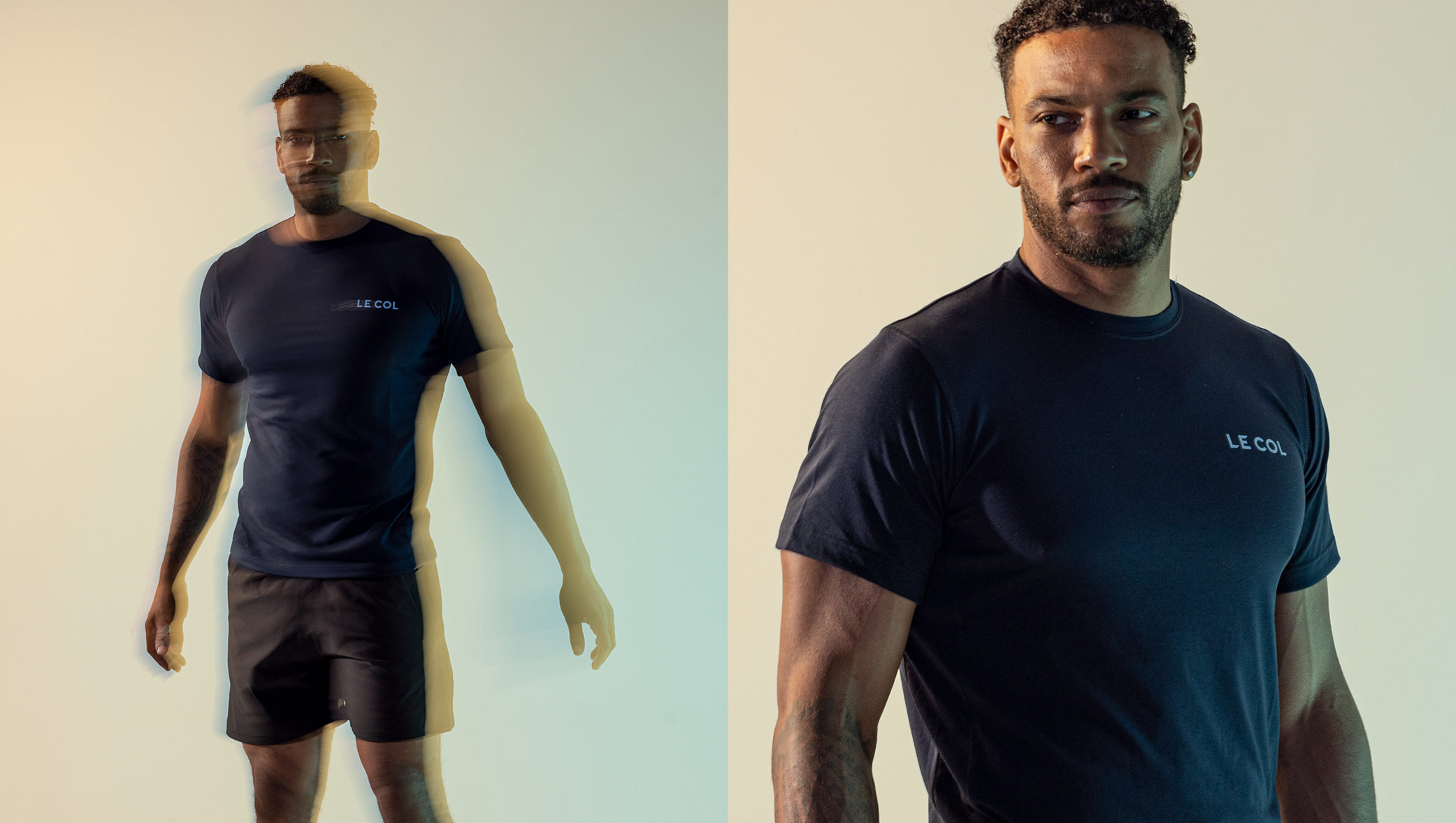
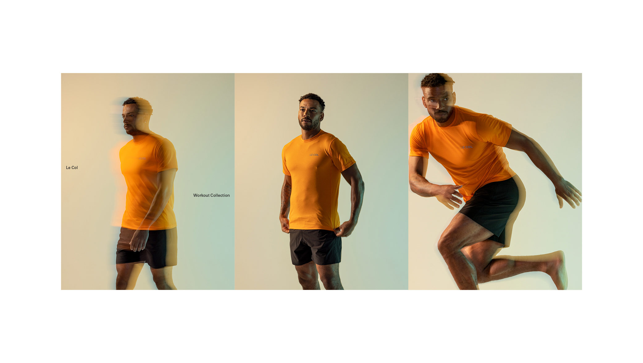
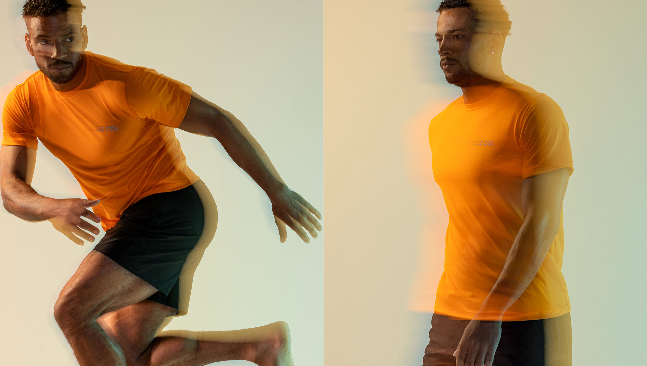
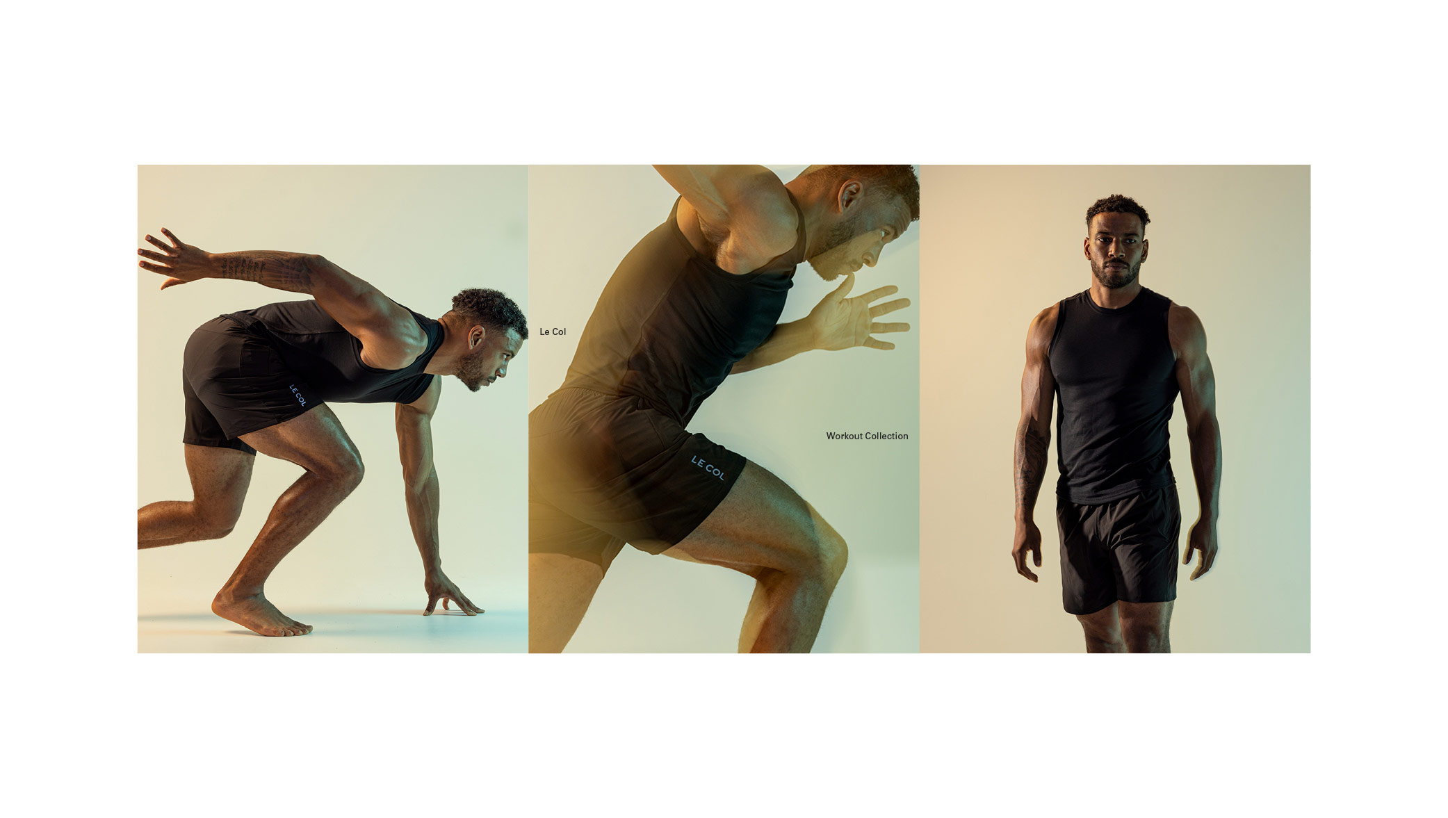
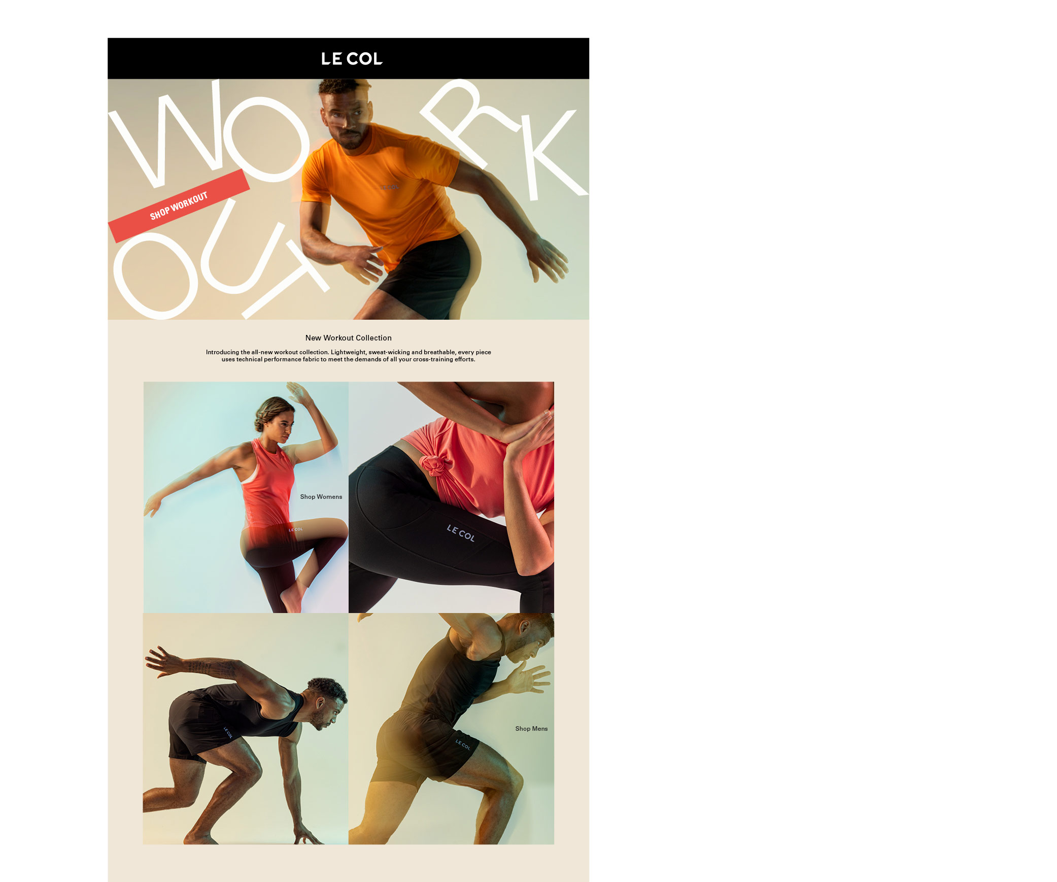
Our work with Le Col covers strategic consulting and creative direction, as well as full delivery of large scale campaigns for digital, eCommerce, paid social, marketing and eCRM. In more recent years we have played a more pro-active role in rooting out key issues within the business and putting systems in place to reduce strain on resource, improve the quality, and reduce spend. Our focus has always been to do more, for less, by using our years of expertise to streamline the areas that are being over-serviced, but not at the expense of the bigger creative and conceptual wins.
We’re not usually ones to boast about what we do, but when we started this journey, Le Col was an unknown entity, from an unknown bike rider. In the past decade we have built a brand that has secured over £15m+ in funding, has worked with the highest calibre of Tour winning riders, Giro winning teams and a host of enviable partnerships. From the logo to the TV commercials, we can proudly say we’ve had our hand in most of it.
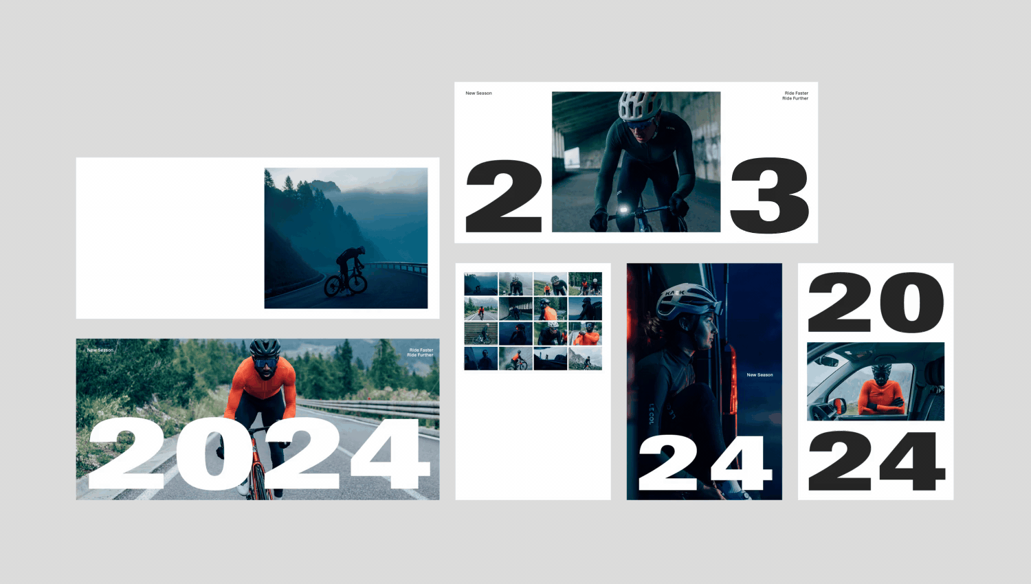
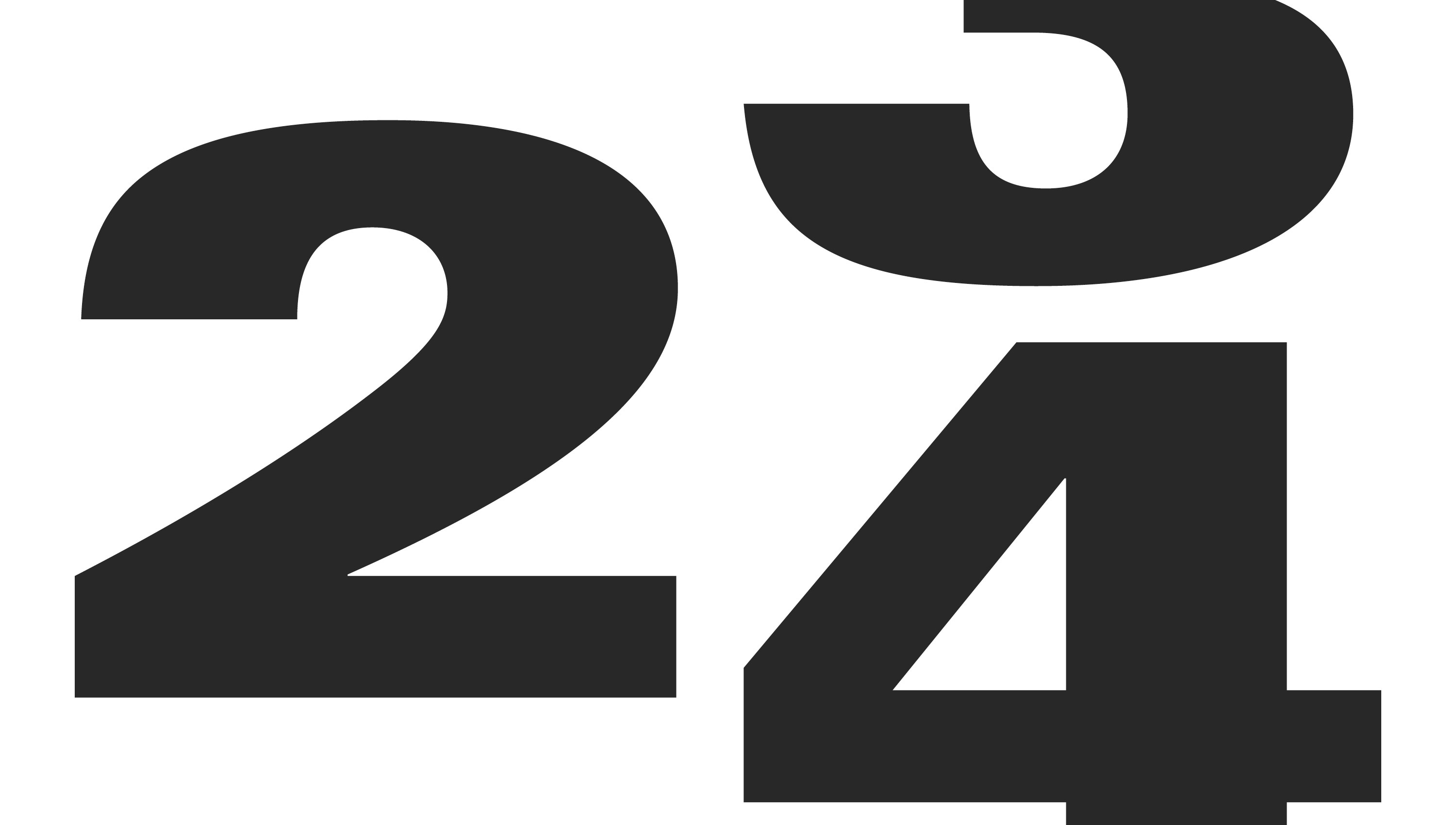
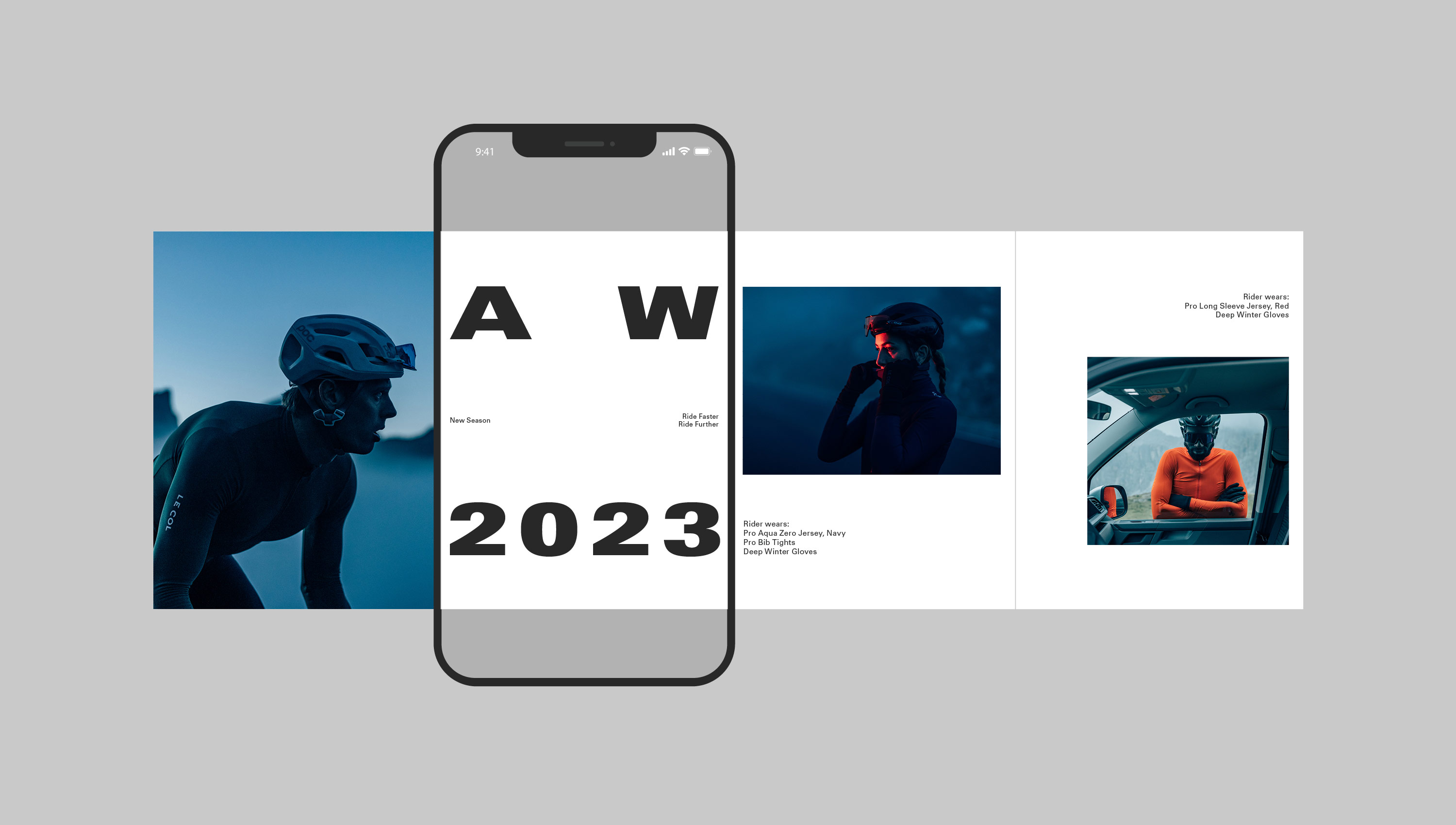
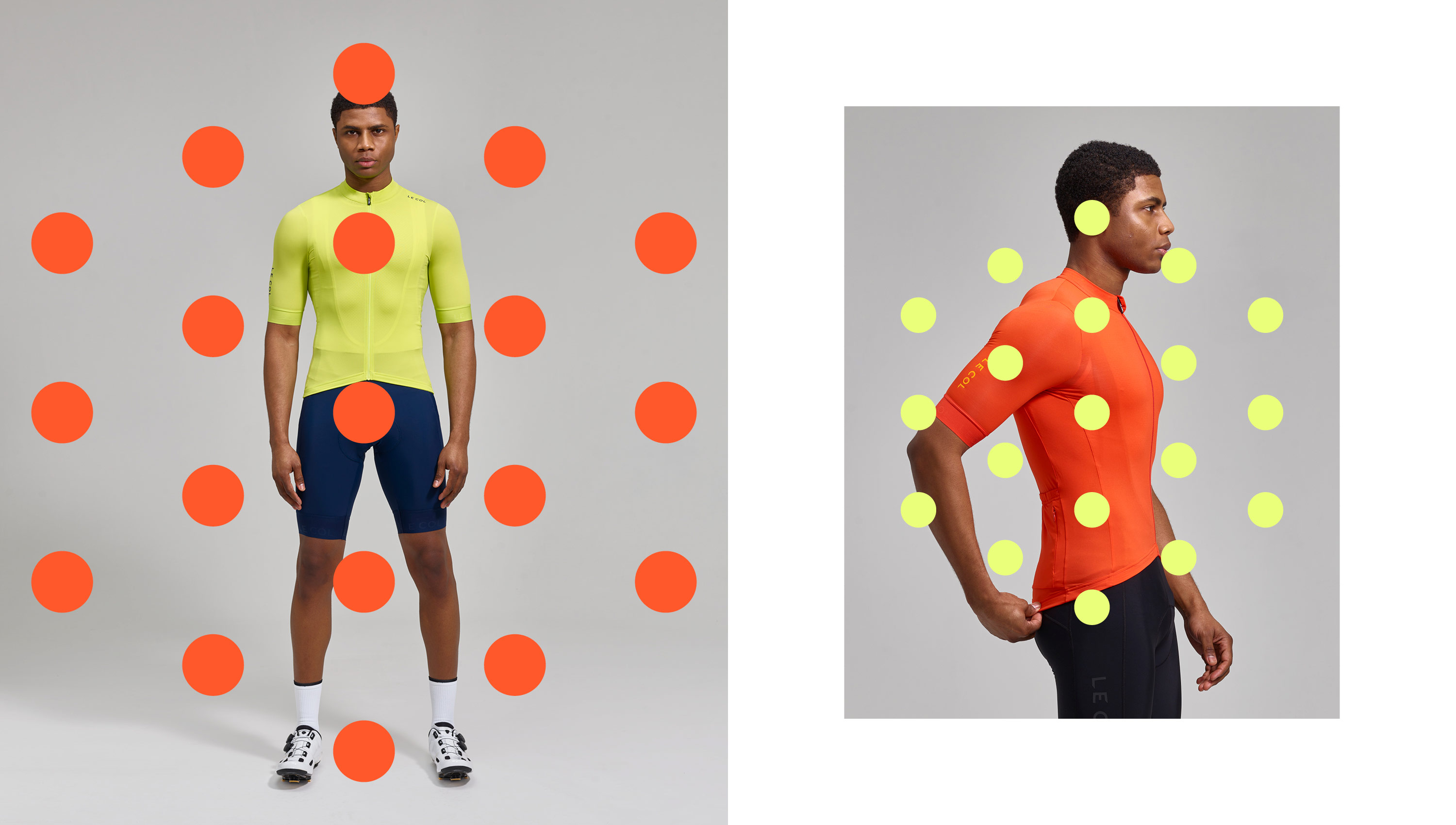
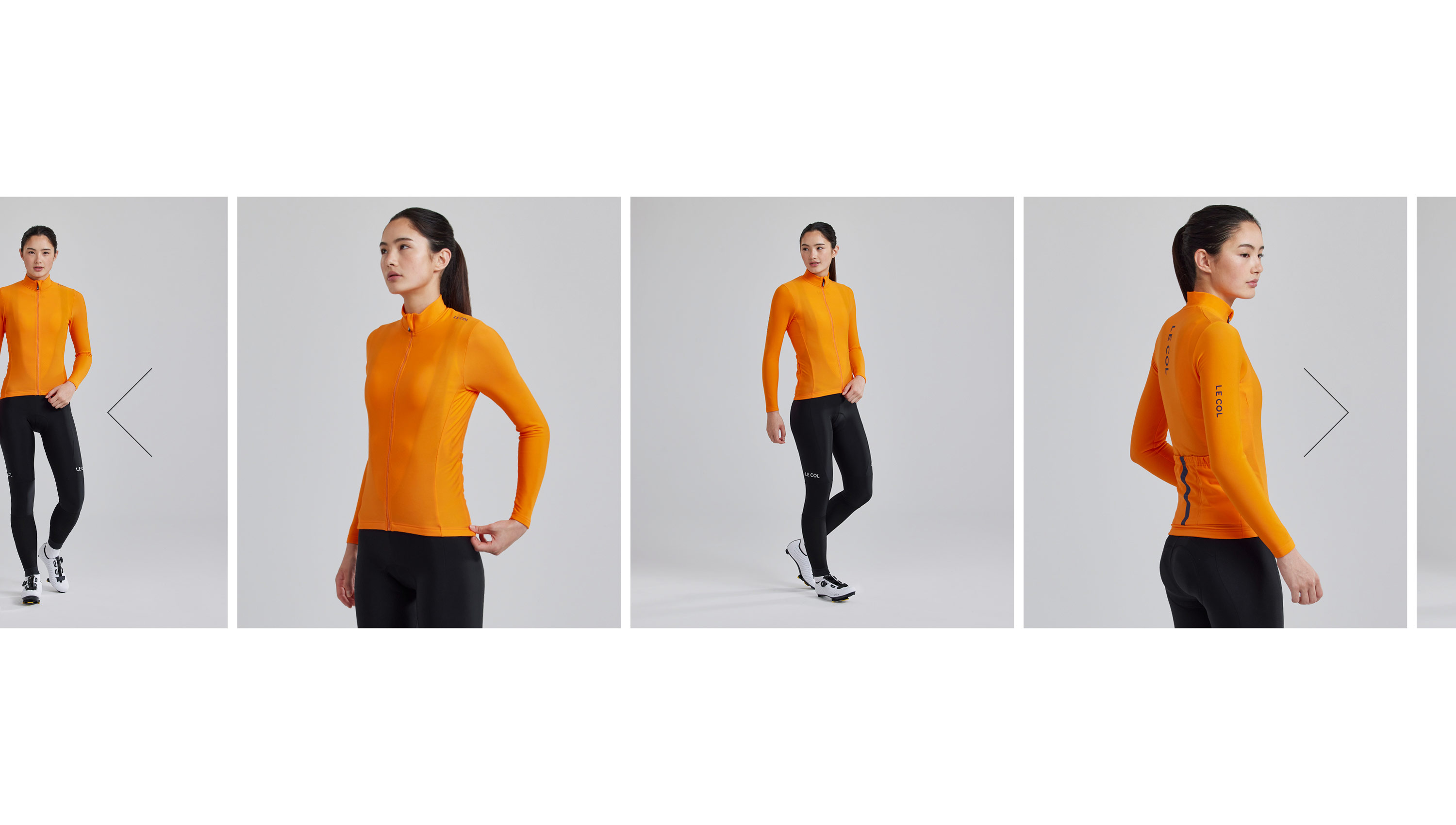
We’re always striving to build on the brand – for higher quality assets, more consistently, with a premium brand offering. But, more than that, we want the passion that most of us riders feel to be handled with care, it’s not just a commodity, and those working on it should enjoy the journey. This passion and drive culminates in more functional deliverables like our over-arching concept development for 2024 below.
Our strategic approach has led to a number of key improvements across the business – an overhaul of email marketing; including new guidelines, a new hierarchy and photography approach, flexible templates, as well as implementing automated batching and scripting processes across the bulk of its products. Having seen first hand the internal issues as the business scaled, we could resolve repetition, as well as specifics like global pricing, gender splits, slow turnaround times and high volumes of assets. Delivering a 60% reduction in design and marketing resource, with more control being put back into the eCRM team to focus on performance.
We’ve audited and recommended better solutions for photography and videography across the board, looking to elevate the offering at all opportunities from a customer perspective. We’ve introduced some immensely talented creatives from photographers, videographers, 3D/designers, animators, production companies and directors along the way, who continue to deliver the vision. This enthusiasm has most noticeable improved the digital and eCommerce proposition with a much more forward focussed approach to improvements and nimble, data-driven, iterations.
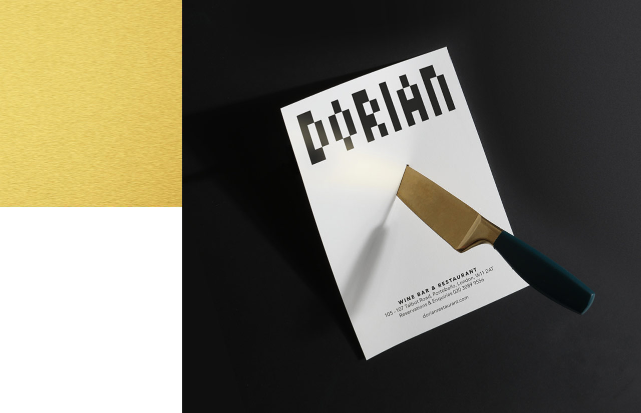
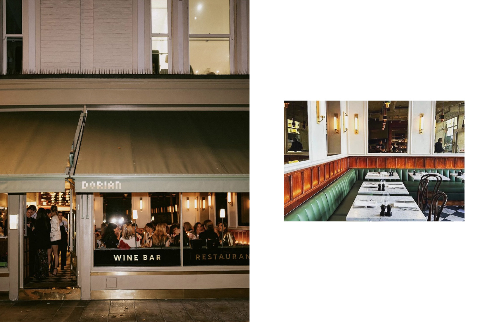
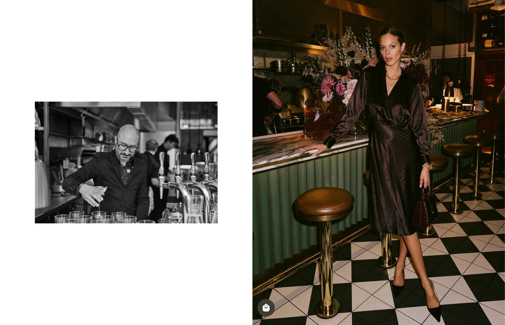
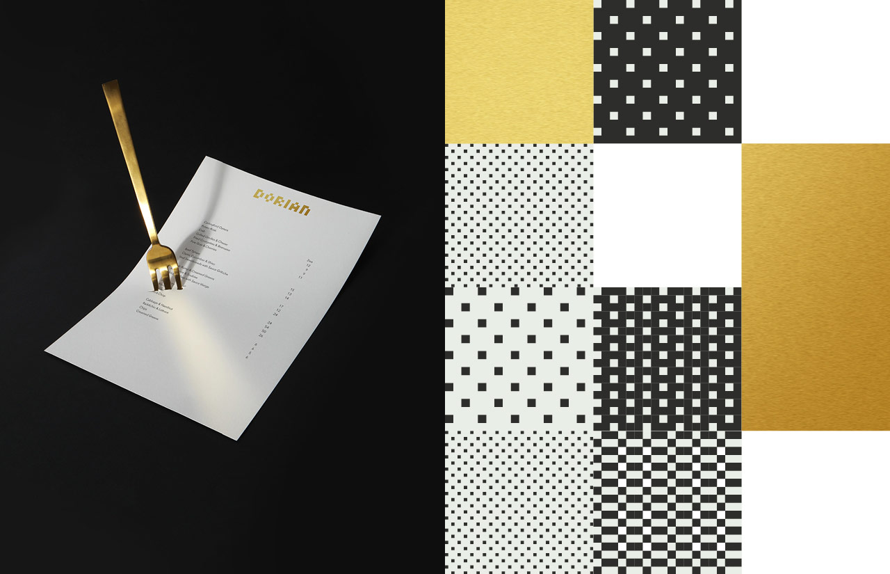
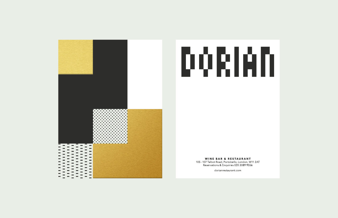
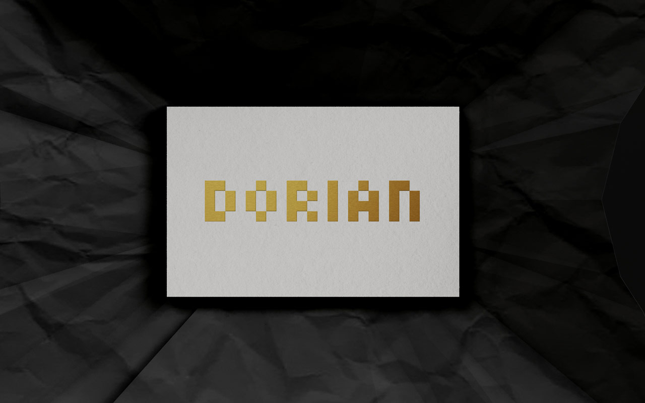
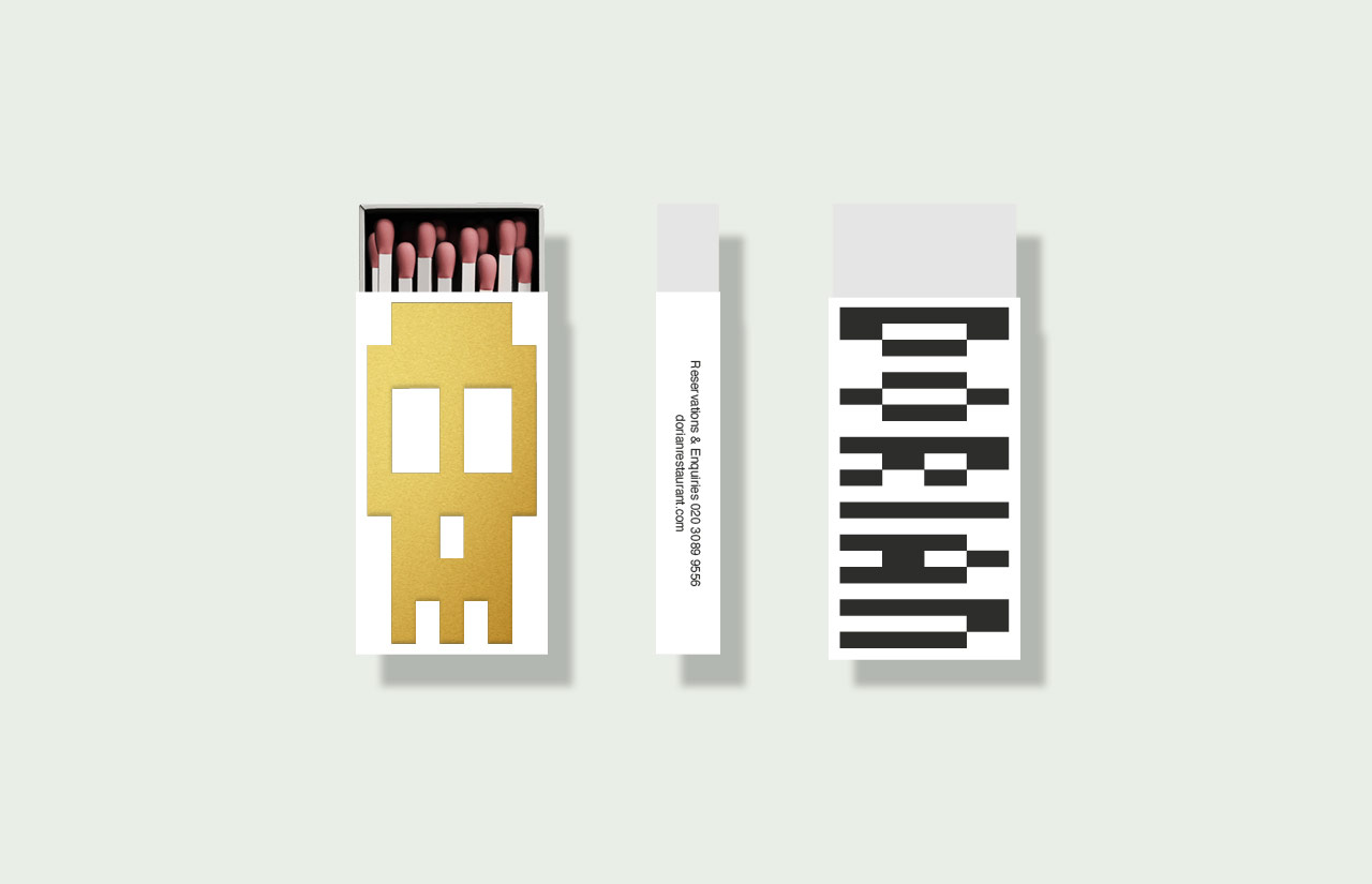
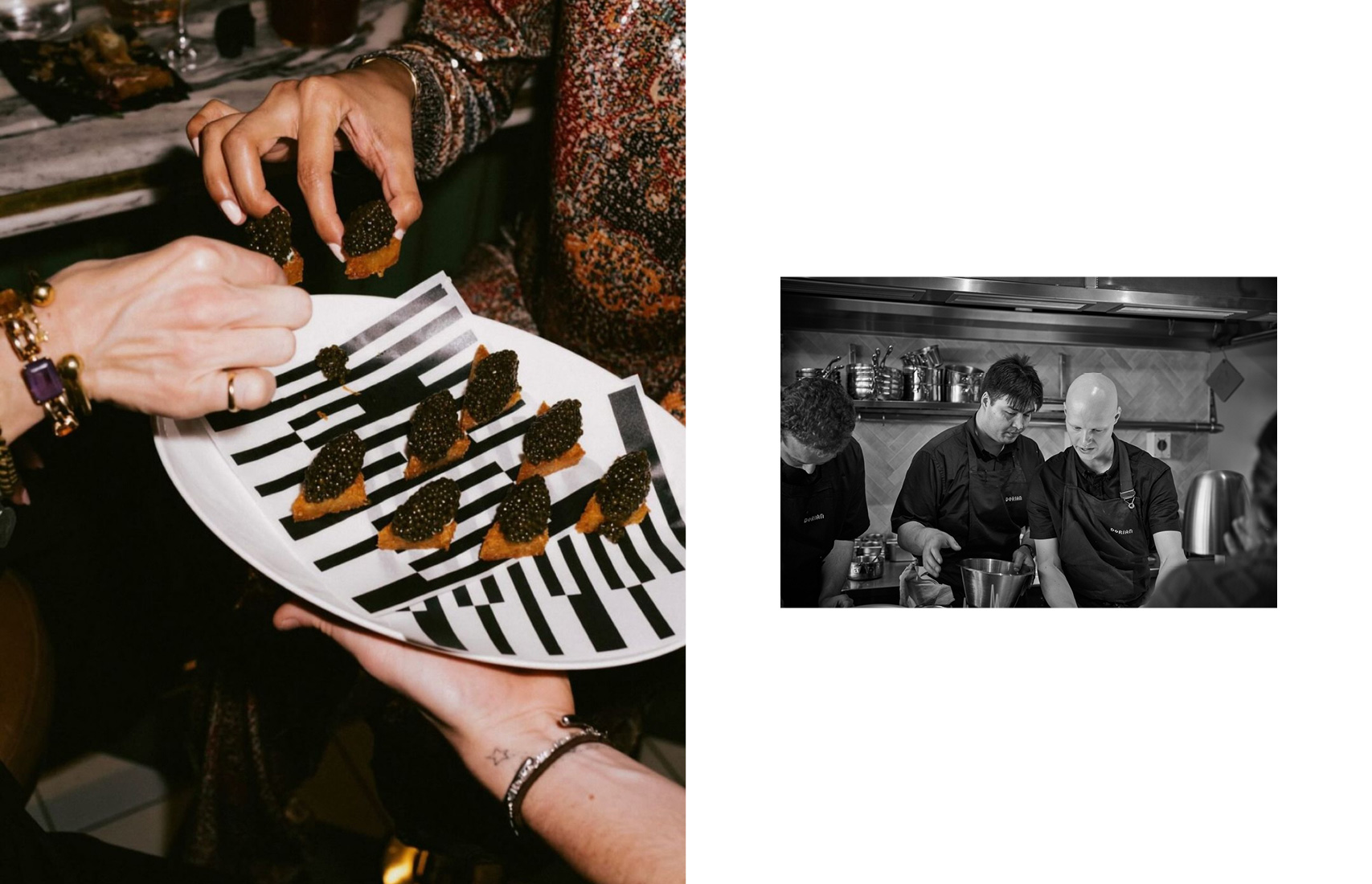
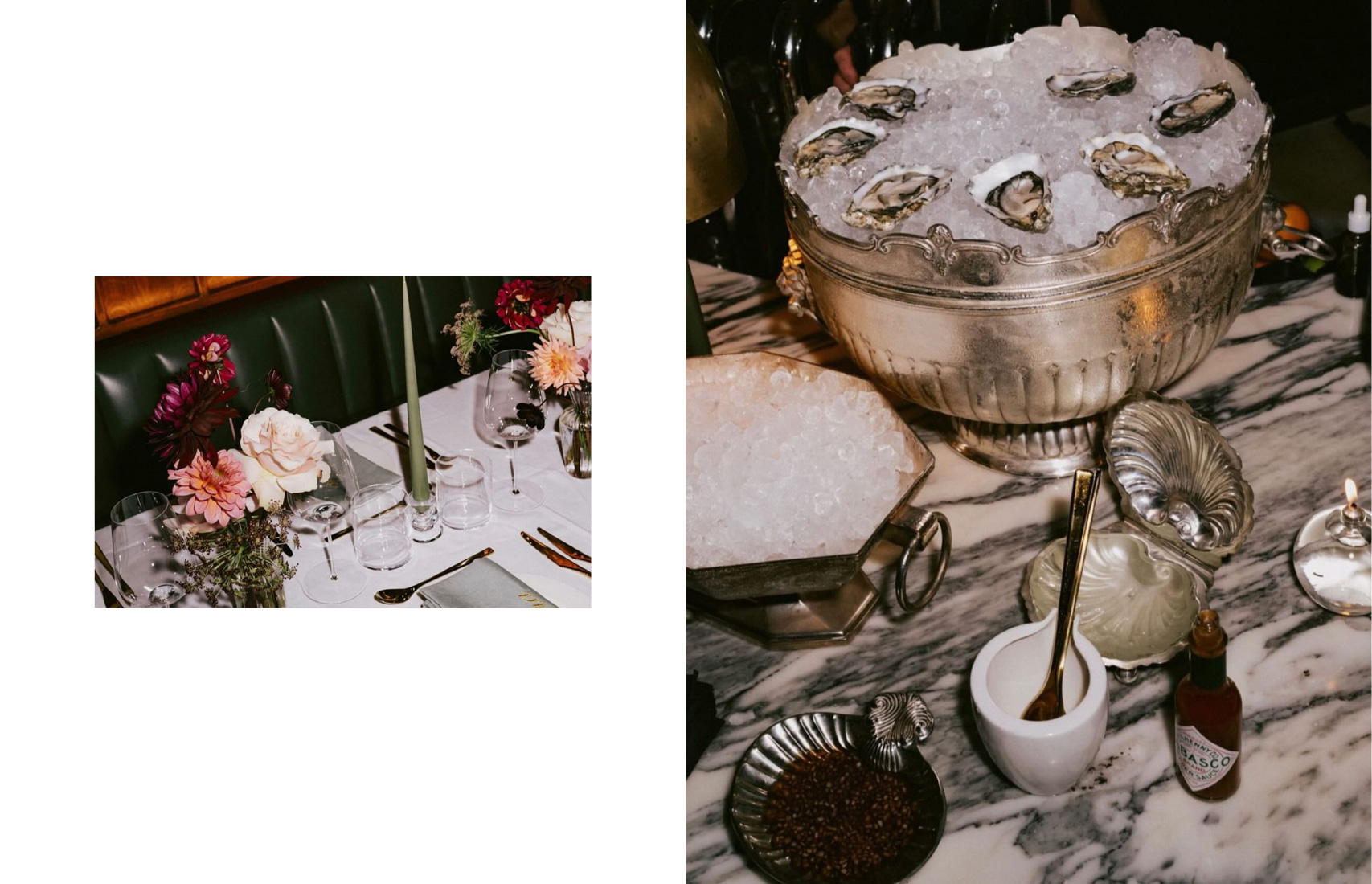
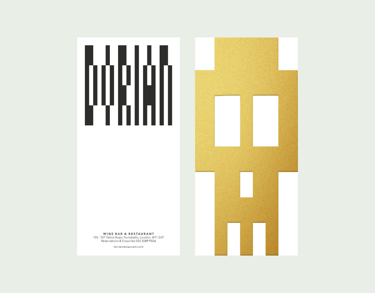
Dorian has all the hallmarks of a classic French bistro, marble bar tops, wood panelling and leather banquettes, but as the name implies, there is a slight undertone of something different. This latest addition to the Notting Hill restaurant scene is being referred to as a ‘anti-Notting Hill bistro’. Dorian boasts an exquisite menu of beautiful seasonal British produce and an enviable wine list.
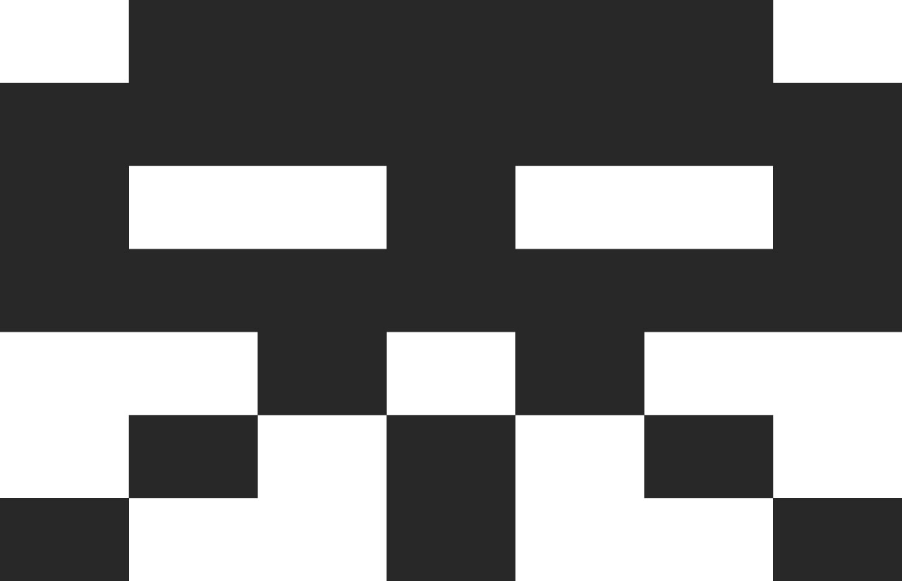
The identity is derived from iconic French bistro mosaic tiles. It takes a more playful and modern approach, in line with the restaurants’ ethos, with a slight nod to Parisian street art. Chef Max Coen and his incredible team have successfully been awarded Michelin stars for two consecutive years.
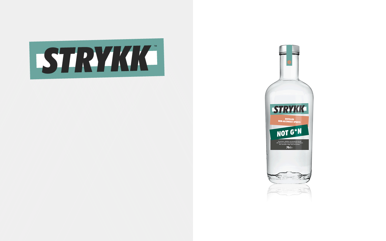
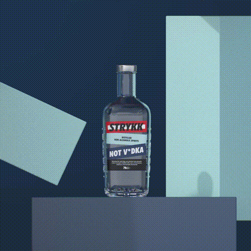
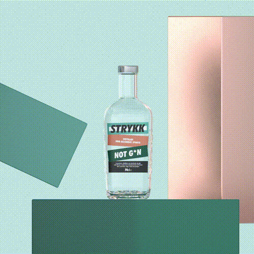
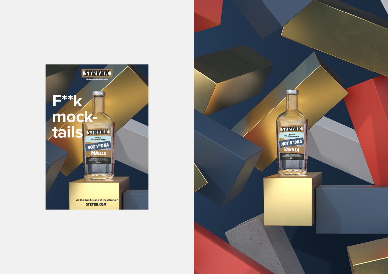
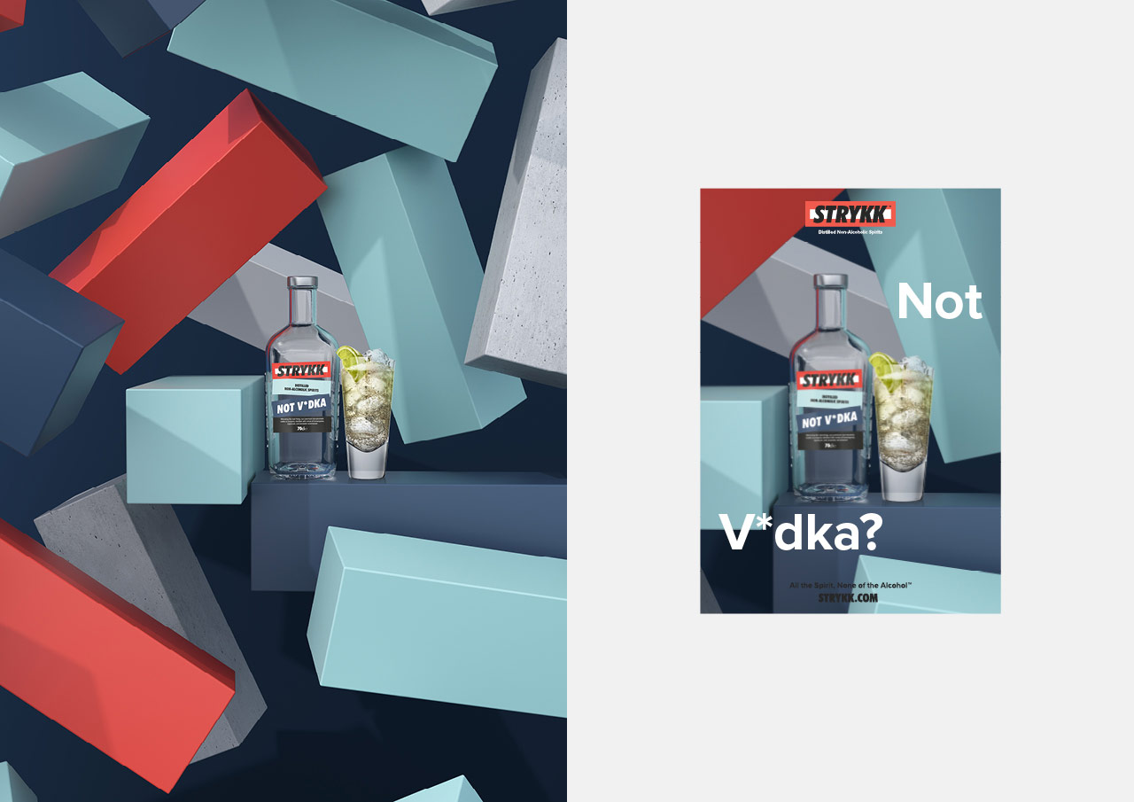
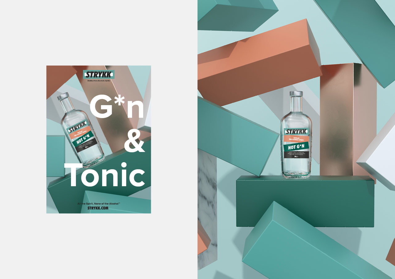
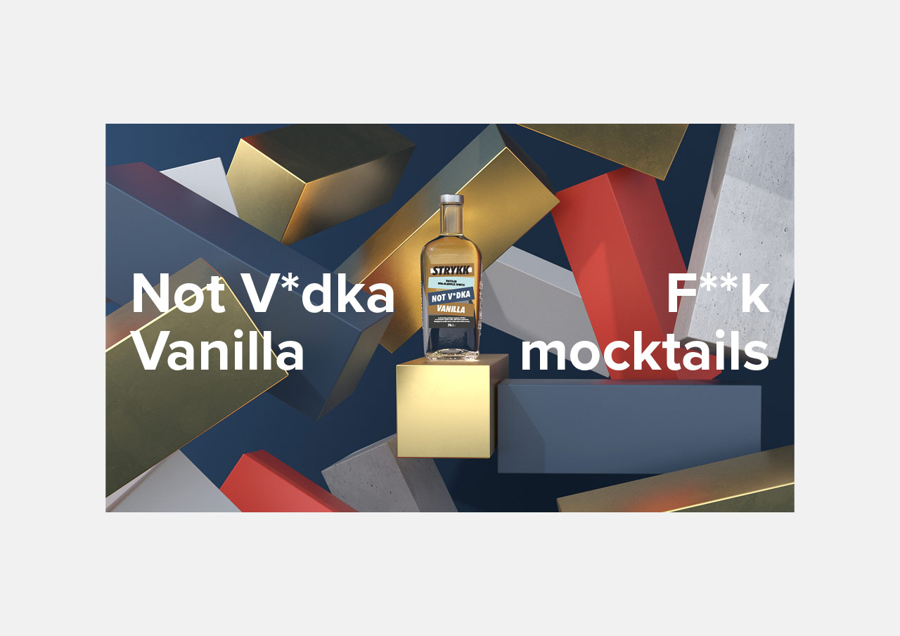
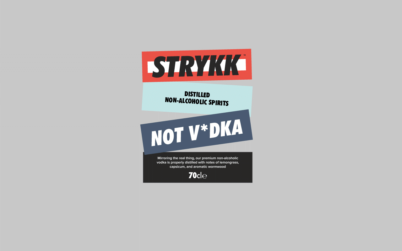
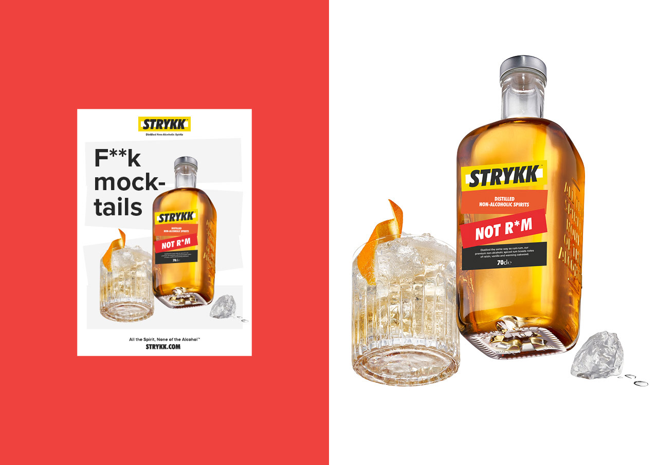
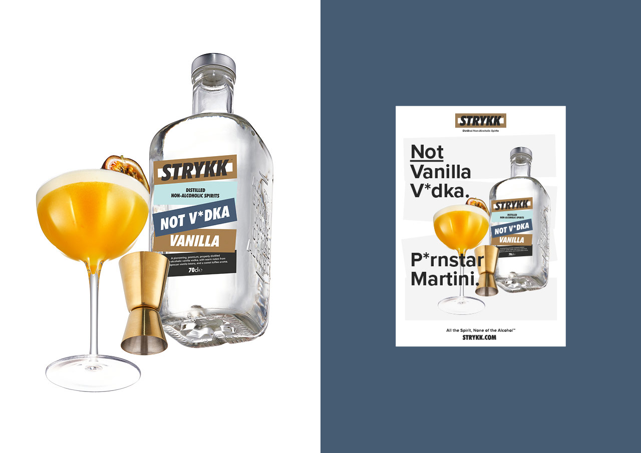
New brand identity and packaging work for Strykk, building on the original foundations we developed for them in 2018. Whilst our underlying strategy remains the same, a number of external factors have led to the need to reinvigorate the brand and re-align the growing portfolio.
Starting with refinements to the logo, we opted for a holding shape that become the central block device that runs through the whole identity. Extrapolated from the three overlapping oblongs that created the original Strykk asterisk, it builds as the common thread for packaging, and is both exaggerated or subtly implemented as a consistent graphic device across all channel executions.
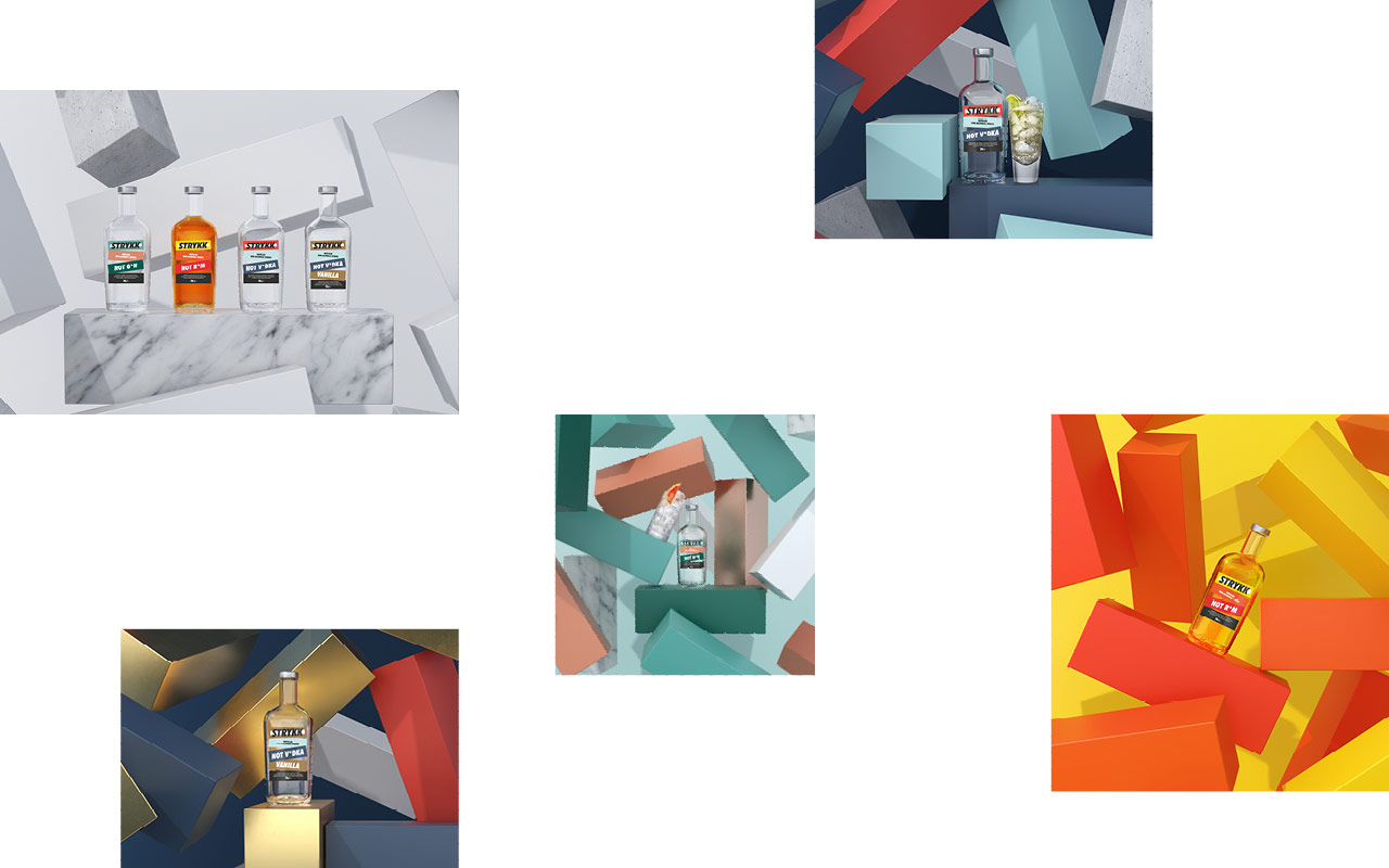
We’ve built on the strong colour palette, bringing in a wider set of bold and complementary tones to increase standout and build better differentiation between products. Typography opts for a more refined sans serif and a slight coming of age, moving from the unruly uppercase Futura Condensed used previously, to a more conversational approach. As before our focus on tone of voice remains confident and unapologetic, a key pillar of the brand.
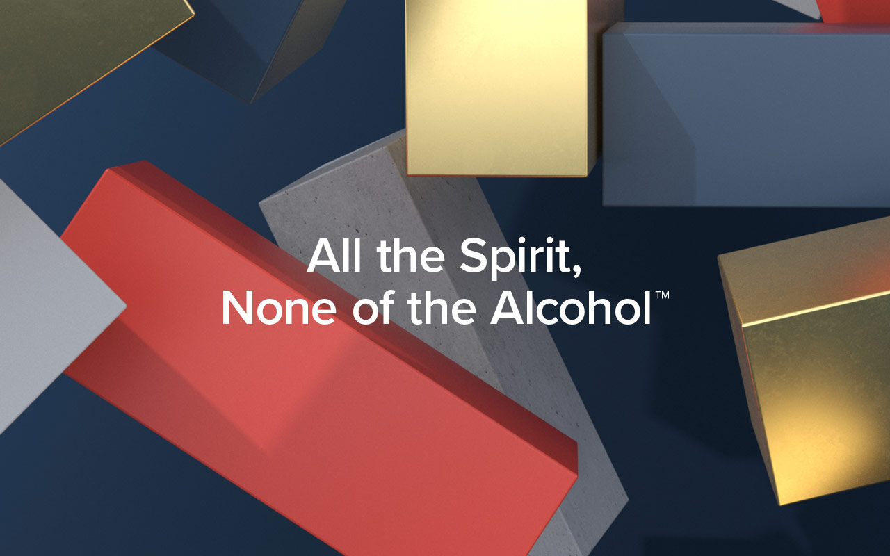
The original strategy and positioning remains, inspired by the idea of enjoying a night out without compromise. A love of going out, being part of the story and not missing out. Removing the stigma of ‘not’ drinking, by delivering a product with the taste and complexity to build a proper drink with 0% Abv Distilled Spirit.
At the heart Strykk remains disruptive and steadfast in its unwillingness to just fit a mould. A bold approach that needed a bold brand, unapologetic and full of energy. We’re not about kooky craft, forced aspiration or self-importance. Uniquely summed up as; All the spirit. None of the alcohol.
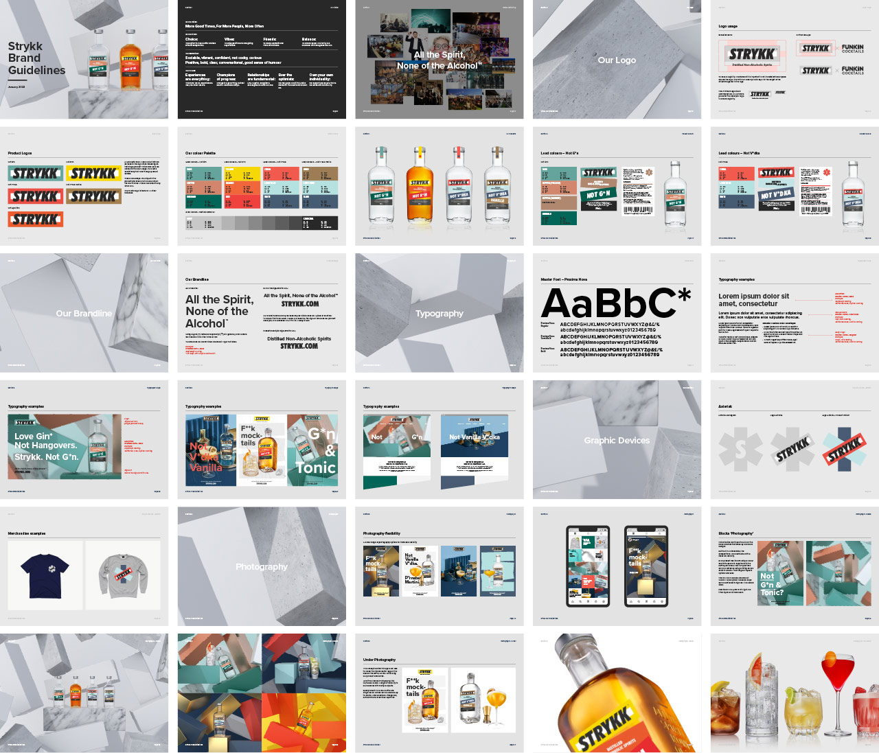
“Limited Edition Design has been at the forefront of Strykk’s brand and visual identity since its inception in 2018. When tasked to overhaul and update the packaging and identity, a clear, comprehensive, and succinct sprint process was followed from start to finish – and at the highest standard. What has resulted, we feel, is a truly world class brand and visual identity, all packaged up neatly in a set of bullet-proof Brand Guidelines to mark the next stage of our business growth.”
Tom Glover, Brand Manager, Strykk
Agency: Limited Edition Design
Creative Director: Paul Greeno
3D & Motion: Sergio Beggiato
Photography: Jeremy Baile