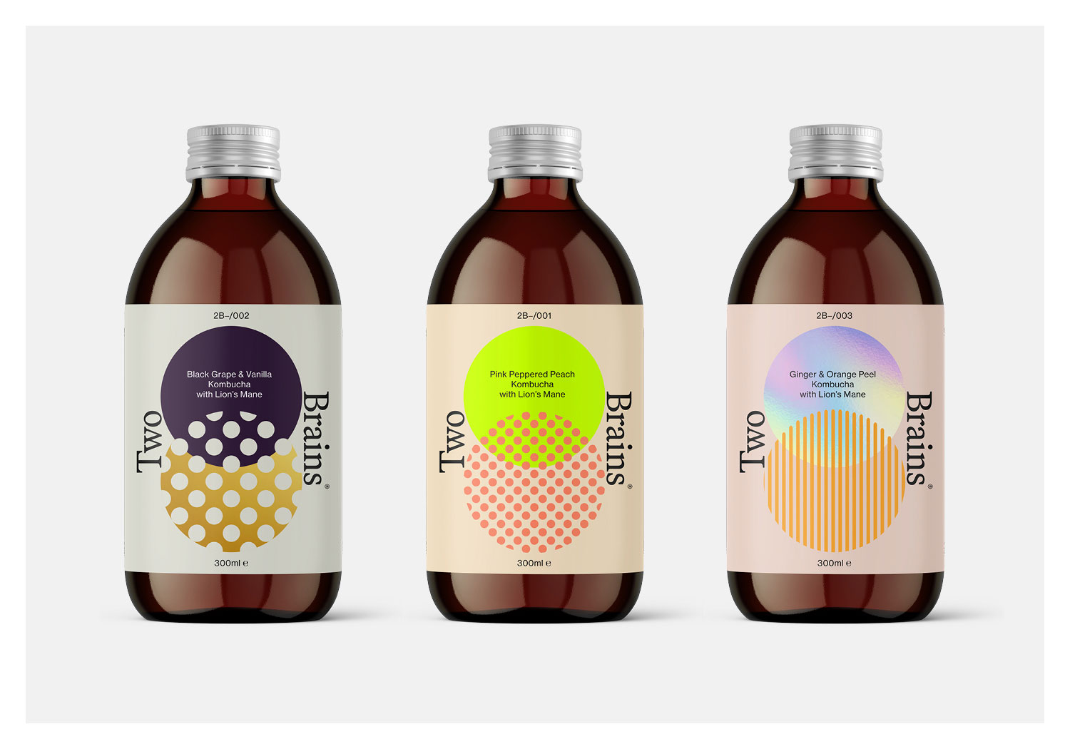
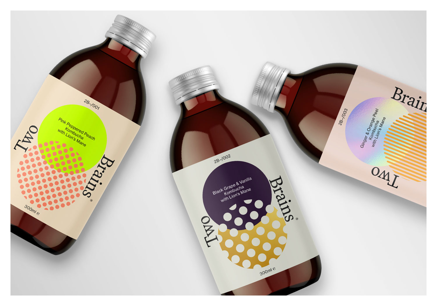
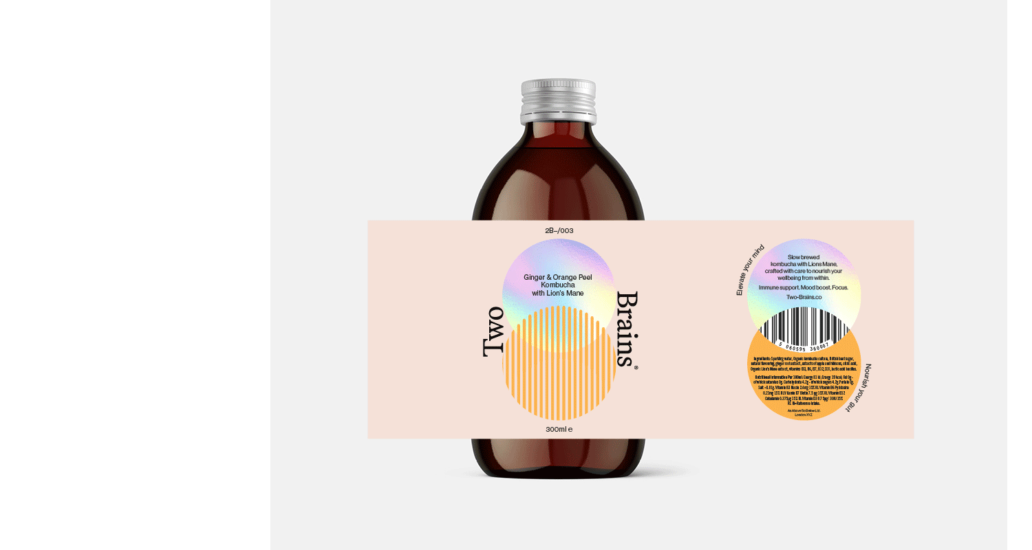
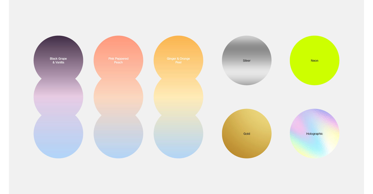
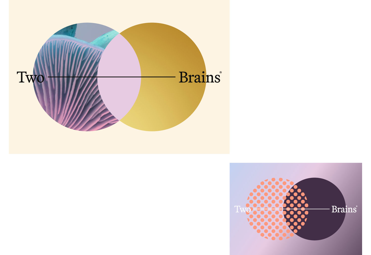
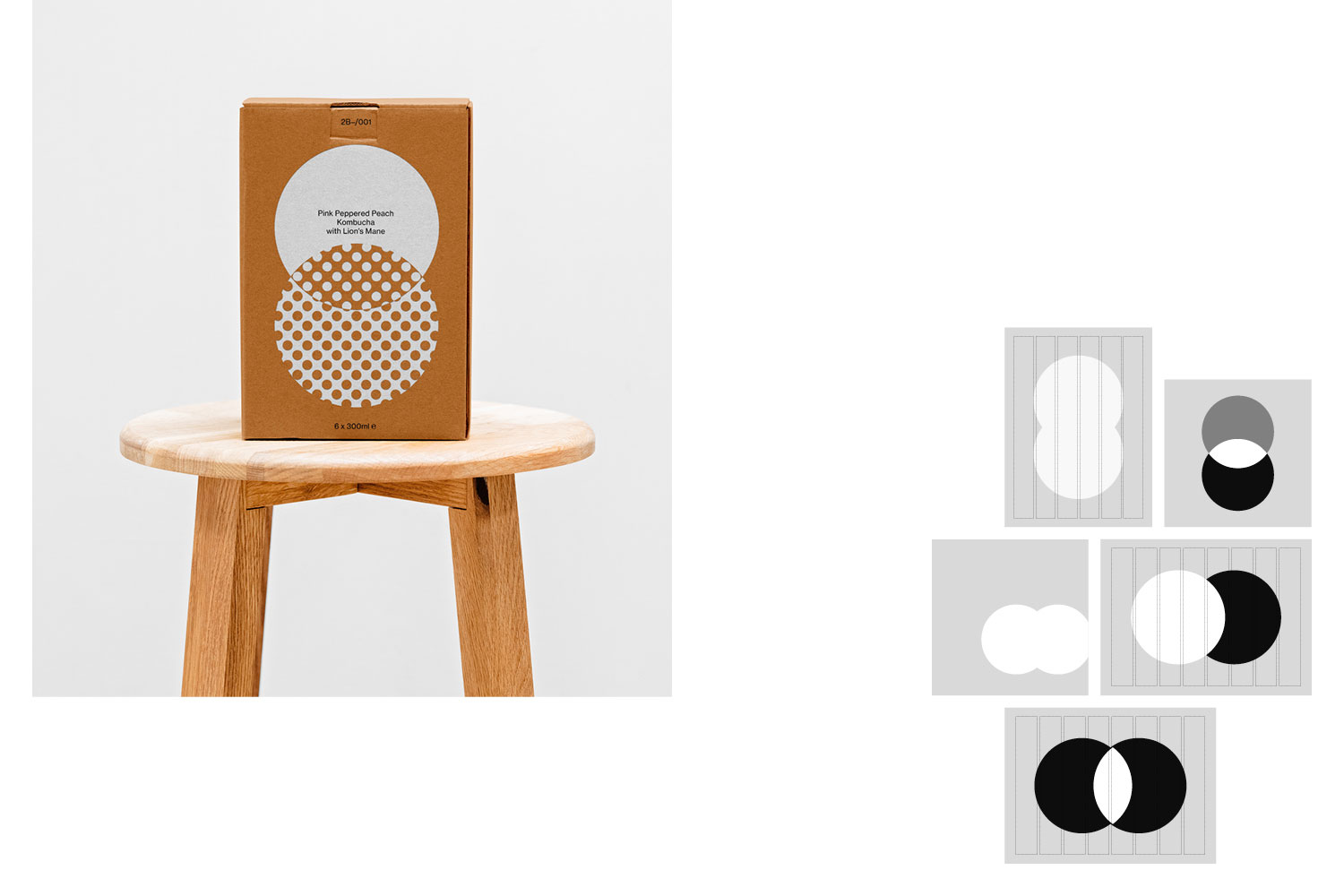
Two Brains is a range of drinks that nourish your gut and elevate your mind. A refreshing, premium non-alc Kombucha with Lion’s mane, combining gut-health with the mental focus of this incredible mushroom.
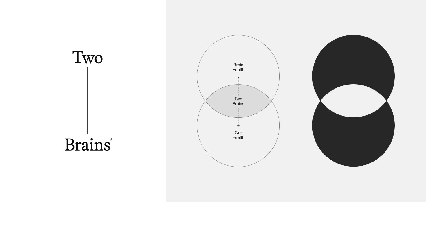
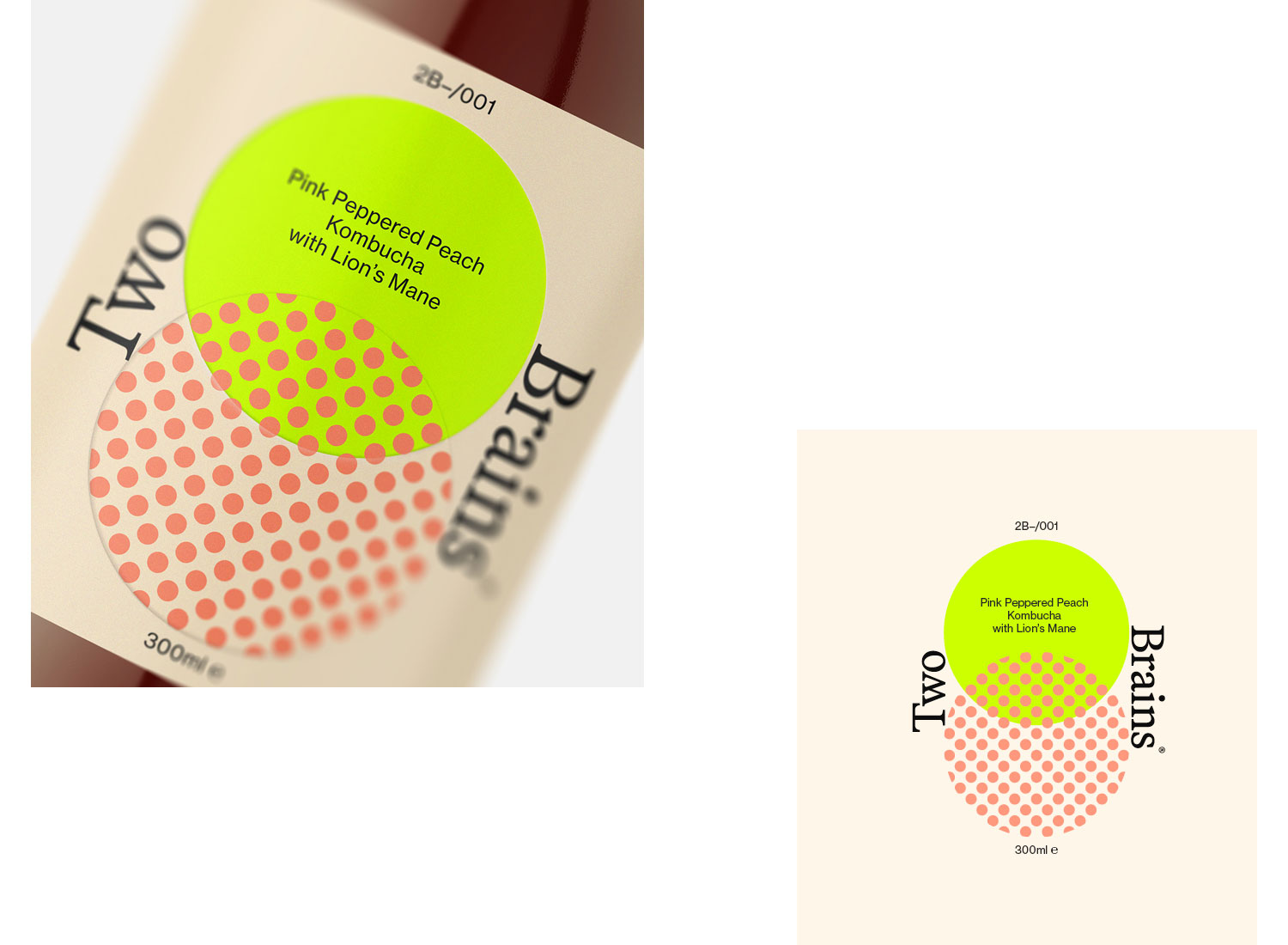
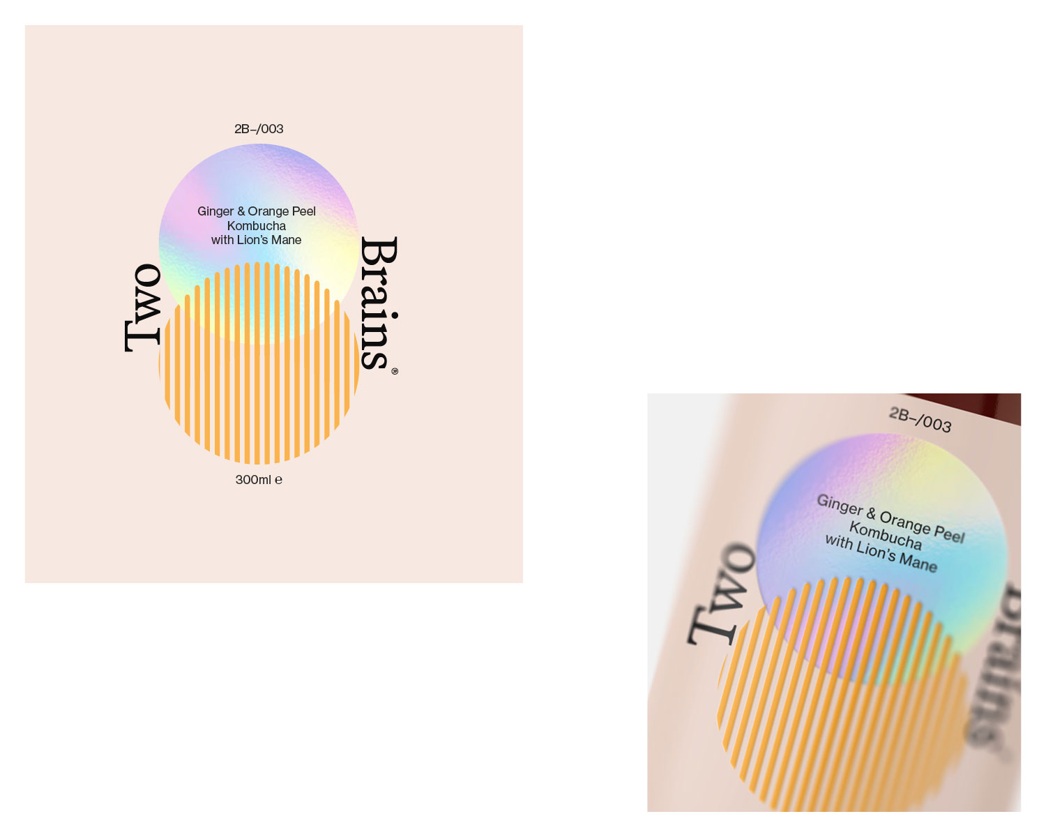
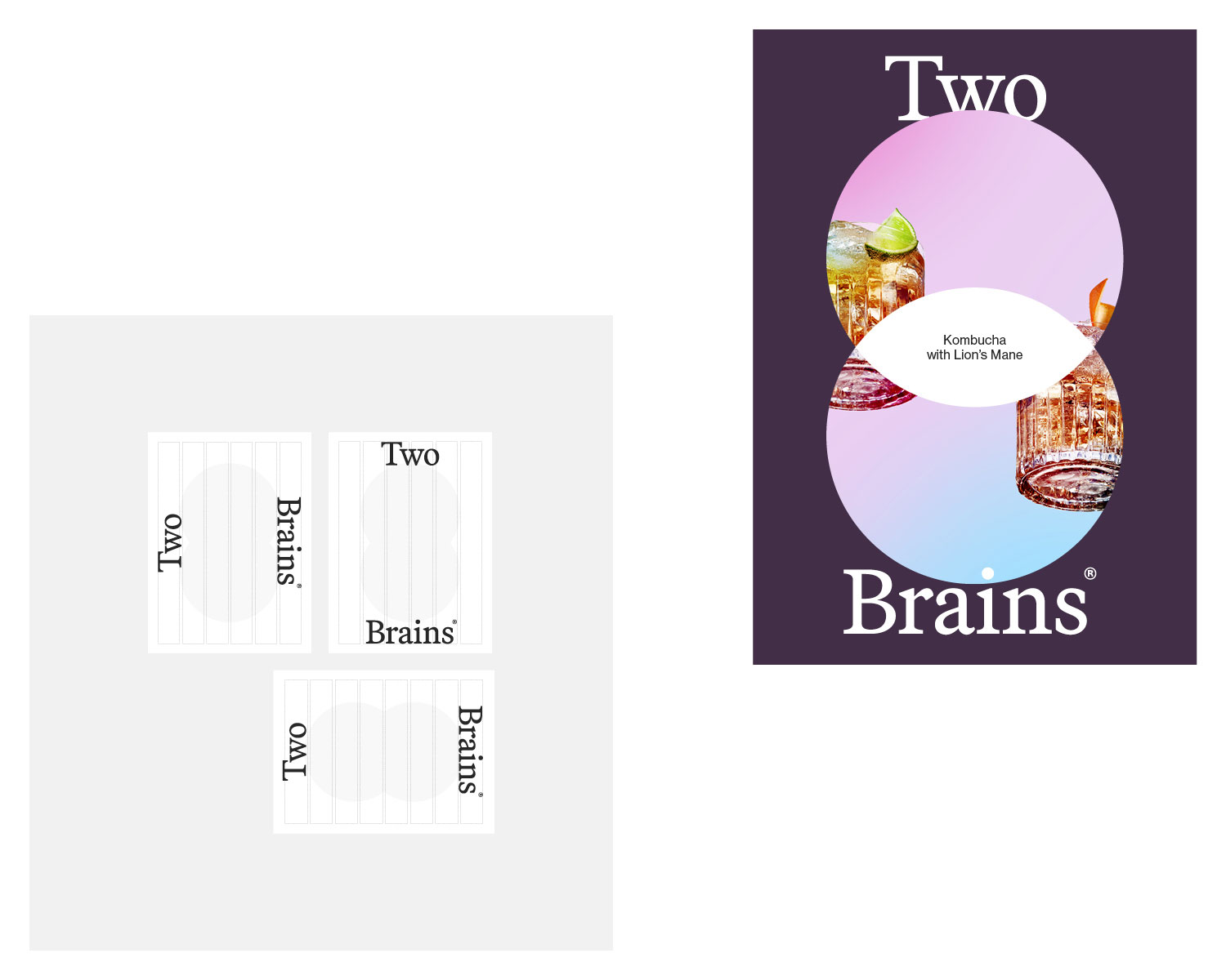
The gut, where 70% of the immune system is located, is often referred to as the ‘second brain’, playing a crucial role in overall health, hence Two—Brains. This physical overlap of gut, and brain, led to the brand device at the centre of the packaging design. This strategic product truth of gut-health and mental-health being at the core of the product, and brand. This interconnected relationship comes through in both the logomark, typography and kombucha packaging.
There’s a number of players in the Lion’s mane and mushroom market, but very few gave the consumer an easy access point to the mushroom movement. Key to our brand positioning was ensuring we avoided the obvious cliches and cheap drug references that are irrelevant to the product.
A premium drink, for a more discerning consumer looking to bolster their immune system, add some perk, and enjoy a great tasting kombucha.
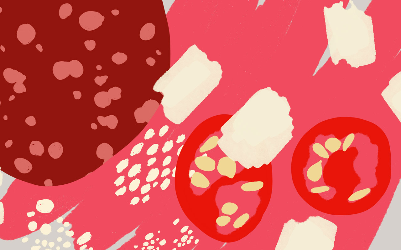
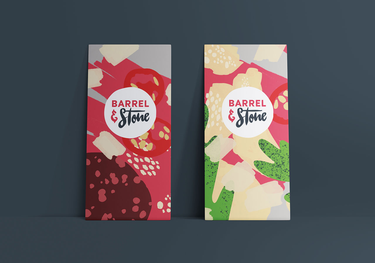
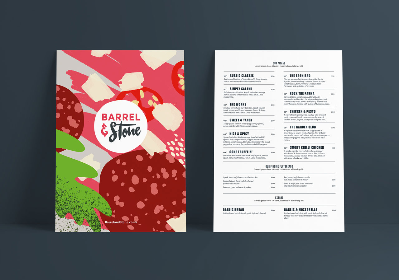
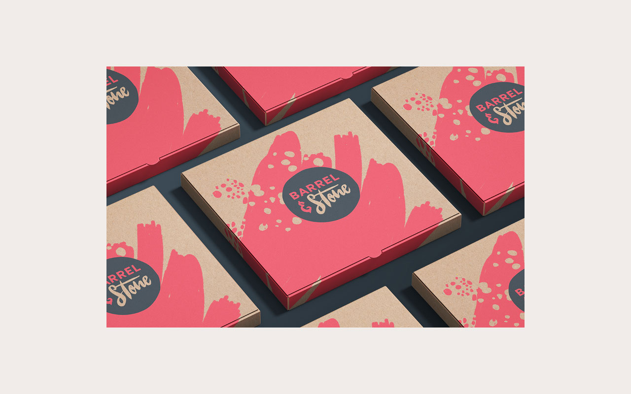
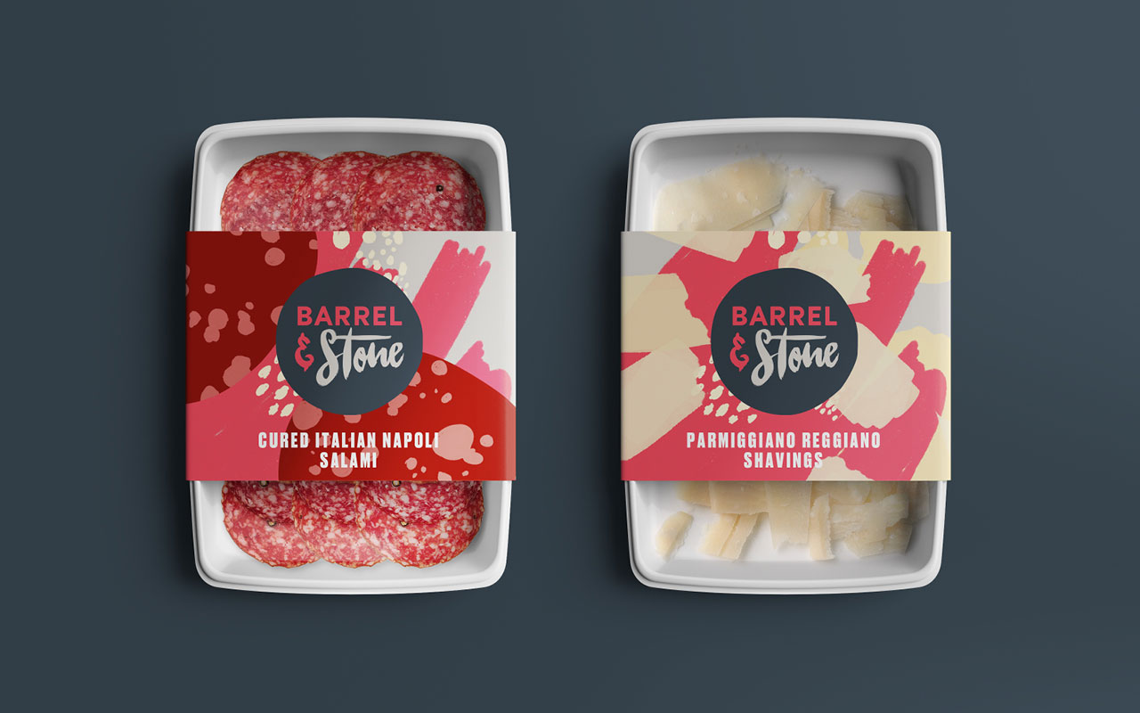
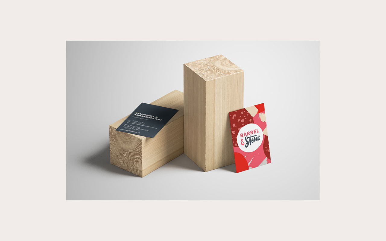
New identity and positioning for Barrel & Stone. Barrel & Stone provides high quality ingredients and training to create premium stone baked pizzas in a diverse range of environments from bars & pubs, retail, galleries, family attractions and more recently developing an at-home concept.
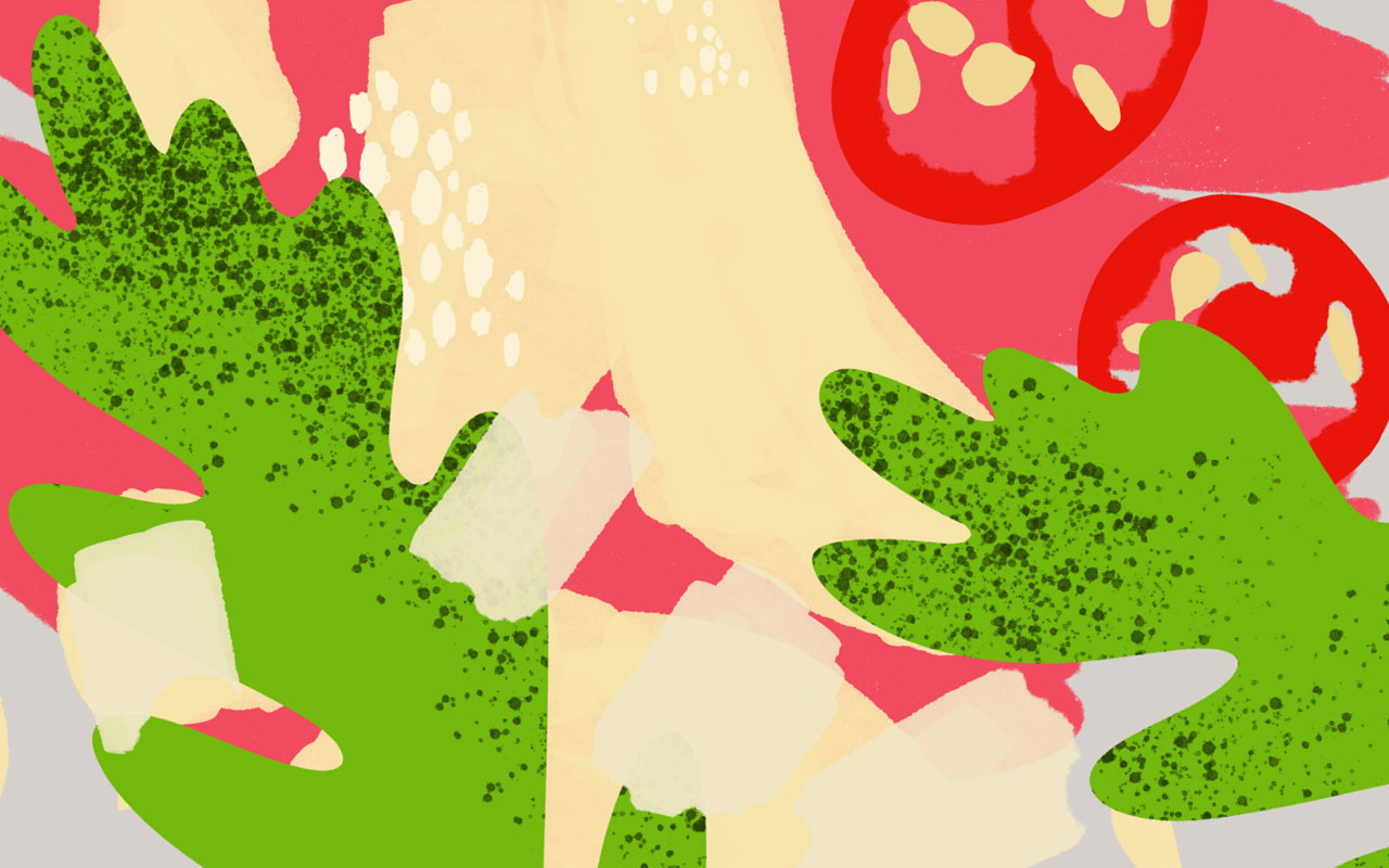
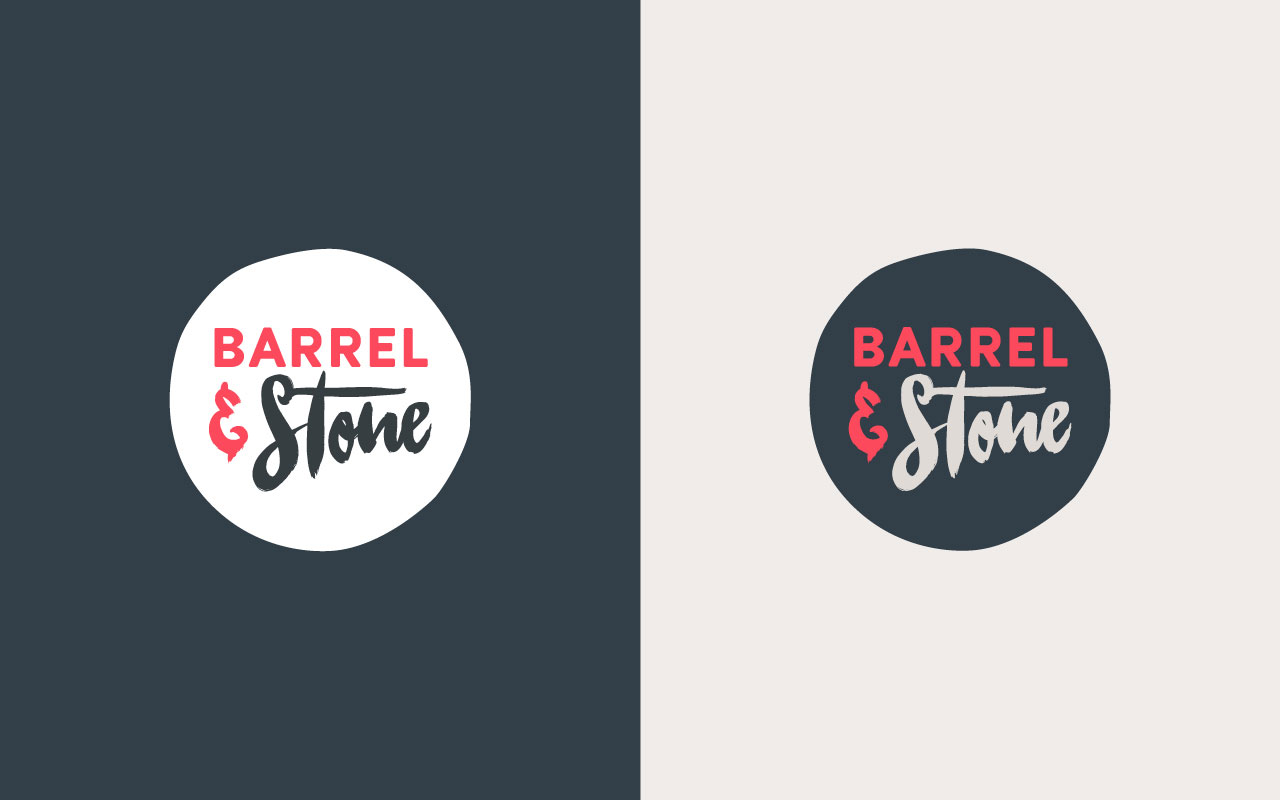
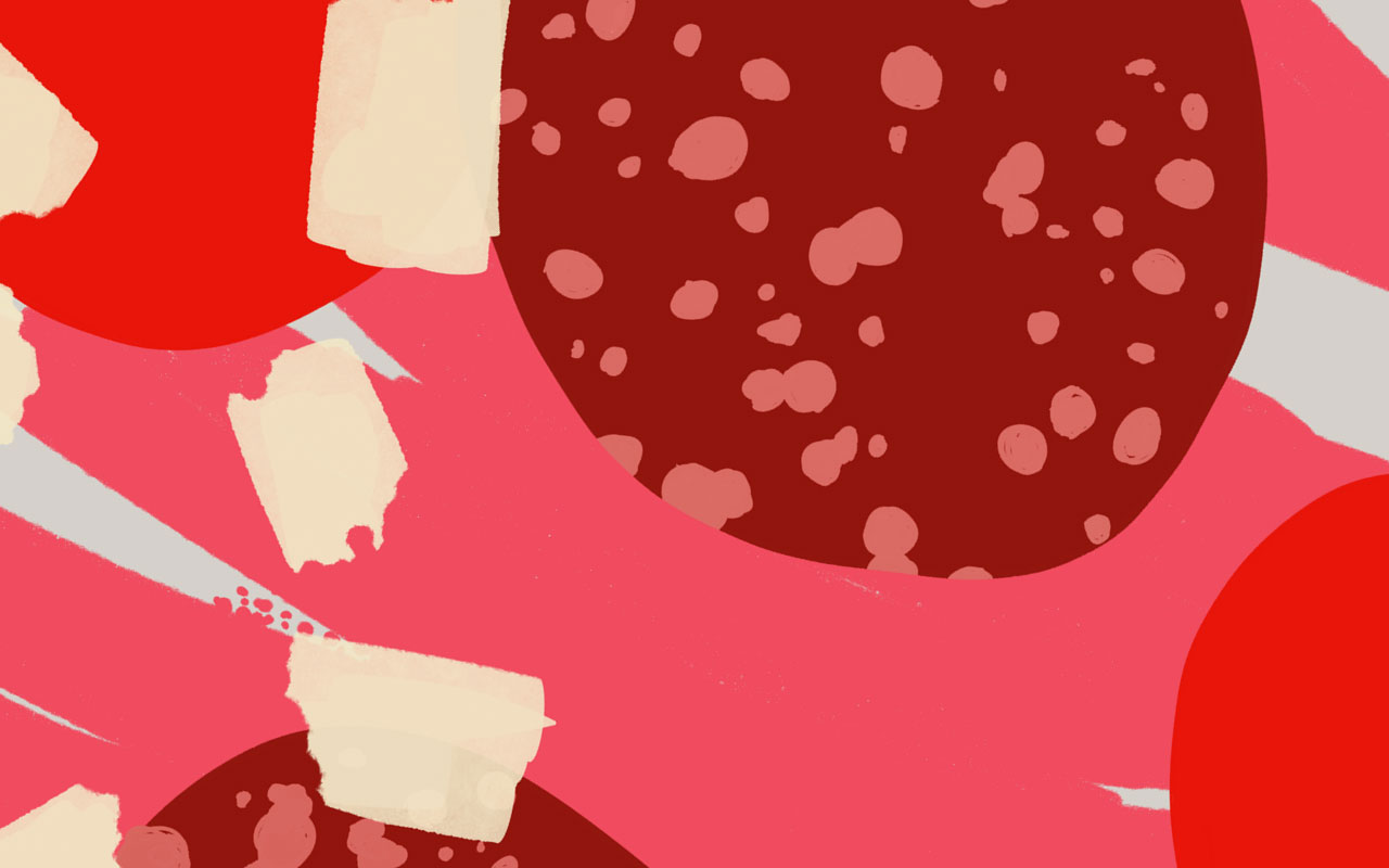
A more illustrative approach that reflects the level of craft and handmade ingredients that goes into each pizza. Including an evolution of the logo, refining and re-cutting all the elements for a more professional and legible mark, backed up with a strong strategic foundation.
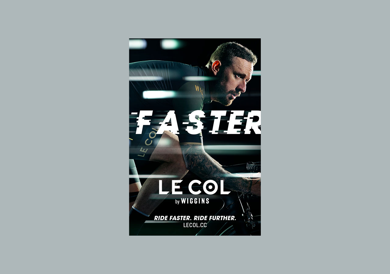
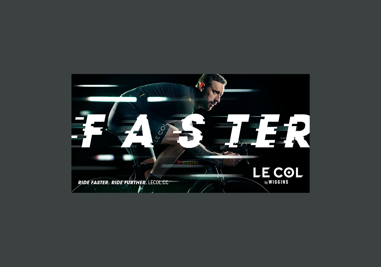
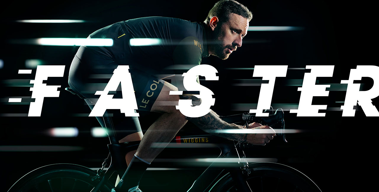
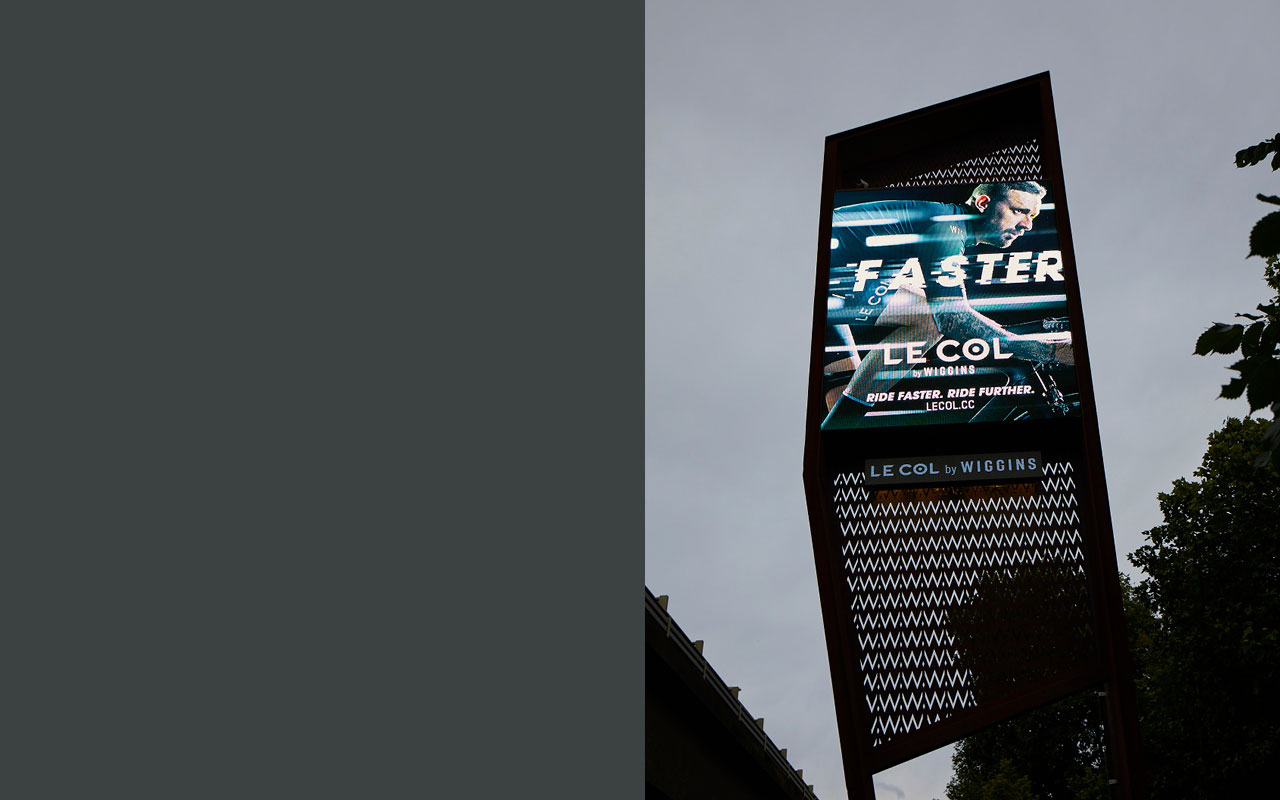
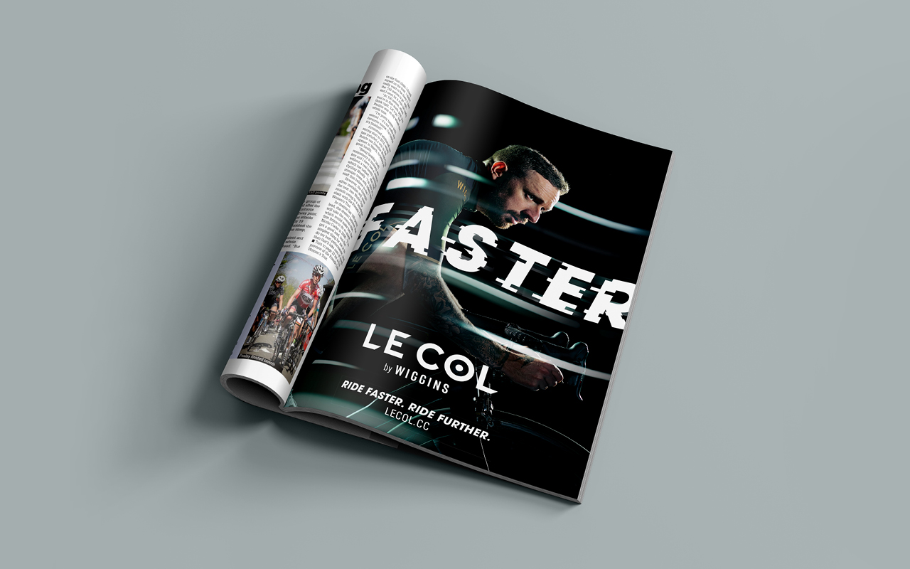
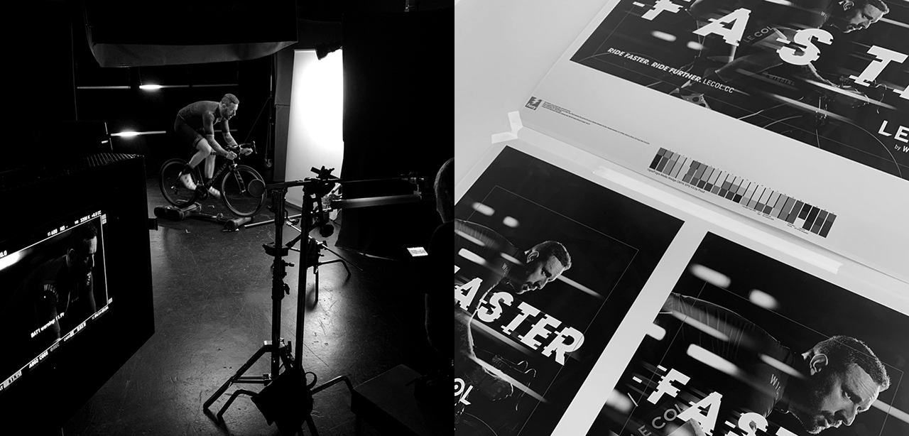
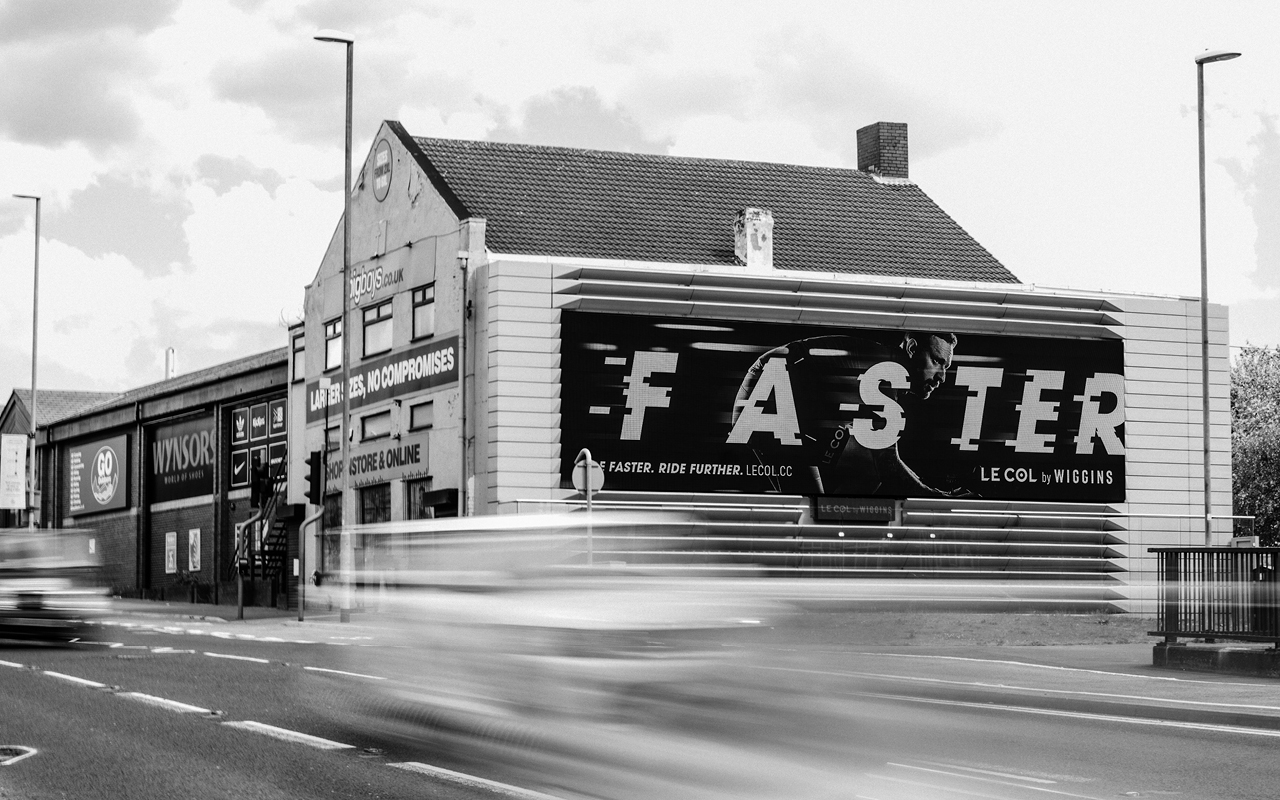
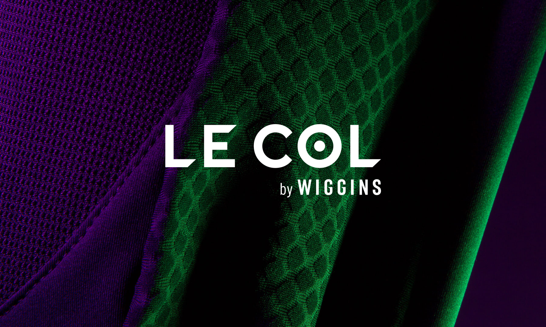
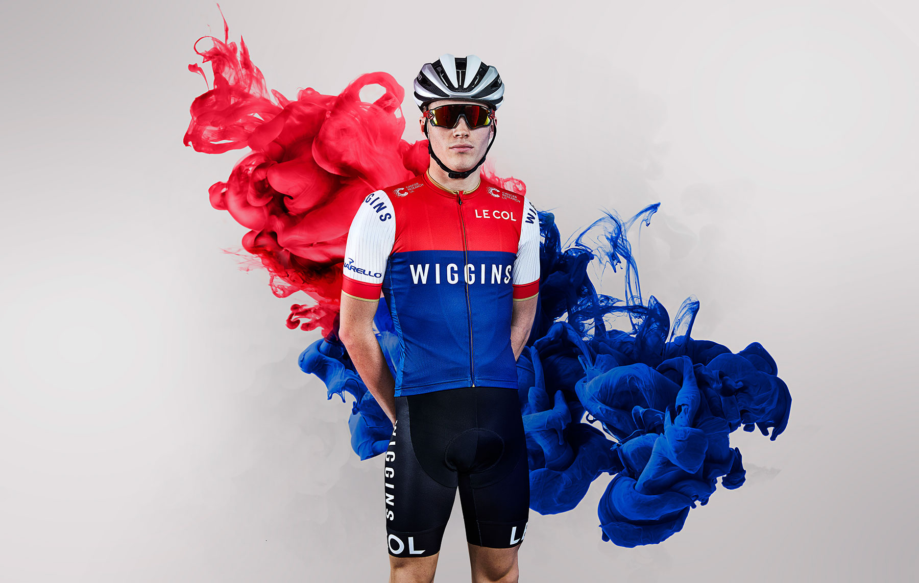
The latest Le Col by Wiggins advertising campaign as part of our brand refresh for Le Col. The approach focusses on Le Col’s Pro credentials, both from ex team GB rider, and founder, Yanto Barker and Sir Bradley Wiggins’ phenomenal palmarès, including the Tour de France and eight Olympic medals to name a few. These combined years of racing have influenced their combined goal to create the best performance cycling kit on the market. Ride Faster. Ride Further.
Typographic Ident:
Eurosport Ident:
Video Production Squire Studio Director – Jay Creagh
Executive Producer – Phil Tidy
Producer – Jonnie Coffin
DOP – Alister Little
Focus Puller – Michael Hannides
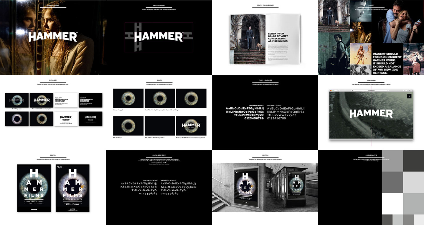
Back last year we worked with Hammer films to re-brand and re-position their current proposition. Originally founded in 1934, the company is best known for its series of Gothic ‘Hammer Horror’ films made from the mid-1950s until the 1970s. Hammer produced classics including The Curse of Frankenstein, Quartermass and The Mummy, working across a wide range of genres from science fiction, thrillers, film noir to comedies, but ultimately dominating Horror. In recent years Hammer has revived itself and produced feature films including Let me In, The Resident and the Woman in Black featuring Daniel Radcliffe, and the sequel Woman in Black:Angles of Death.
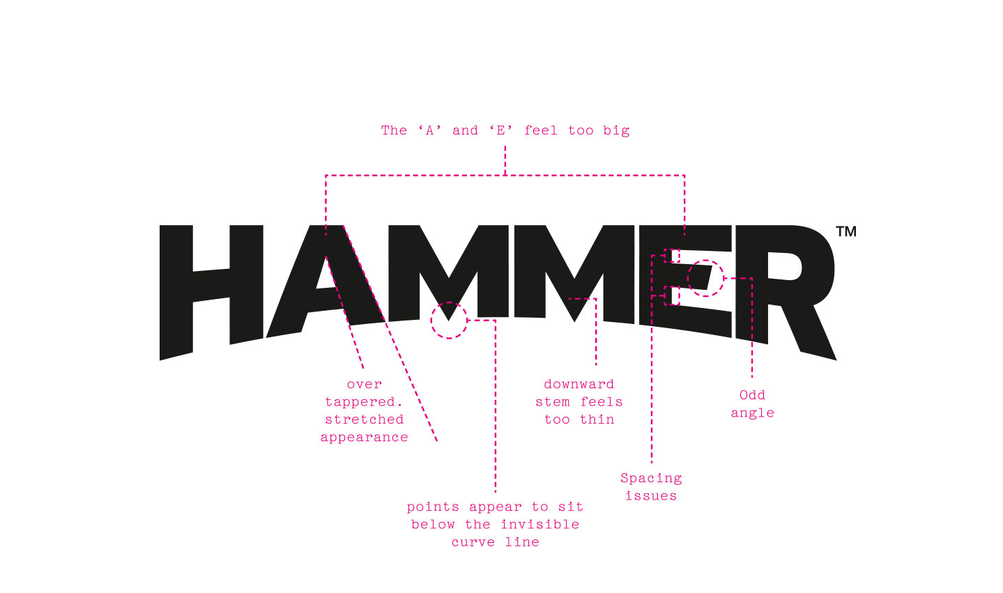
As part of our work we re-cut their new identity to give it the love and attention it deserved. We also worked on the guidelines and art direction for idents and print collateral. Our work focussed on the future ambitions, without losing their rich history and heritage. Hammer exists to provoke the human psyche through extraordinary story telling and we hope this continues to leave audiences on the edge of their seat.
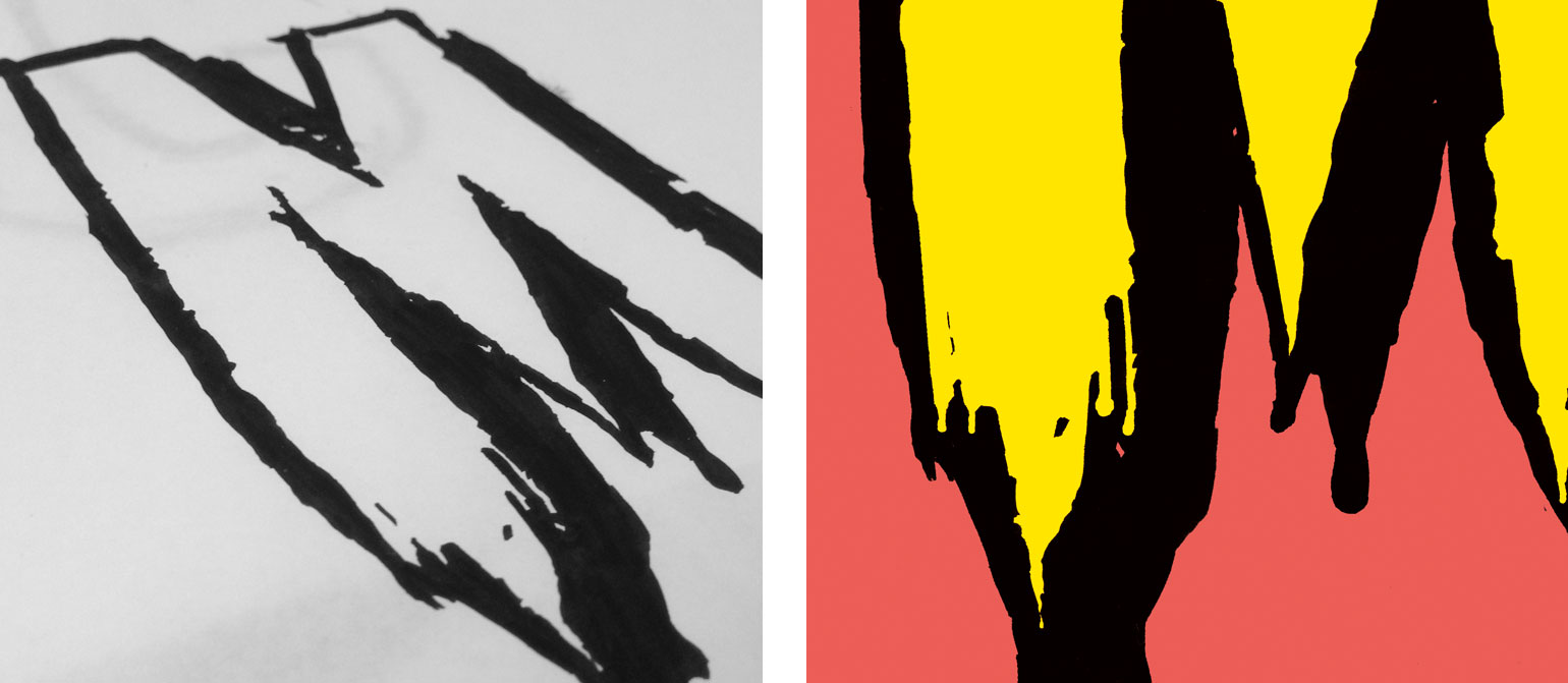
The new logo:
Brand guidelines:
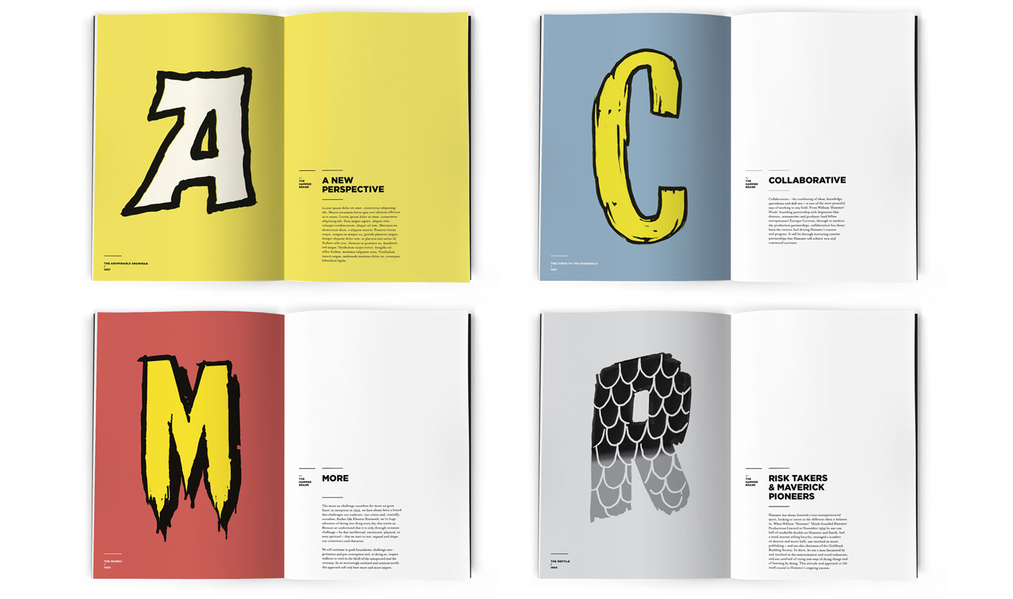
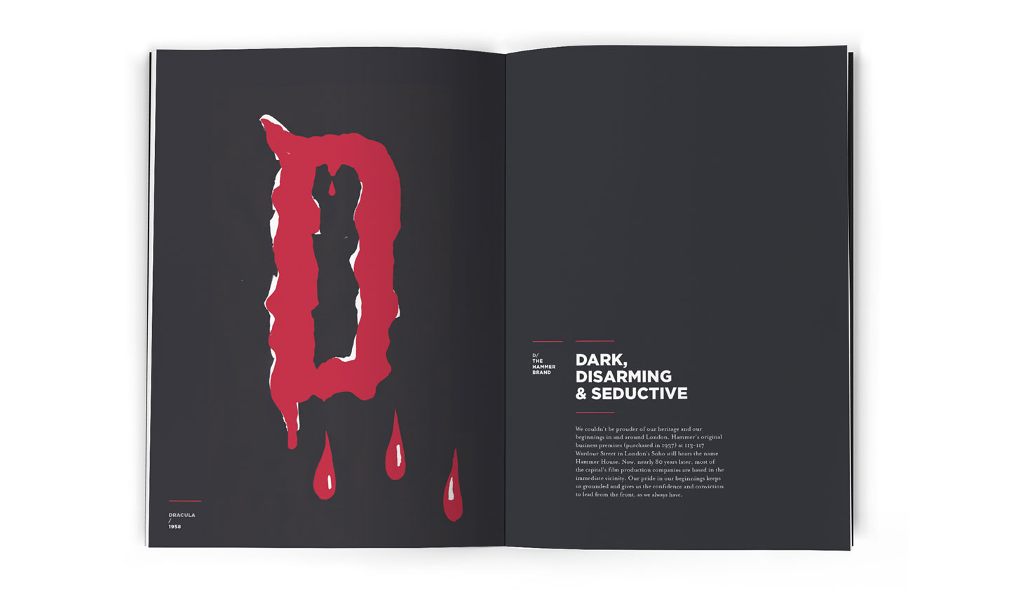
The A to Z of Hammer:
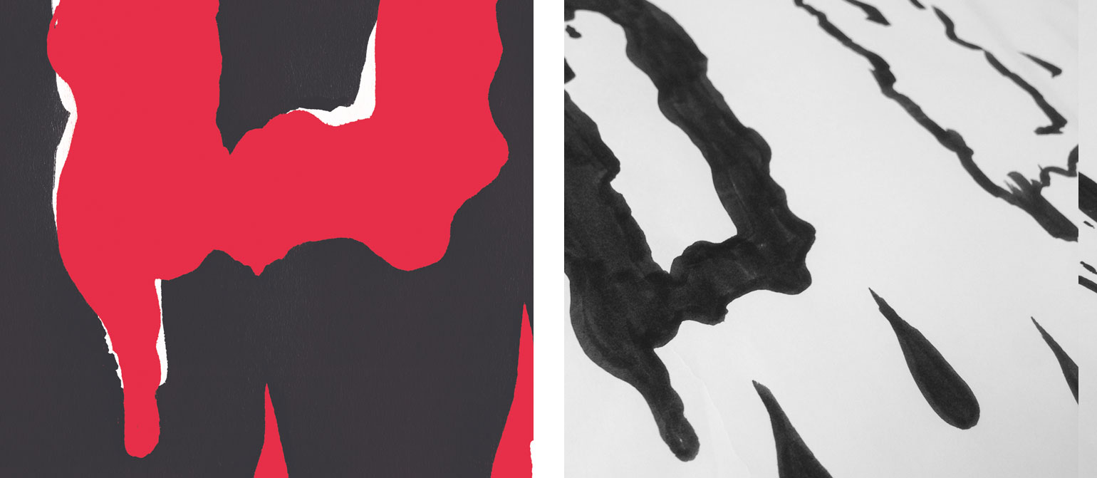
We created a brand book to show what Hammer stands for – changing misconceptions and reinforcing the principles that they have stood for from day 1. We re-drew the alphabet from the beautiful old posters that are as iconic as the films themselves, giving them a new lease of life with a bold colour palette and simple clean typography.
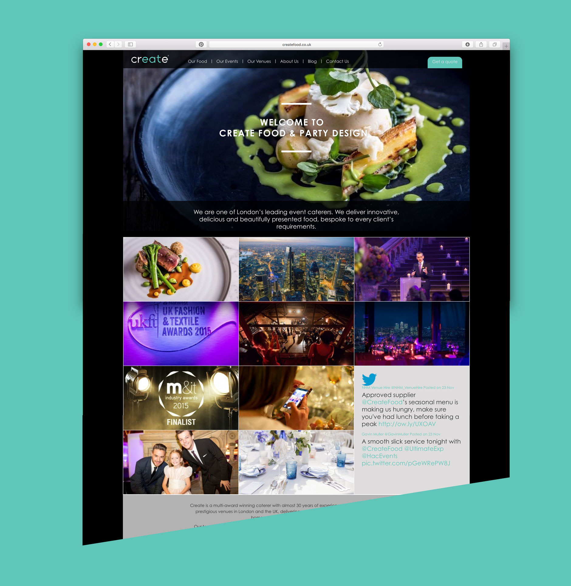
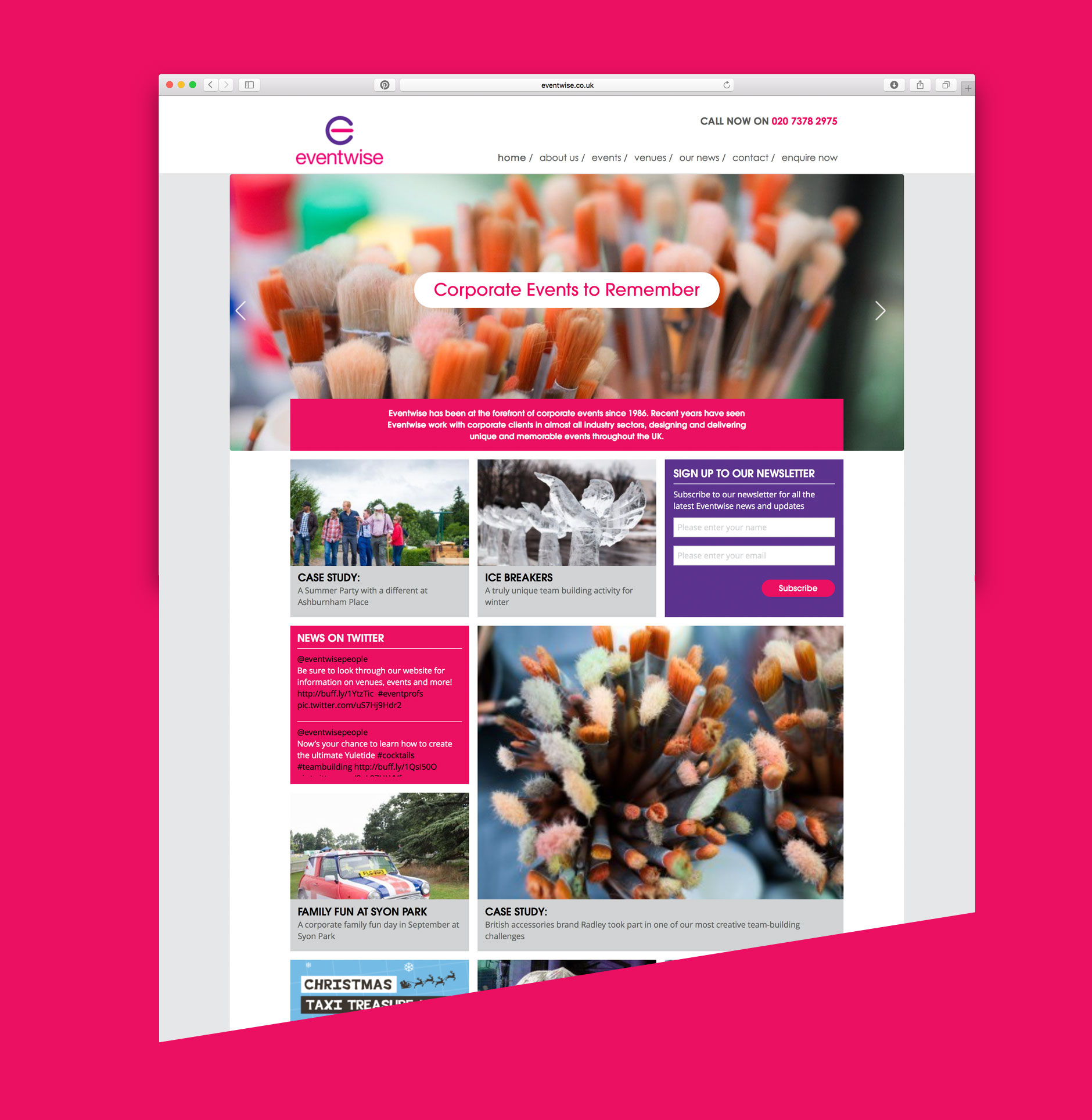
We recently delivered these 2 websites for the Concerto Group. Create Food are one of London’s leading event caterers. Delivering innovative, delicious and beautifully presented food for prestigious venues and events. Eventwise organises a host of event options for corporate clients. Both sites were built bespoke on the WordPress platform to enable the clients to update and manage content inhouse.