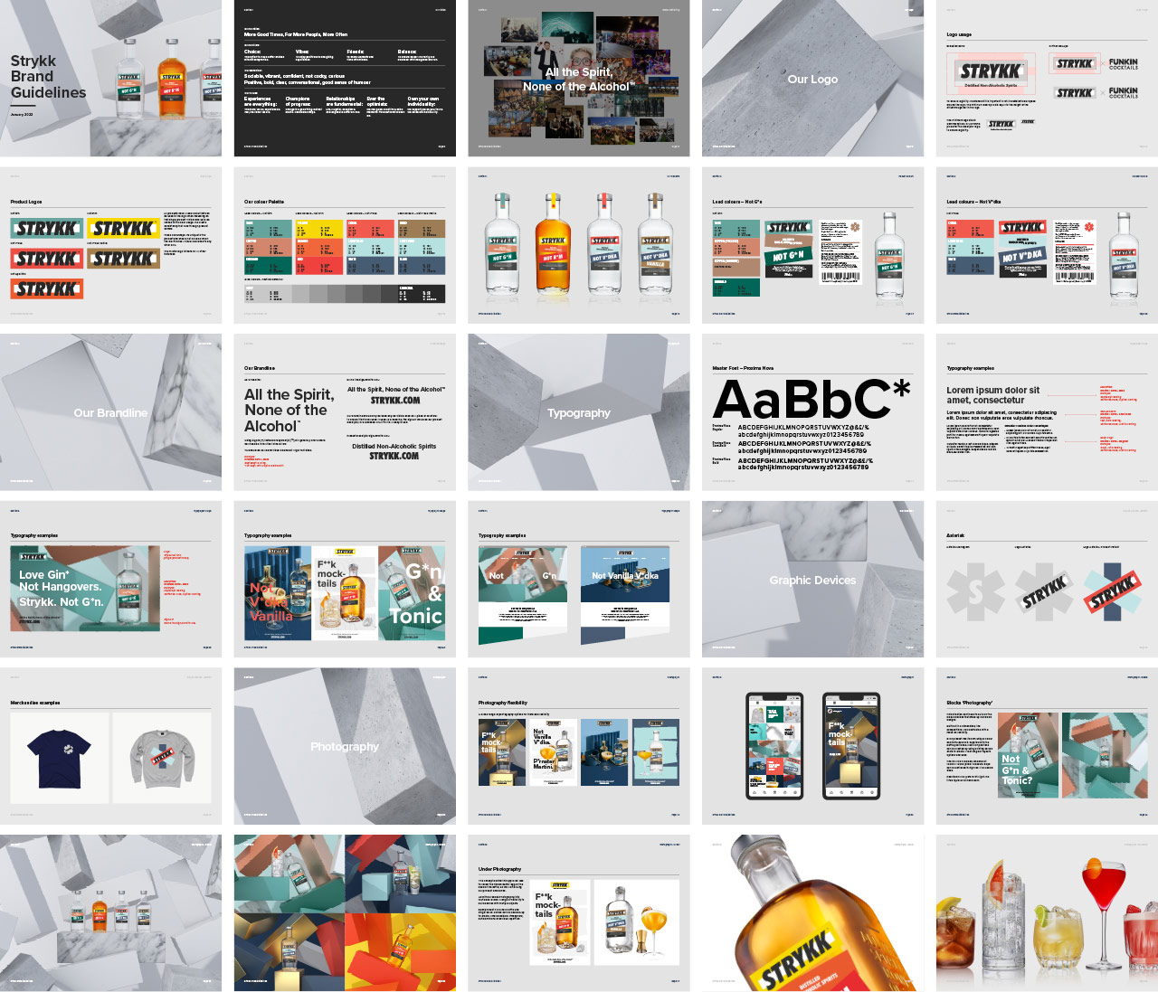
New brand identity and packaging work for Strykk, building on the original foundations we developed for them in 2018. Whilst our underlying strategy remains the same, a number of external factors have led to the need to reinvigorate the brand and re-align the growing portfolio.
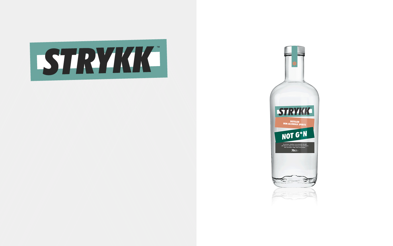
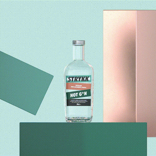
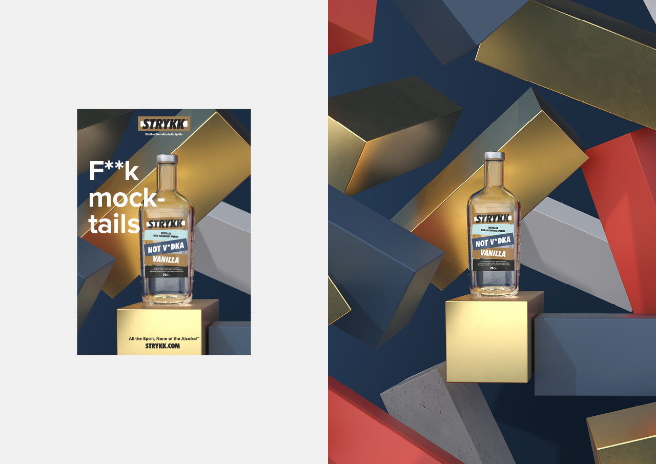
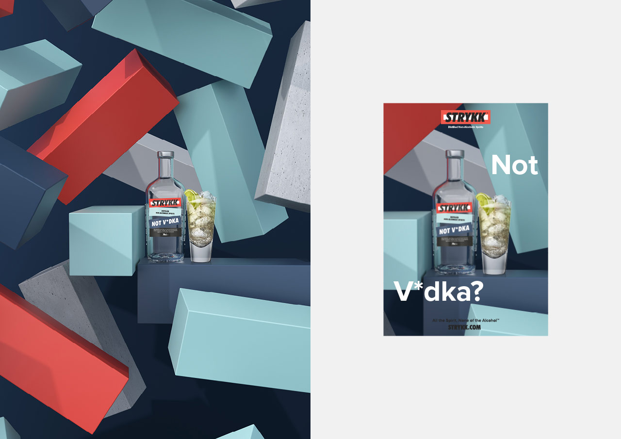
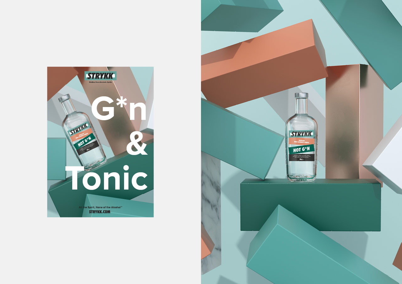
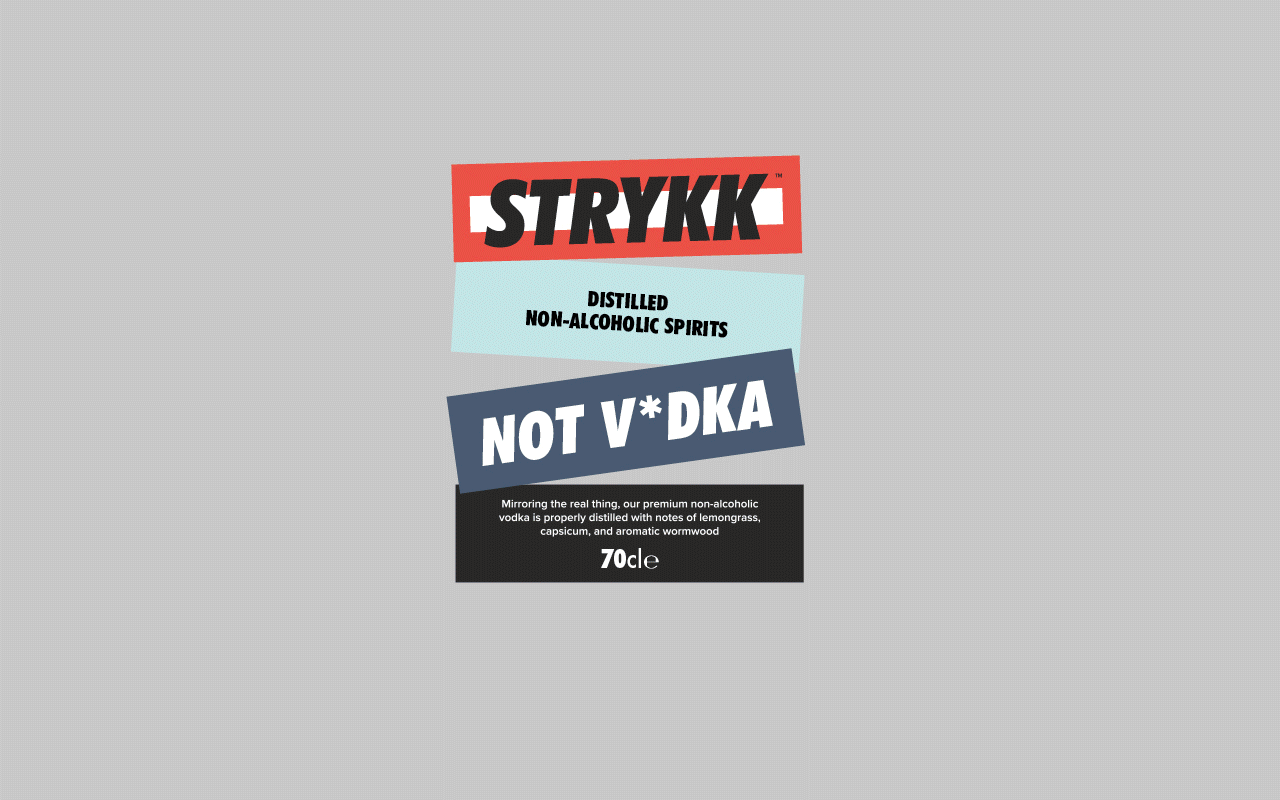
Starting with refinements to the logo, we opted for a holding shape that become the central block device that runs through the whole identity. Extrapolated from the three overlapping oblongs that created the original Strykk asterisk, it builds as the common thread for packaging, and is both exaggerated or subtly implemented as a consistent graphic device across all channel executions.
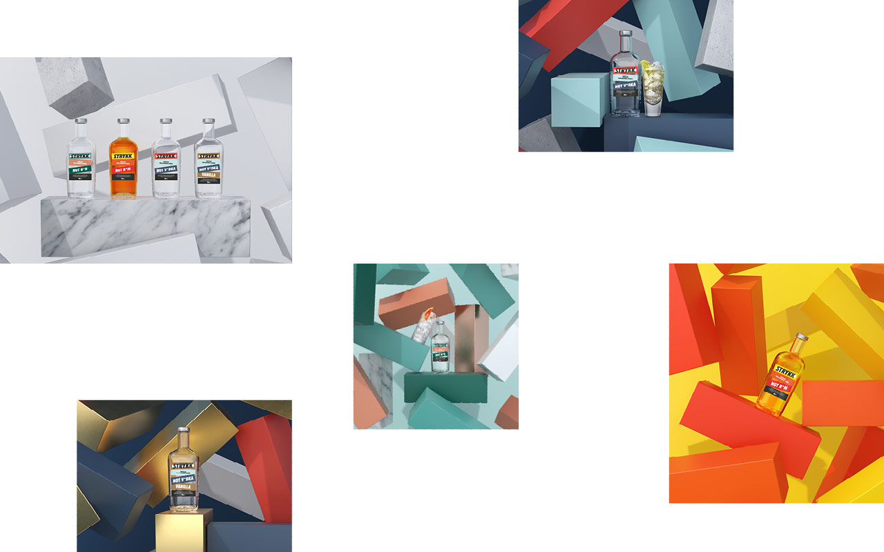
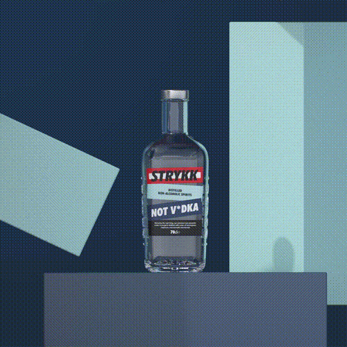
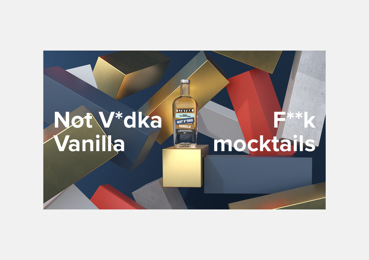
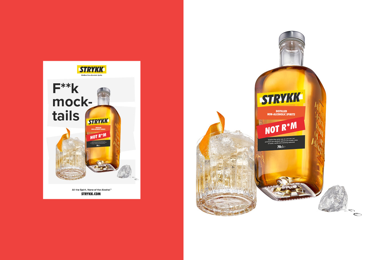
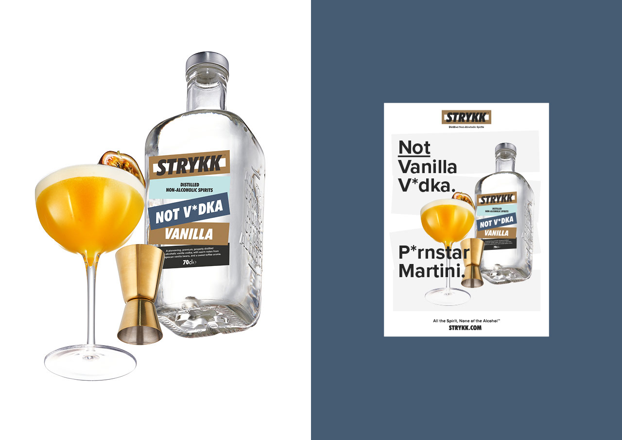
We’ve built on the strong colour palette, bringing in a wider set of bold and complementary tones to increase standout and build better differentiation between products. Typography opts for a more refined sans serif and a slight coming of age, moving from the unruly uppercase Futura Condensed used previously, to a more conversational approach. As before our focus on tone of voice remains confident and unapologetic, a key pillar of the brand.
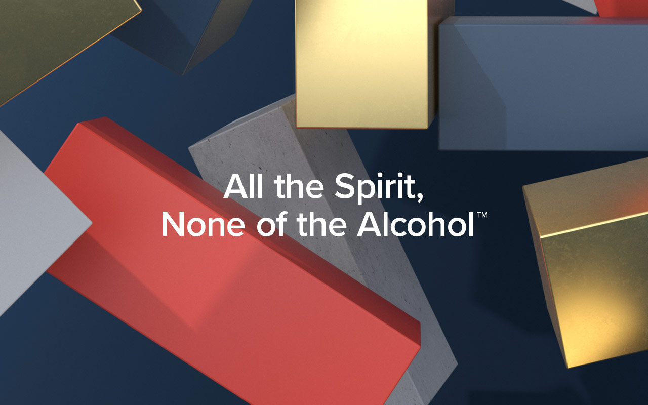
The original strategy and positioning remains, inspired by the idea of enjoying a night out without compromise. A love of going out, being part of the story and not missing out. Removing the stigma of ‘not’ drinking, by delivering a product with the taste and complexity to build a proper drink with 0% Abv Distilled Spirit.
At the heart Strykk remains disruptive and steadfast in its unwillingness to just fit a mould. A bold approach that needed a bold brand, unapologetic and full of energy. We’re not about kooky craft, forced aspiration or self-importance. Uniquely summed up as; All the spirit. None of the alcohol.
“Limited Edition Design has been at the forefront of Strykk’s brand and visual identity since its inception in 2018. When tasked to overhaul and update the packaging and identity, a clear, comprehensive, and succinct sprint process was followed from start to finish – and at the highest standard. What has resulted, we feel, is a truly world class brand and visual identity, all packaged up neatly in a set of bullet-proof Brand Guidelines to mark the next stage of our business growth.”
Tom Glover, Brand Manager, Strykk
Agency: Limited Edition Design
Creative Director: Paul Greeno
3D & Motion: Sergio Beggiato
Photography: Jeremy Baile
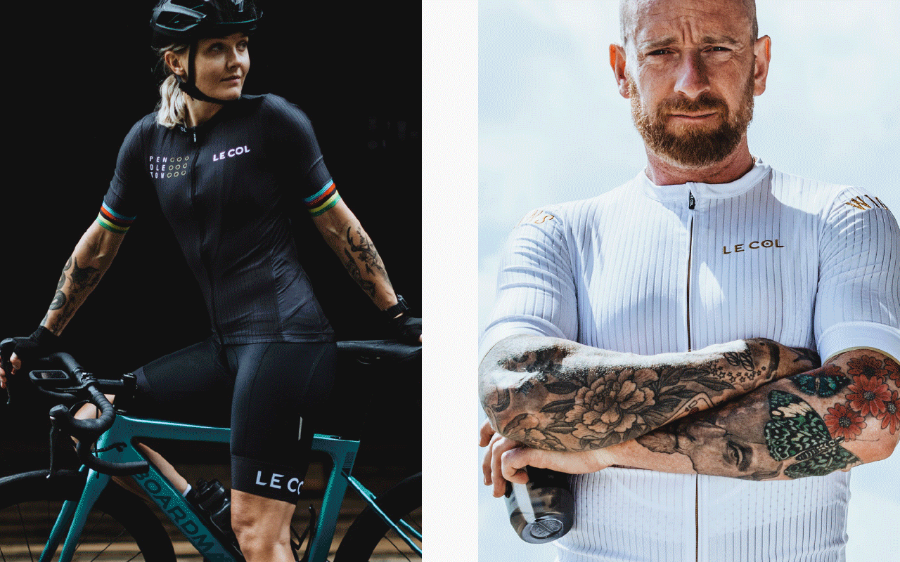
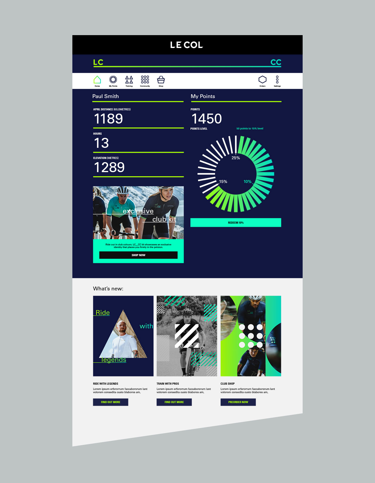
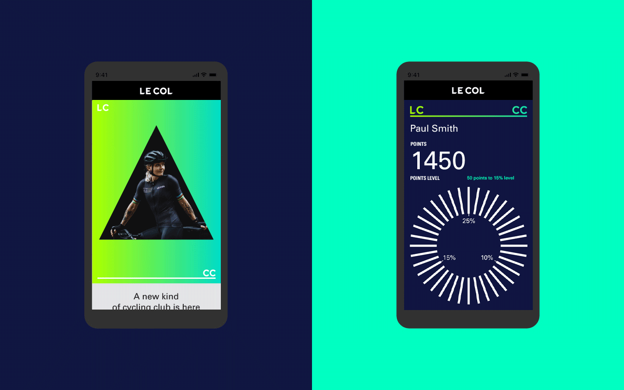
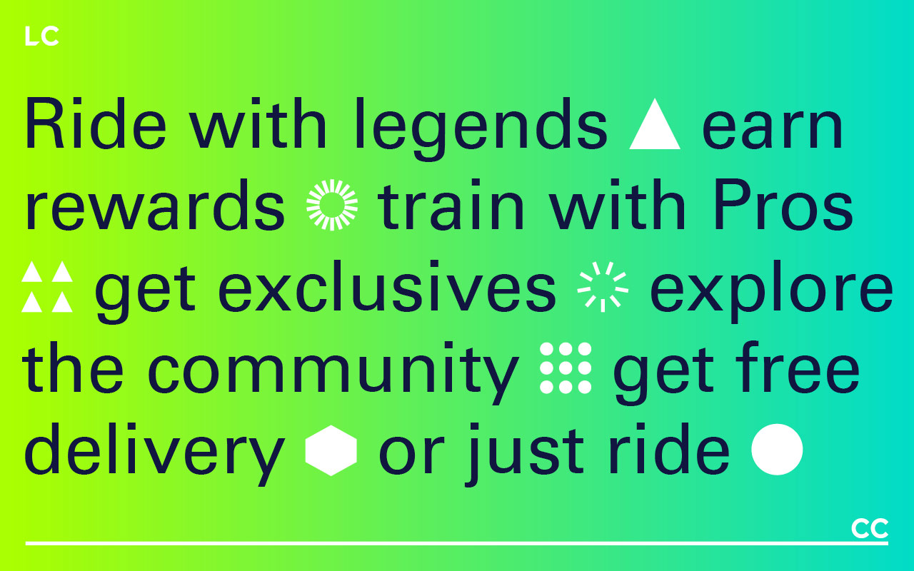
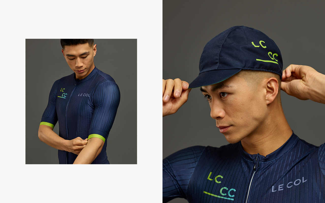
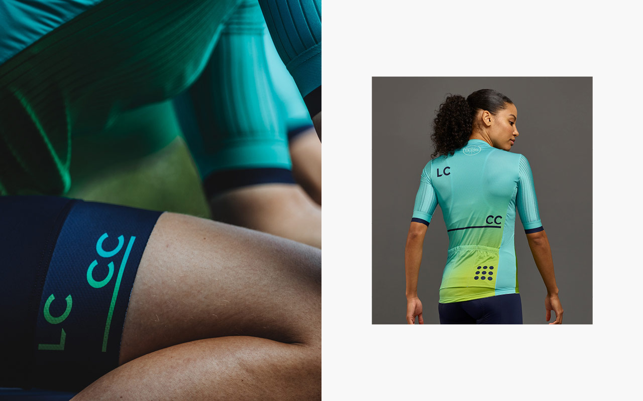
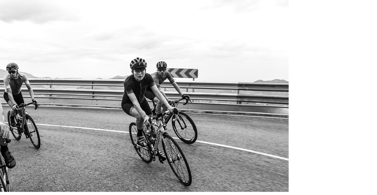
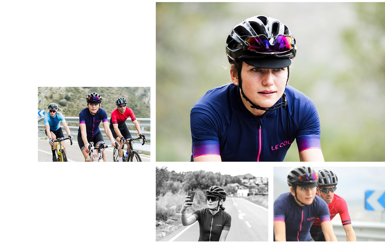
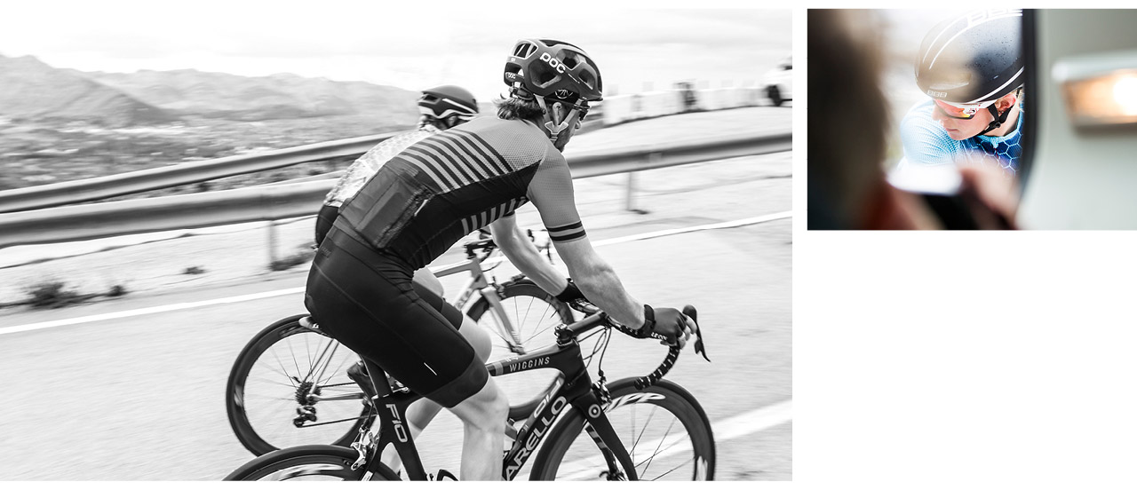
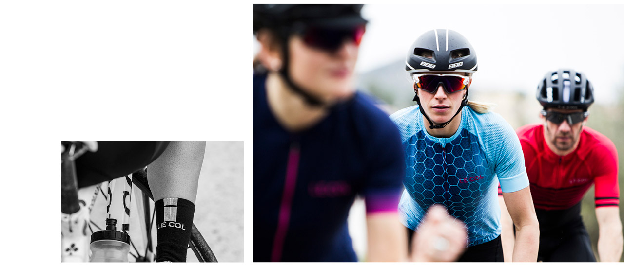
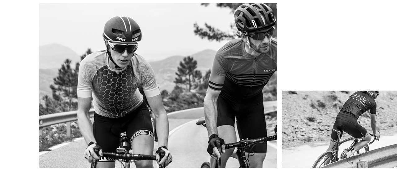
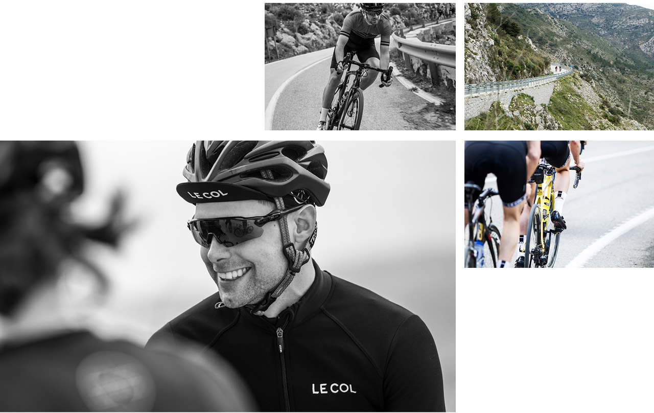
Welcome to LC___CC – Le Col Cycling Club. Ride with legends, train with Pros and turn your effort into rewards. A community united by stories, shared goals and hard-and-fast ambition. The most rewarding club in cycling.
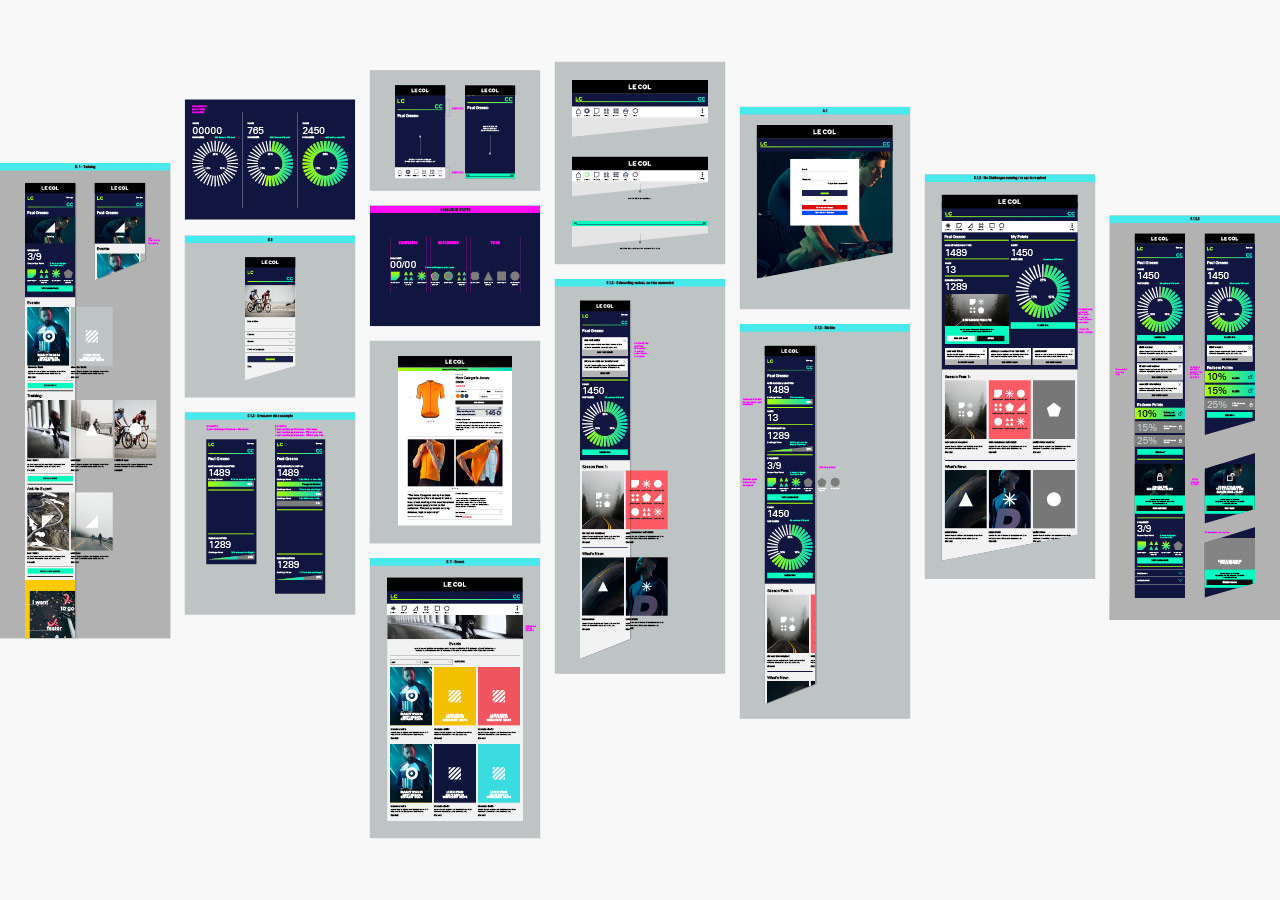
Limited Edition Design worked with the senior Le Col team, to develop a branding strategy, messaging and a dynamic new visual and verbal identity — including user interface and experience design across hundreds of items and details to enable development agency Savvy, and the internal team of developers, to bring the complex platform build to life. From the outset, the concept was a digital first approach, so the visual identity had to be flexible enough to work across multiple strands, whilst ensuring a sense of community and warmth.
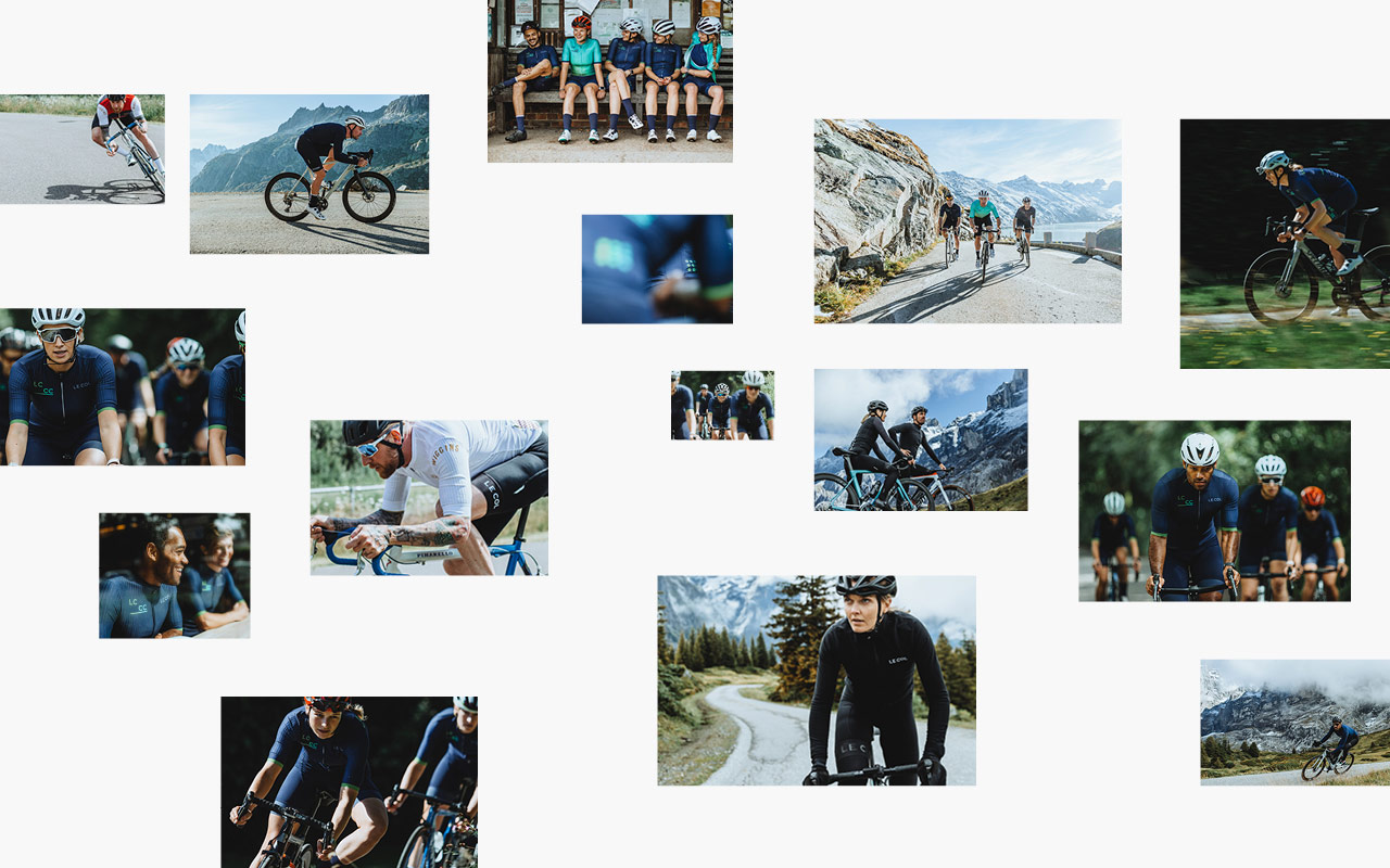
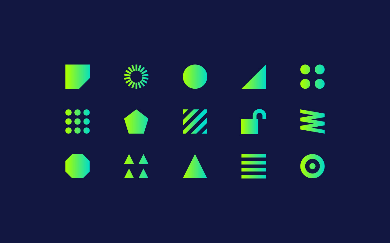
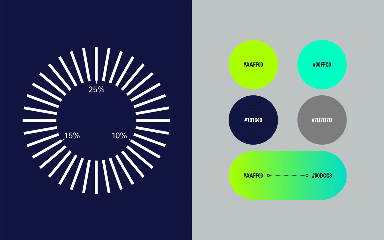
The visual design approach comprises of entirely new colour systems, photography, typography, iconography and signature graphic assets in both static and animated forms. The iconography plays a key role in creating a visual language and design system for the content, whilst typography plays to a fluid, more conversational tone to maintain that warmth.
A small selection of our work below, with an update to follow soon.
The identity also runs across mens and womens Kit design that is only available to members:
Wireframing and interaction design to integrate Club into the overall eCommerce design we’ve developed for the master brand. Maintaining enough of a unique feel that it can standout and be signposted as part of the customers user journey.
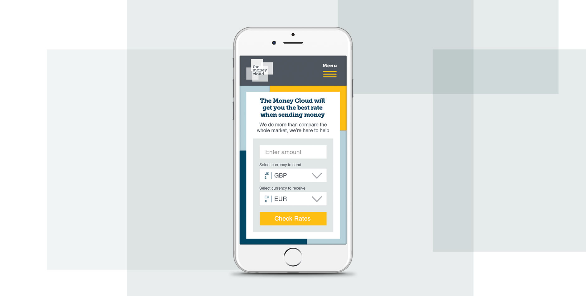
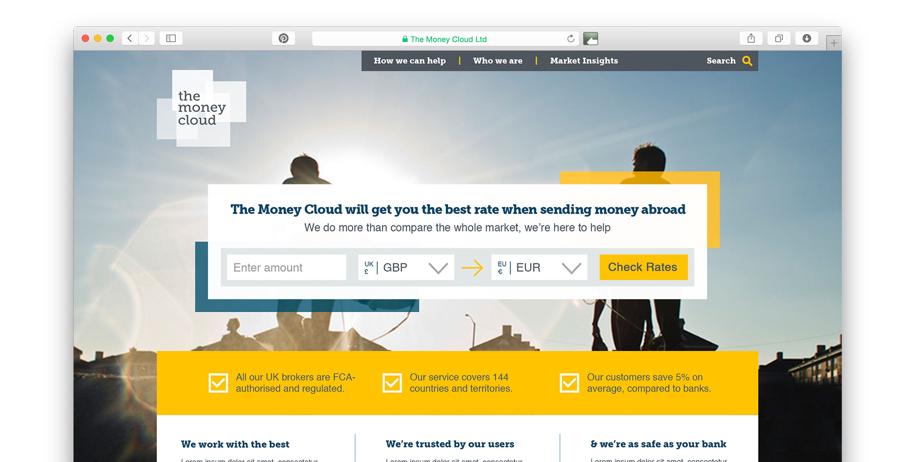
We delivered the branding and art direction for this impressive start-up, The Money Cloud. The Money Cloud is the international money service for the modern global economy. It allows users to get the best rates for money transfers worldwide. With RPM digital working on the in-depth strategy and user experience, we were tasked with translating that into a visually engaging brand. The results are clean and simple, focussing on the conversion tool and their trustworthy and transparent service.
The logo:
The mobile version of the website is designed to bring the conversion tool to the fore in a way that mimics an app:
The website focusses on the user experience with the conversion tool at the centre:
The logo is designed to be flexible, and can adapt and animate to add subtle movement and diversity:
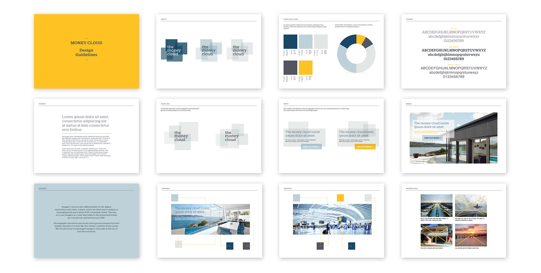
Guideline and strategy document to ensure consistent brand use:
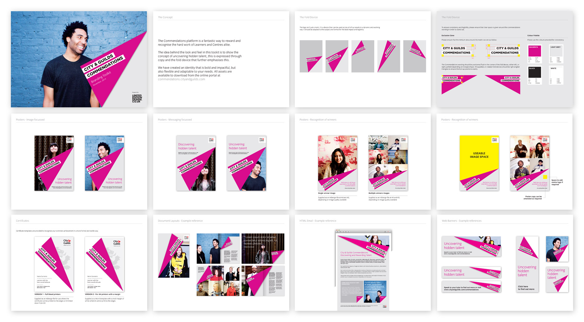
The City & Guilds Commendations platform has been created to reward and recognise the hard work of Learners and Centres alike. Commendations is designed to bridge the gap between Medals of Excellence and The Lion Awards, both of which we have also worked on and developed identities for.
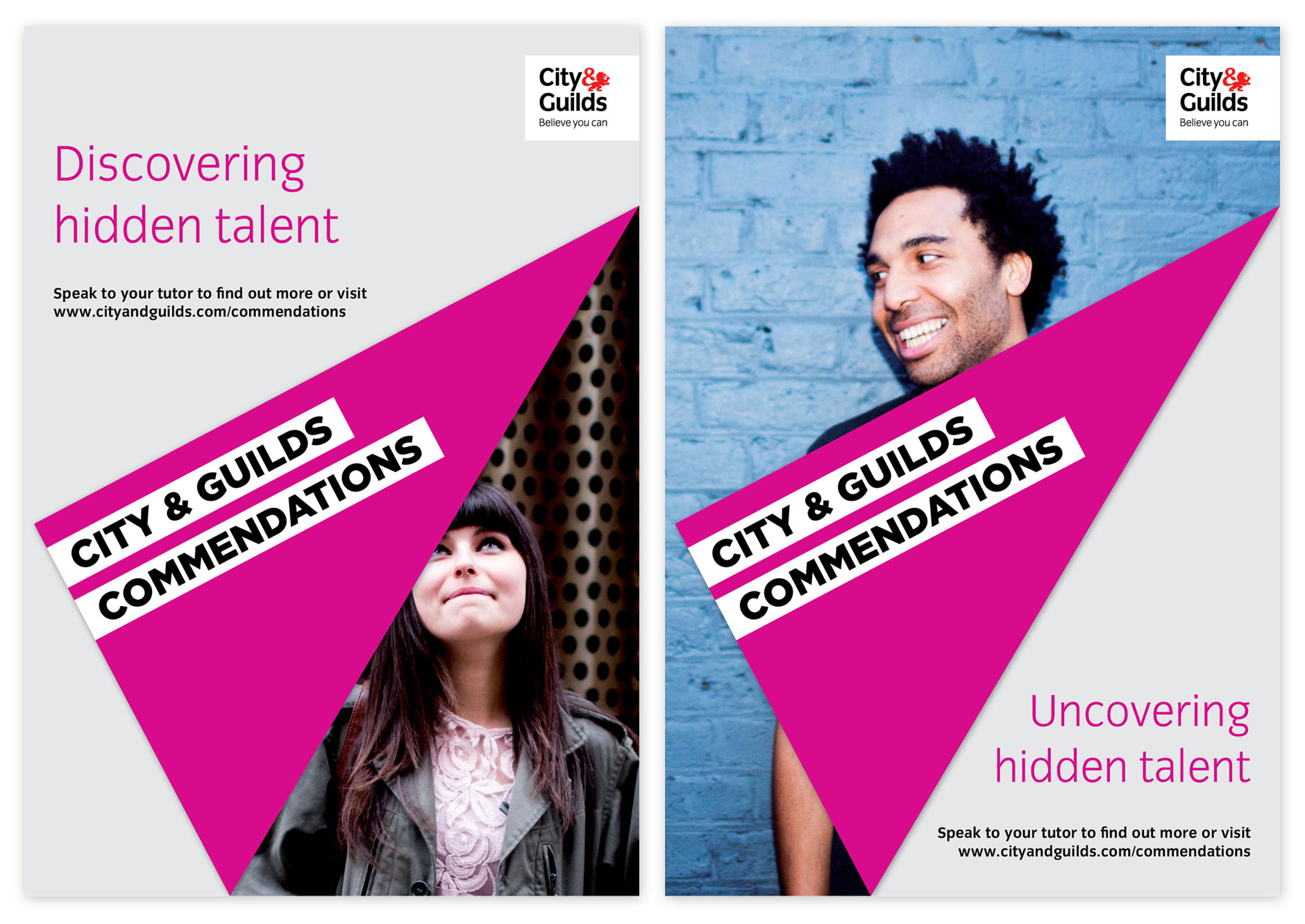
Our idea behind the look and feel is to show the concept of uncovering hidden talent, this is expressed through copy and the fold device that further emphasises this. We have created an identity that is bold and impactful, but also flexible and adaptable to allow colleges and centres to incorporate it into their own guidelines.
Posters:
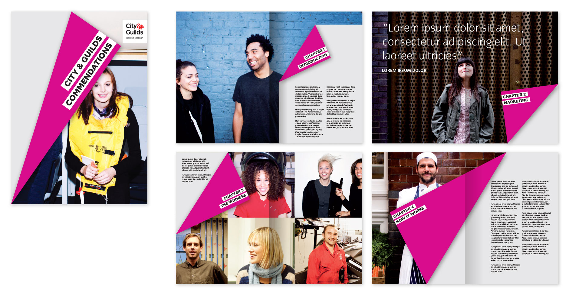
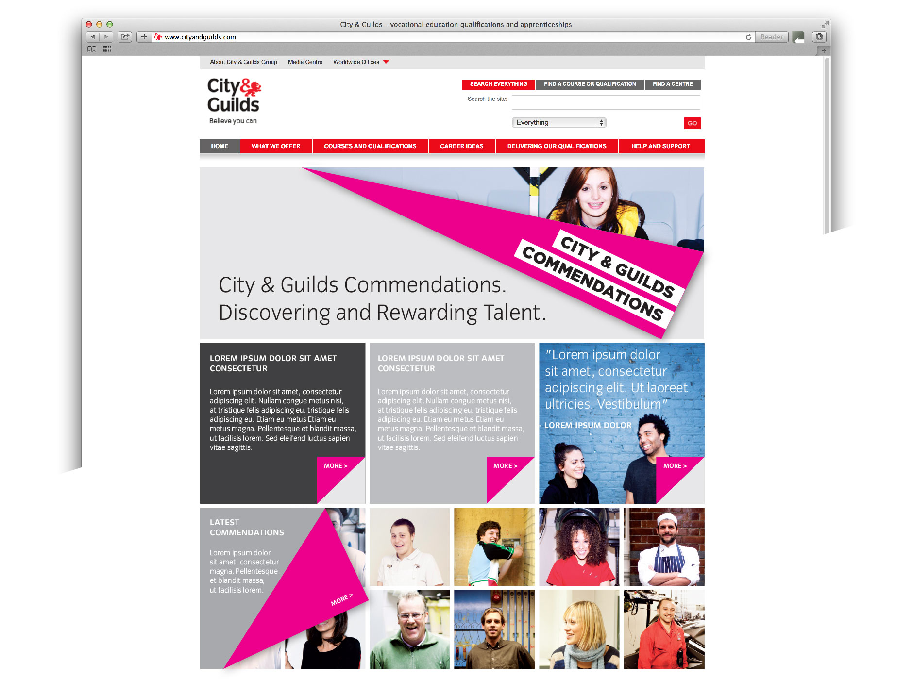
Toolkit examples showing how the identity can be used in print design:
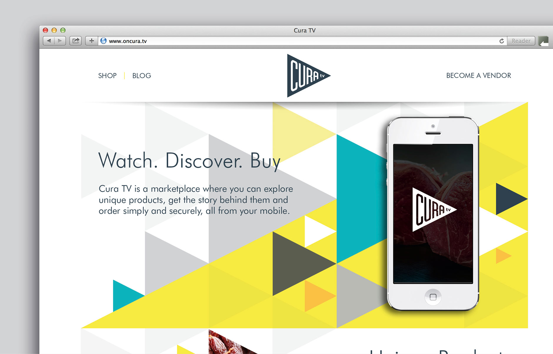
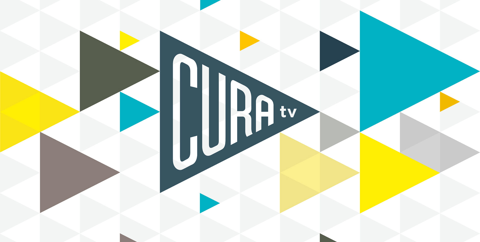
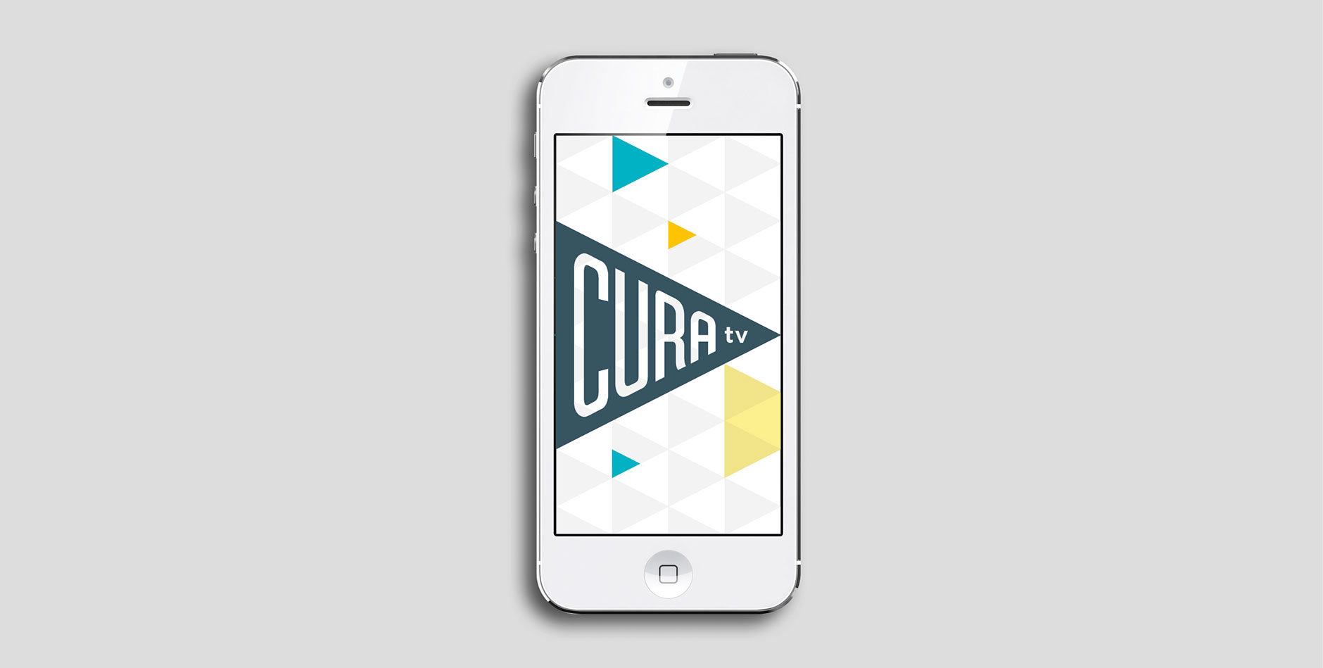
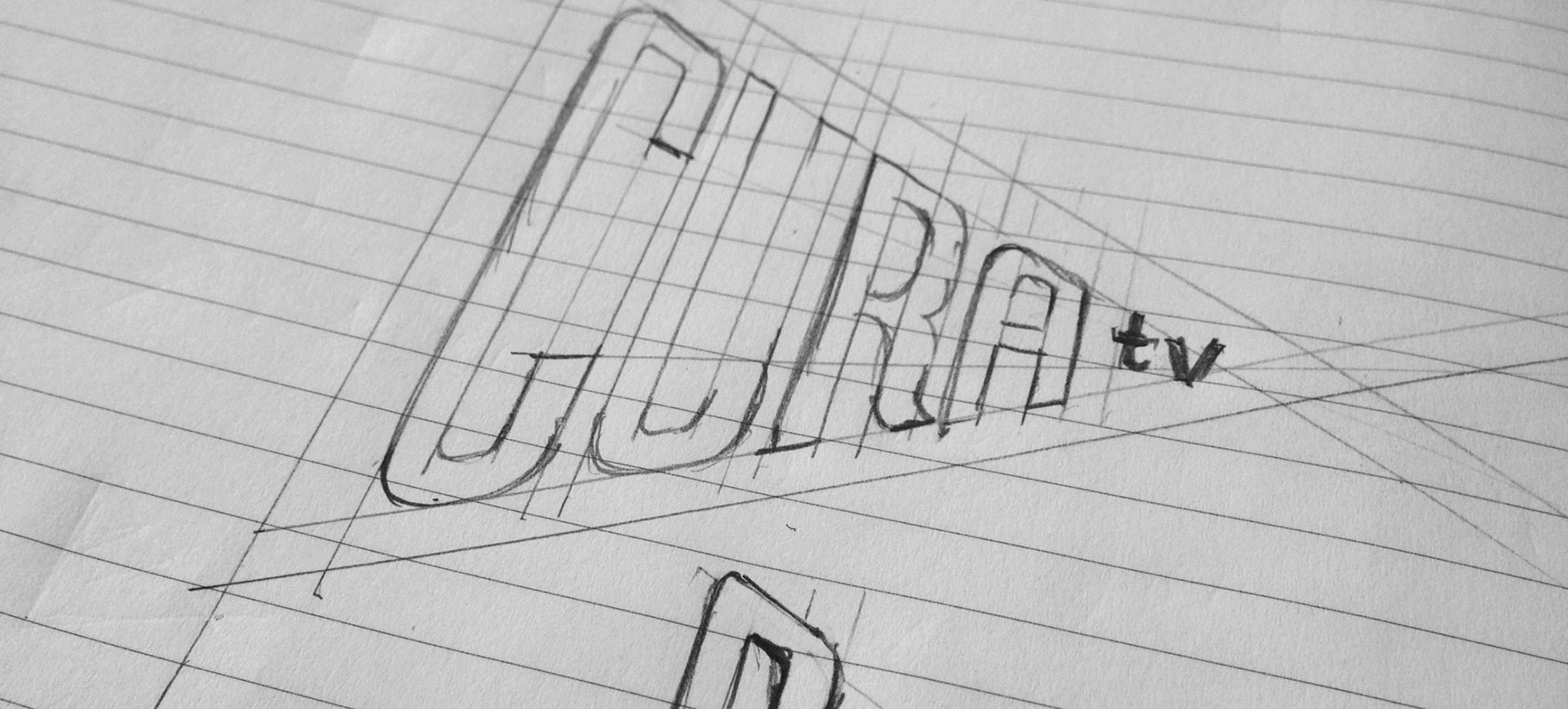
We’ve been working on the strategy and branding for the launch of Cura TV. The Cura platform transforms mobile commerce through the power of video. Cura TV is a video-based mobile marketplace that provides a tailored and immersive shopping experience, on-demand. The platform allows vendors to easily shoot videos, tell engaging stories about their products and sell directly to consumers, all from directly within the app, including simple and secure payment and nationwide delivery. Cura TV is built on the world’s fastest transactional video platform.
We’ve worked with the team to craft a brand platform and robust design strategy and then turn that thinking into practice. The Beta version is now online and the app will follow shortly. It’s a brilliant concept and we’ve really enjoyed working with the team to bring this to life.