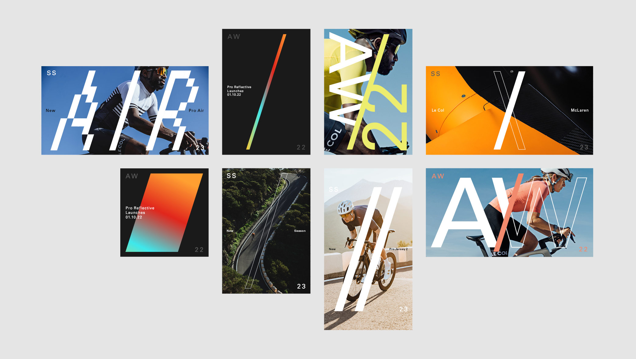
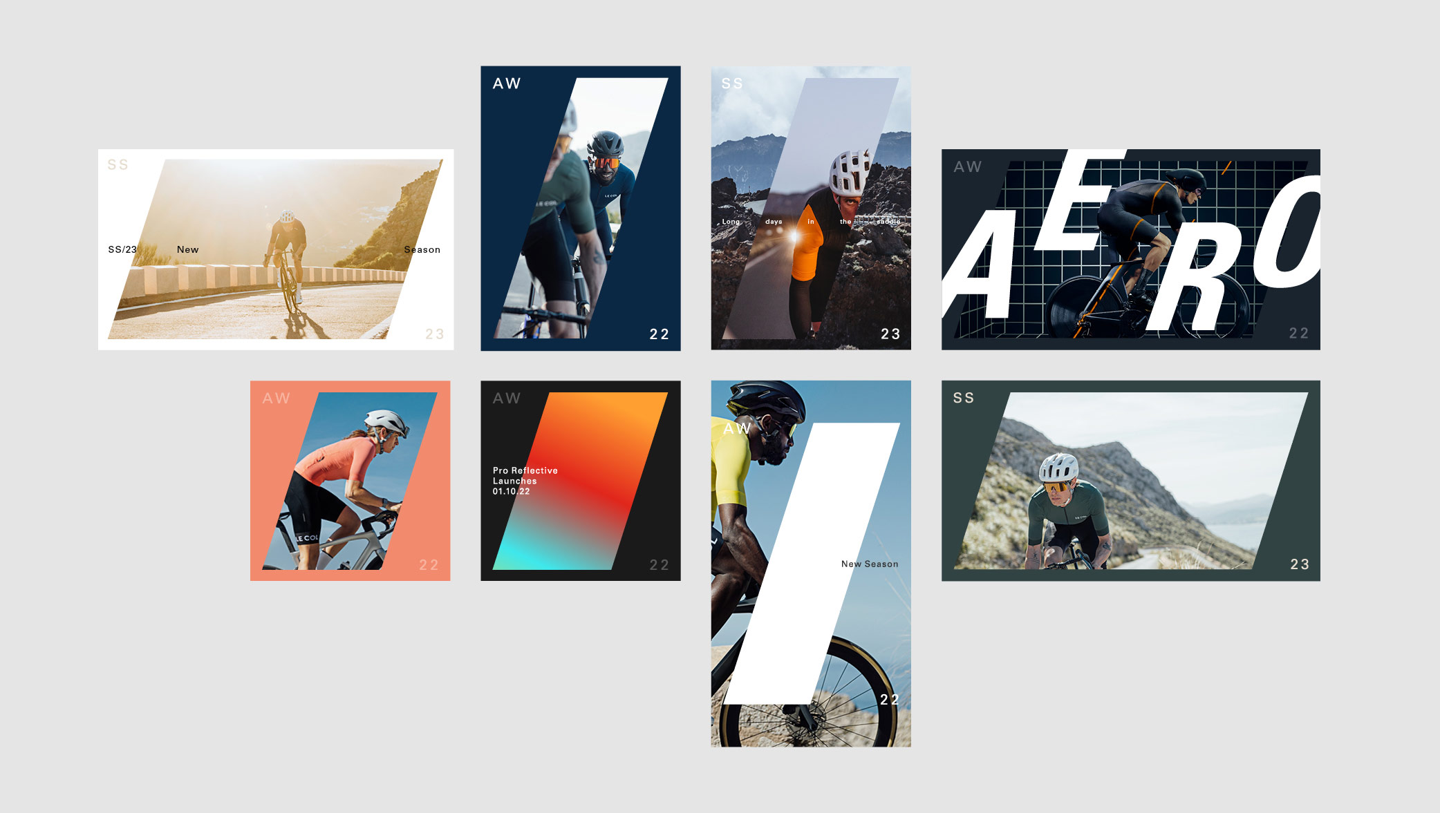
Having audited the brand development from previous seasons, we created a flexible identity system that would streamline internal resource without impacting on the quality of the output. By producing an over-arching design system, we were able to build an identity that was dynamic enough to deliver simpler, more templated, solutions when the deadlines are tight, whilst having the ability to be flexible on larger campaigns. We also delivered a large proportion of the output and art direction across all platforms.
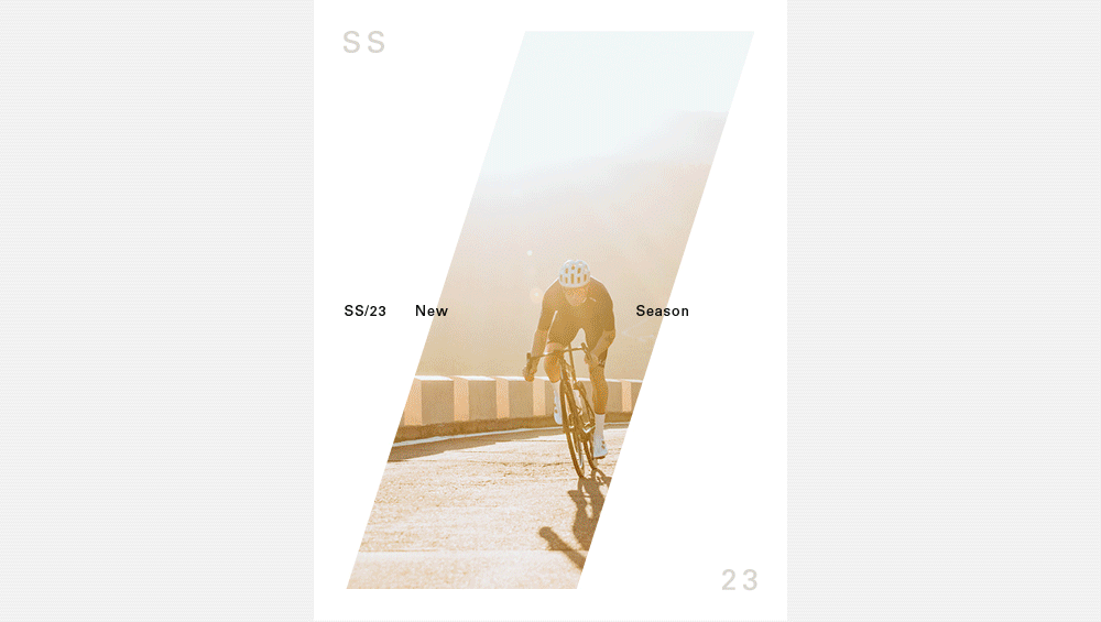
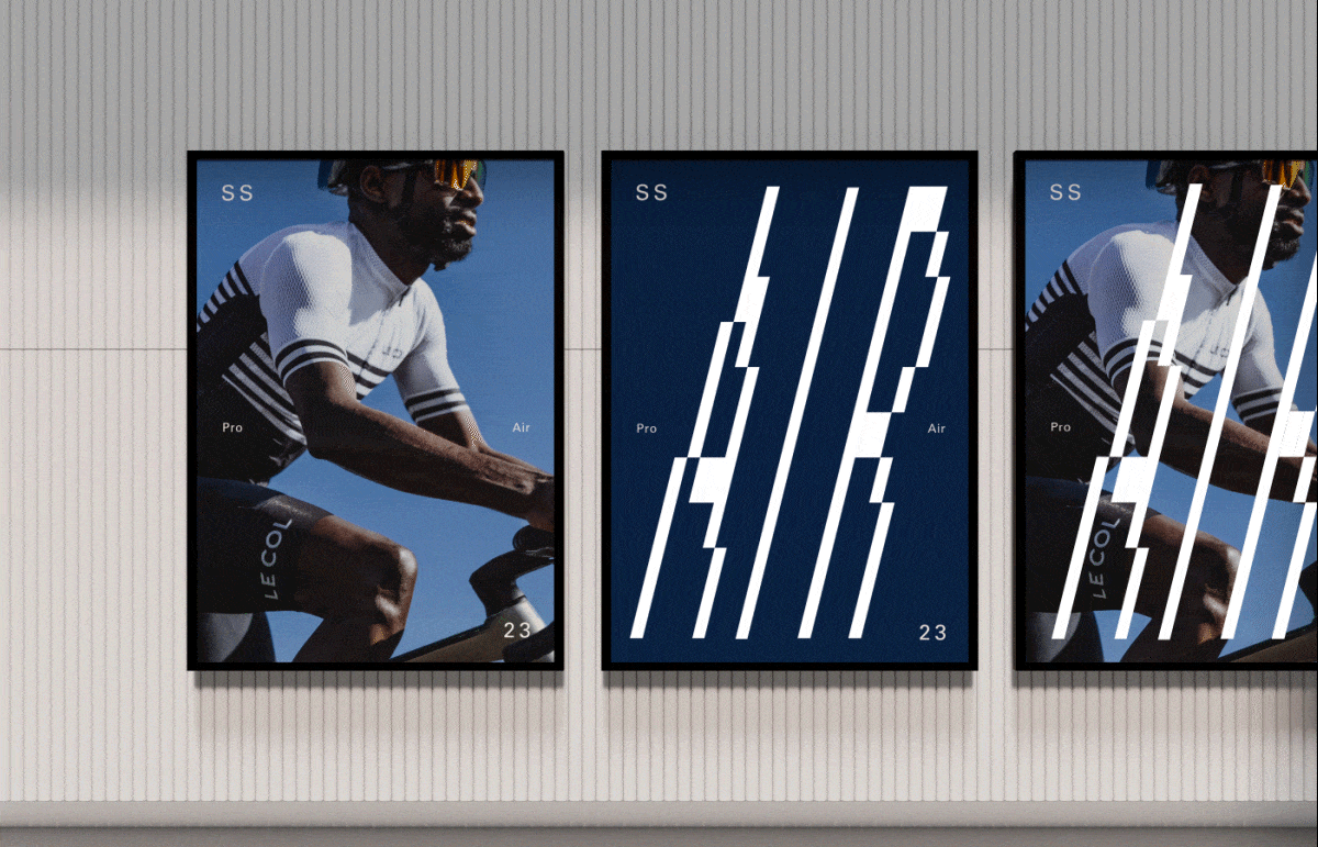
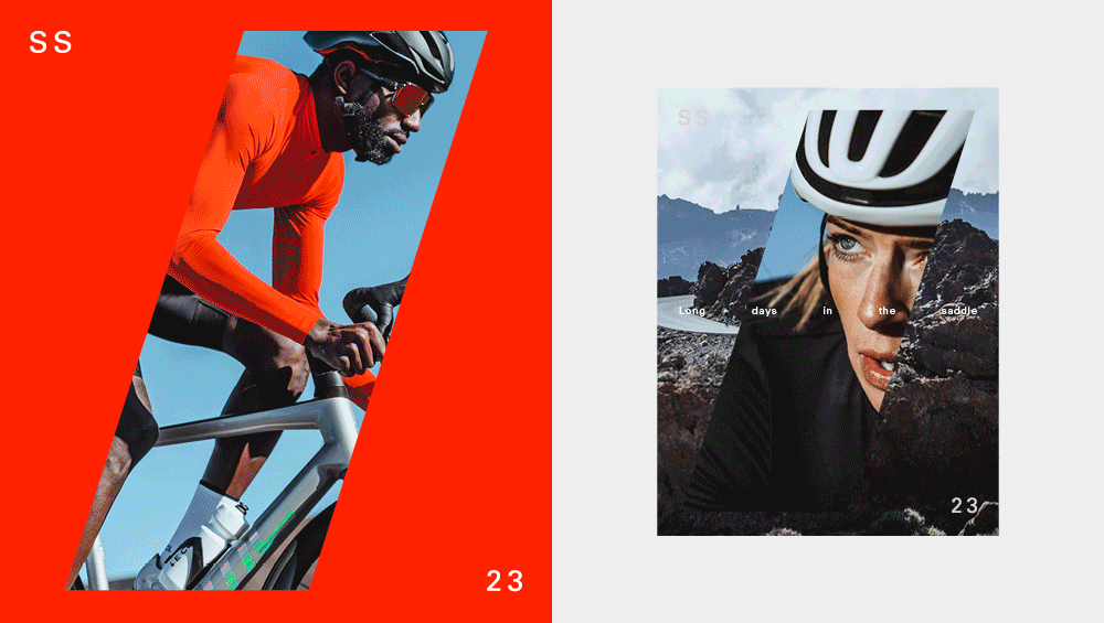
The forward slash solution and frame device allowed room for creativity, maintaining a consistent look and feel across multiple products and ranges. The key was to find a solution that enabled typography, a key brand pillar, to work effectively as well as leave room to be playful without stringent rules that would stifle exploration.
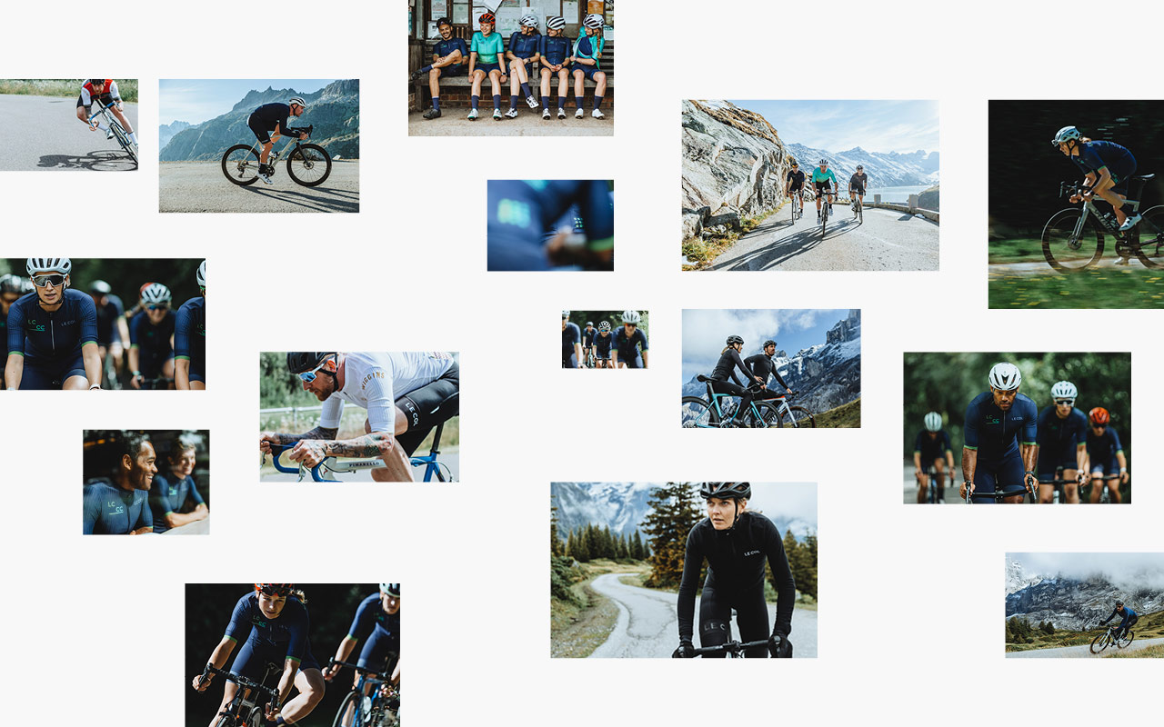
As part of the brand audit, we also gave recommendations on shoot direction and photography approaches for social media and all digital platforms. As well as creating a new set of brand guidelines across eCrm, to again, pull back valuable time that was being lost, but also to raise the bar on the quality of output. We overhauled the teams approach to studio & model photography that considers UI and UX work that is in progress.
Our unique position allows us to really understand where the internal team can make better use of resources, driving competitive edge and deliver across multiple channels effectively. A future-proofed approach that can be built on for the next season.
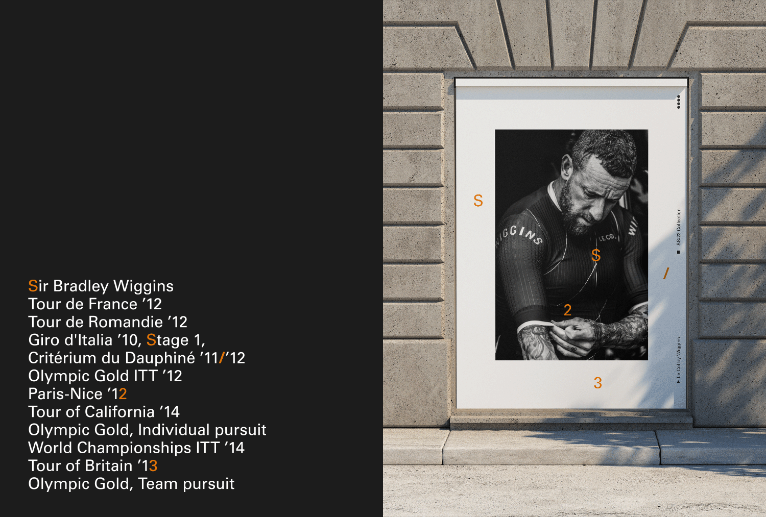
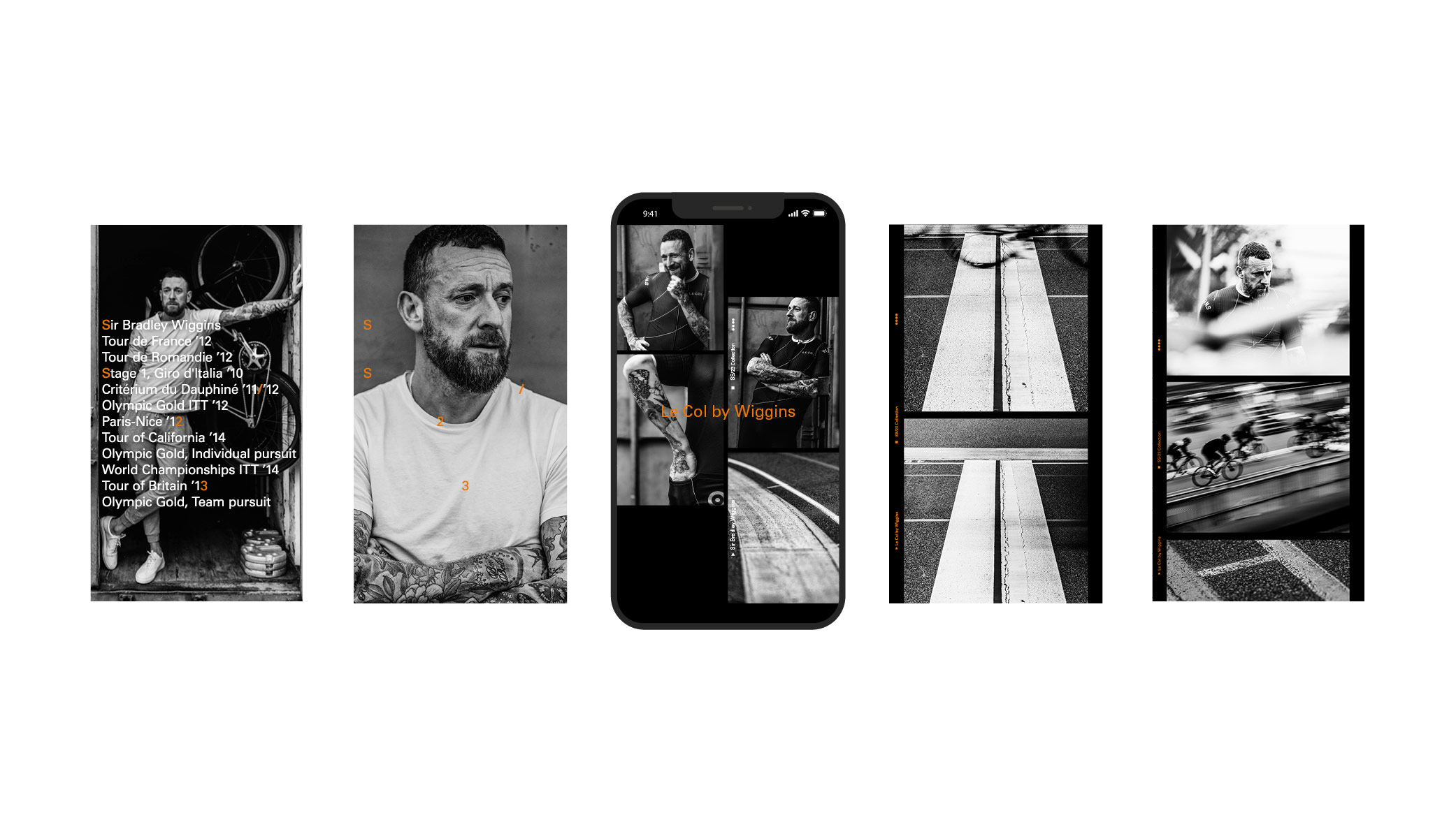
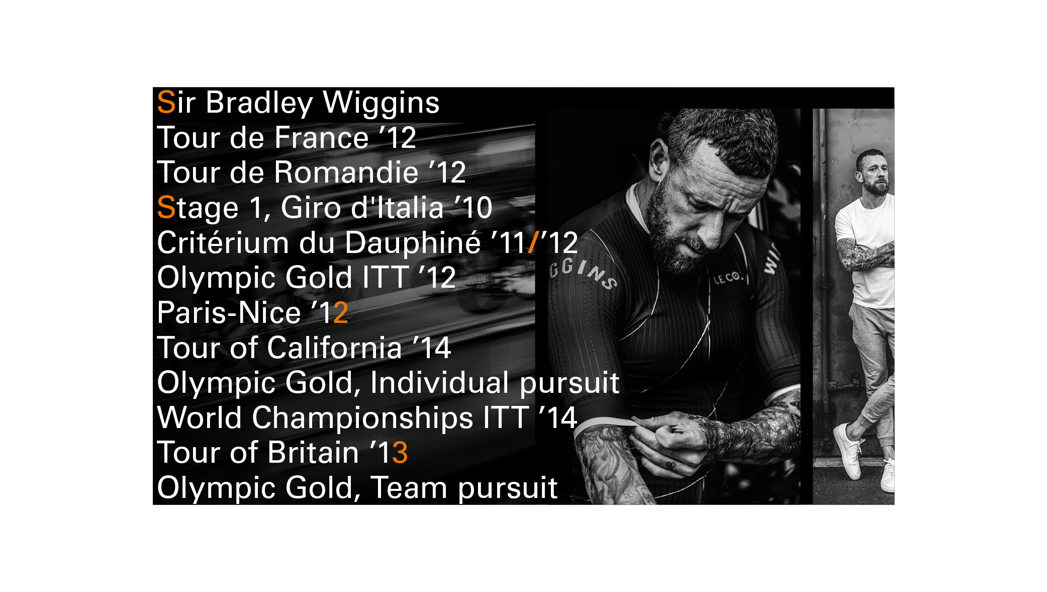
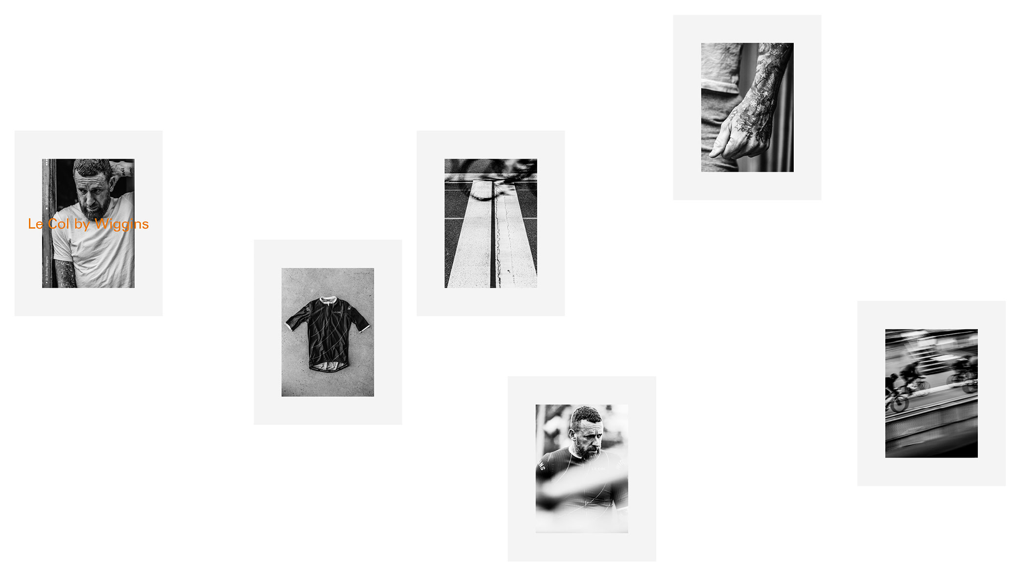
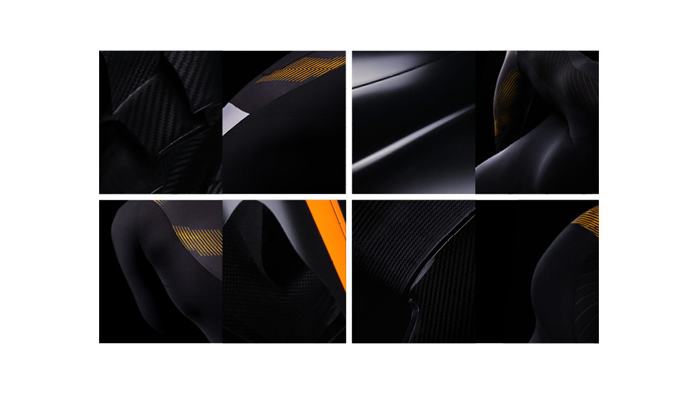
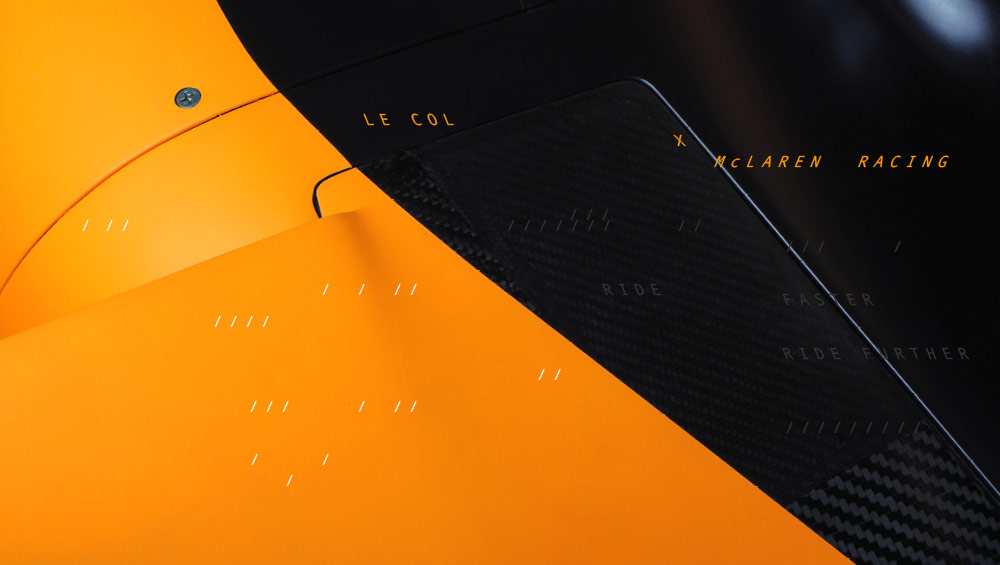
Adapted and applied to the Le Col x Wiggins launch:
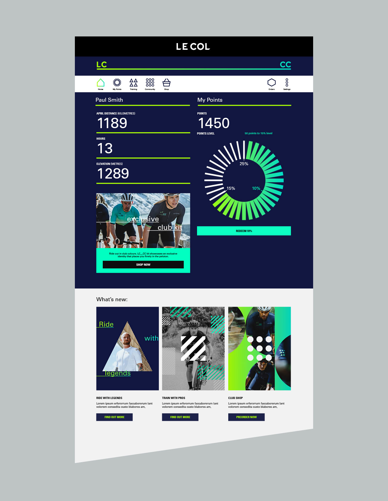
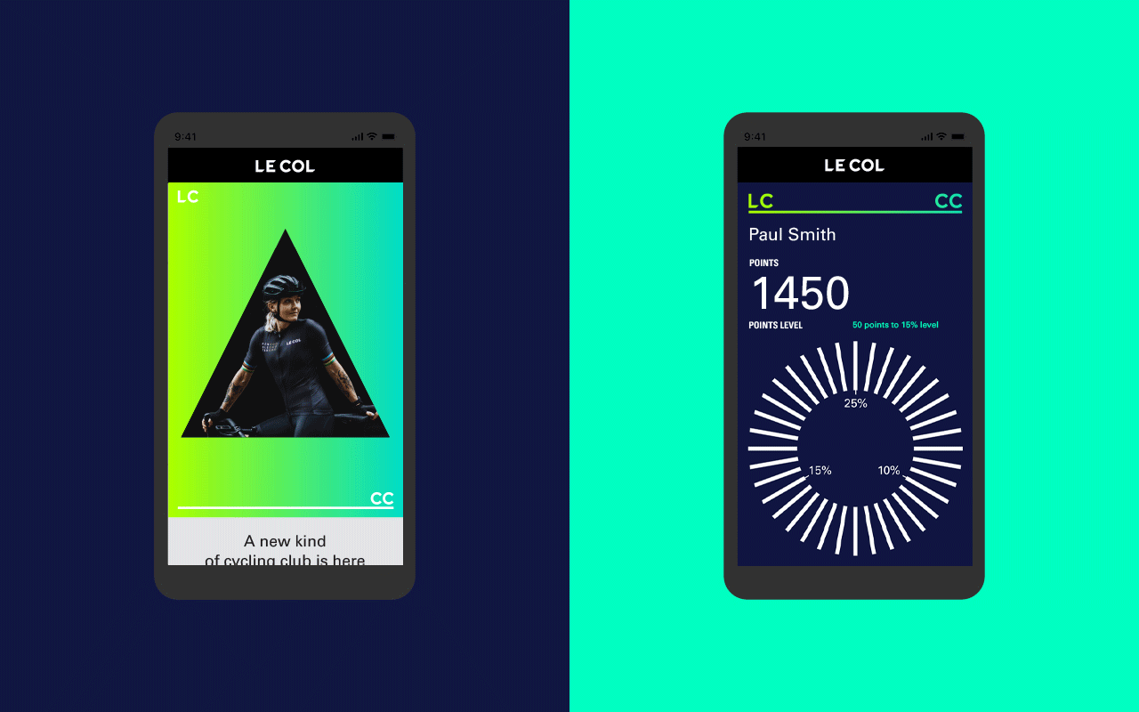
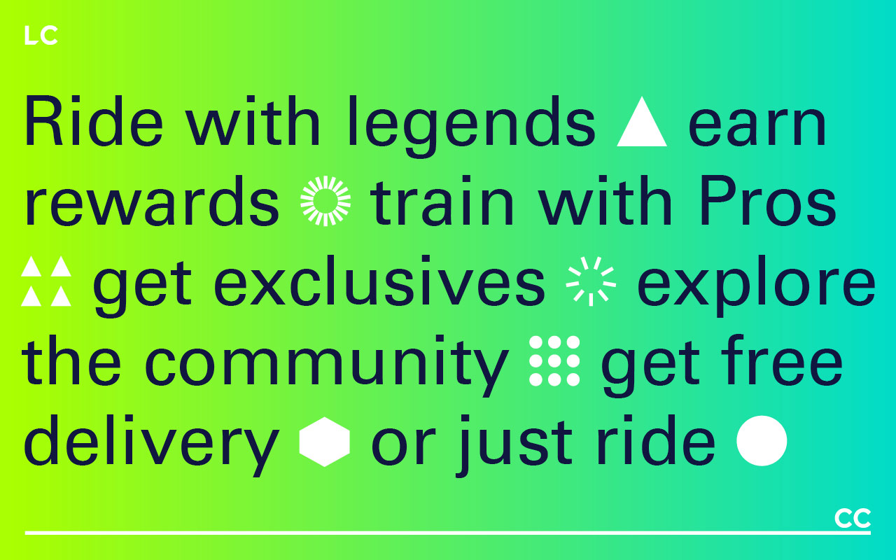
Welcome to LC___CC – Le Col Cycling Club. Ride with legends, train with Pros and turn your effort into rewards. A community united by stories, shared goals and hard-and-fast ambition. The most rewarding club in cycling.
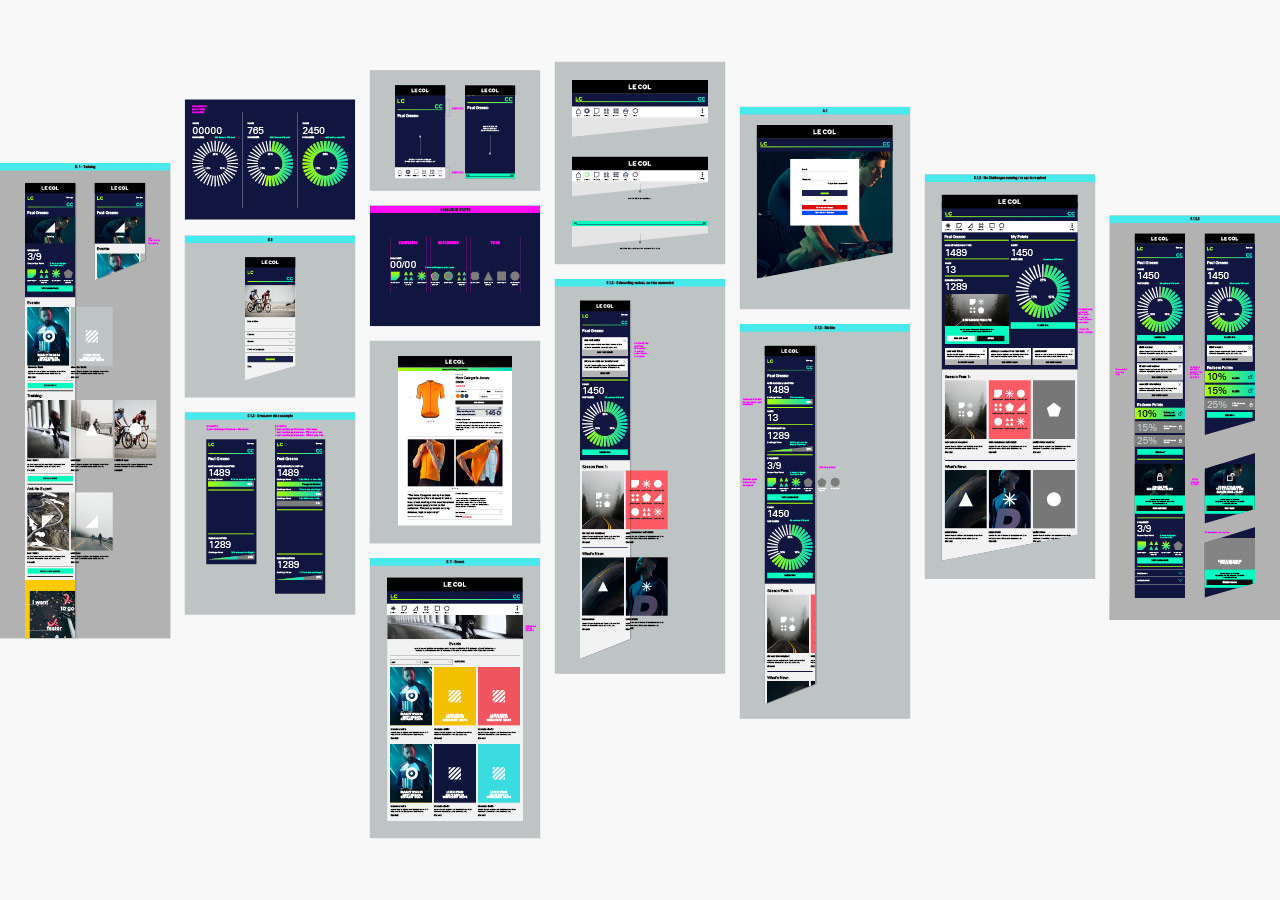
Limited Edition Design worked with the senior Le Col team, to develop a branding strategy, messaging and a dynamic new visual and verbal identity — including user interface and experience design across hundreds of items and details to enable development agency Savvy, and the internal team of developers, to bring the complex platform build to life. From the outset, the concept was a digital first approach, so the visual identity had to be flexible enough to work across multiple strands, whilst ensuring a sense of community and warmth.
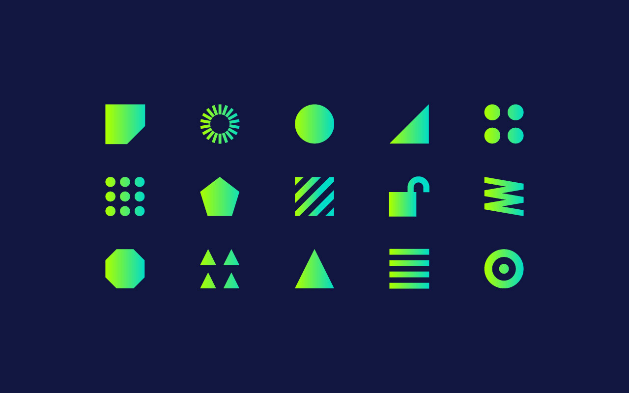
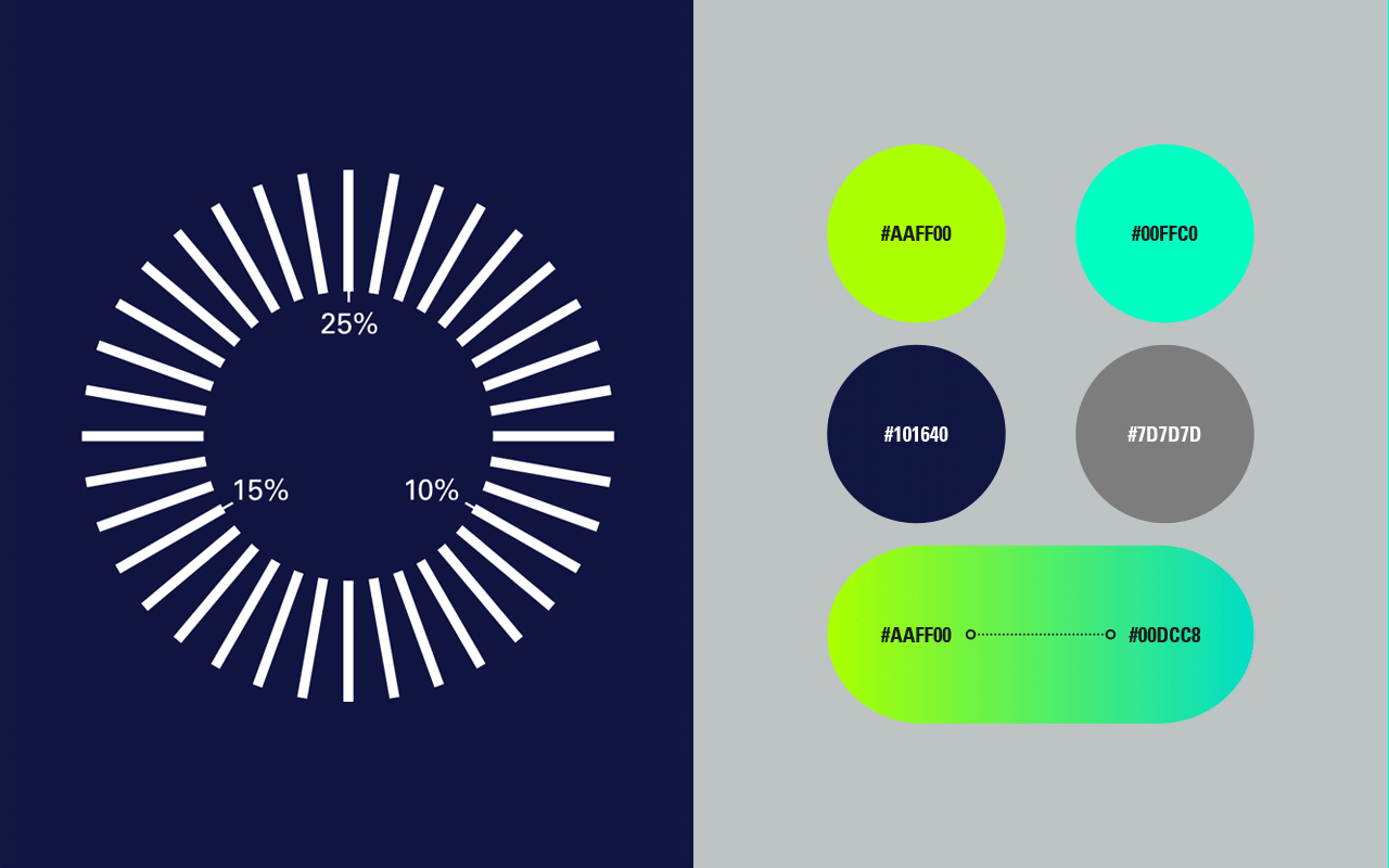
The visual design approach comprises of entirely new colour systems, photography, typography, iconography and signature graphic assets in both static and animated forms. The iconography plays a key role in creating a visual language and design system for the content, whilst typography plays to a fluid, more conversational tone to maintain that warmth.
A small selection of our work below, with an update to follow soon.
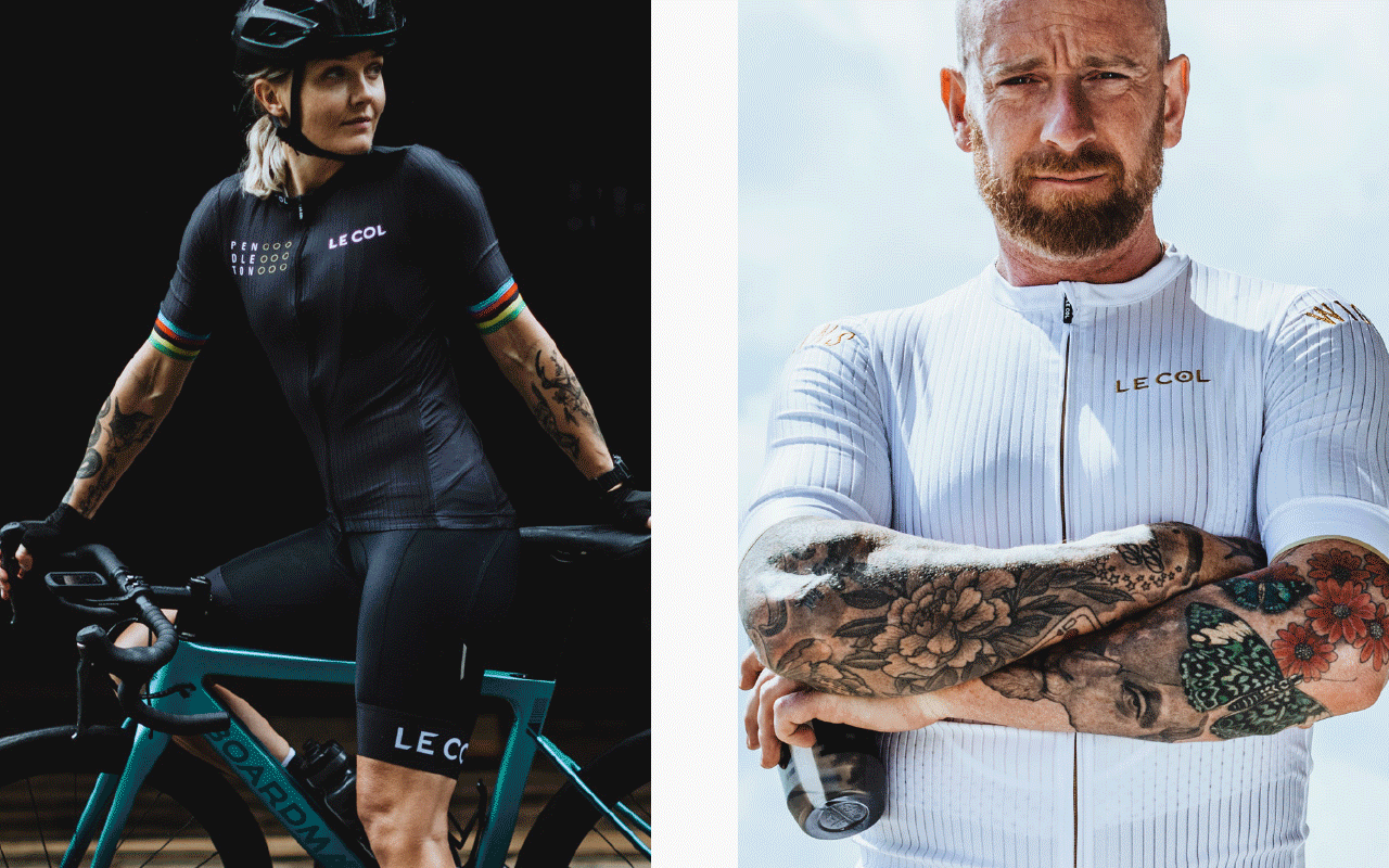
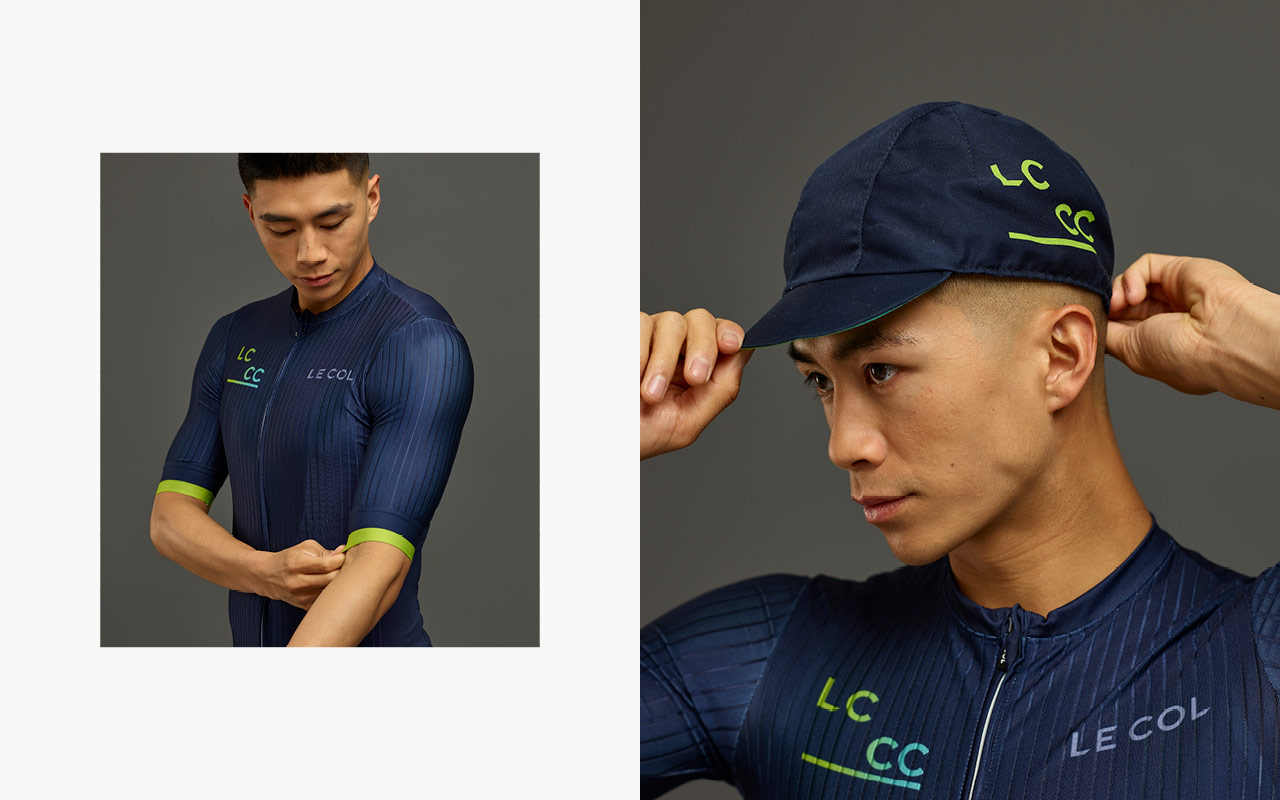
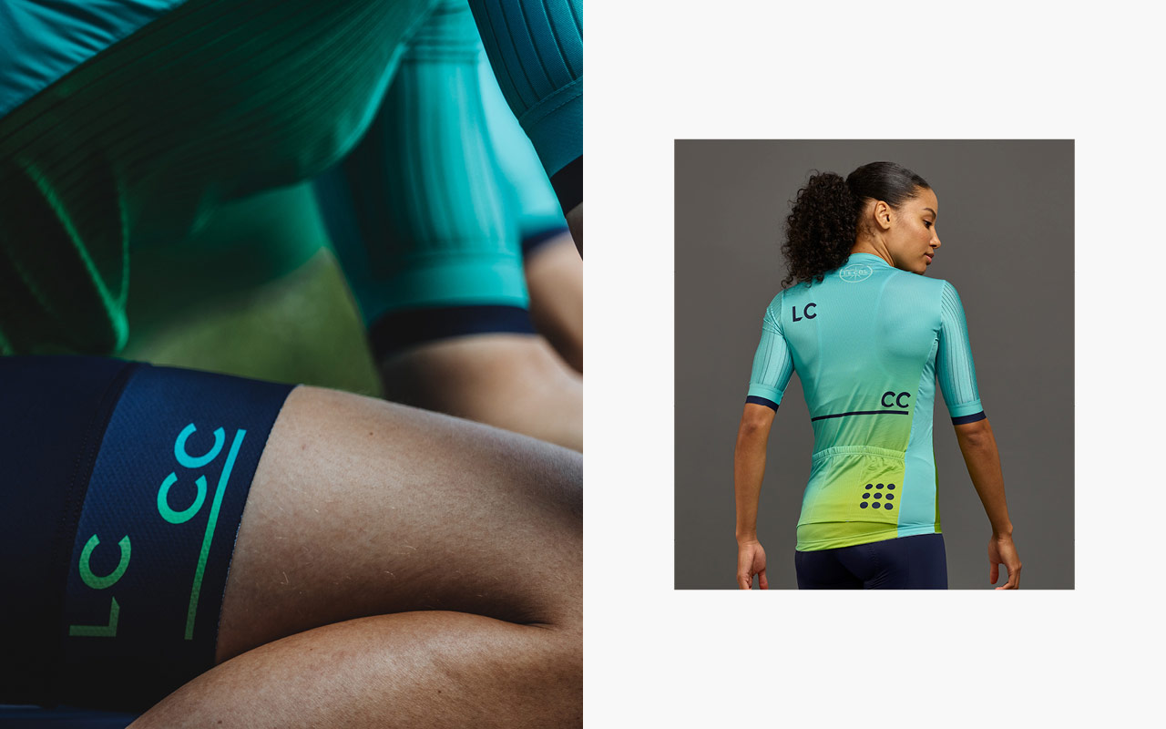
The identity also runs across mens and womens Kit design that is only available to members:
Wireframing and interaction design to integrate Club into the overall eCommerce design we’ve developed for the master brand. Maintaining enough of a unique feel that it can standout and be signposted as part of the customers user journey.
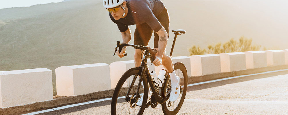
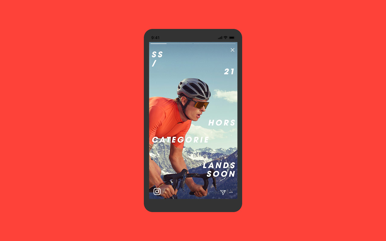
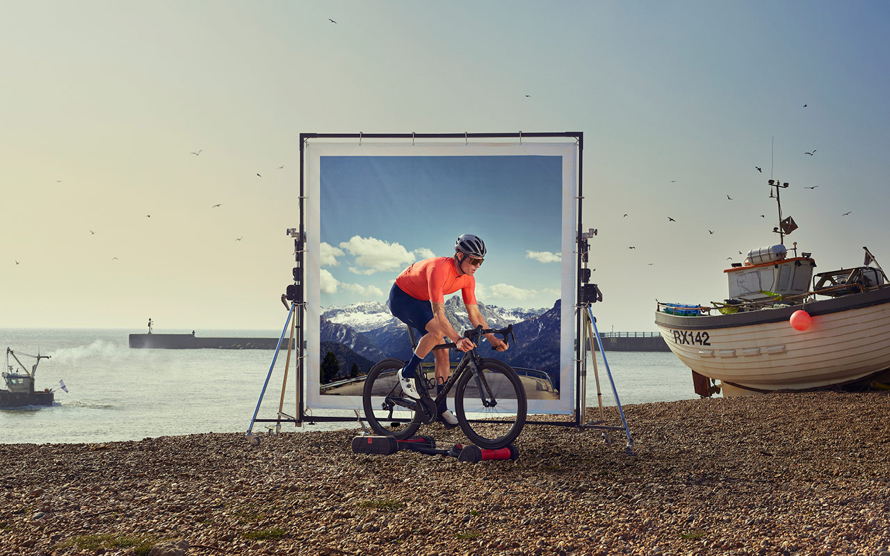
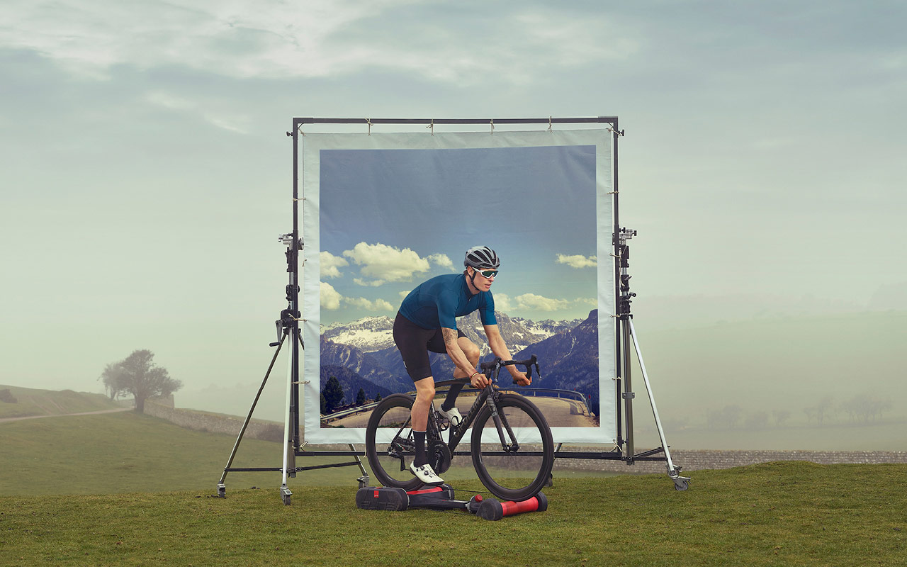
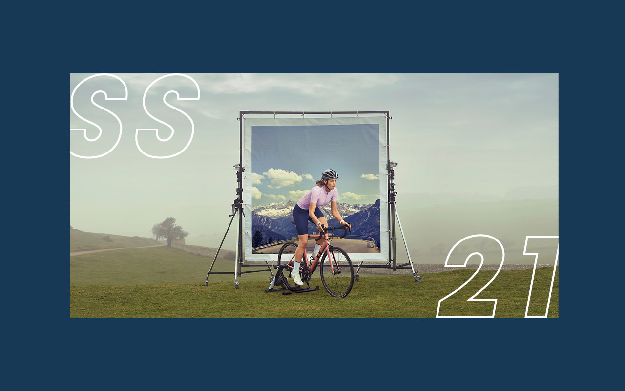
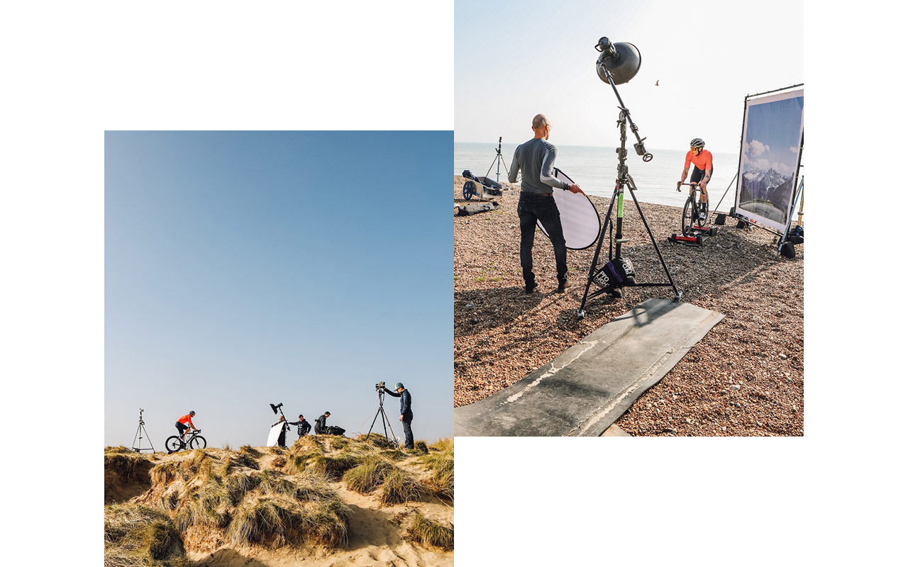
Cycling has always put emphasis on place – From the Alpine climbs of Galibier, Croix de Fer and Stelvio, to the steep streets of Siena – where you ride holds weight. In testing times with restrictions on travel and hopes of winter sun abroad, hopes of our Spring Summer photoshoots evaporated with each announcement. Like everyone, dreams of switchbacks and short sleeves were dashed.
Having explored options to shoot in Tenerife, and then Mallorca, and then turning our own frustrations into an opportunity to go back to the drawing board and be more creative. It became clear from the process, that actually, do we want to be seeing images of other people riding those iconic and sunny roads? Social influencers were flouting the rules, and our patience, time for Plan C – F*ck it, Fake it… time to be more playful, embrace our home roads and put a bit of fun back into cycling, like so many have found in lockdown. Own it.
Concept & Execution: Limited Edition Design
Client: Le Col
Photography: Michael Blann
Retouch: Phil Borg
Production: Squire & Thom Green
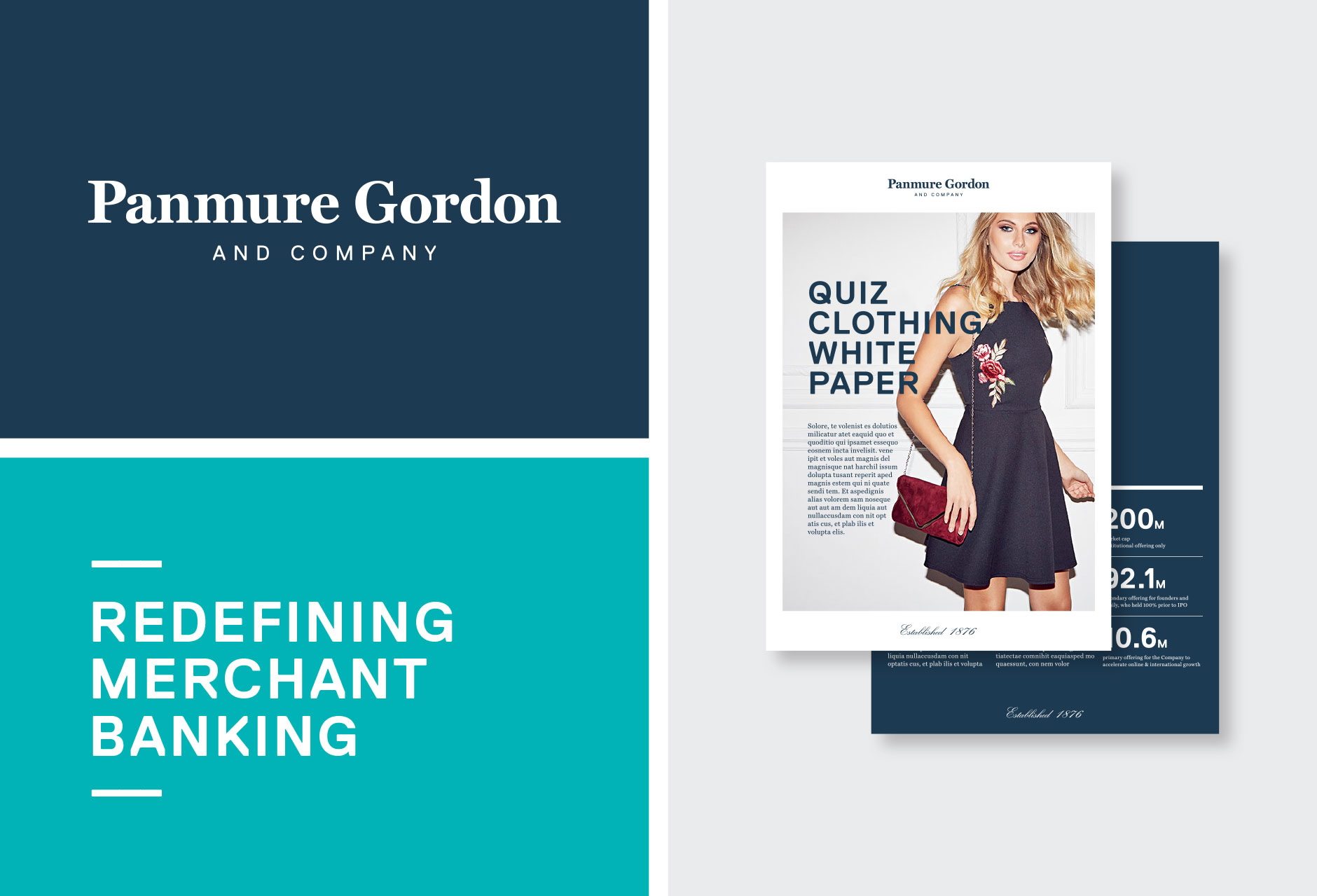
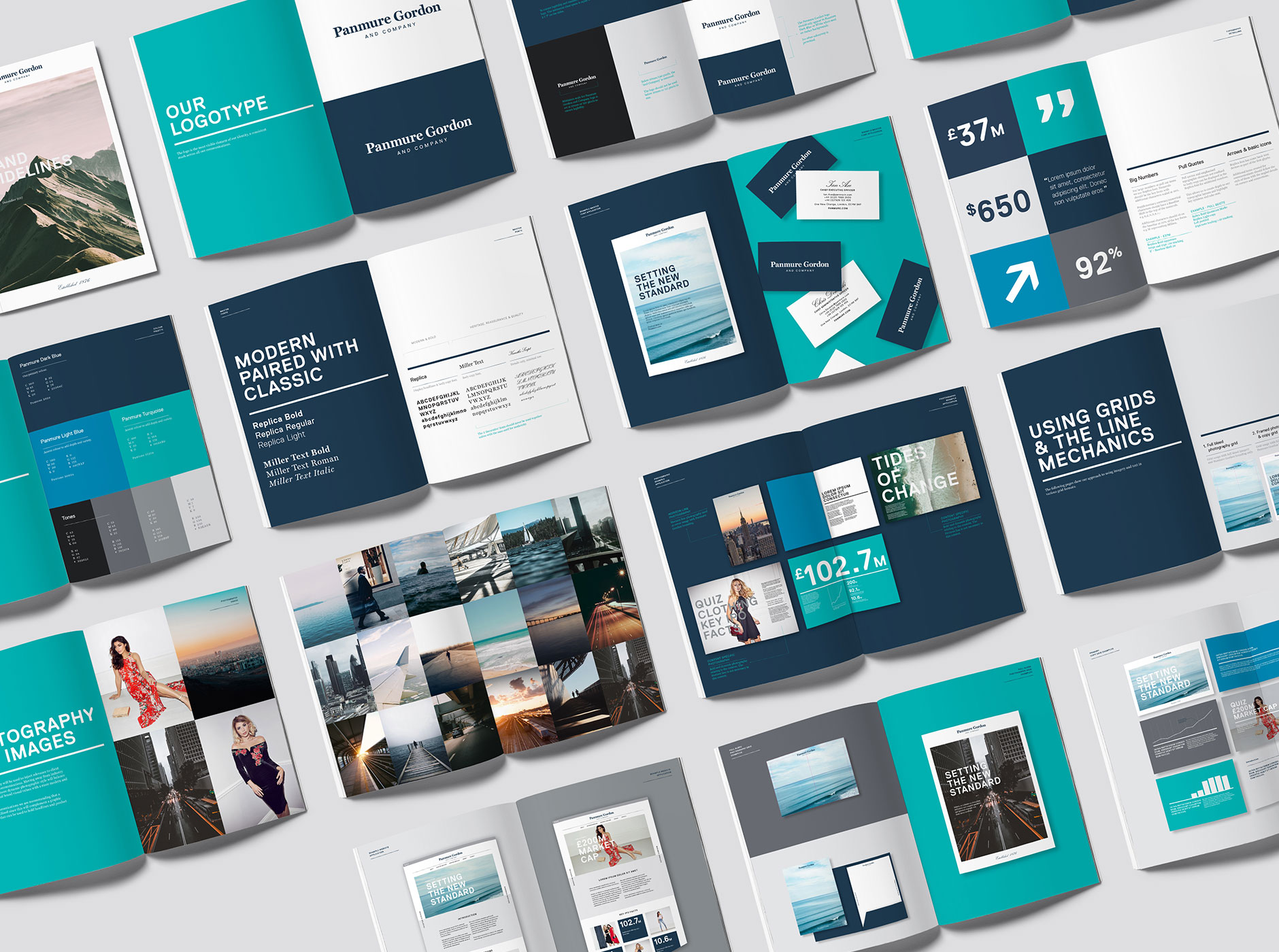
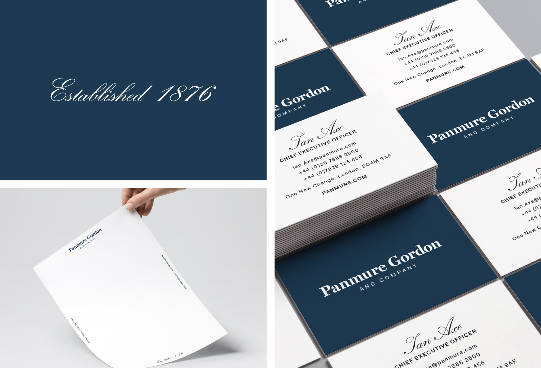
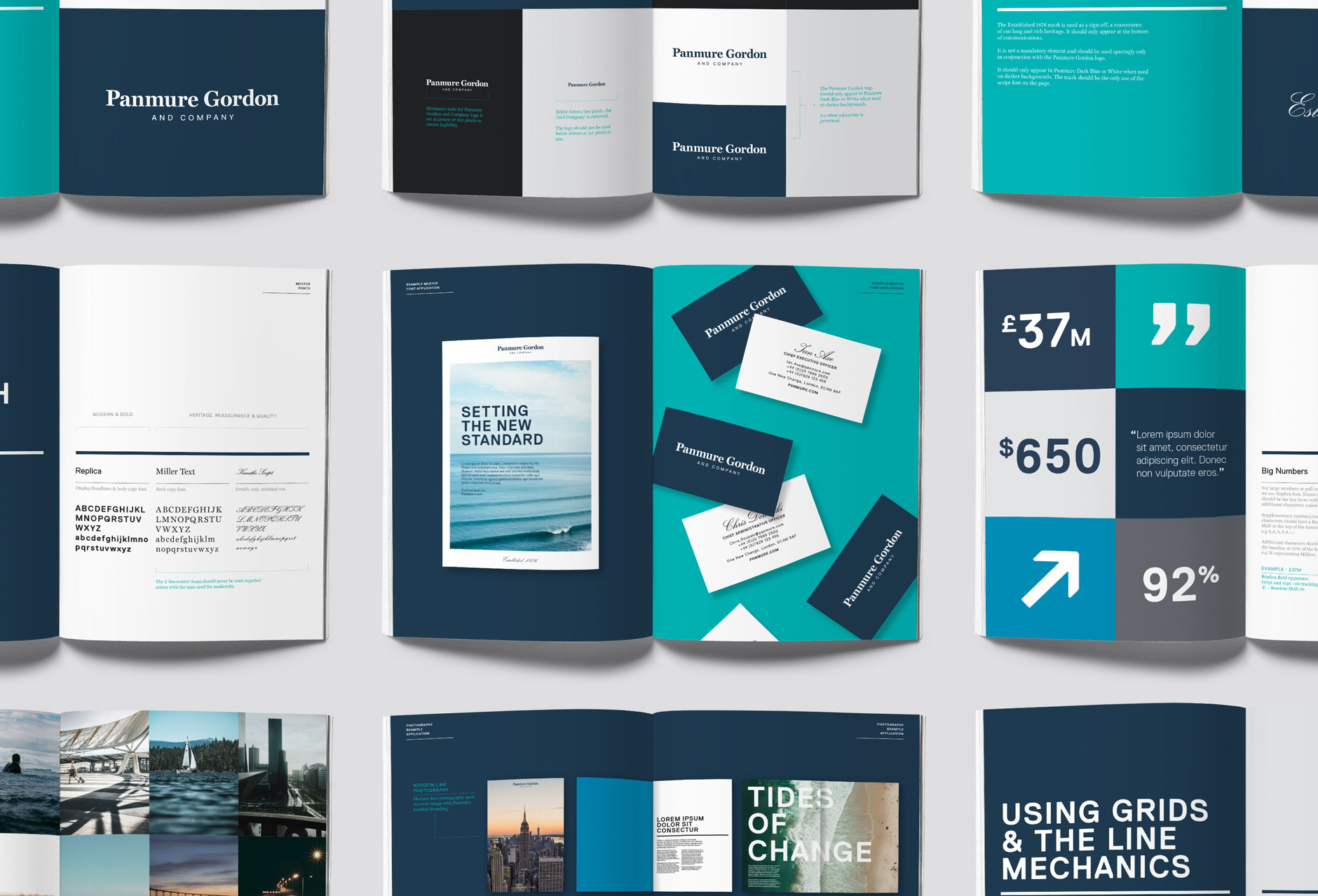
Our latest repositioning and branding project for banking institution Panmure Gordon & Company, building on its rich heritage and progressive plans for growth.
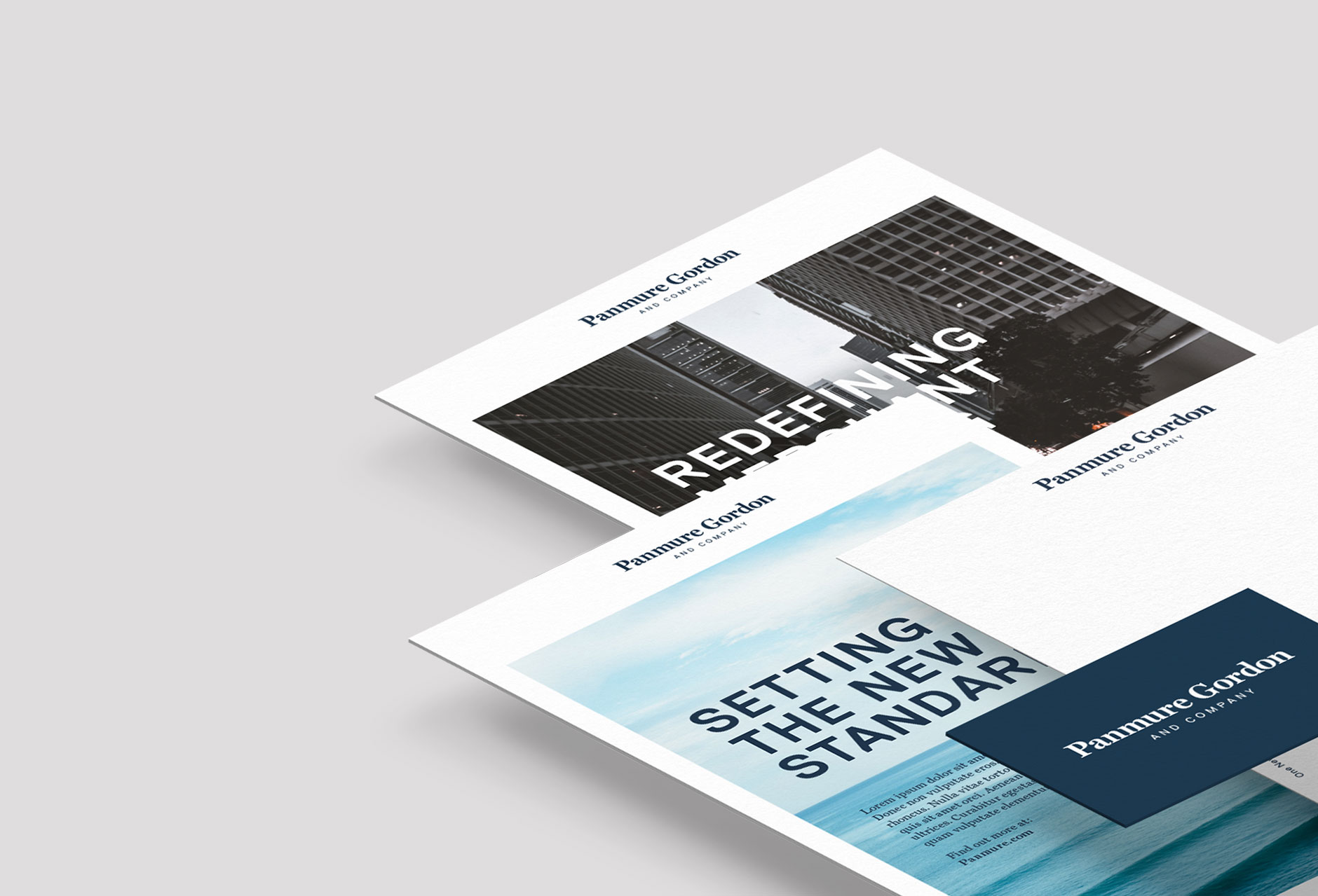
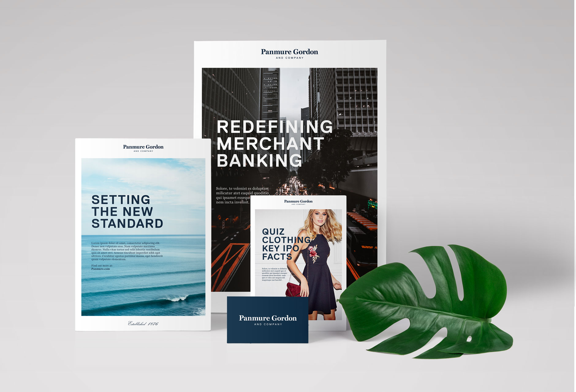
The project covered a strategic phase, defining and repositioning the business leading into the creation of the visual brand that fitted its new purpose of Redefining Merchant Banking.
We’ve created a new brand world and guidelines covering all aspects of the visual identity from logo, photography, tone of voice, marketing collateral and a new website currently in production.
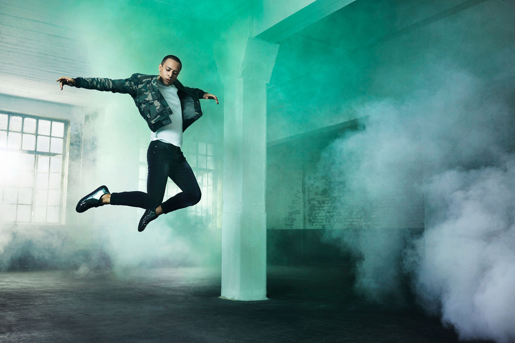
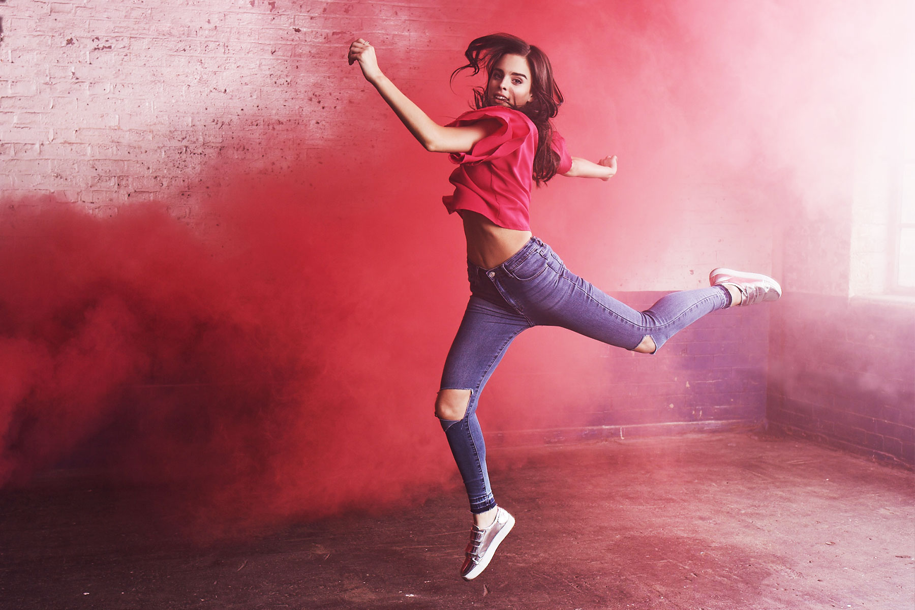
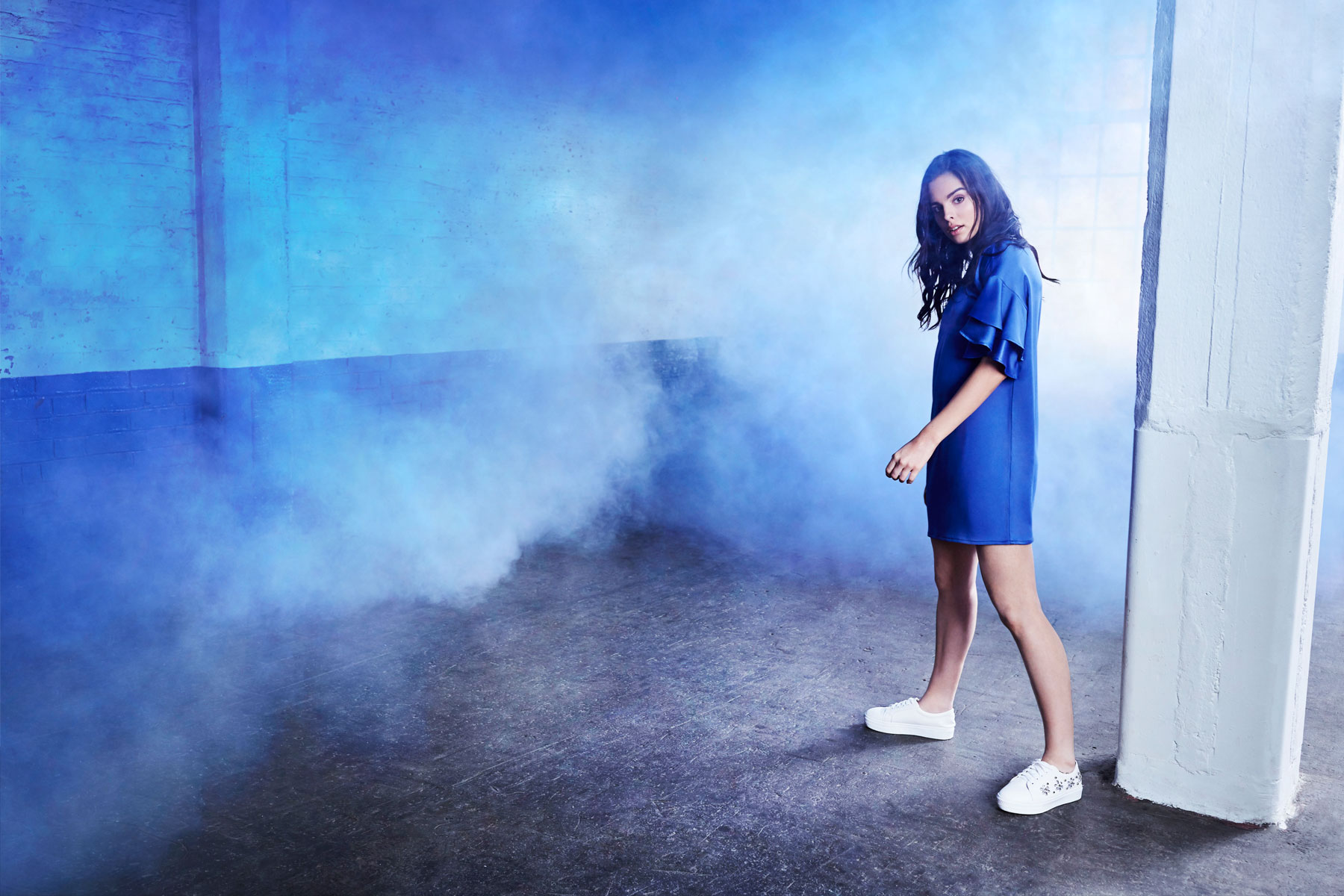
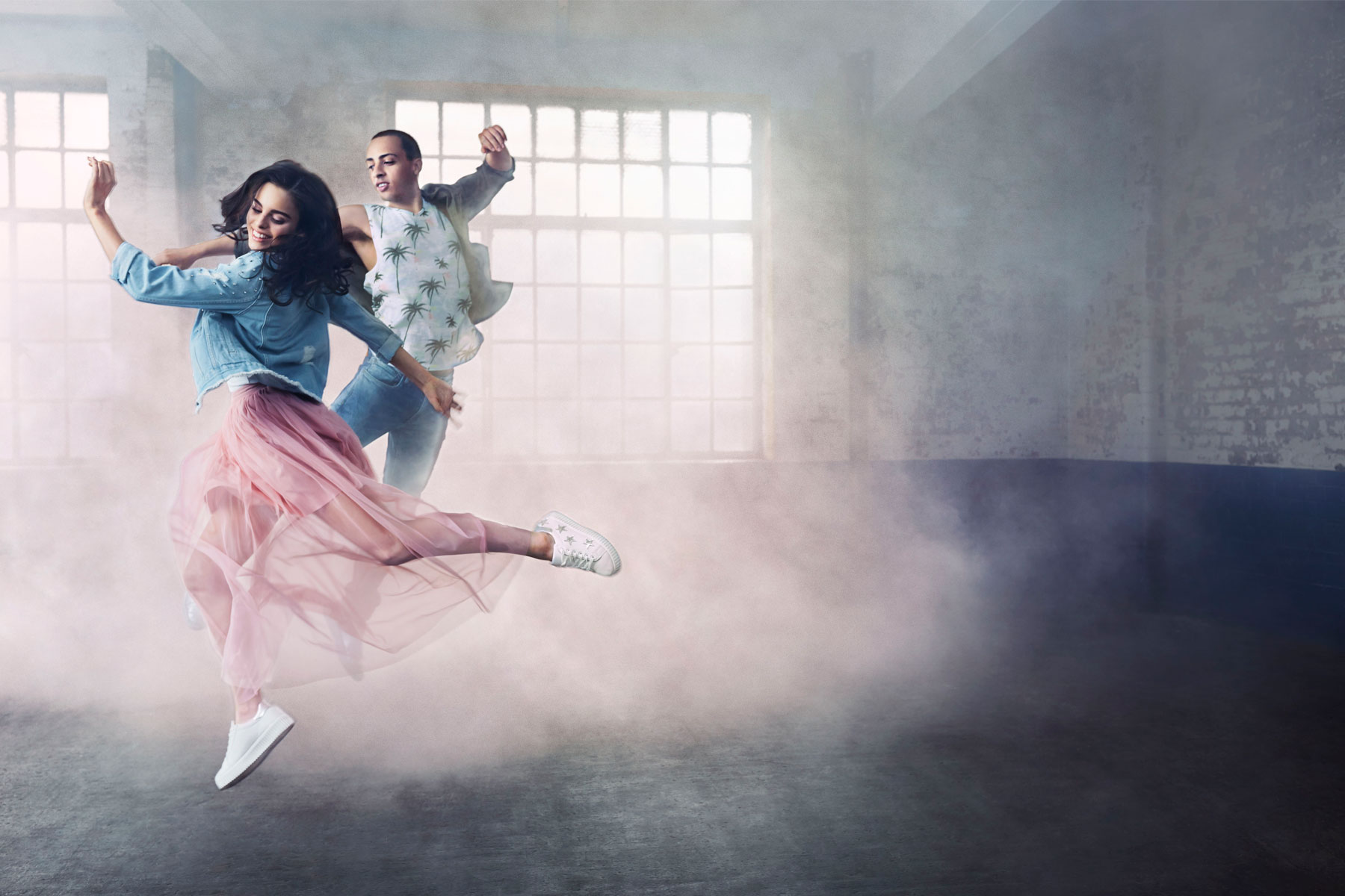
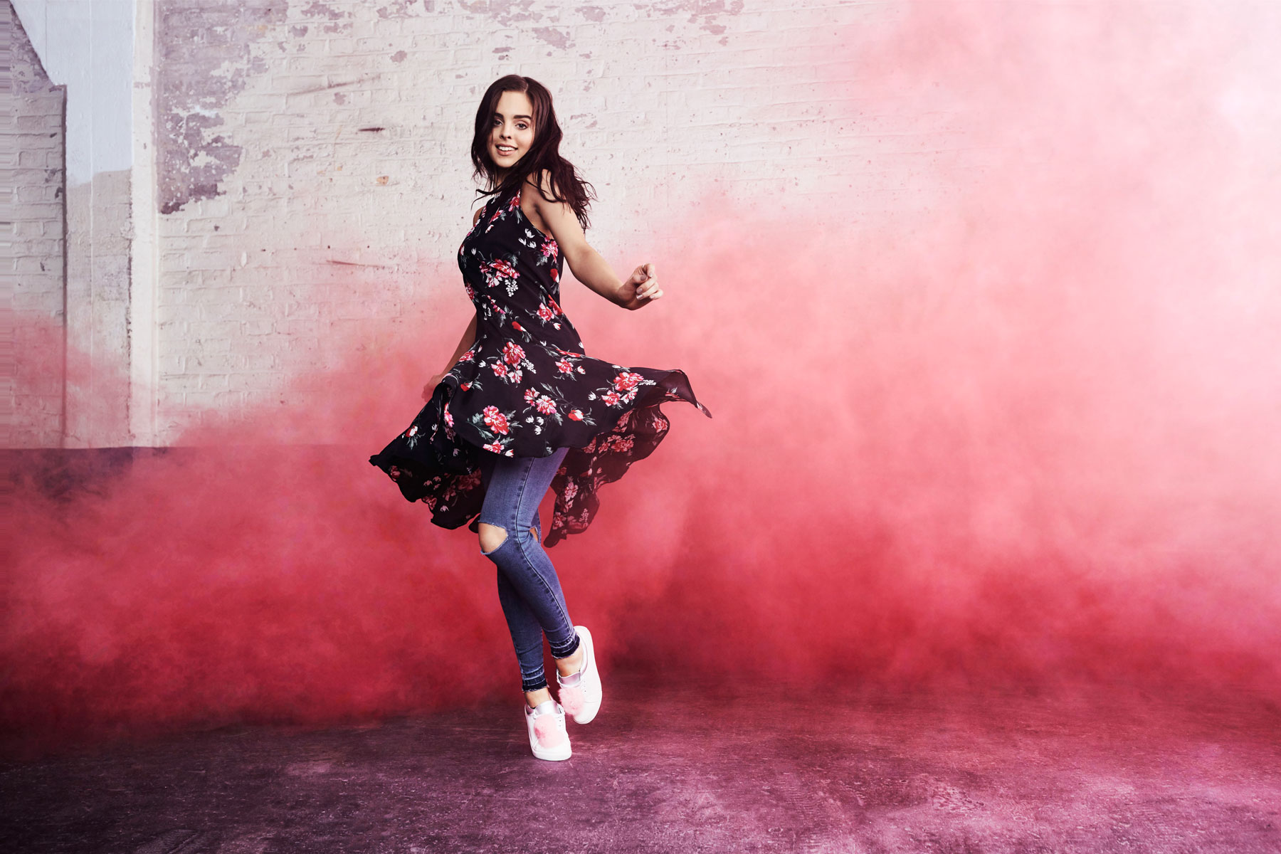
Creative Direction for the 2016/17 campaign for India’s leading online fashion store, KOOVS.com. The video concept combines a progressive dance narrative with in-camera transitions, allowing for multiple outfit changes, fitting seamlessly into the action. The video is coupled with a bold music track composed specifically for the campaign. Our male and female lead embody the cultural shift of India’s youth, empowered and driven by a more western influence to fashion. Colour is bought to the fore using a paired back location with coloured smoke grenades further emphasising the outfit shades. A celebration of colour, and the confidence you get from looking great.
The new KOOVS.com campaign is now live and consists of a TV commercial, print and digital advertising, shot and filmed in the Truman Brewery, London. The TVC began airing last week, with the video surpassing 1.5 million views on YouTube in the first few days.
20 Second TVC spot:
Stills campaign:
Agency: Quill
Creative Director: Paul Greeno
Producer: Paul Albert
Exec Producer: Giulio Sarchiola
TVC Production: Agile Films
Directors: Tom & Amar
Producer: Rebecca Little
Exec Producer: Richard South
1st AD: Bailey Marks
2nd AD: Rick O’Connor
DOP: Mathew Taylor
FP: Robin Webster
DIT: Chris Nunn
Steadicam: Thomas English
Talent: Charlotte Hawthorne & Tylor Deyn
Choreography: Adrian Gas
Hair: Paris France
Make-up: Lara Himplemann
Photographer: Kayla Varley
Producer: Morgan Parker
Agents: AMP Agency
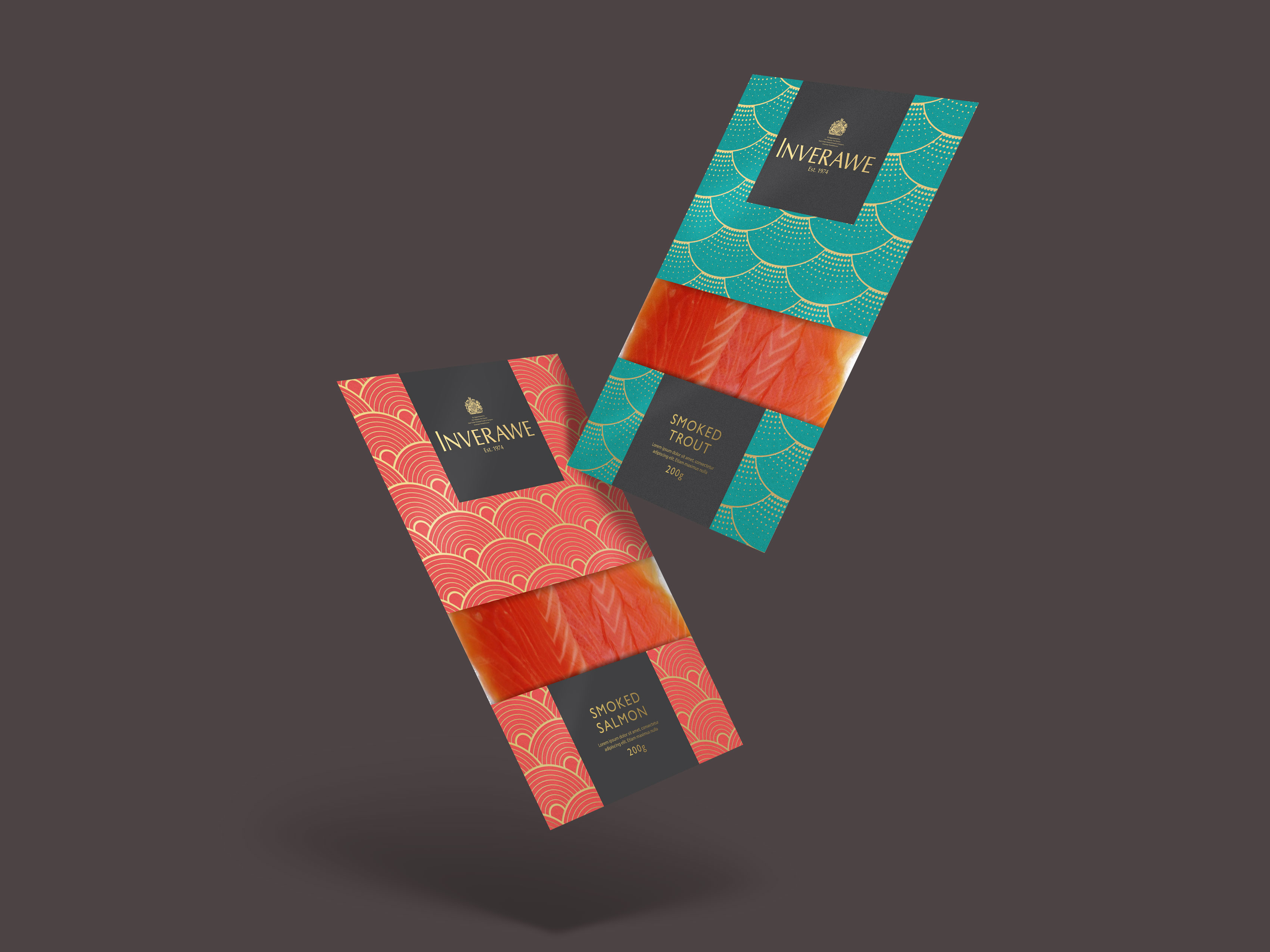
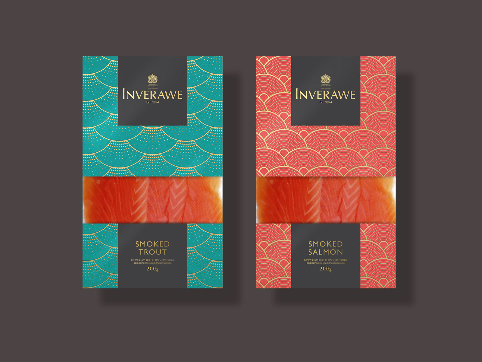
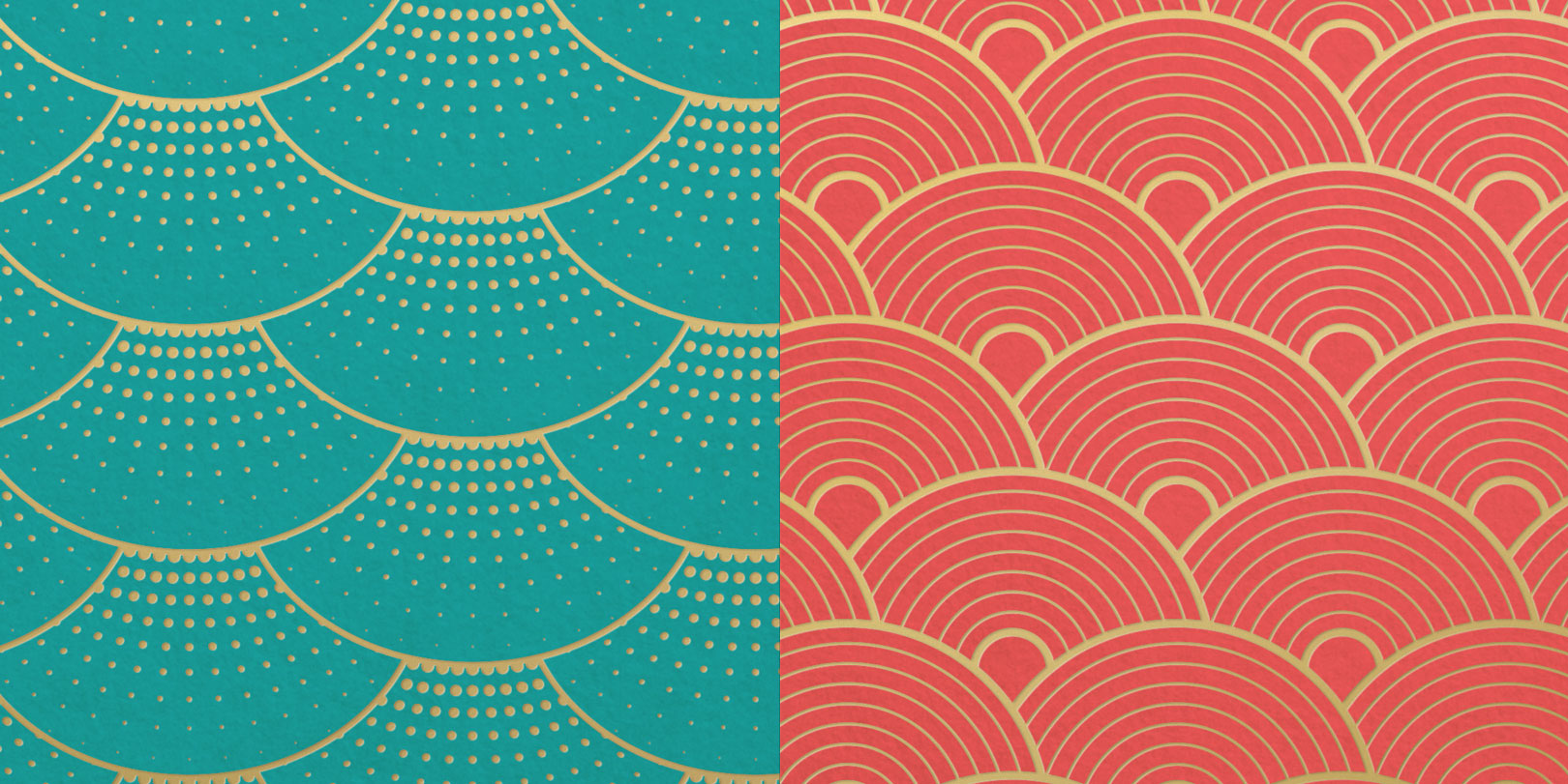
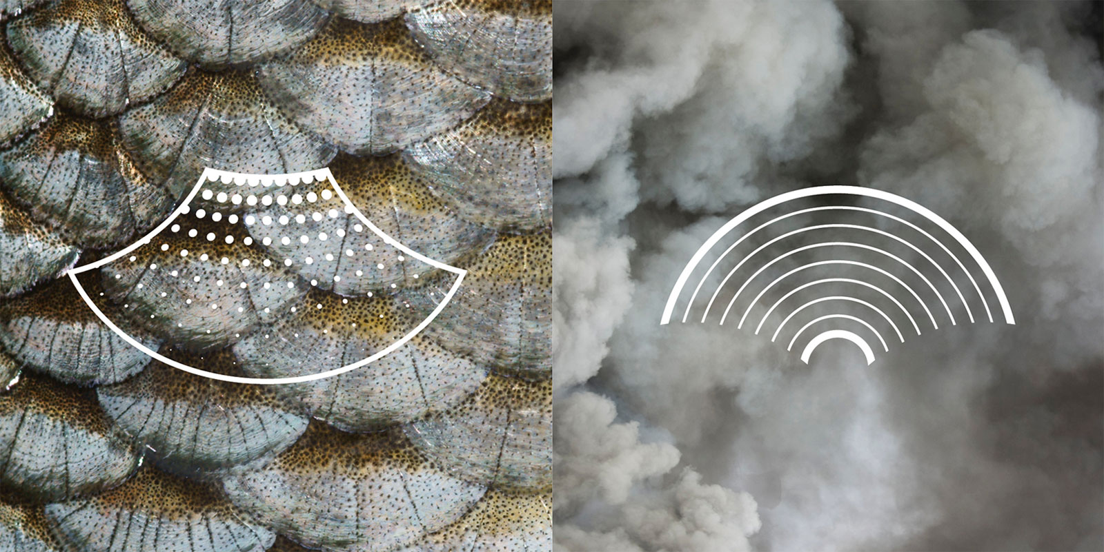
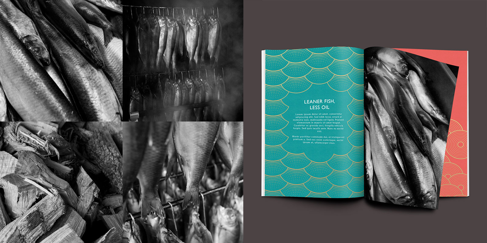
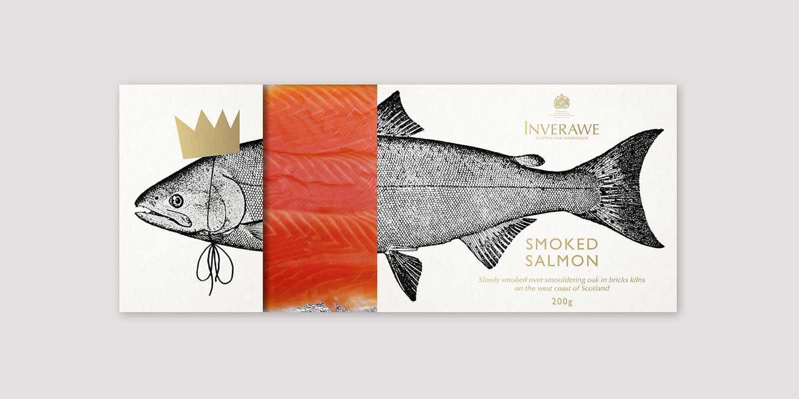
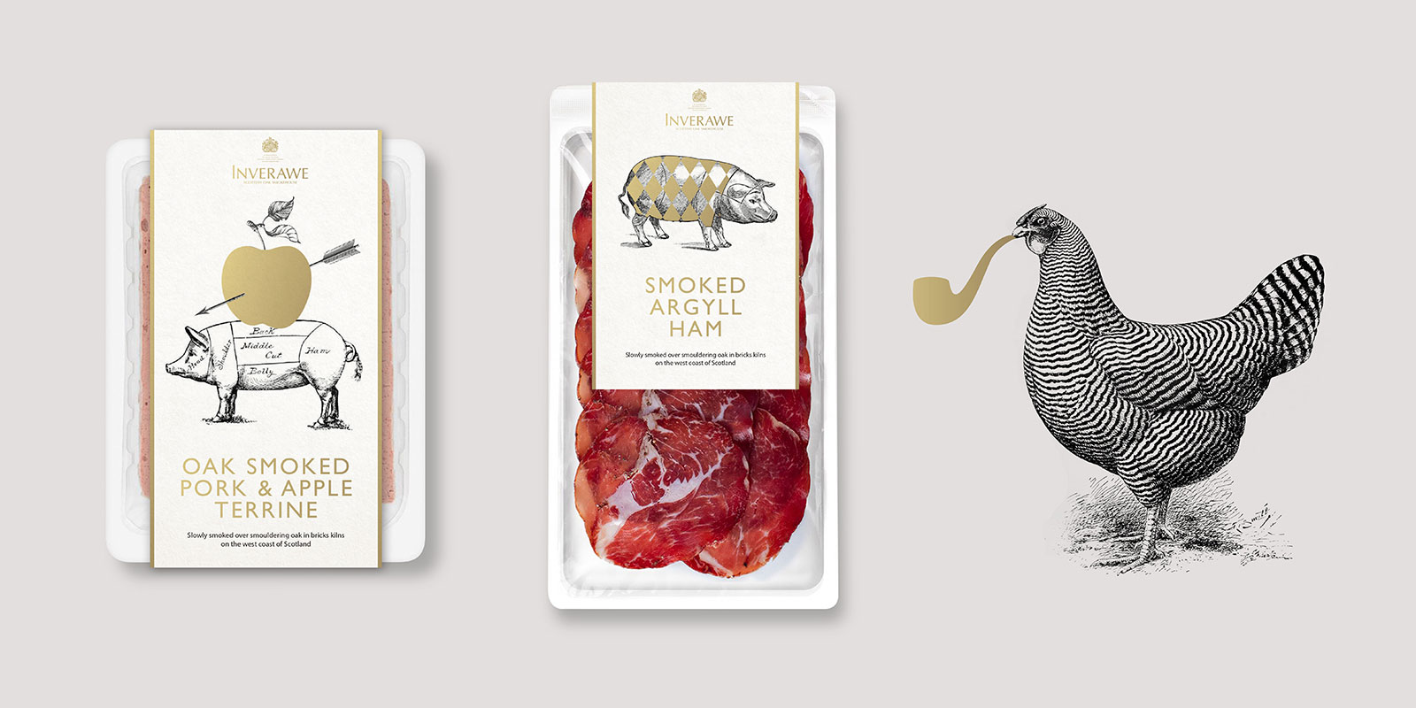
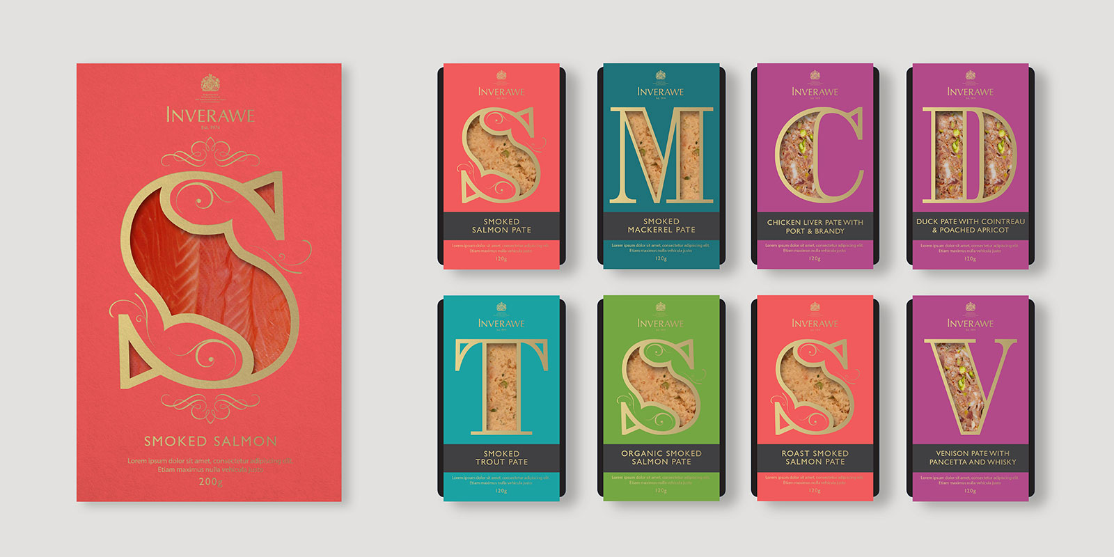
Back last year we started on an innovation project, re-positioning and re-packaging Inverawe. Inverawe Smokehouses started in 1974, and produces some of the finest Smoked salmon in Scotland as well as other fish, meats and smoked products. As part of the project we immersed ourselves in their age old process of using hand built smokehouses and oak logs that define the award winning flavour, re-positioning the brand and progressing their packaging into a more unique and luxury field. Below is a small part of the work we produced.