New brand identity and packaging work for Strykk, building on the original foundations we developed for them in 2018. Whilst our underlying strategy remains the same, a number of external factors have led to the need to reinvigorate the brand and re-align the growing portfolio.
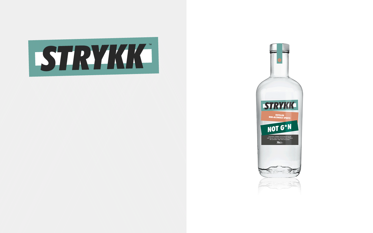
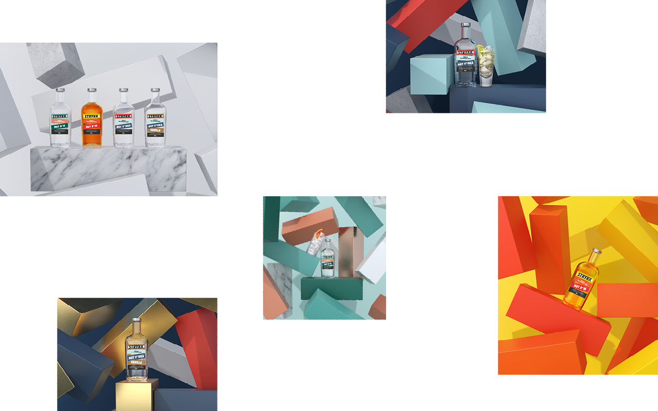
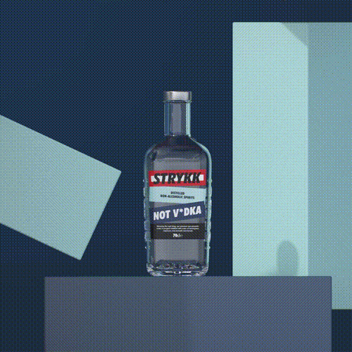
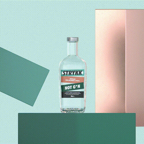
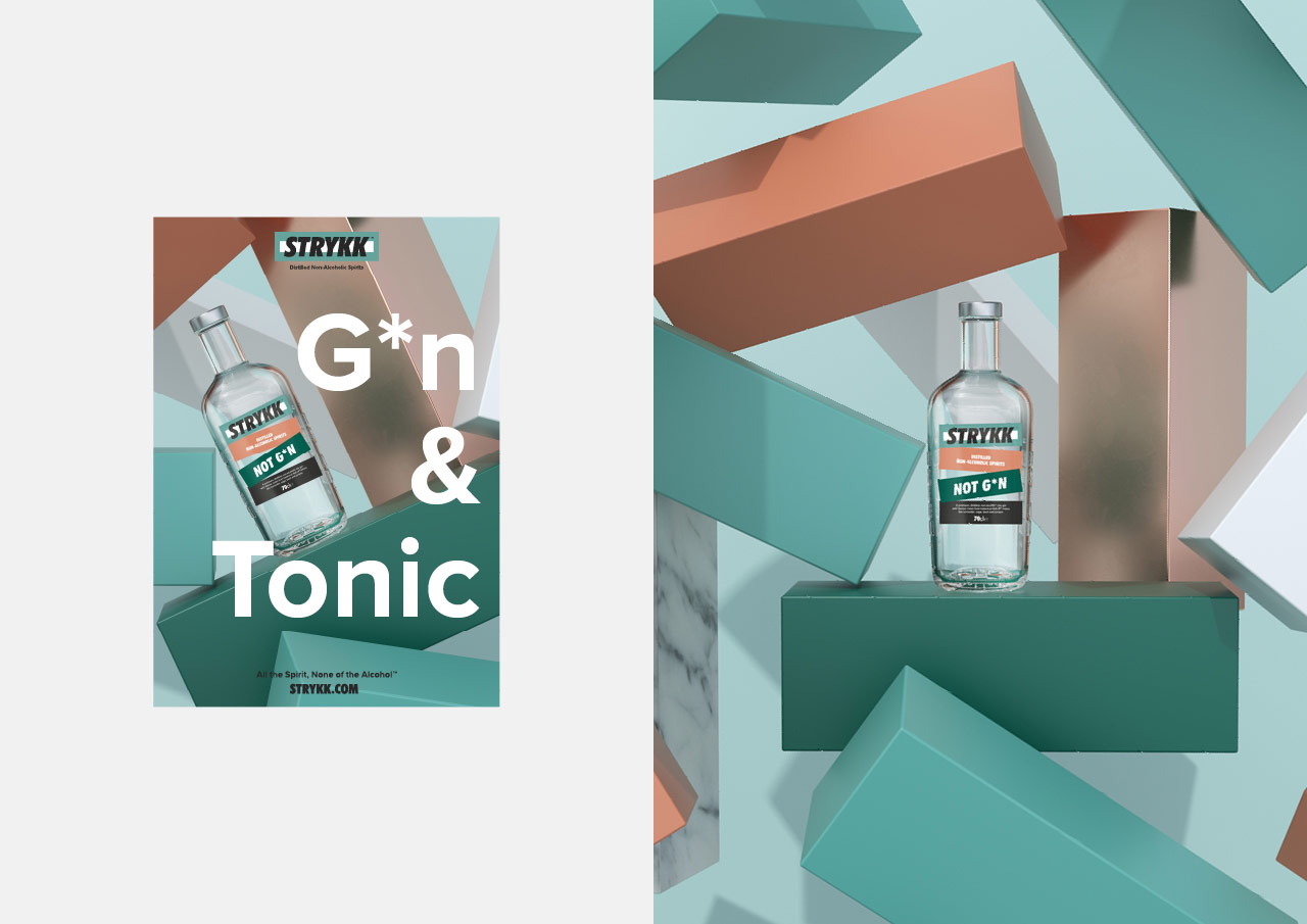
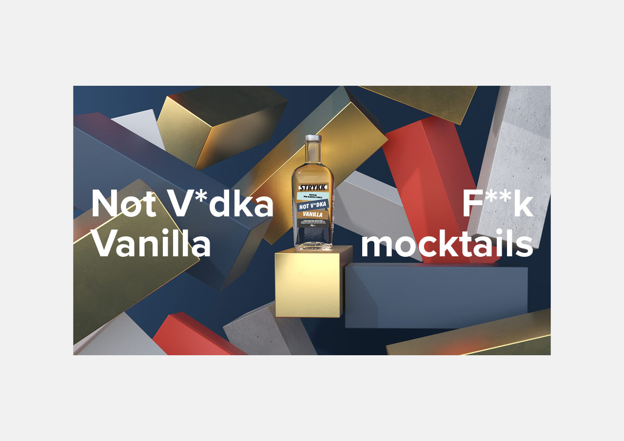
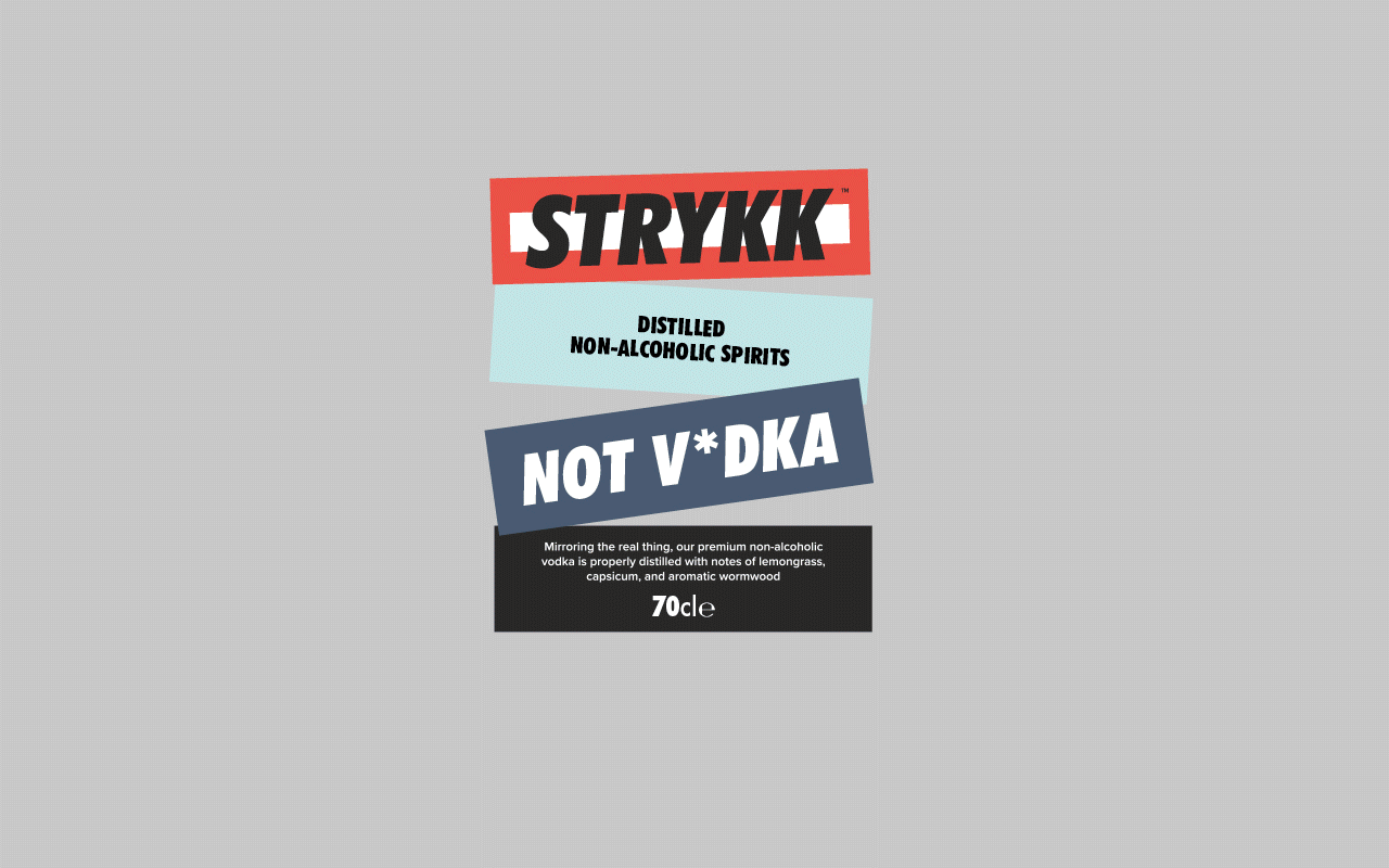
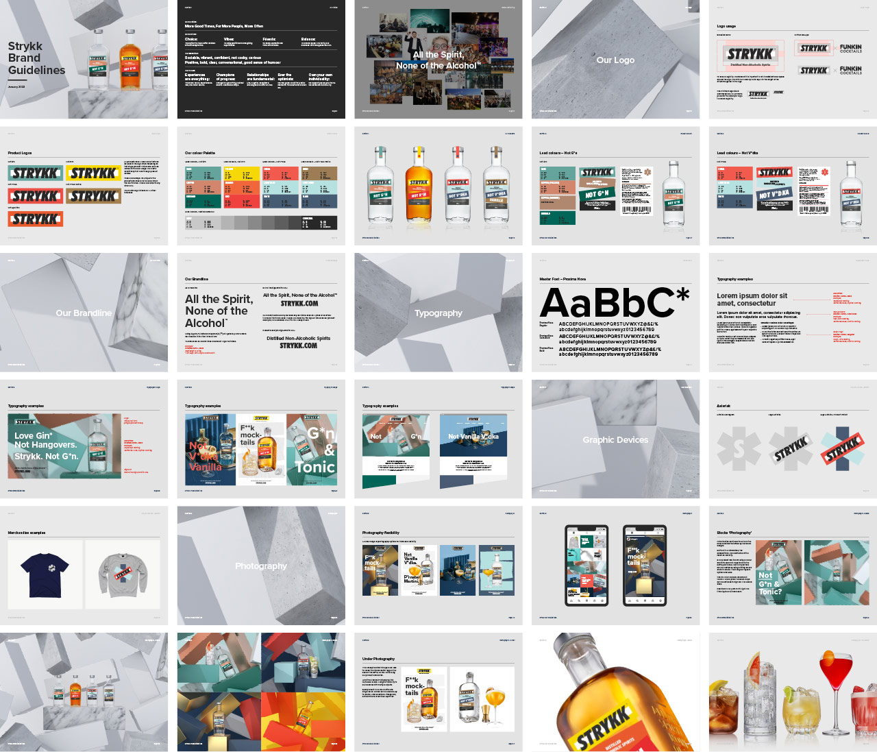
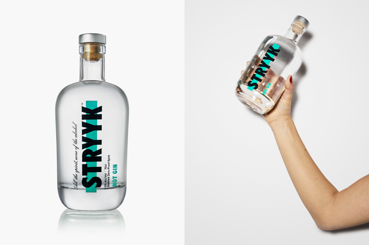
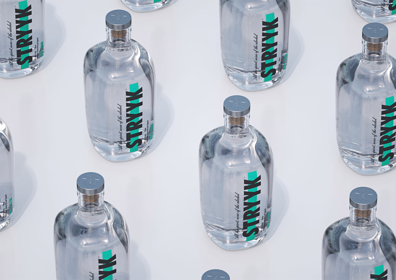
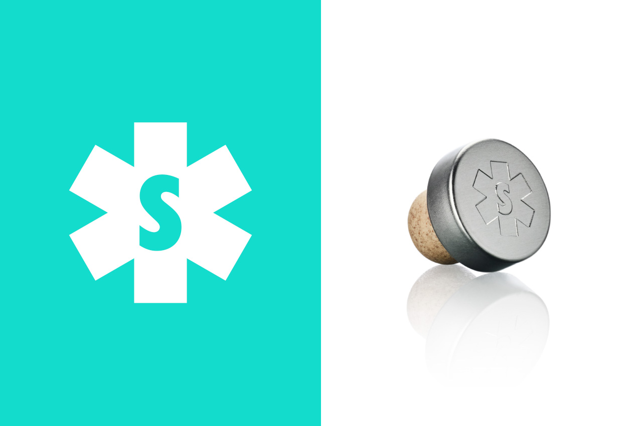
Starting with refinements to the logo, we opted for a holding shape that become the central block device that runs through the whole identity. Extrapolated from the three overlapping oblongs that created the original Strykk asterisk, it builds as the common thread for packaging, and is both exaggerated or subtly implemented as a consistent graphic device across all channel executions.
We’ve built on the strong colour palette, bringing in a wider set of bold and complementary tones to increase standout and build better differentiation between products. Typography opts for a more refined sans serif and a slight coming of age, moving from the unruly uppercase Futura Condensed used previously, to a more conversational approach. As before our focus on tone of voice remains confident and unapologetic, a key pillar of the brand.
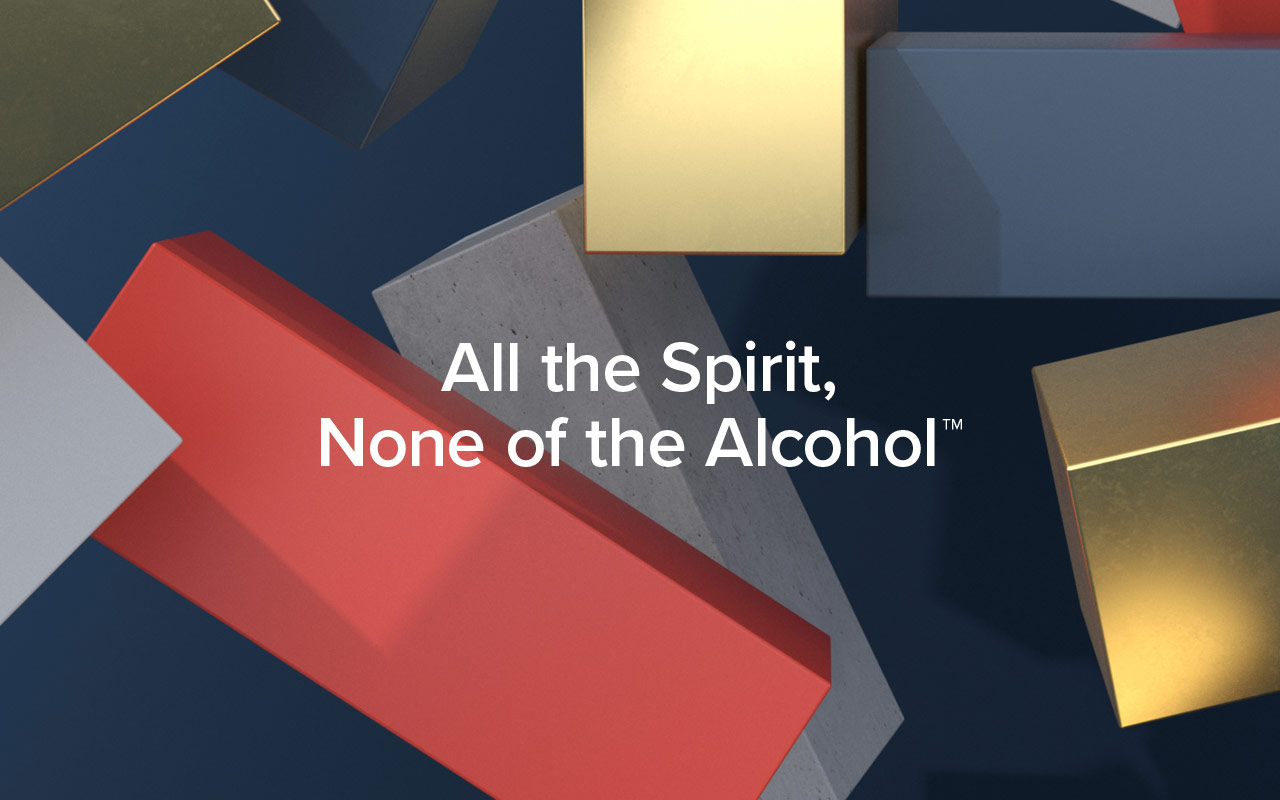
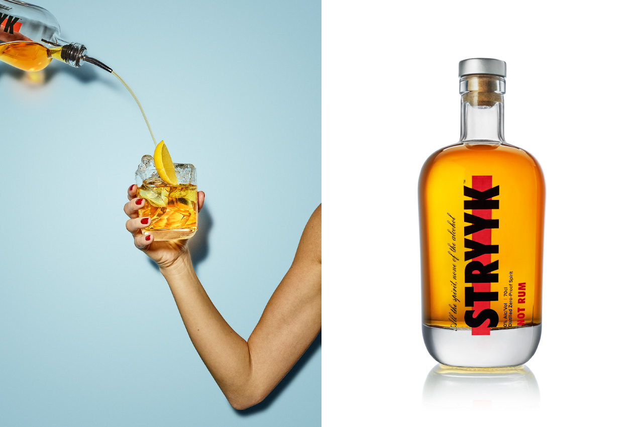
The original strategy and positioning remains, inspired by the idea of enjoying a night out without compromise. A love of going out, being part of the story and not missing out. Removing the stigma of ‘not’ drinking, by delivering a product with the taste and complexity to build a proper drink with 0% Abv Distilled Spirit.
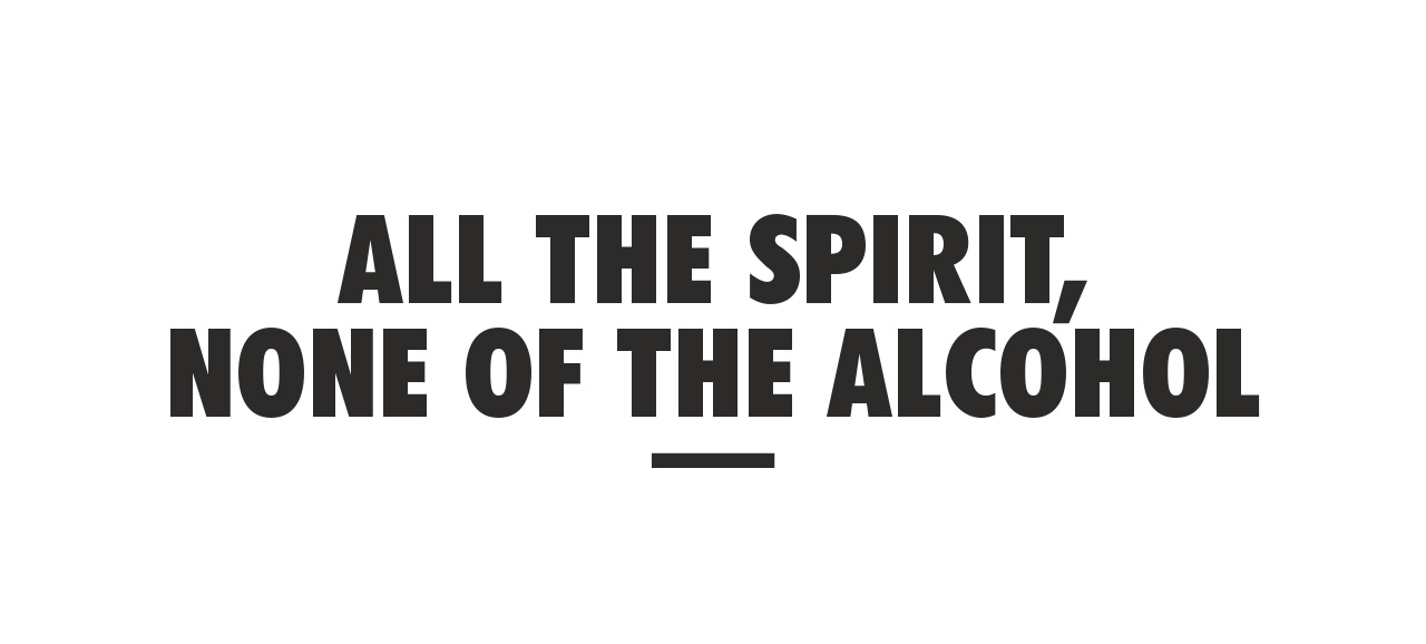
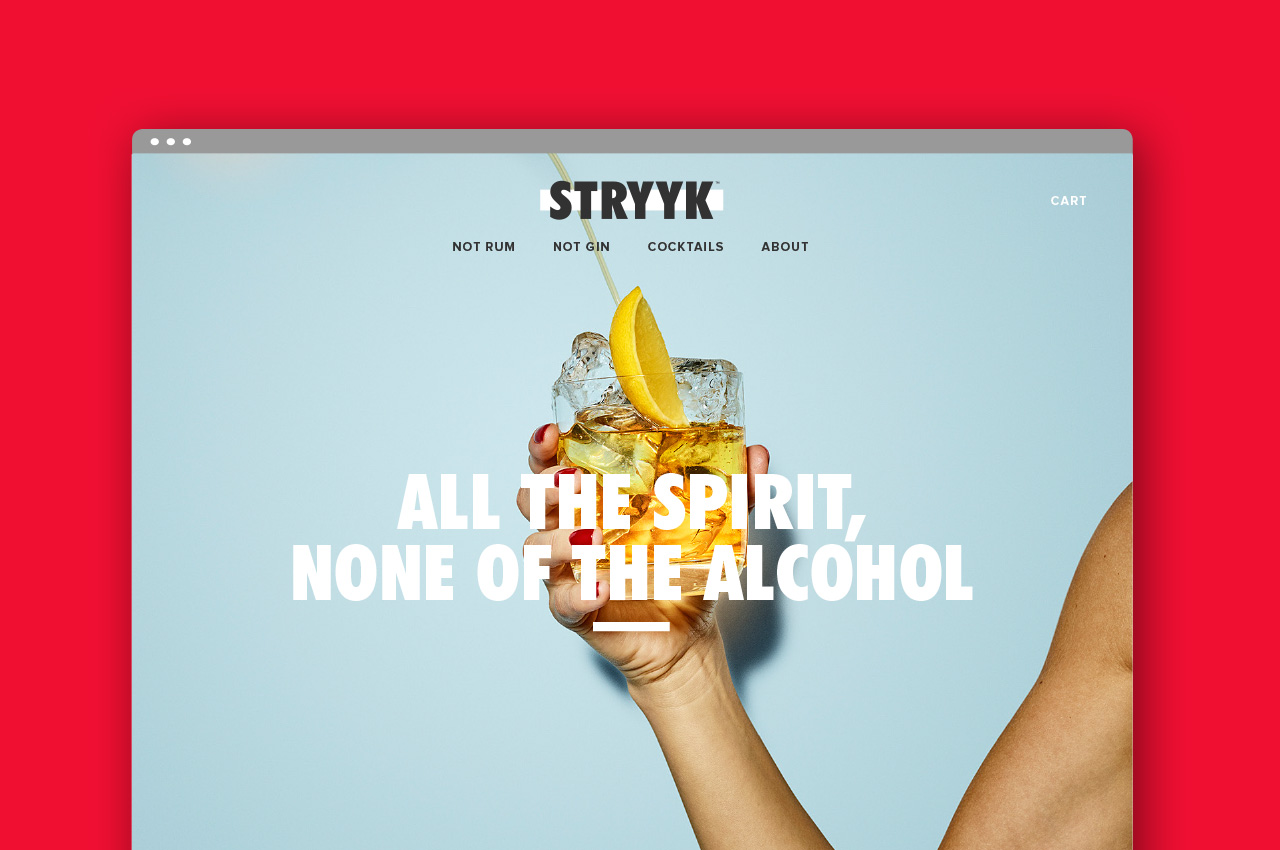
At the heart Strykk remains disruptive and steadfast in its unwillingness to just fit a mould. A bold approach that needed a bold brand, unapologetic and full of energy. We’re not about kooky craft, forced aspiration or self-importance. Uniquely summed up as; All the spirit. None of the alcohol.
“Limited Edition Design has been at the forefront of Strykk’s brand and visual identity since its inception in 2018. When tasked to overhaul and update the packaging and identity, a clear, comprehensive, and succinct sprint process was followed from start to finish – and at the highest standard. What has resulted, we feel, is a truly world class brand and visual identity, all packaged up neatly in a set of bullet-proof Brand Guidelines to mark the next stage of our business growth.”
Tom Glover, Brand Manager, Strykk
Agency: Limited Edition Design
Creative Director: Paul Greeno
3D & Motion: Sergio Beggiato
Photography: Jeremy Baile
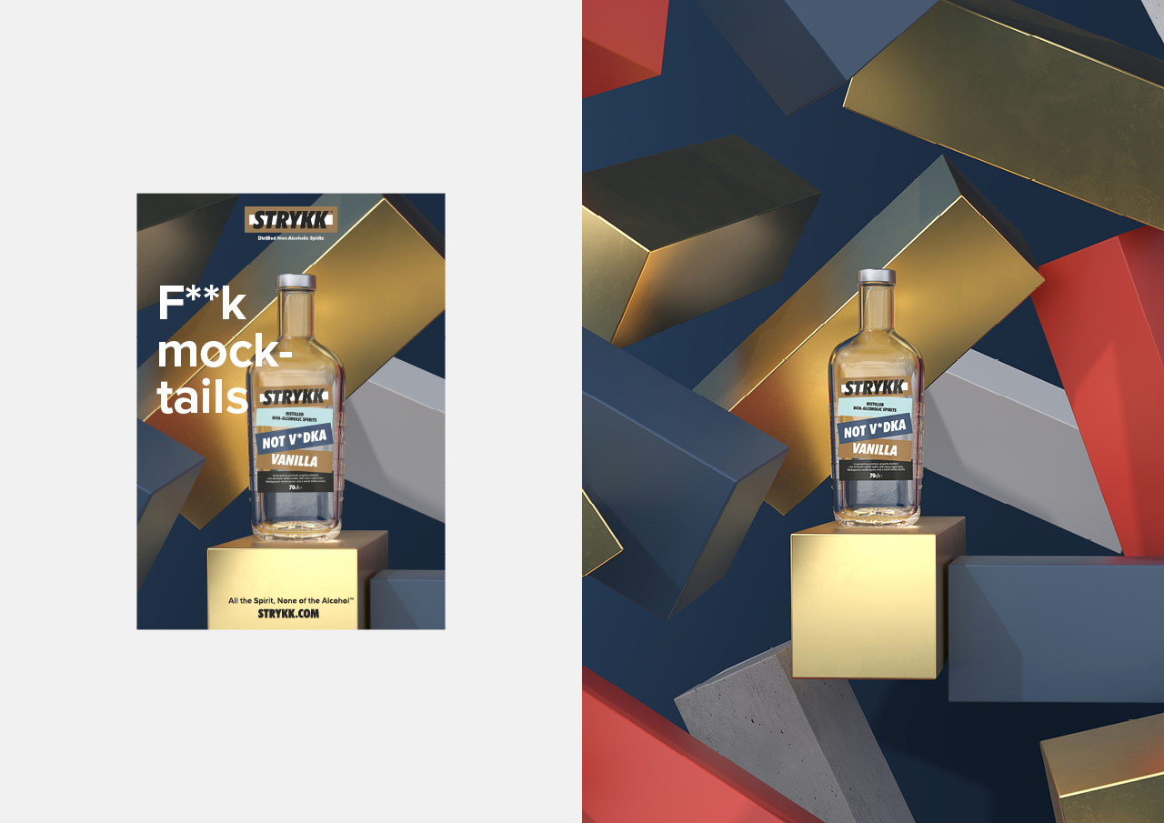
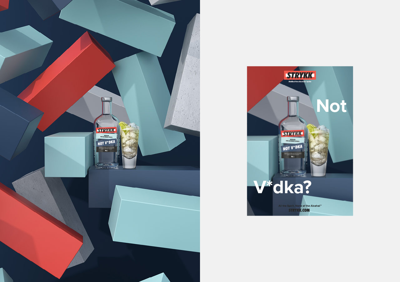
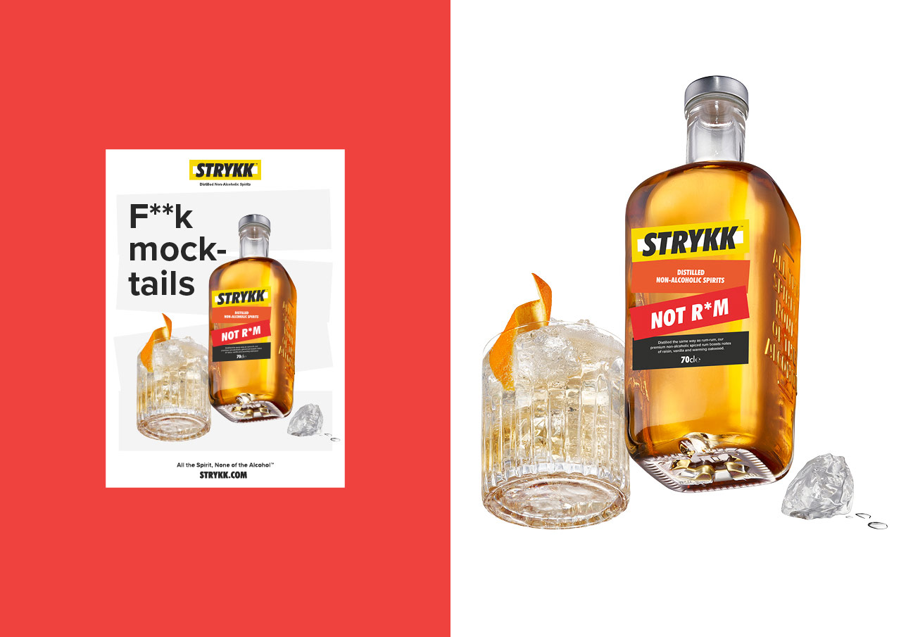
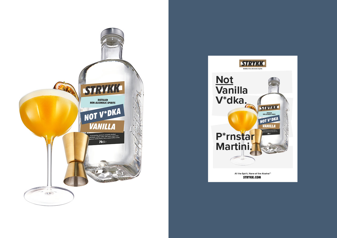
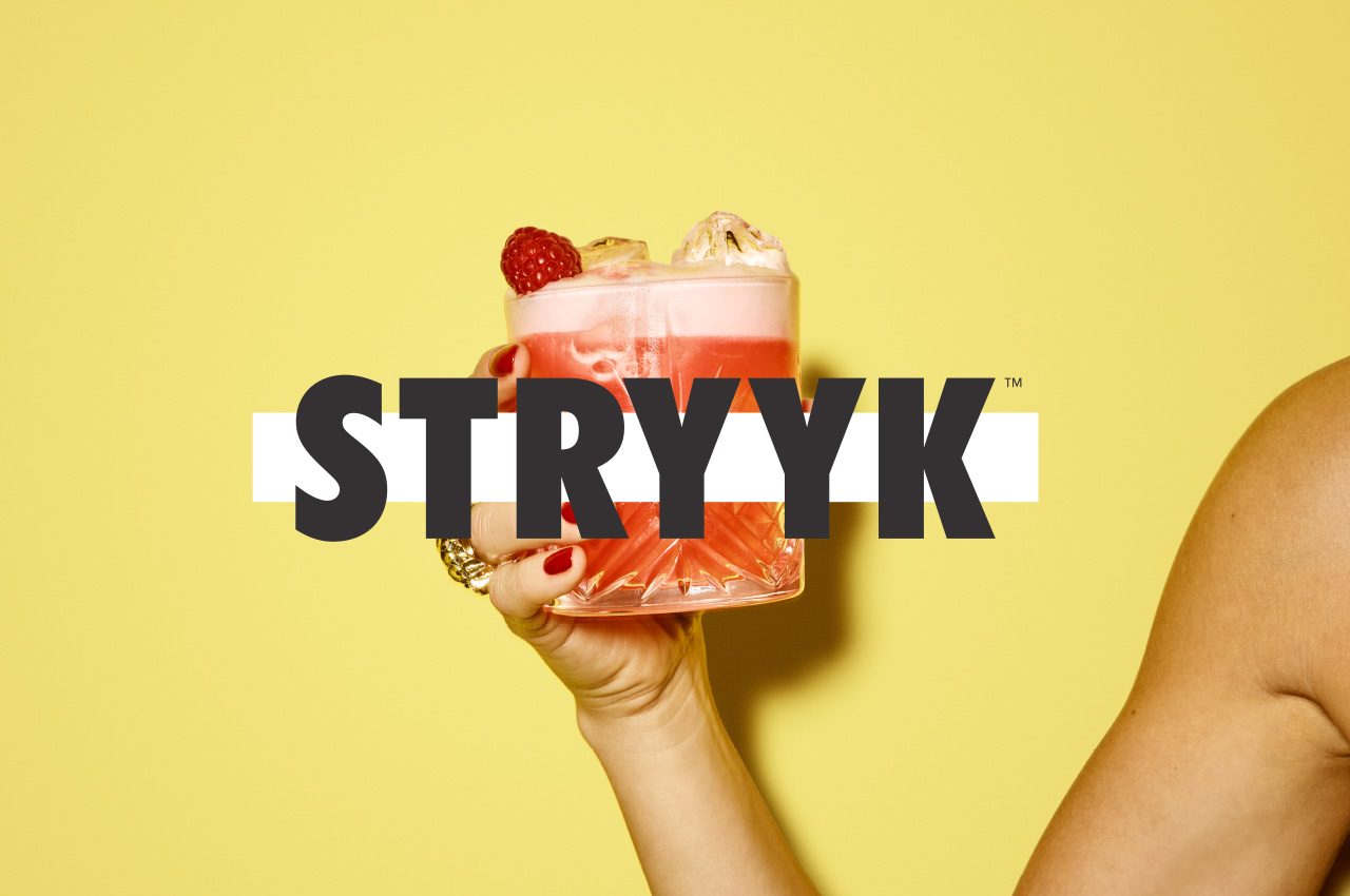
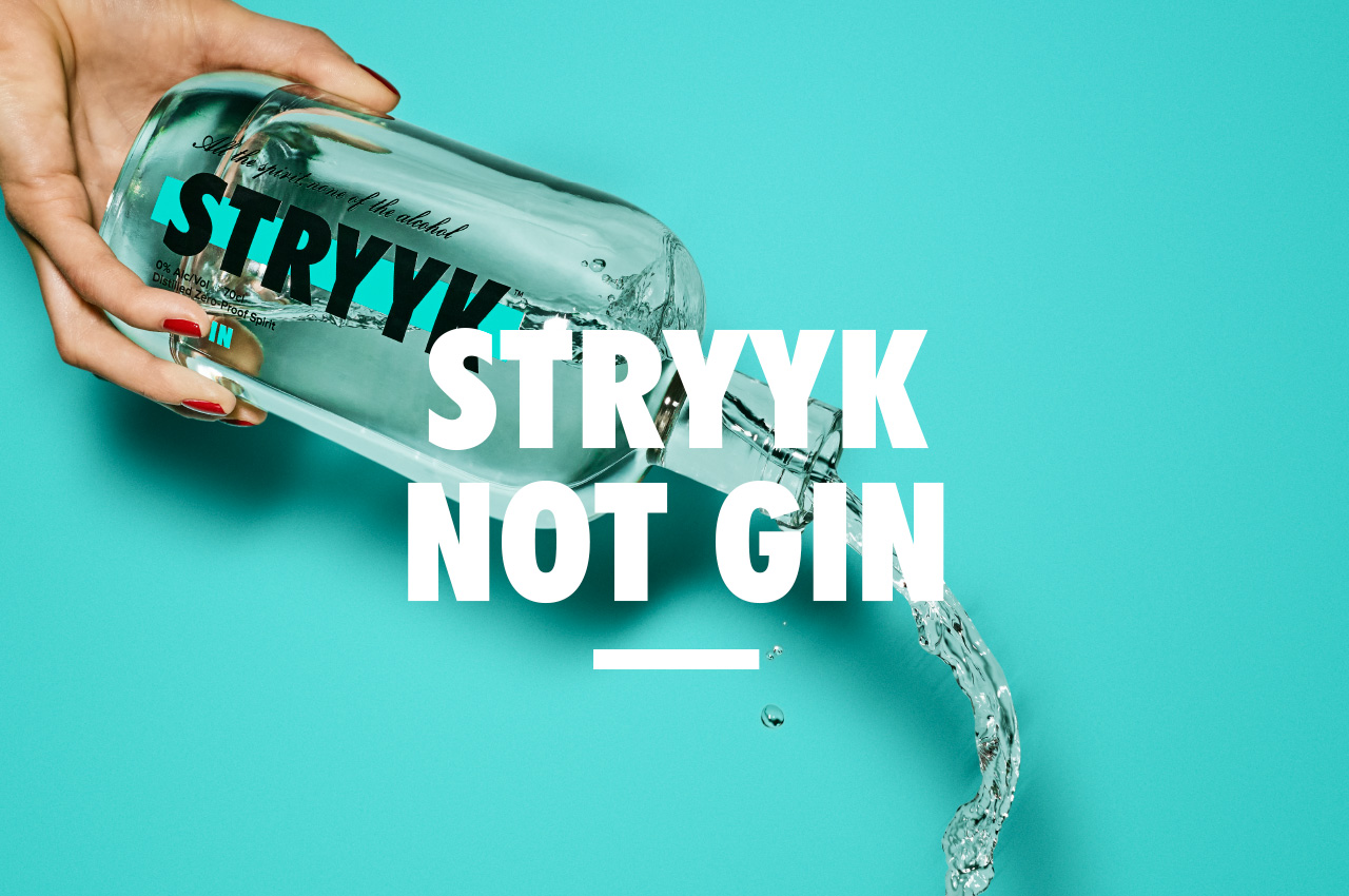
We’ve spent the last six months working closely with the Stryyk team to realise the initial concept and bring the first two products to market. Our strategy and positioning is inspired by the idea of enjoying a night out without compromise. A love of going out, being part of the story and not missing out. An innovative approach, for an innovative product, removing the stigma of ‘not’ drinking, by delivering a product with the taste and complexity to build a proper cocktail with zero-proof.
A bold approach that needed a bold brand, unapologetic and full of energy. We’re not about kooky craft, forced aspiration or self-importance. Uniquely summed up as; All the spirit. None of the alcohol.
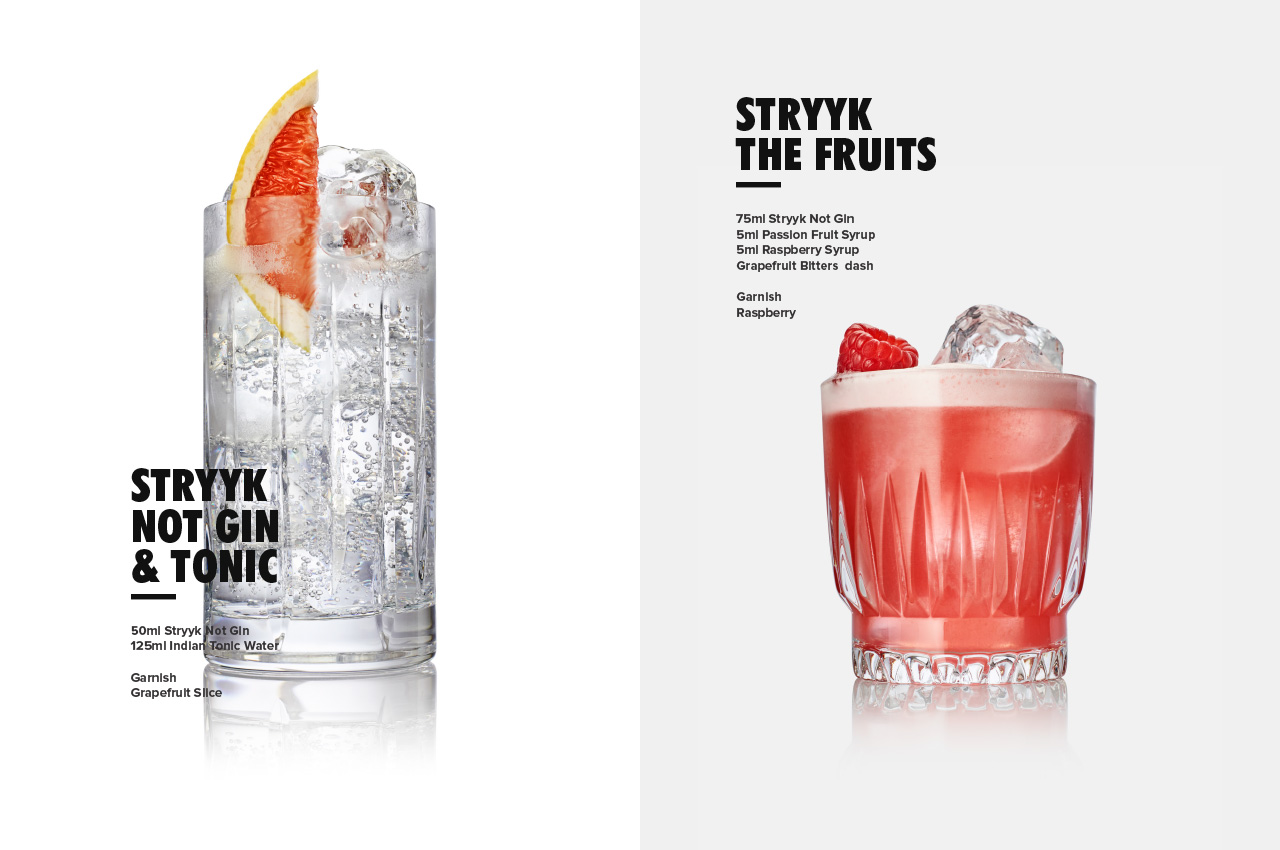
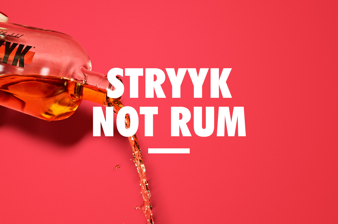
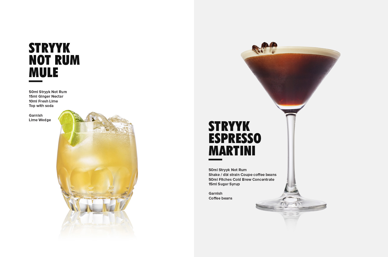
Stryyk emulates the flavours of gin and rum. Stryyk Not Gin is a blend of juniper, rosemary and basil, while Stryyk Not Rum combines clove, oakwood and grapefruit. Stryyk is 100% natural with no sugar, no fat, no carbs and no artificial flavours.
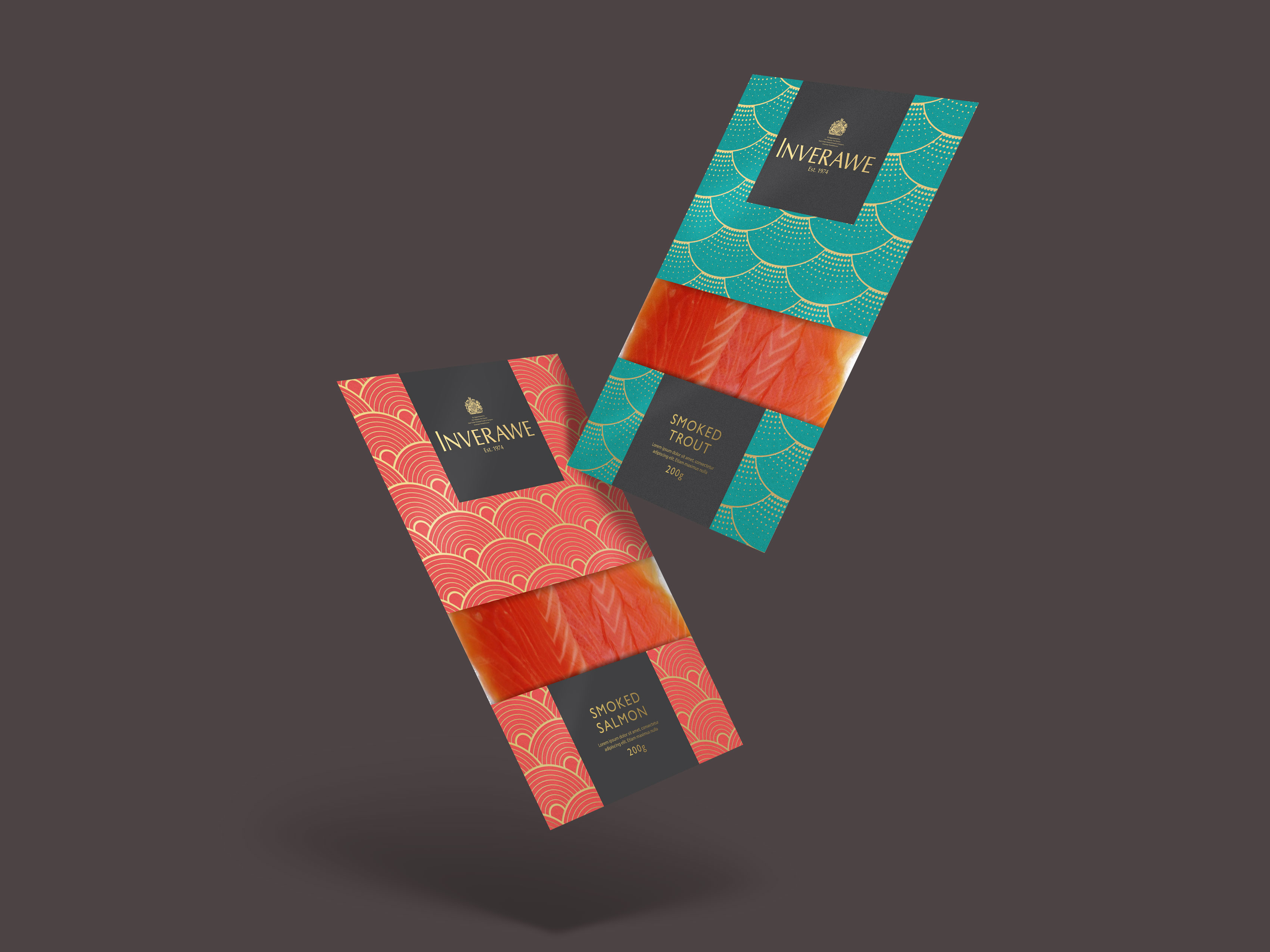
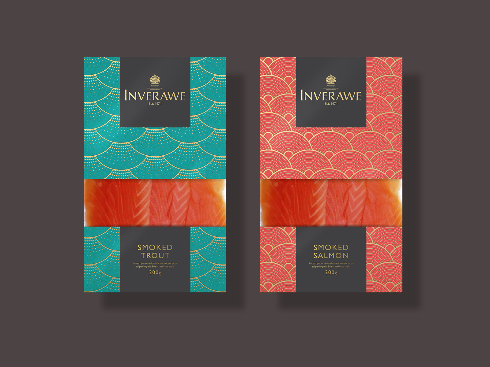
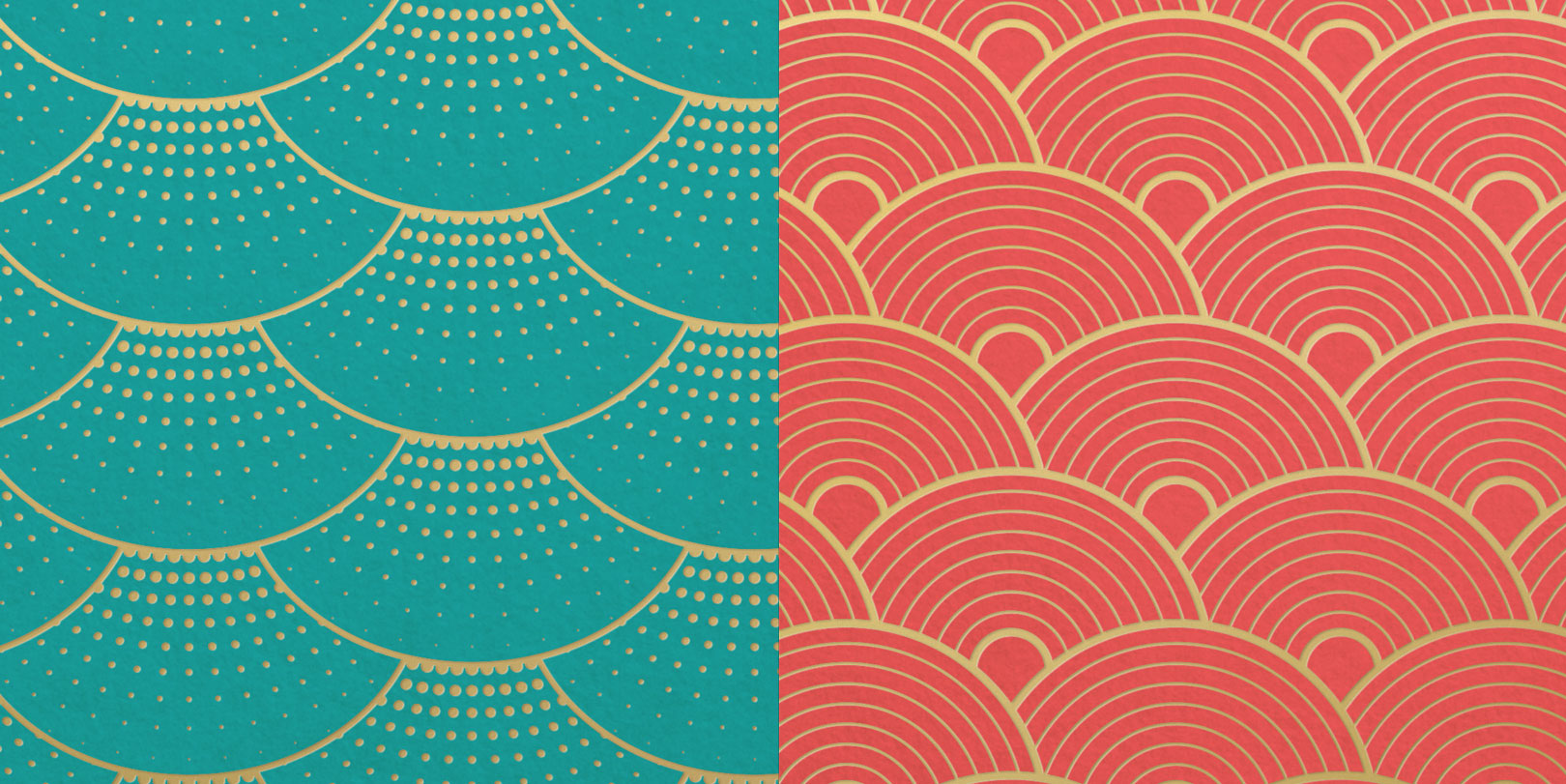
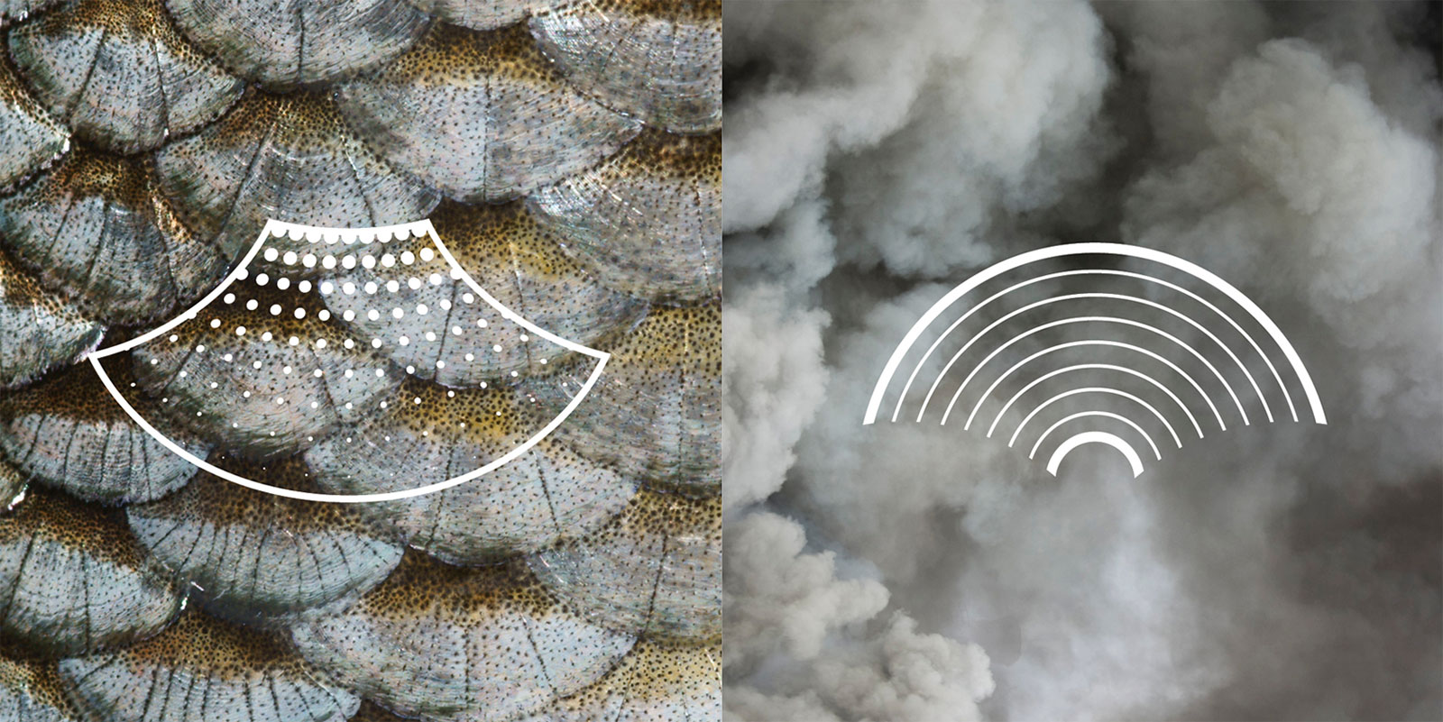
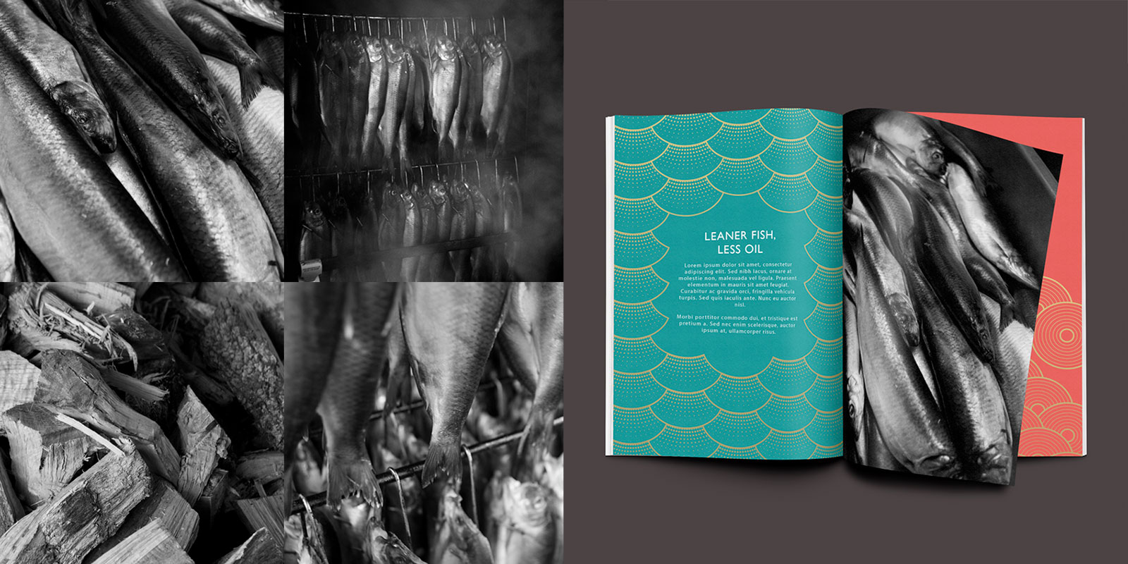
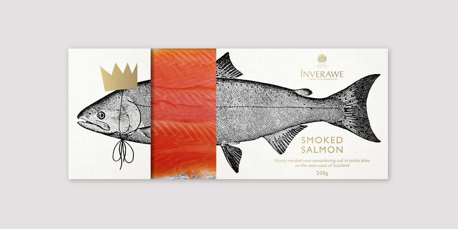
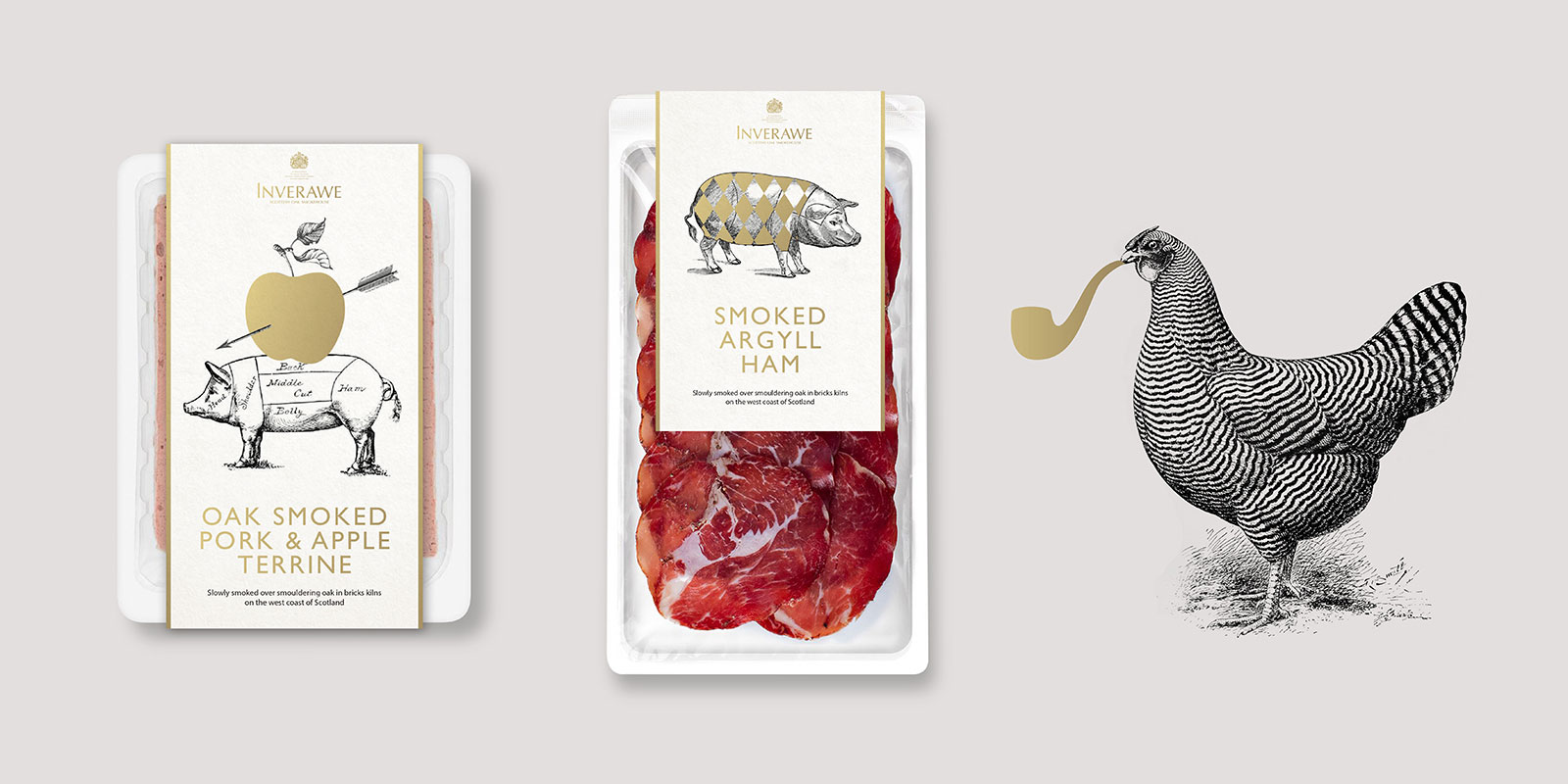
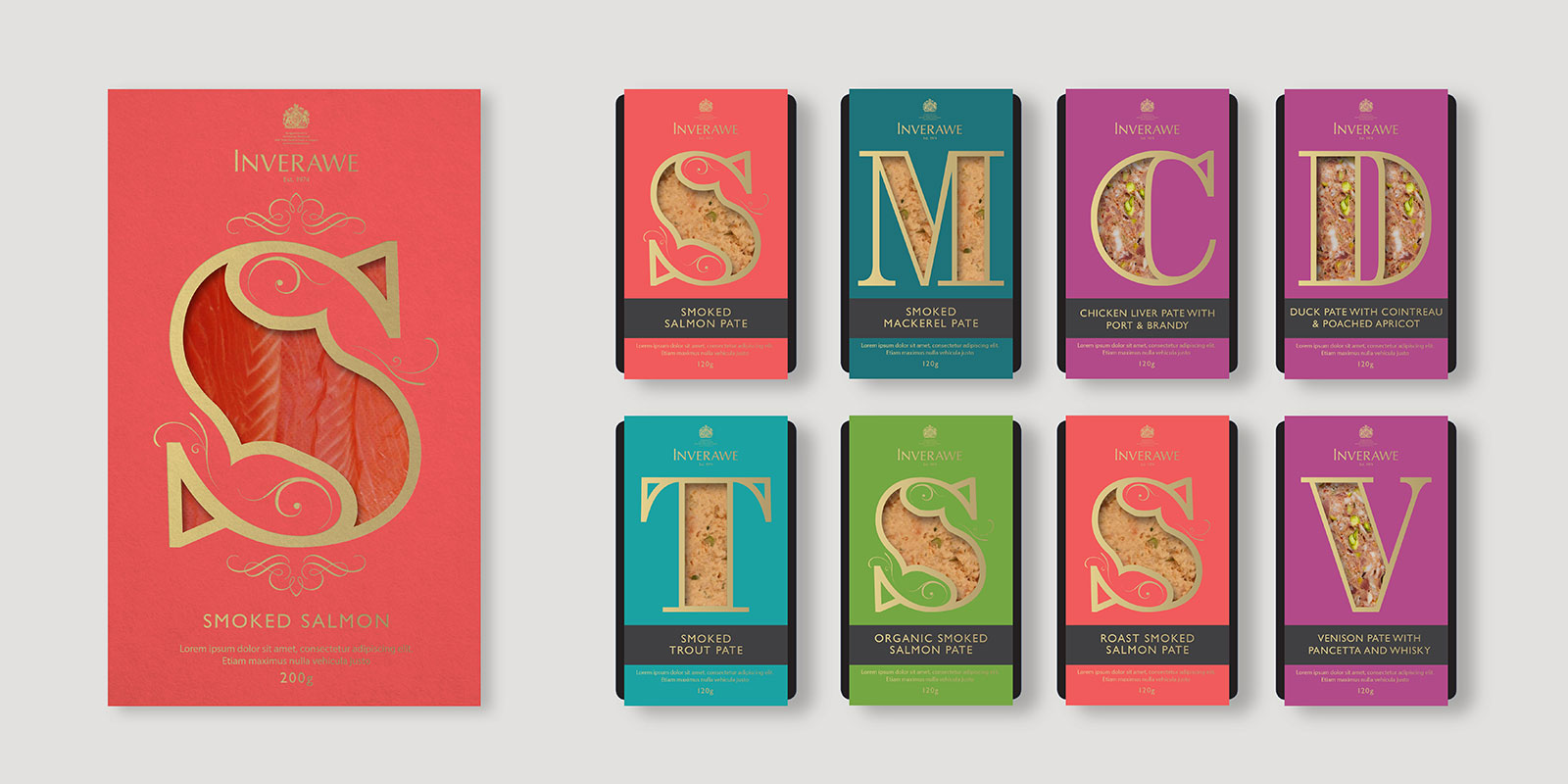
Back last year we started on an innovation project, re-positioning and re-packaging Inverawe. Inverawe Smokehouses started in 1974, and produces some of the finest Smoked salmon in Scotland as well as other fish, meats and smoked products. As part of the project we immersed ourselves in their age old process of using hand built smokehouses and oak logs that define the award winning flavour, re-positioning the brand and progressing their packaging into a more unique and luxury field. Below is a small part of the work we produced.
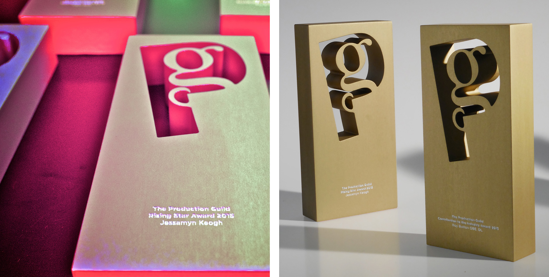
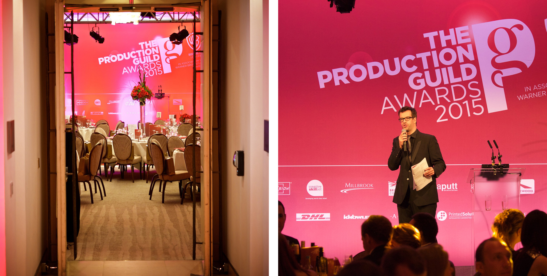
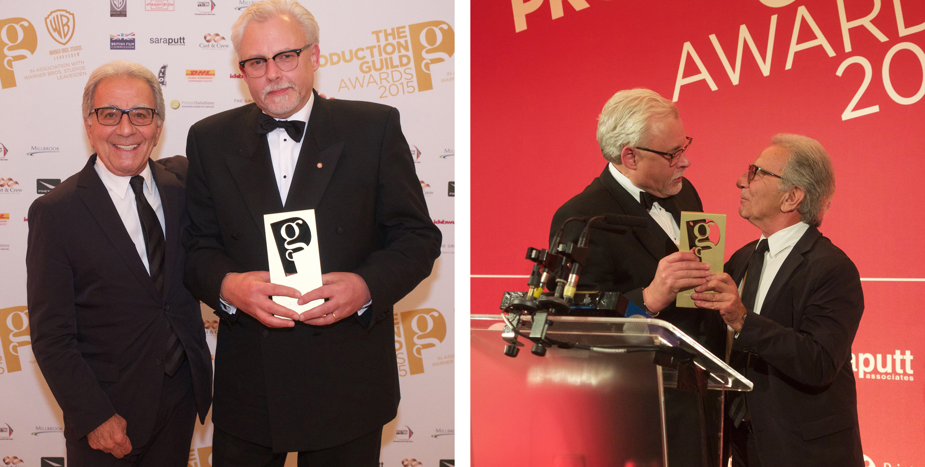
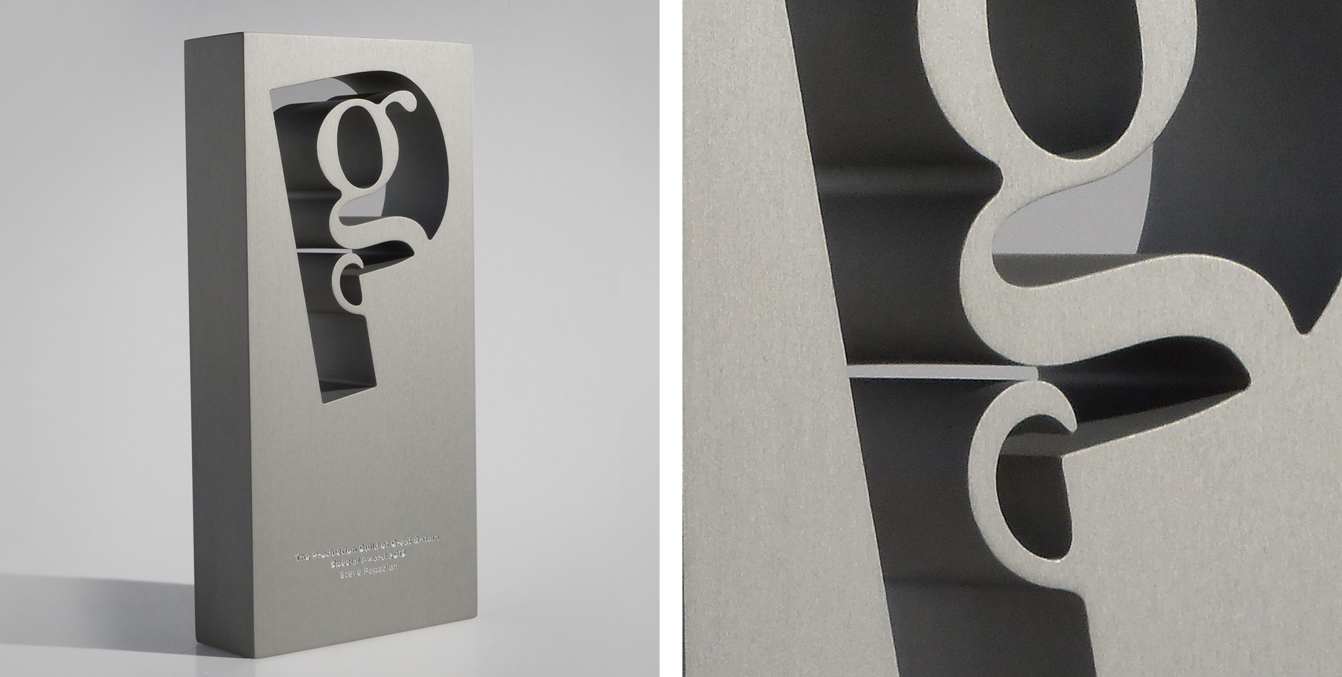
The Production Guild Awards was held on Saturday 19 September and provided the opportunity for the best in UK film and television production to come together and celebrate excellence and champion UK film and TV drama production. We worked with Ballistic events to deliver to branding and event materials, including the revamped trophy design with a huge thank you to Artem who kindly donated their services in getting them produced.
“The Production Guild Awards will give us the opportunity to celebrate excellence in UK film and TV production and enable film and TV professionals to network and develop potential relationships. The support of all of our Sponsors and Partners provides a great boost for our work supporting the best in UK production”
Alison Small, CEO, The Production Guild
Congratulations to the winners:
The Production Guild Rising Star Award 2015
Jessamyn Keogh
The Production Guild Member or Team of the Year Award 2015
The 24: Live Another Day Team
The Production Guild Inspiration Award 2015
Mairi Bett
The Production Guild Contribution to the Industry Award 2015
Roy Button OBE DL
The Production Guild Special Award 2015
Steve Papazian
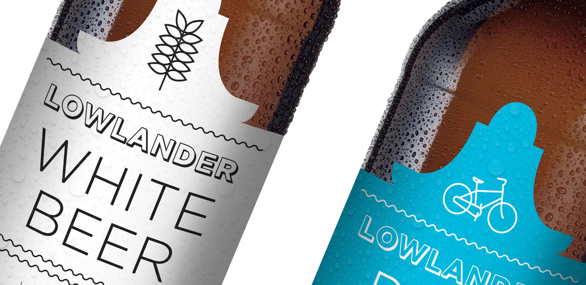
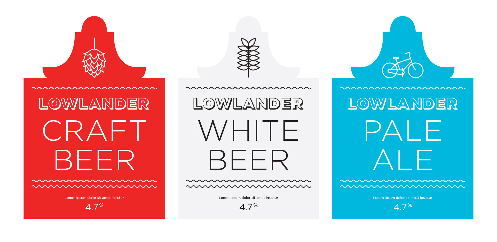
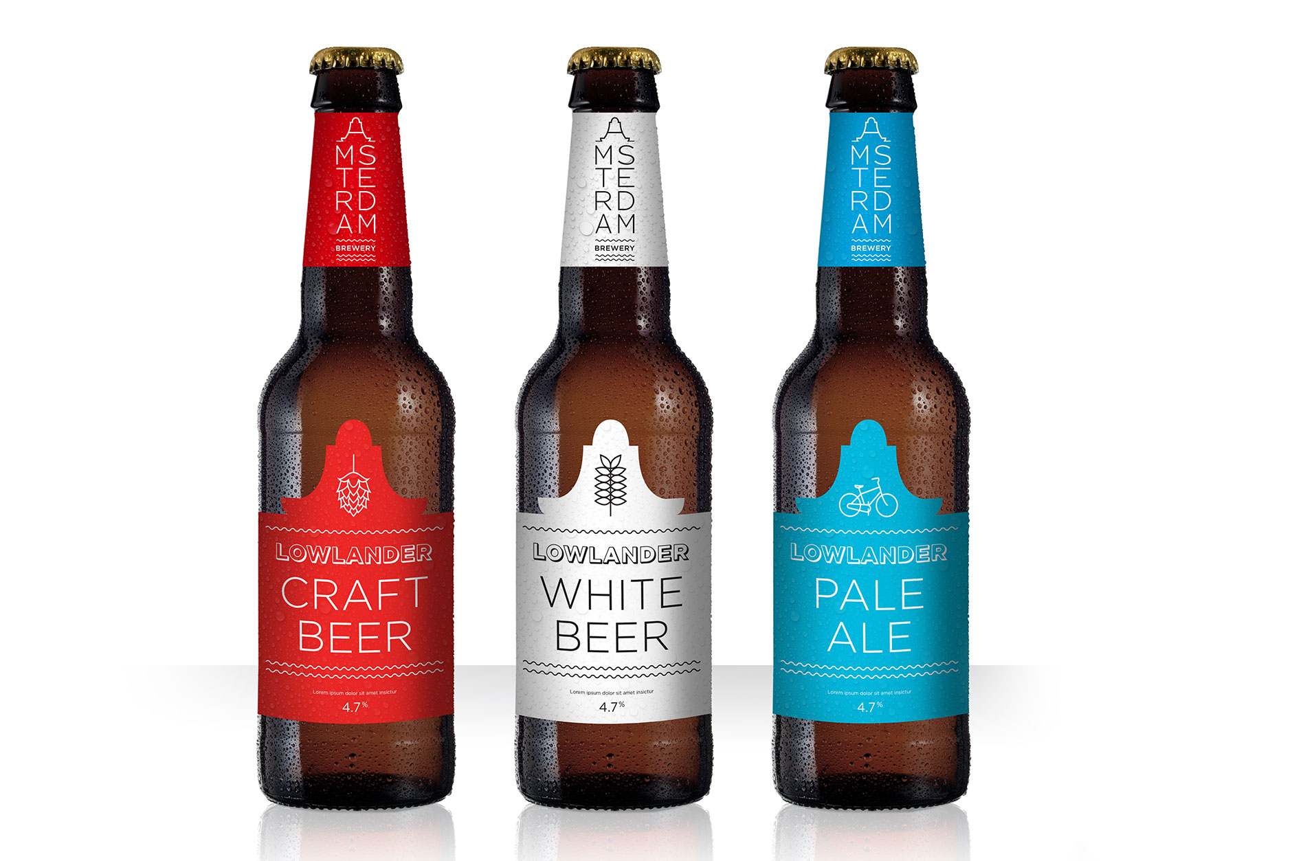
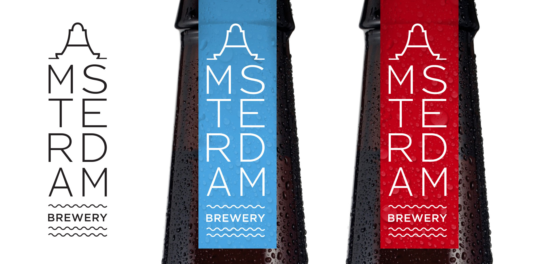
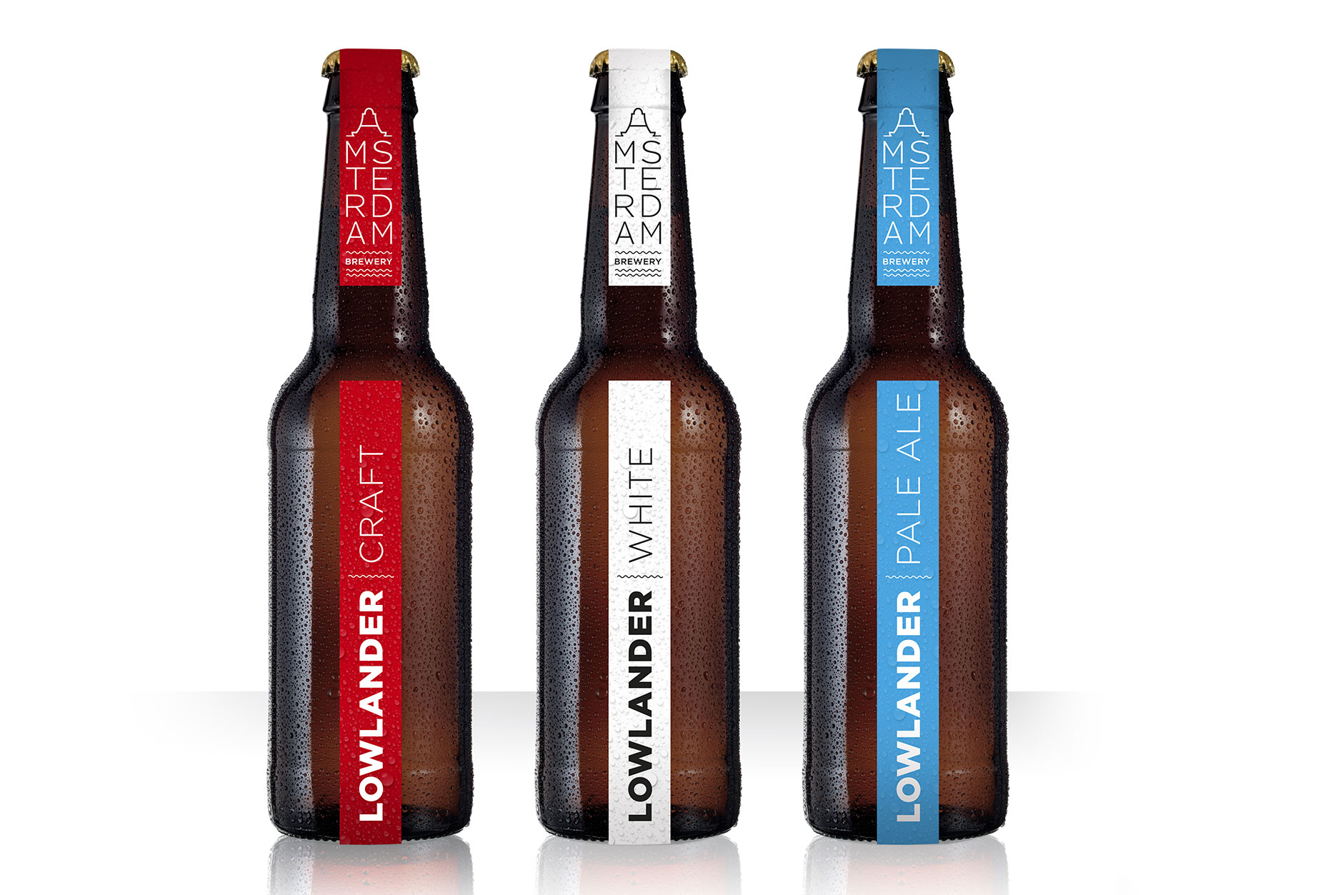
We worked on the concept designs for a new craft beer company – Amsterdam Brewery. Initial branding ideas and packaging concepts were created to bring to life, and gain investment, for a startup in beer innovation. The concept for the brewery logo focussed on the iconic canal houses and warehouses creating a typographic mark that tapered down from the gabled A.
Label variation using simple illustrated icons to create a clean and contemporary looking beer, moving away from some of the cliches of craft beer to create stand out at bar:
Packaging concept one:
The brewery logo influenced by Amsterdam’s iconic architecture:
We’ve just finished the branding for Hoxton Pickles, the latest venture from James Morgan and Chris Todd. Diners at last weeks 2NO were given a jar of the Smoked bourbon, black garlic and dill pickle as Hoxton Pickles made its debut outing.