menu

All posts in: moving image

Strykk rebrand and packaging

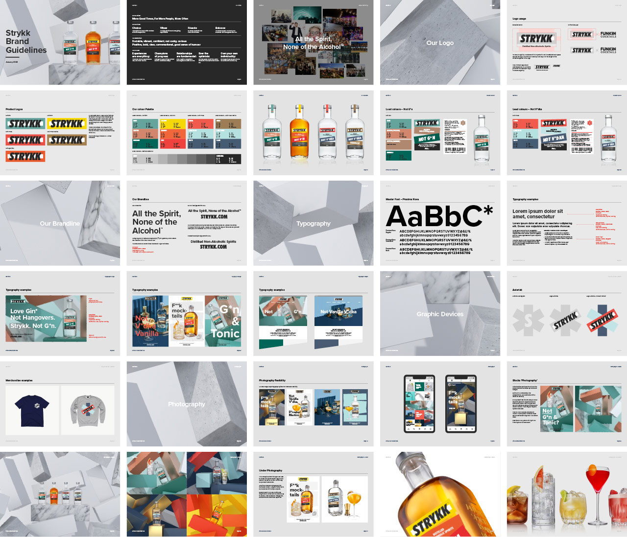
New brand identity and packaging work for Strykk, building on the original foundations we developed for them in 2018. Whilst our underlying strategy remains the same, a number of external factors have led to the need to reinvigorate the brand and re-align the growing portfolio.

Starting with refinements to the logo, we opted for a holding shape that become the central block device that runs through the whole identity. Extrapolated from the three overlapping oblongs that created the original Strykk asterisk, it builds as the common thread for packaging, and is both exaggerated or subtly implemented as a consistent graphic device across all channel executions.

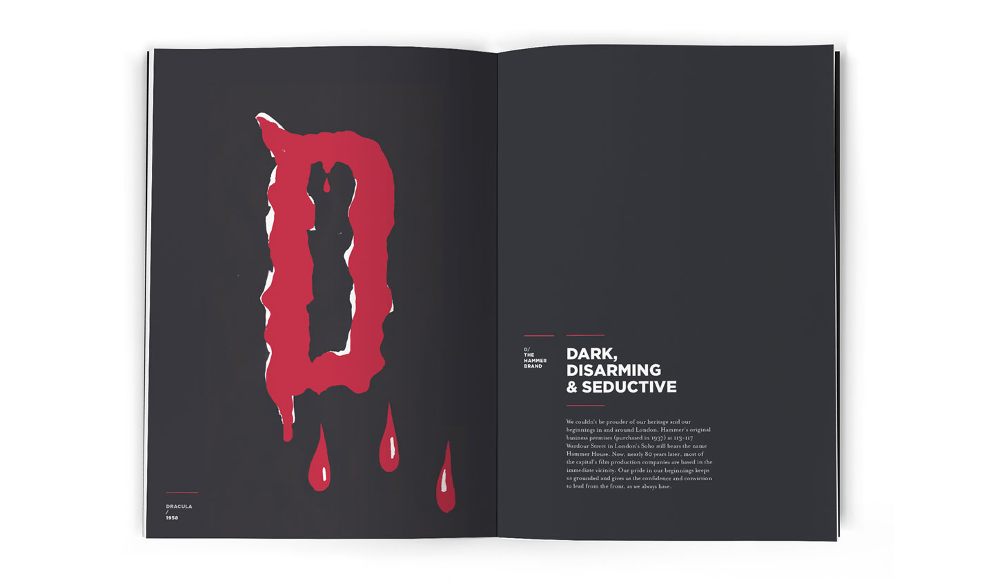
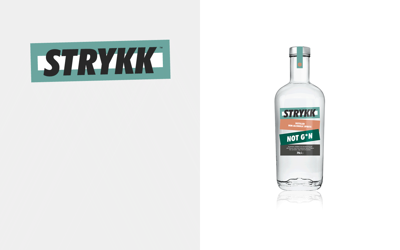
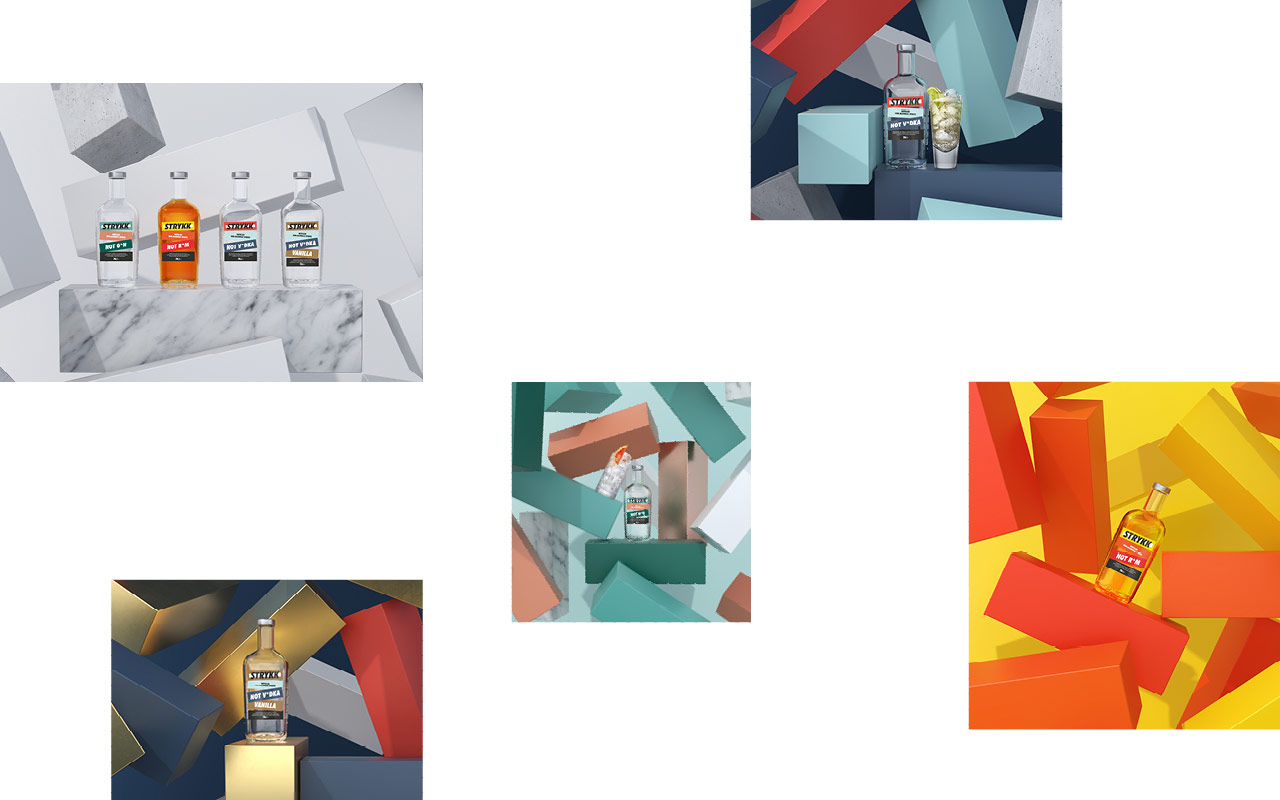
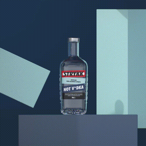
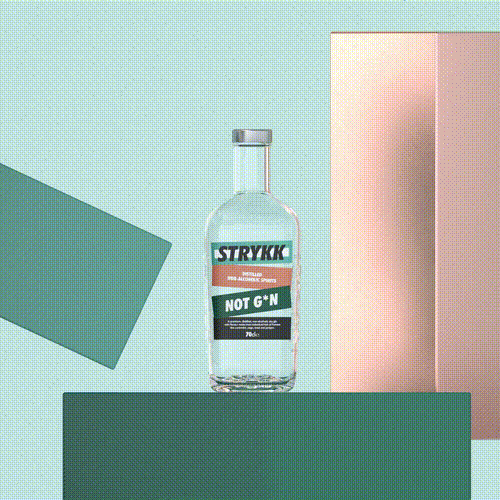
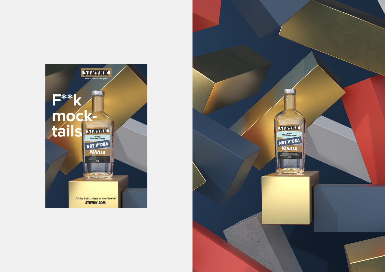
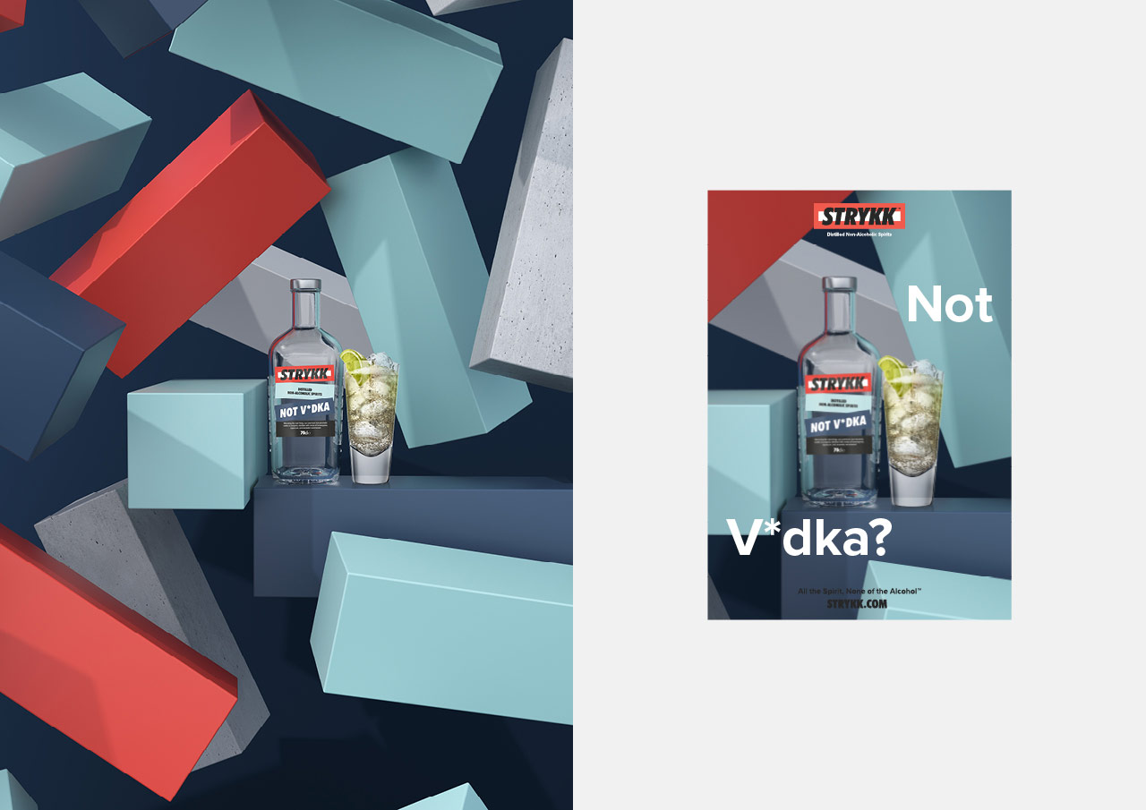
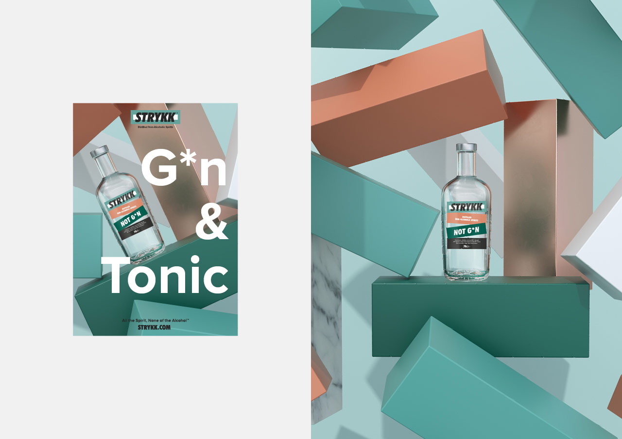
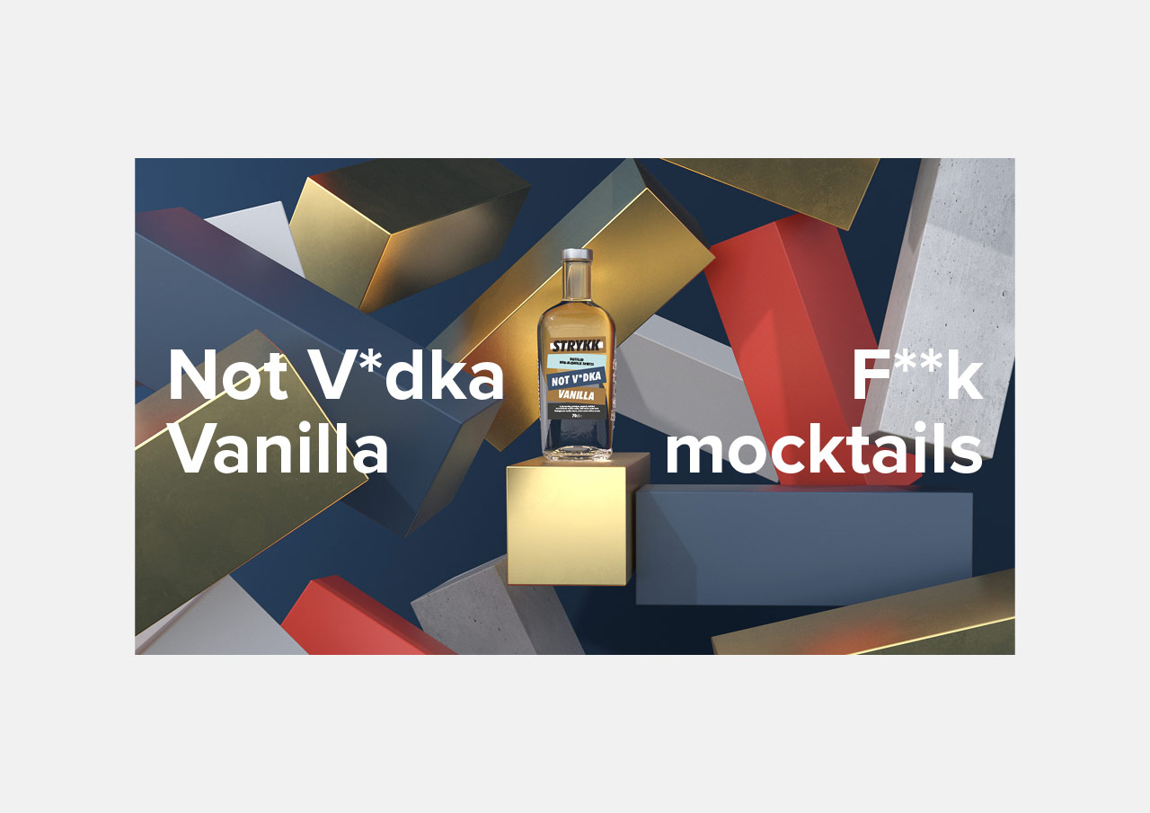
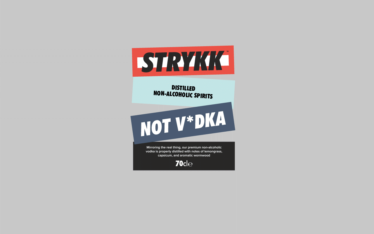
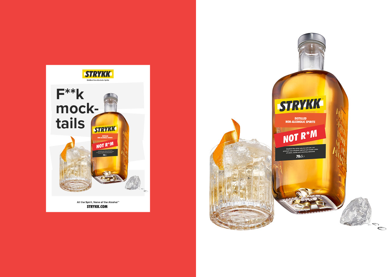
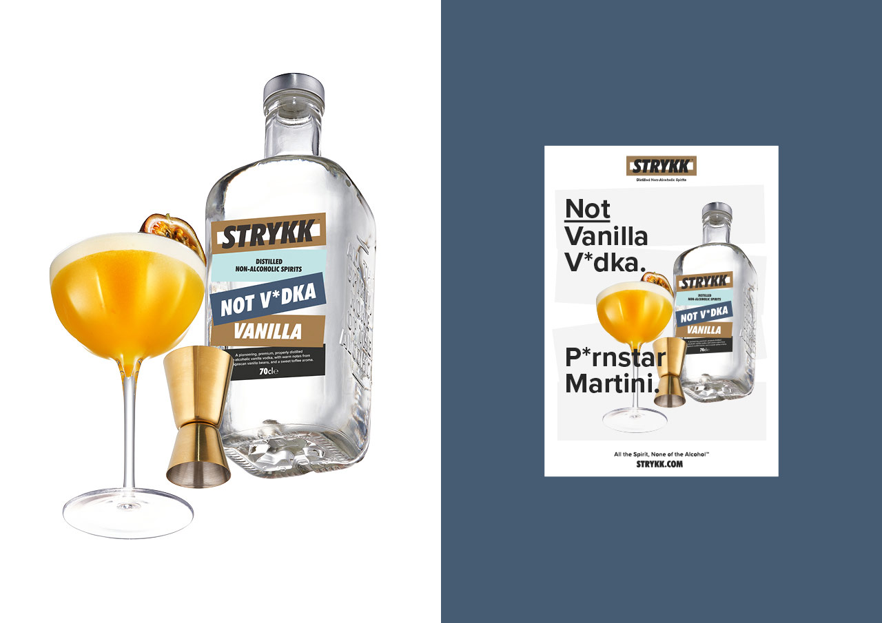
We’ve built on the strong colour palette, bringing in a wider set of bold and complementary tones to increase standout and build better differentiation between products. Typography opts for a more refined sans serif and a slight coming of age, moving from the unruly uppercase Futura Condensed used previously, to a more conversational approach. As before our focus on tone of voice remains confident and unapologetic, a key pillar of the brand.

The original strategy and positioning remains, inspired by the idea of enjoying a night out without compromise. A love of going out, being part of the story and not missing out. Removing the stigma of ‘not’ drinking, by delivering a product with the taste and complexity to build a proper drink with 0% Abv Distilled Spirit.

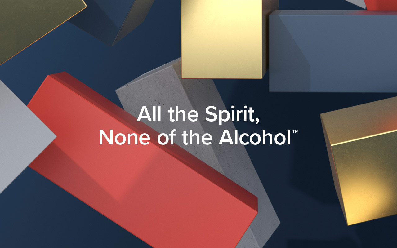
At the heart Strykk remains disruptive and steadfast in its unwillingness to just fit a mould. A bold approach that needed a bold brand, unapologetic and full of energy. We’re not about kooky craft, forced aspiration or self-importance. Uniquely summed up as; All the spirit. None of the alcohol.

Strykk_logo

Strykk_Rebrand_

Strykk_rebrand_bottles

Strykk_Rebrand_7

Strykk Not Vodka
Strykk Not Gin

“Limited Edition Design has been at the forefront of Strykk’s brand and visual identity since its inception in 2018. When tasked to overhaul and update the packaging and identity, a clear, comprehensive, and succinct sprint process was followed from start to finish – and at the highest standard. What has resulted, we feel, is a truly world class brand and visual identity, all packaged up neatly in a set of bullet-proof Brand Guidelines to mark the next stage of our business growth.”

Tom Glover, Brand Manager, Strykk

Strykk_Rebrand_3Strykk_Rebrand_4Strykk_Rebrand_5

Strykk_Rebrand_6

Strykk_brand_device

Strykk_Rebrand_8Strykk_Rebrand_9

Strykk_guidelines

Agency: Limited Edition Design
Creative Director: Paul Greeno
3D & Motion: Sergio Beggiato
Photography: Jeremy Baile

Le Col x Bahrain McLaren

Team launch video and photography to announce Le Col’s sponsorship of the new Bahrain McClaren WorldTour team.

Bahrain_Mclaren

Bahrain_Mclaren2

Bahrain_Mclaren3

Video Production Squire Studio
Director – Jay Creagh
DOP – Deane Thrussell
Executive Producer – Phil Tidy
Producer – Emma Giacalone
Sound Design – Kieran Seebach
Rigger – Steve Daly
Focus Puller – Gabriel Jones
Gaffer – Genki McClure

Photography Michael Blann

BUG 56

Latest BUG now selling out quickly at the BFI:

email_56

On sale here

Decca Publishing identity

New work for Universal Music – Identity and brand development for its new Decca Publishing wing. Decca Publishing will offer, synch, sampling and repertoire in the fields of neo-classical, score and soundtrack music.

New identity:

Decca_Publishing_s042

Our modern take on the stave, becomes a bold graphic device when used across collateral:

Decca_Publishing_s044

Decca_lines

Decca_Publishing_s049

Example application:

Decca_Publishing_s048

Decca_Publishing_s0410

Decca_Publishing_s0411

More info at: www.deccapublishing.com

Hammer films branding

Back last year we worked with Hammer films to re-brand and re-position their current proposition. Originally founded in 1934, the company is best known for its series of Gothic ‘Hammer Horror’ films made from the mid-1950s until the 1970s. Hammer produced classics including The Curse of Frankenstein, Quartermass and The Mummy, working across a wide range of genres from science fiction, thrillers, film noir to comedies, but ultimately dominating Horror. In recent years Hammer has revived itself and produced feature films including Let me In, The Resident and the Woman in Black featuring Daniel Radcliffe, and the sequel Woman in Black:Angles of Death.

As part of our work we re-cut their new identity to give it the love and attention it deserved. We also worked on the guidelines and art direction for idents and print collateral. Our work focussed on the future ambitions, without losing their rich history and heritage. Hammer exists to provoke the human psyche through extraordinary story telling and we hope this continues to leave audiences on the edge of their seat.

The new logo:

Hammer_logo2

Brand guidelines:

Hammer_guides

Hammer_logo

The A to Z of Hammer:
We created a brand book to show what Hammer stands for – changing misconceptions and reinforcing the principles that they have stood for from day 1. We re-drew the alphabet from the beautiful old posters that are as iconic as the films themselves, giving them a new lease of life with a bold colour palette and simple clean typography.

AtoZ_spreads

D_dracula

Details and preliminary sketches:

D_dracula_sketches

The_mummy

New re-cut logo:

Hammer_logo_3

…and before

old_hammer

Johnnie Walker brand videos

We art directed these two, 45 second, videos for Johnnie Walker Red Label and Black Label. Shot on Phantom for beautiful slow motion, each film highlights the flavour cues specific to the variant. With a mix of liquid nitrogen and an array of ingredients and hitting utensils, we managed to capture the explosive nature of the taste notes in super slow motion with balletic elegance.

Johnnie Walker Black Label – Director’s Cut:

Johnnie Walker Black Label stills:

JW_video_black

Johnnie Walker Red Label – Director’s Cut:

Johnnie Walker Red Label stills:

JW_video_red

On set:

JW_setup

JW_fruit

JW_setup2

Original storyboards:

storyboards

Agency: RPM
Director: Martin Wonnacott
Production: ParkVillage
Music: Patrick Cannell